Class
This week we had a group meeting with Mike who gave us some feedback on our character designs and the storyboards.
- Adjust the character designs, make Gumball look older and Lollipop look newer.
Edit the storyboards:
- Remove the fade to black, scene 12
- Change the establishing shots, scene 13A and 13B
- Add the photo wall at the start to emphasise that Gumball has done this for a long time then use him to guide the camera into the first scene
- Change the cake scene to the two robots fighting over who delivers it to the kid then drops it which still splashes the kid
Homework
I added some rivets to the chest plate of Gumball as well as adding some patches to his trousers to make him look more run down. I did not want to make him look too damaged as this could appear that he is no longer fit for his job.
 (My work)
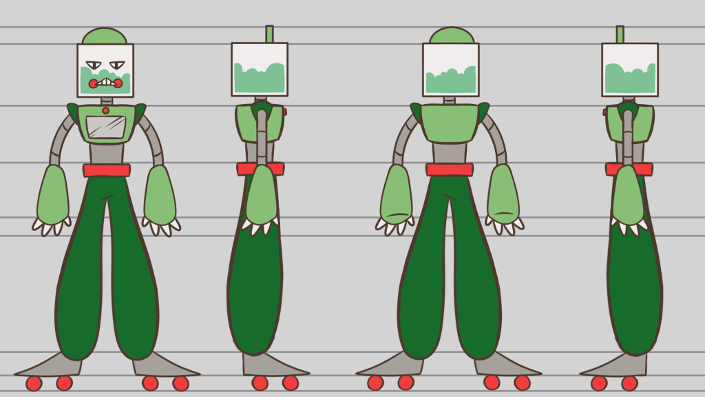
For Lollipop I redesigned his torso and arms, Nicole and I agreed that the trousers, shoes and head were fine. I tried to make him look sleeker and action figure like to make him more appealing to kids. I added a screen to his chest, larger hands and shoulder plates.

For the colour pallet I used the same colours as before, I just shuffled them to make it look more balanced.

This is the turnaround for Lollipop.
 (My work)
Nicole adjusted the storyboards based on Mike feedback.
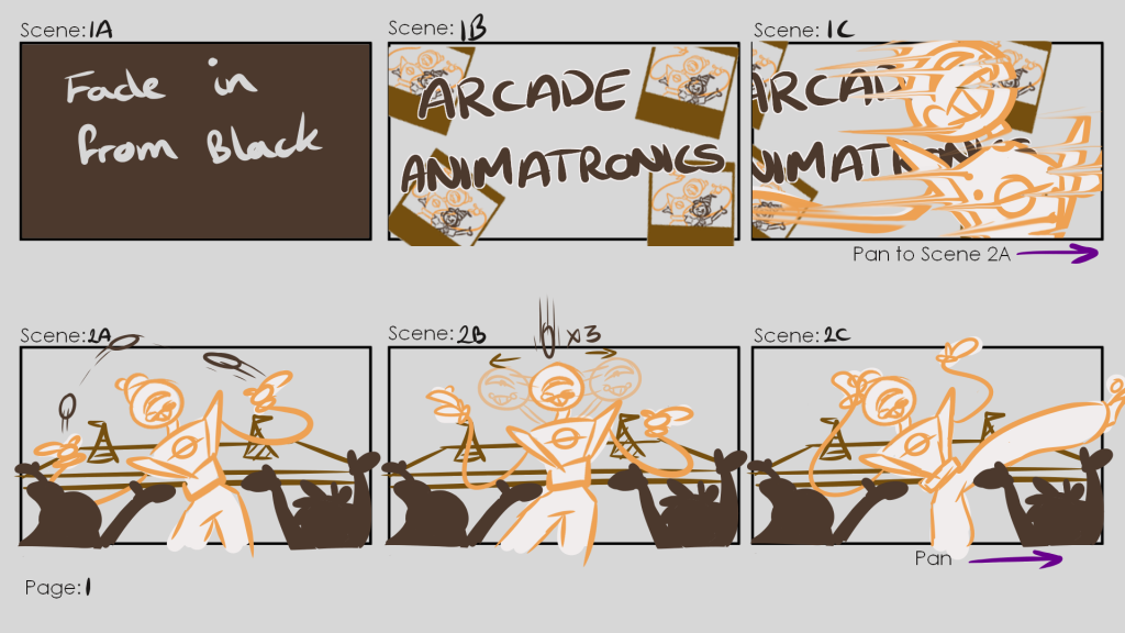

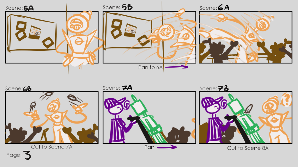


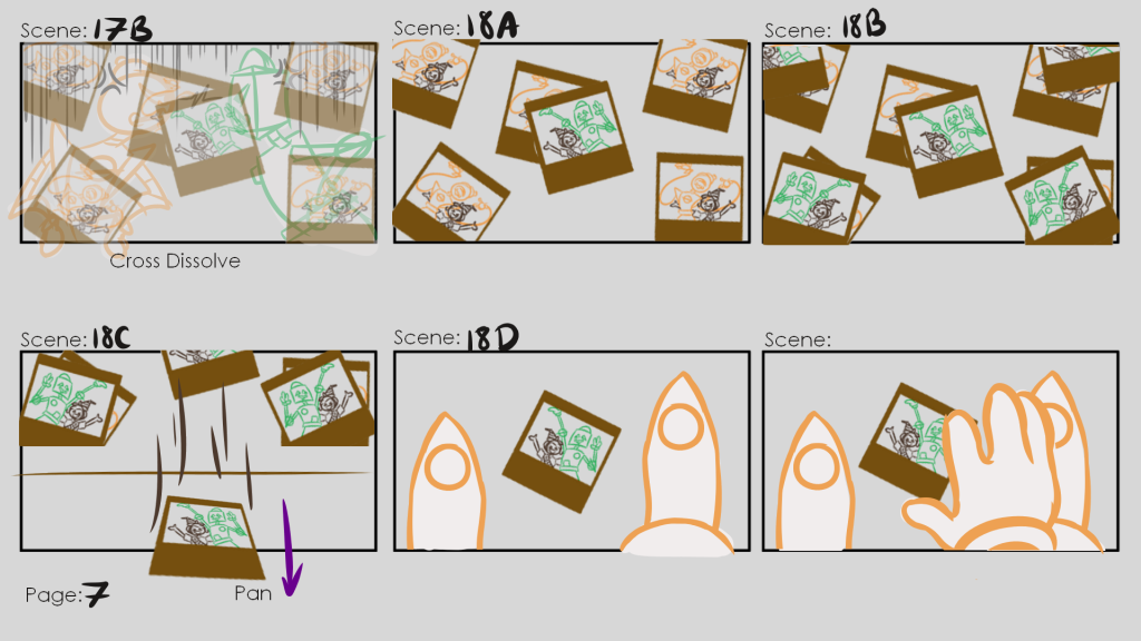


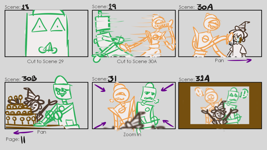

 (Nicole’s Work)
I also started work on the animatic, overall happy with it so far however after talking with Nicole she suggested the white flash should last a little longer. The shot with the photo should also be held longer to give it more impact.
Animatic (WIP)