This week after talking with the group and agreeing that everything was correct, I went to work on backgrounds and started my animation. When designing my backgrounds I kept in mind the overall colour scheme for the rooms that we discussed were warm colours; reds, browns, yellows and oranges.
Backgrounds
First I looked up some references on the internet; I mainly looked at features that would be on a vintage like the type of microphone and the shape of the stage. I also came across some images from the game ‘Overwatch’ of a stage with a mechanical singer.
This is my process as I completed the backgrounds
Here are my backgrounds, I like how they turned out, and I think the perspective looks good. The colours will make the character stand out; her colours are white and mint greens. However I did not add lighting as I was the lights to move and follow the character.


Rough Animation
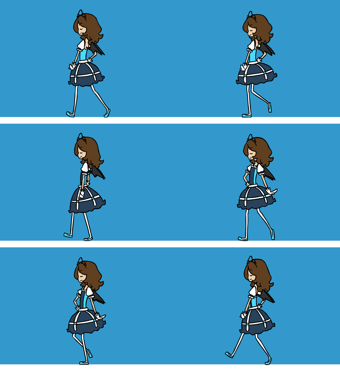
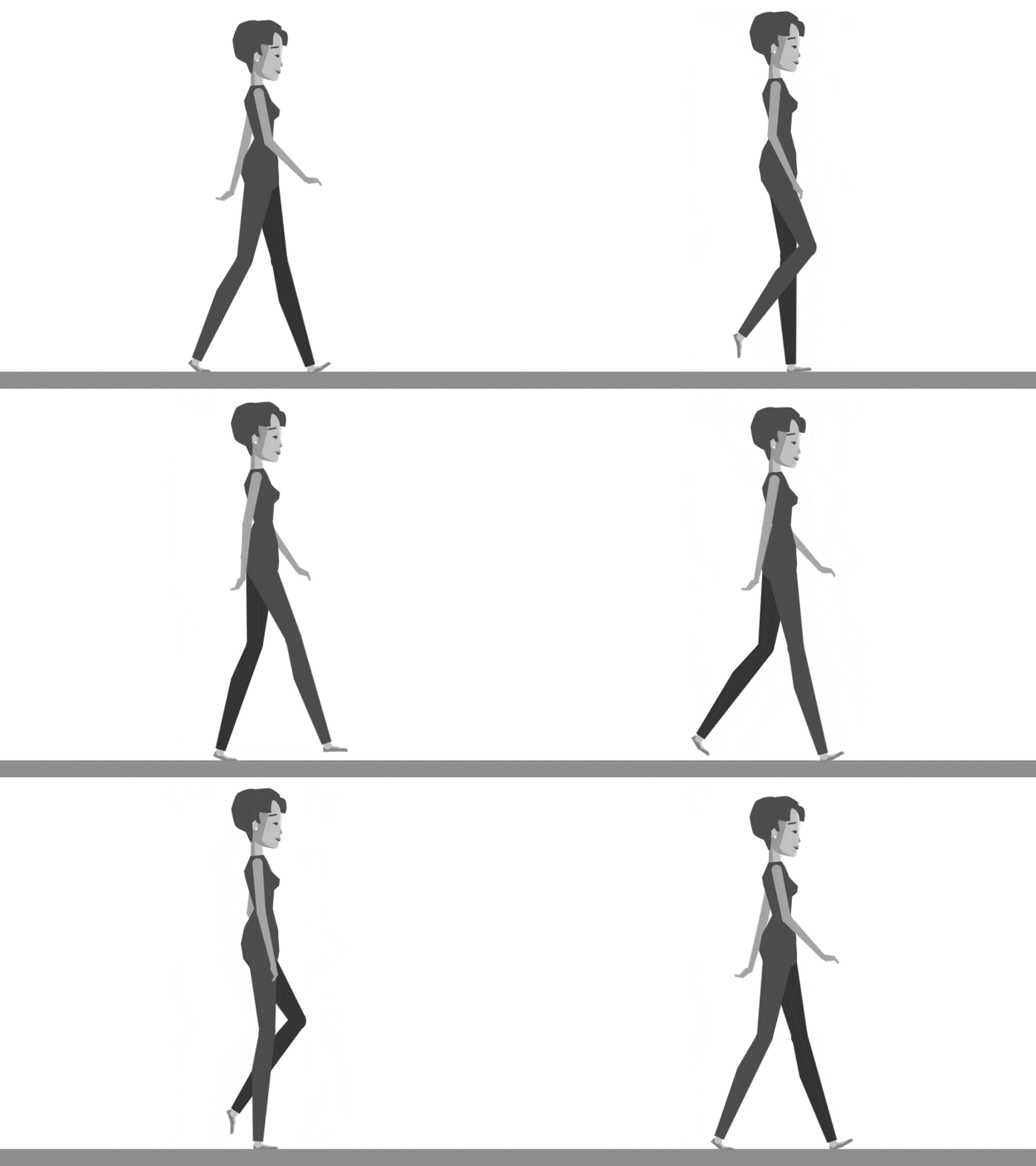
After working on the backgrounds I made a rough animation of the characters movements, I looked at how other people animated strutting to see how the body moves, this was helpful as I struggle with walk cycles. I like how she moves and the timing looks right, this is my first pass of the animation so she is missing her clothes, hair and props.
After this I added my backgrounds in and roughed out the lighting, I like how it follows the character however I think the opacity is not low enough as she fades into the light slightly, this also may be due to the fact she is a flat white instead of a pale mint green, I will need to experiment more to figure out what looks best.
The next thing I will be working on will be the secondary animation of her hair, clothes and props.
The references I used:
- sardine queen walk cycle by Nami-Tsuki on DeviantArt
- Walk Cycle WIP by Allen Laseter for IV on Dribbble


