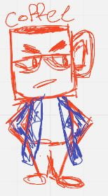
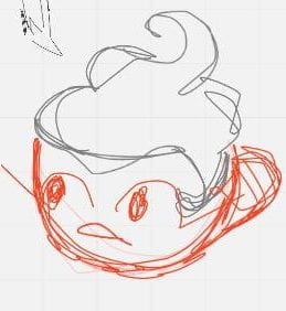
During class we were told about the design a world project and were split into groups of 4 and 5, I was put into a group of 5. We were all told to think of 100 ideas, after brainstorming in my group we had to narrow down our ideas to one; we chose to do a tea and coffee mafia world. All of us really liked this idea and chose the film style of film noir. After that we all went onto a site called Miro and brainstormed some character concepts for our world.
After the discussion on Miro we were tasked with designing 12 thumbnails of places in our world and to design some characters.
The Thumbnails
Initial Sketches for the Thumbnails
Here are some of the quick sketches I made for the 12 thumbnail task.
Final thumbnails
Here are my thumbnails for the world.
Overall I like my thumbnails, I think the perspective looks good and the tones show the depth of the images. However I dislike the perspective on the fifth one as it looks off. Overall if I was to do this again I would change the fifth thumbnail to a more interesting scene such as two characters playing cards.
Character Design
Initial sketches of characters
Here are some rough sketches from the brainstorm session on Miro
Before designing my characters I looked on the internet to find references images that portrayed the mood I was looking for.
Then I did some small quick sketches mainly focusing on shapes and silhouette.
Final character designs
Here are my character designs for the world.
Mocha is on the coffee side and was designed to be the femme fatal that would infiltrate the tea side and manipulate the main protagonist. I really like the look of the cream on her head and her dress. However if I was to draw her again I would push her proportions more to make her look more stylised.
Cinnamon Sticks is on the tea side and is very close friends with the protagonist, she will do anything she can to help him. I really like her design; it fits with the 1920’s ascetic and has a classy look. I would not change anything about her design.
Matcha is also on the tea side, he is an assassin that helps the protagonist to kill the enemy and help fight the war between tea and coffee. I like the different colours on his skin as it make him look unique however I don’t think he suits the 1920’s mafia theme. If I was to re-design him I would make him wear a suit of some form with a large trench that sits on his shoulders and have more subtle Chinese influences.
Cold Brew is a coffee, he runs the bar and casino and is a neutral party, he has no problem with either side as long as they don’t cross him or make a mess in his bar. Overall I really like his design as he looks like a bar tender from the 1920. The only thing I would change about him is his proportions as his head looks a bit big for his body and I think it would look better if he had longer legs.
Red is on the tea side. He is my version of the main protagonist. I am not very happy with Red’s design as it is a bit simple and cliché however I do like the crack across one of his eyes as it shows he has been in fights before. If I was to redo his design I would look up more references for his clothing and try to make him more unique.
This is all the characters together to show height and silhouette. Overall I enjoyed designing these characters.


