-
For this task we are asked to create a Pizzeria Brand in a week recapping on and using our newly learned skills.
Like always, I need to ask myself some questions to set the foundations of my brand:
Who my target audience will be? – Teenagers/Young Adults
Where will my brand be based? – Local/Belfast – Use local slang to create a sense of familiarity with ones community.
What experience will my Pizzeria create? – Happy, friendly & inviting
What is the main selling point of my brand? – Health & alternative ingredient based Pizzas.
Tone of voice, Word Bank & Brand dictionary
Word Bank
- Juicy
- Palatable
- Quality
- Season
- Ethical
- Exciting
- Fun
- Modern
- Innovative
- Unique
- Happy
- Playful
- Bright
- Diverse
- Green
- Lively
Once I have the basic understanding of where I want my brand to head, I can now create a confident tone of voice describing the words I want the Pizzeria to be knowledgeable with.
- Helping the community.
- Sharing Familiarity & locality.
- Reliable and Trustworthy.
- Variety of taste.
- The face of the new and modern restaurant.
Naming my Brand:
I made a quick list of different keywords associated to my Pizzeria:
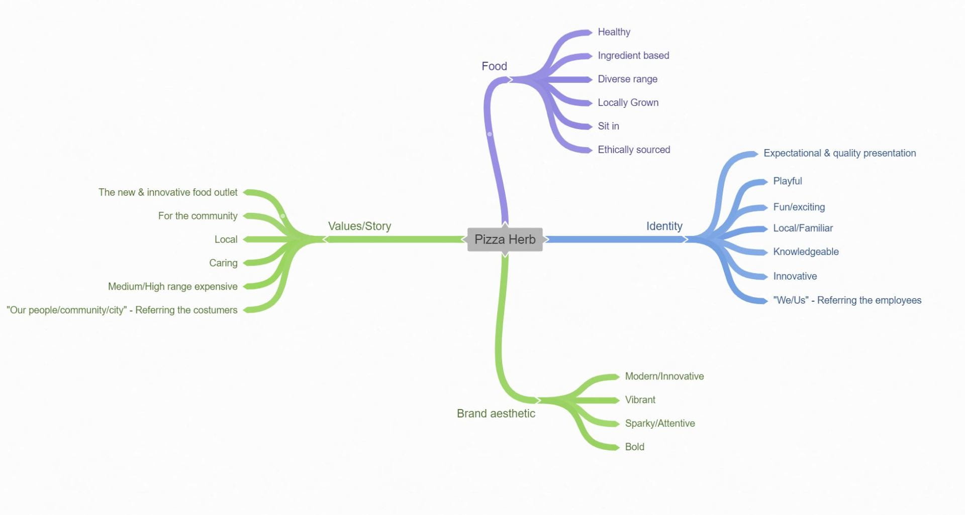
To grasp a better understanding of my brand I want to divide each different sector up and describe them using a mind map.
Looking at Competitor Brands
Pizza Guys – Primary Inspiration
Pizza Guyz is a local, modern and innovative fast food Pizzeria based in Belfast delivering a premium and exciting experience to its local community. I picked Pizza Guyz as it matched a similar criteria of what I want my brand to conclude such as visual, social and experience aspect (minus the more relaxed ingredient importance).
Logo – Analysing
I really like Pizza’s Guyz simple yet striking logo which I will try and implement some of its features into my monograms:
- Simple yet striking design
- Inverted text – Adds less cluster & detail, more simple to understand.
- Bold sans serif – Draws attention, shows strength, easy to read from a distance, simple, more playful
- Modern Symbolic shape on top right corner – Just the right amount of detail, fun and exciting illustration, illustration facing text.
- Round circle – Geometric, simple, easy to understand
- Bright colour – Unique striking red catches eye. Red stands for passion, excitement and importance, in this case it also has a double entendre in which the red also mimics the pizza sauce.
‘About us’
“We are the “PIZZA GUYZ.” We are a vibrant family run pizza spot who are top rated in Ireland. We are passionate about delivering the ultimate pizza experience. We GUARANTEE a piping hot pizza or it’s FREE!All of our pizzas are handcrafted by our amazing team of Pizza Artists in our 5 star hygiene rated facility.All of our meat is finely selected and sourced locally, our cheese is 100% buffalo mozzarella, and our veggies are all organic.We offer an amazing choice of signature pizzas and great value deals but also encourage our customers to be a pizza “vigilante” and create their own masterpieces.”
Word Bank
- Juicy
- Vibrant
- Fresh
- Local
- Ethical
- Family
- Unique
Tone of Voice
- For the community
- Affordable
- Confident
- Engaging
- Fun/Exciting
- Playful/Outgoing
- Caring
Website/Brand Dictionary
Page 1
Pizza Guyz doesn’t have a mobile app, therefor I will be having a look at their online website. Pizza Guyz uses a modern, simple and professional interface on their home screen which makes it extremely easy to navigate contained only vital visual and written information such as
- Clean Navigation bar
- small unobtrusive Logo
- Small graphic art of moped – shows pace, service and portability of their deliveries
- Image of pizza – appetizing
- Short review – confirms positive status & highlights achievements
- Call now/Order Online – easy to access/primary function on page due to scale, position and colour
- Motto – confirms professionalism
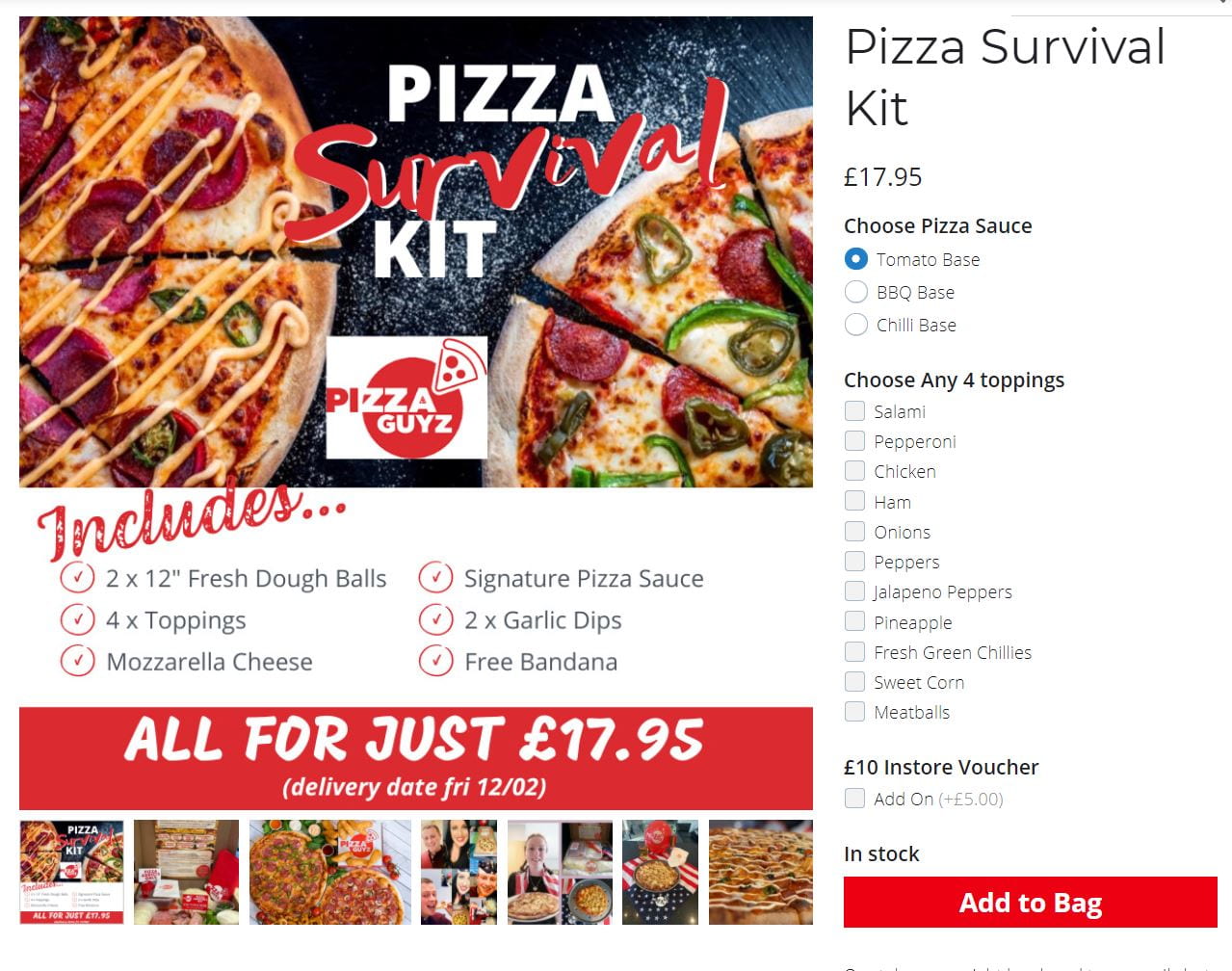
Clicking on ‘Pizza Kits’ on the navigation bar it showcases their ‘pizza collections’. Staying with their satirical and playful values they include the “Survival Pizza Kit” offering a meal deal with a wide range of toppings, highlighting bargains and deals in red to add importance to what they want you to read as they know most of their audience will be younger who aren’t really interested in the written word.
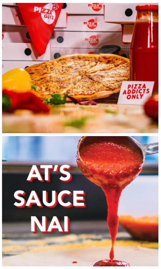
Clicking on “Pizza Gallery” on the navigation bar we can see them using satirical terminology such as “Pizza addicts only” and looking at the image below they use a play on words “At’s sauce nai” as the term is usually “At’s us nai” they are staying relevant and keeping a close cultural ties within the local community.
Domino’s
Dominos is an expensive, global and enticing fast food Pizzeria chain which is world famous by their unique juicy pizzas and also their franchises such as their iconic logo and physical touchpoints such as their pizza boxes.
Logo
- Uses simplistic logo consisting of basic geometric shapes.
- Mimics Pizza box (plays into physical touchpoint).
- Red: exciting, joyful, passionate & pizza sauce.
- Blue: Trustworthy, safe & reliable.
- Bold sans serif font to create a bold and striking impression.
About Us
“The Domino’s story began in 1960, when Tom and James Monaghan opened the first “DomiNick’s” store in Michigan, USA. A year later, Tom traded his car for his brother’s share of the store and later renamed the business Domino’s Pizza. The three dots on our logo represent the three stores that Tom originally planned to open.
The business idea was simple; to deliver hot, freshly made pizzas in as quick a time as safely possible, while playing an active role in the local community. Through a little known format now called franchising, Tom enabled other people to invest in opening their own store.
Domino’s came to the UK in 1985, with the first store opening in Luton, Bedfordshire. Today, there are now over 1,200 Domino’s stores across the UK and Republic of Ireland, delivering over 105 million freshly handcrafted pizzas a year.”
Domino’s mainly focused on their foundation and evolution as a brand, this narrative is used to communicate immediate trust and reliability to the reader as they sell themselves as a “well founded food chain” proclaiming their establishment in 1960 & also talking about their first UK & Irish Pizzeria in ’85. They also confidently show their well established brand implementing statistics of their company such as “over 1,200 Domino stores across the UK and Ireland” & “105 million freshly handcrafted pizzas a year”
Domino gets to the point describing why so many people love them, “delivering hot, freshly made pizzas in as quick a time as safely possible”. Also, Although it is seen as a global brand, it also mutually prescribes a sense of involvement in ones community.
Word Bank
- Juicy
- Paste
- Variety
- Expensive/Premium
- Global
- Secure
- Tasty
- Iconic
Tone of Voice
- Reliable
- Confident
- Assuring
- Professional
Mobile App
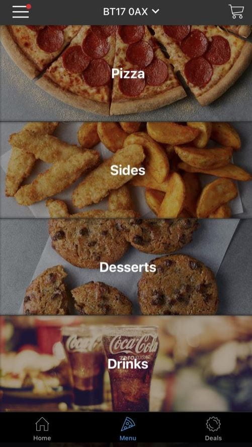
Although Domino is a very successful pizza establishment, the app takes a different direction from different pizzeria connotations. It uses a black/grey colour palette which creates a more sophisticated appearance. The layout of the home screen and selection screen is in a column which makes the app more approached and useable as you aren’t cluttered with options.
Looking at the home screen it contains:
- Statured image of produce with visually obtrusive font/design – stands out
- Multiple meal deals/upgrades, personalised and catered to the user
- Geo located map
- Three icons – simple and easy navigation
- 2 top bar icons
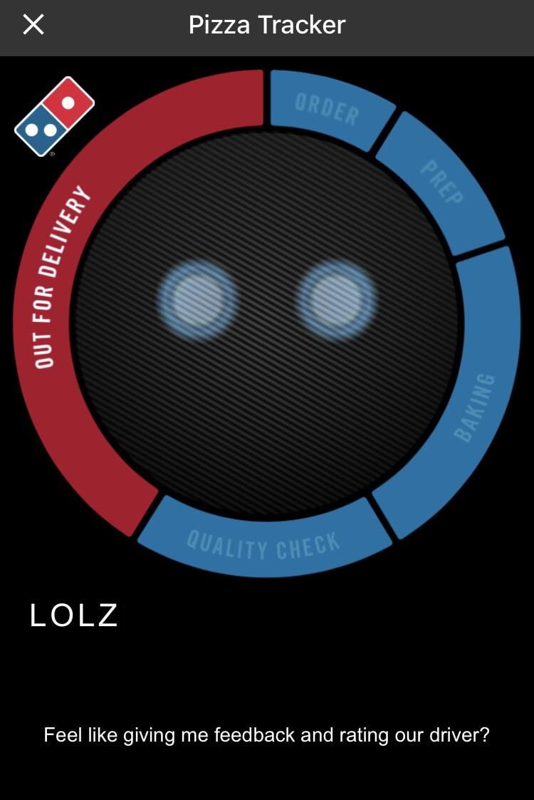
The confirmation screen contains a ‘pizza tracker’ which has a name called ‘Dom’. Dominos has created an anthropomorphic mascot built into their app to make the app feel more friendly and relative to the user. He also contains catchphrases in the bottom corner which makes the experience more playful.
Pizza Hut
Logo
- Unique, vibrant and striking red
- Round logo representing a pizza
- Minimal colours and objects
- Use of negative space to create a more simplistic design yet retain character
- Thick playful sans serif typeface
- Playful logo
About Us
“We’ve come a long way from our first Hut in Islington more than 45 years ago.
We try to make sure that everything we do lives up to our promise of being “the best loved place to eat and work”. Whether it’s developing new food, offering degree level apprenticeships or supporting our charity partners, we’re committed to making a difference.
Some places call it ‘Corporate Social Responsibility’. We just like to think of it as doing the right thing.”
Word Bank
DIY
Family
Children
Ethical
Moral
Environmental
Tone of Voice
Welcoming
Inviting
Professional
Mobile App
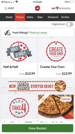
Pizza Huts layout contains a white clean background, as this makes their reds/deals stand out. Although, Pizza hut has went for different approach the first thing I noticed on their website is how jammed everything is as looking at their ordering section we can see it has two columns instead of Dominos which is one, as Pizza Hut is mainly for kids this type of layout isn’t necessarily a good idea. It also uses images of their produce like both other pizza sites.
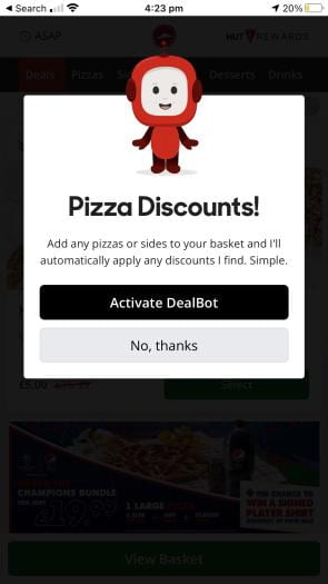
We can also see Pizza Hut creates an anthropomorphic ‘dealbot’ onto the site to make the site more interactive, fun and inviting for users.
Website
On Pizza’s Hut website we see a very ethical and moral stance, contributing to multiple charities and fighting against pollution.
We also see Pizza Hut refers to their employees as ‘Our’ and creates a relation between company and employee.
Colour Scheme
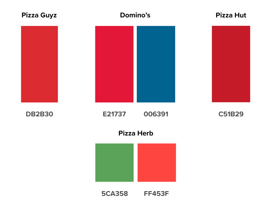
Whilst looking/researching about Pizza brands I noticed a lot of Pizzeria chains which use a vibrant red in their logo which is striking and renowned as this has connotations with being passionate and exciting. Also, whilst looking at the physiological impact of this dominate red in Pizzeria logos it creates a sense of the pizza being covered with juicy tomato sauce.
Sticking with my values, I went for a more vibrant unique red (and also green to match the leafy aspect). I think these colours really stand out and catches attention. It is also quite similar to the Italian flag.
Typeface
From all of the Pizzeria brands that I have researched I saw a common bold sans serif typeface being used, as this grabs the attention of many of it’s family focus fast food consumers and using my brand values I visualized having the same aspects.
I went on Adobe fonts and selected a variety of similar yet individually unique sans serif typefaces.
I decided to go for ‘Dazzle Unicase’ font (3rd down) as this clearly stands out from the rest. It also retains the most structure and edge. The rounded typefaces are too playful and less noticeable.
Visibility Test
For this I want to see how my chosen brand colours clash against different shade/colours taking in account of distance (scale 100% – 20%).
Monograms
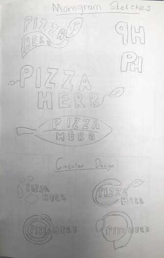
1. Sketching
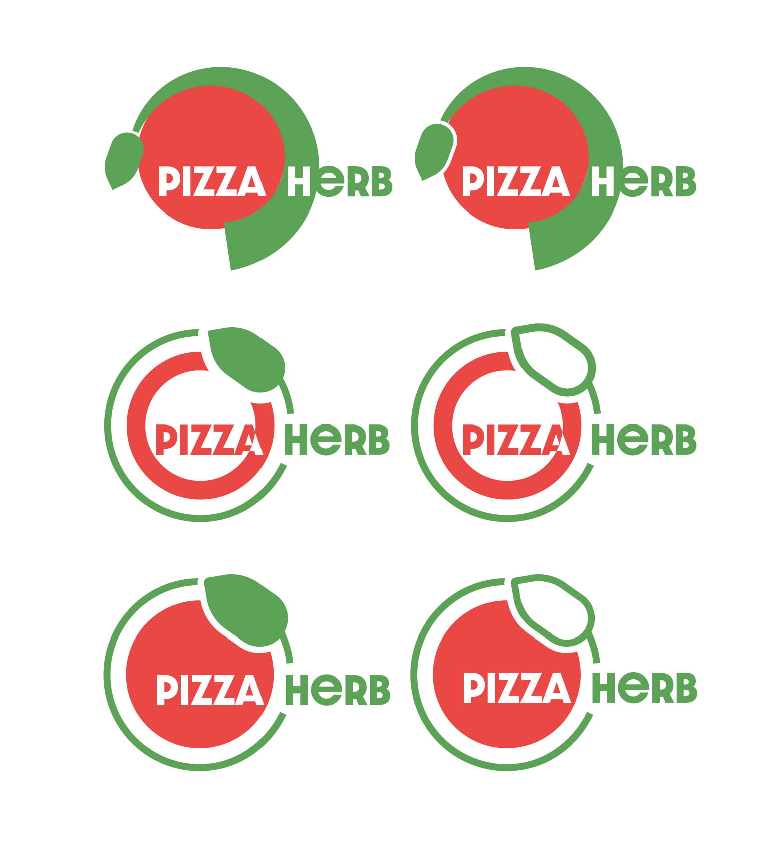
2. Digitising
- too little balanced – too much happening
- too much balance, too much negative space
- perfect
Revisions – Finding the right width
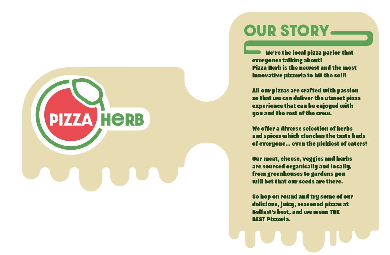
Logo & Brand Story
Physical Touchpoint
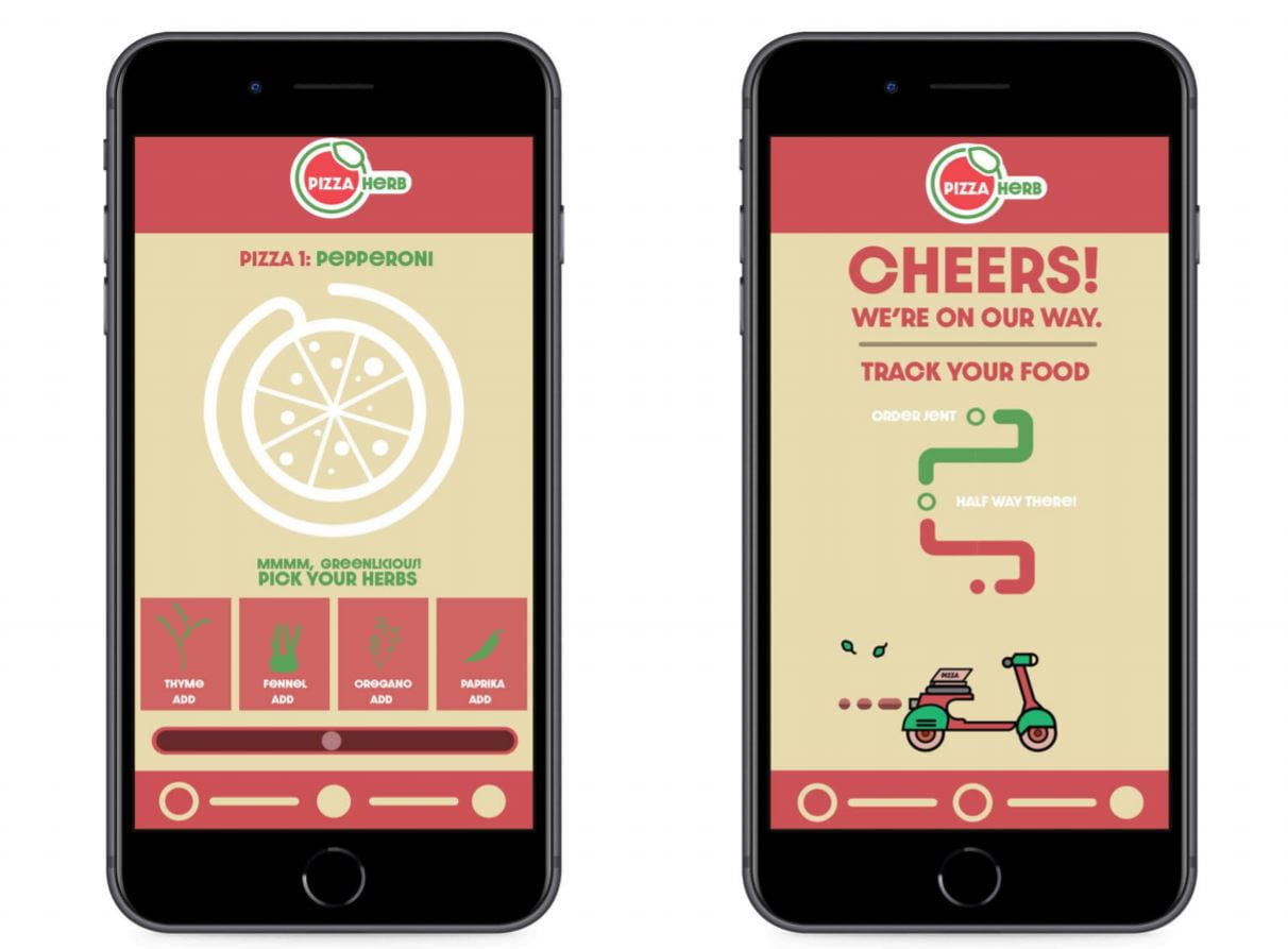
Digital Touchpoint
Conclusion:
I found this task very fun to complete it allowed me to gather all the information I required from previous weeks and deploy it as quickly as possible. The organization and planning that went into creating this pizza brand has gave me better skills in managing time, experimenting and it has also gave me a refresh of all of the stuff we have learned so far.
Feedback:
After doing a critique session with Daniel we came to the conclusion that for my ‘about me’ section the first two paragraphs aren’t needed as they don’t dive into the companies values and claim that “We’re the best pizza parlour about” which can be seen in a negative light as the company can come across as cocky.

