Olly Johnathan Moss is another famous English illustrator who is most famous for his work on the game Firewatch and his Star Wars original trilogy posters. At first, graphic design came to Moss as a hobby but through university he began to create and publish popular t-Shirt designs on Threadless.com. Eventually, he showcased his work on the internet allowing him to become a prominent graphic artist. He now works for Value in which his latest work saw him working on Half Life: Alyx as an artist.
I am particularly interested in Olly Moss’s artistic work on the game Firewatch. His ability to prescribe immense character and dense atmosphere in his illustrations is overwhelming.
Looking at his work
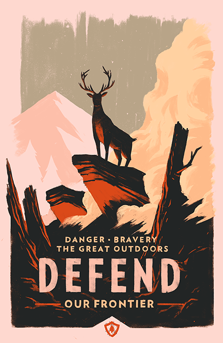
I really like this rough poster which would look great as ‘badges’ or ‘achievements’. Olly creates this by blending and roughening the edges and corners of the frame of the poster. He also creates a sense of mystery and intimidation through both his colour palette and artistic style. Looking at colour he uses harsher tones highlighting the foreground against more mute colours in the background. He also sticks to a limited colour scheme for each elemental ground. For the foreground he creates a sense of mystery and intimidation through the sparse contrast between his signature orange and black which outlines the environment in distress. The deer is also the centre piece of the image that can represent both ‘king of the woods’ or isolation.
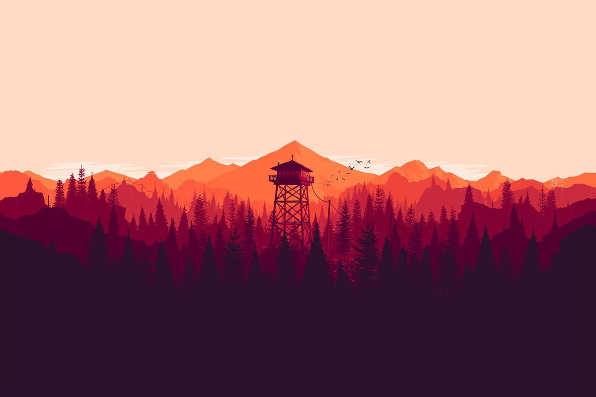
For his more iconic pieces he presents them as beautifully laid out landscapes creating a deep emotional connection and conveying a sense of mystery and isolation, two main themes of the game itself. The consistency in the artwork is implemented perfectly through the multi-layered forest with each row containing a different hue/colour slightly changing by the location of the sun. His use of darker colours in the foreground to more lighter and vibrant colours creates a spark contrast in both areas. It’s so simple and consistent that it works as we look at the watch tower in the first image we can see it holds the same colour scheme as the layers of trees that surround it. This means there’s no opposing or odd colours that take away from the beauty of the landscape around it.
Looking at Olly Moss’s work, it is really inspiring at looking how he uses colours, graphical style and emotion through layering to achieve his pieces on Firewatch. This has gave me new ideas for my travel app project and I will try to add some of his artistic style to my work.