This week’s lecture gave us a look into the world of data and how it can be shaped to provide a story or a sense of progression in today’s products. Data helps us understand a depth of a problem, it confirms the factuality of a sequence, without data everything is an assumption. Data storytelling can communicate information, tailored to a specific audience and boast a compelling narrative. Combined with data this makes an extremely trustworthy and if visualized correctly compelling story.
What makes a good data story?
A good data story leverages three major elements:
- Data
- Narrative
- Visuals
To create a good story through data, it needs to have correct and grounding logistics to it. It needs to be important and provide strength to an argument or point that you are trying to convey. Equally as important, the narrative drives the desire to interpret the data and make sense of it. It allows for the suggested audience to engage in what is being presented. Thirdly, the visuals which basically rails the audience in and can make or break the story. Without the visuals, you have failed to grab the attention and execute the data appropriately so it is easy to digest.
Why is data storytelling essential?
Morphing data into a story it makes it more memorable, persuasive and engaging for the audience. Many people enter a trance-like state, dropping their intellectual guard about the figures they are being shown and instead they just want to see where the story takes them. People’s memories and intuition can be over-righted as most people base decisions and formula consensus on emotion not logic. So when data is crafted into a story, a bridge can be built in the emotional side of the brain for a more influential experience.
Uber
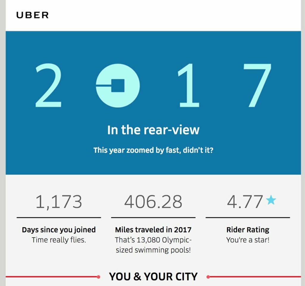
A more recent way many of the big companies are communicating data-driven stories to their customers is through annual reports on their apps/websites. For example, Uber has shifted the conversation to visually display how much value the service has delivered to its customers. Profiling a personalised collection of statistics of the rider’s experience with the app.
Data in Design
Giorgia Lupi

Giorgia Lupi is a well-known data visualisation artist, she created a piece of correlated data and arranged it over the Covid-19 outbreak during the lockdown and transformed non-sensical and perhaps baseless information into a compelling and sequential journey of data.
It shows different landmarking events such as the ‘first socially distant walk with a friend’ or ‘Last subway ride’. She then coloured coded the events in half to represent the various lockdowns that she was forced to endure.
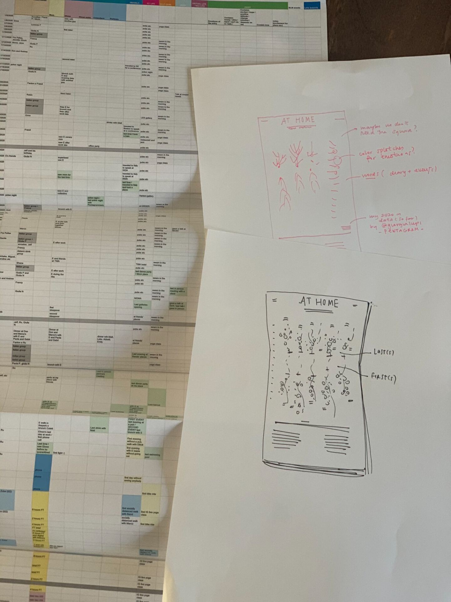
Initially, she would organize this data into events (oldest to newest) on an excel sheet. From there she began noting each incident and colour coding them.
David McCandless
A guy I come across, again and again, is David McCandless, a person who is primarily dedicated to data visualisation in as many creative ways as he can think of. He achieves success in this field due to four elements – information, story, goal and visual inform.

On his ‘Information is Beautiful’ site, McCandless prescribes a fast network of data through colour, patterns and connections. While I don’t think this data is suited for the ordinary viewer to decode. However, instead, it is used for a visual exploration of design. Personally, I’m 50/50 with McCandless’s work, some things are extremely well formatted while others don’t appeal to me due to the sheer chaos and unattractive visualisation.
Conclusion
This lecture was really informative and showed us a wide range of techniques and methods we can go about moulding data into a story. While my own personal project doesn’t deal with a wealth of data, I still need to include statistics about the Saturn V rocket and I intend to create a compelling, minimalistic and engaging display of figures. Looking at some partitioners has inspired me with new ways I can go about it,