What is a monogram?
A monogram is a signature symbol mainly used by companies that include two or more letters (usually the companies initials) to create a unique representation of their brand.
How can I make a successful monogram?
Simplicity – Simple monograms are usually the most efficient.
Attentive – Monograms should capture the attention of the spectator.
Flexibility – Monograms should be flexible and should fit on different appliances both physically and digitally.
Uniqueness – A successful monogram should stand out from competitors capturing its own unique flair.
Consistency – A successful monogram should reflect its brands values and characteristics, without this the monogram will look out of place.
Enduring – Monograms should be fashionable and last the test of time. It’s better to look to the future than the present. An example of this is CNN’s monogram that still stands out since its creation in 1980.
How can I design a monogram?
Sketching:
- Create multiple unique designs/sketches
- Develop those designs
- Can the initials fit into each other?
- Use a grid or dotted paper, be attentive to details
- Be careful of space, scale, placement, gaps, width, etc.
- Start black and white
- Focus on Negative space
- Once initial sketches are done precede to professionally redraw it
- Avoid misalignment errors, everything should look proportionate
- Take into account additional information such as can my monogram be animated in the future?
- Initials must be recognizable and not look like other letters.
Books to read:
Marks of Excellence
by Per Mollerup
Logo Design Love
by David Airey
Logo Modernism
by Jens Müller
Case Study – LW Theatres
After refurbishing their logo, LW theatres created a new sophisticated and elegant logo that visually represented a stage and a spotlight, although it’s can be hard to see the meaning at face value.
LW theatres have six theatres around the city of London, as Andrew Lloyd Webber wanted to visually make each theatre unique yet consistent to the companies identity so they developed a unique letterform from negative spaces that break into individual letters representing all of the six theatres.
They also implemented their monogram into their material such as envelops, business cards and even wallpaper.
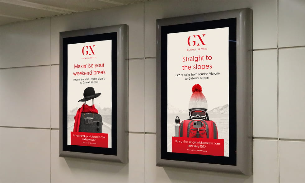
Case Study – Gatwick Express
Since 1984 Gatwick Express have been connecting London through its underground train services. Many consumers felt like they weren’t getting their moneys worth as their heavy service fee and identity was outdated. This prompted Gatwick Expressed to revamp themselves.
In their new identity makeover, they tried to show their services as a premium, one of their efforts towards this was their monogram & wordmark. To do this they made a more formal, luxurious and simple design saying, “We lost the clutter and made our new logo all about clarity.” The mix of cusps and curves brought
a sense of calm to the brand, and the ‘G’ and ‘X felt seamlessly connected and simple. They brought this sense of clarity to all the brand communications – including tone of voice and photography.”
This new modern design allowed them to get creative on their advertising in which they placed it on many things.
Case Study Reflection
I really enjoyed looking at these two case studies on how they both changed their identities to a more modern, fashionable and simplified design. It has allowed me to see the different directions brands can take to develop their own identity and how they can employ this innovatively not just in advertising but nearly every application to present their brand identity. This is now made me think more clearly on how I can present my brand outside the digital workspace and how simple identity can change the views of my brand.
Letter compatibility
Some letters can be symmetrically reflected both vertically and horizontally. Bare in mind that not every typeface is the same consistency.
Horizontal Axis
A, H, I, M, O , Y, T, U, V, W, X
Vertical Axis
B, C, D, E, H, I, K, O, X
Both Axis
H, I, O, X
Asymmetrical Letters
F, G, J, L, N, P, Q, R, S, Z
Luton Airport – Rebrand process
I enjoyed watching this short clip of the rebranding process that took place to develop and redefine Luton Airports visual identity from basic sketches to a full blown digital reinvention. Looking at a variety of typography used and intertwining it and maintaining consistency with the monogram and airports typography, it has shown me a broad process of what rebranding takes to get to the final product and has got me thinking of the methodology of creating a brand and ways I can develop this.
What have I learned?
Todays class was really interesting as I started to explore the visual production my own brand. It has shown me how I can create and deploy a successful monogram as well as the compatibility of individual letters. I’ve took a lot from todays lesson such as exploring different ways visual identity and monograms can be created and how companies can deploy this to visually present their brand.


