Final Manifesto
Reflection on this project
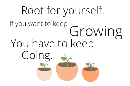
I have been on a long journey with this project and I feel as though the end result is what I initially hoped for. I finally decided on a simple, minimal font (Open Sans) with a few simple illustrations. It was important to me that the ‘Growing’ word was highlighted in some way so I made this font bigger. I played around with typography hierarchy and chose to make certain lines more prominent, I like the staggered text and different font sizes I think it adds more personality to the manifesto. It’s simple and straightforward and the illustrations don’t take away from my important message. I have learned that I tend to stick to simple, minimal designs and for my future projects I want to venture out and try bolder, braver design choices and try something new and different! However despite the fact my manifesto is simple, when I look at it I do feel motivated!