I began experimenting digitally. to create this font style I used small rectangle shapes and merged them together to make letters. I feel as though this style really highlights the Line aspect of my project and that is such an important part that I want to portray.
I have completed some sketches which included in a previous blogpost which can be viewed here- Follow the Rhythm sketches.
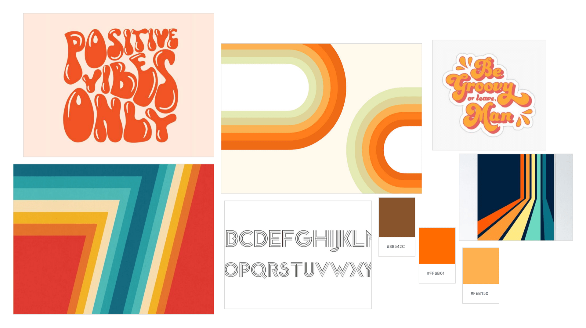
Mood boards
Mood board 1 (neon style)

My first mood board includes images I found online with a neon inspired feel. I like the neon era of the 80’s, it was a big part of the design back then and I think this could make for a lively poster! I will design posters using this mood board and colour schemes.
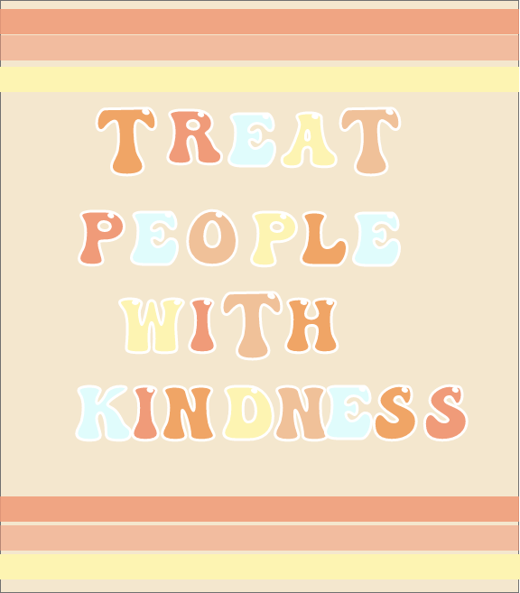
Mood board 2 (neutral retro style)
This second mood board is more warm toned and focuses on the ‘hippy, bubble letter’ era in the 70’s. It’s a softer atmosphere and I will use the inspiration here for colour schemes and geometric line ideas.
Digital Experimentation
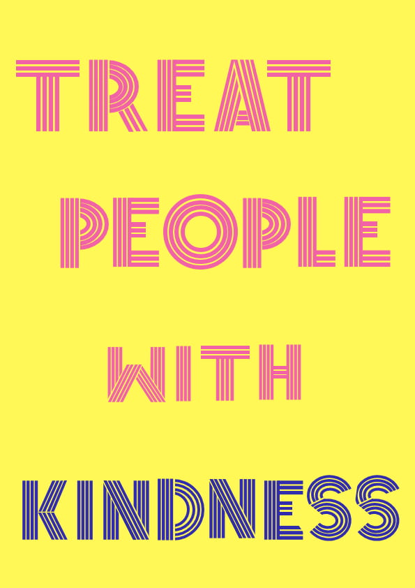
Trying out the retro style- bubble style


My opinion on this style-
Something with this style didn’t work for me. I love the colour scheme that I chose for this particular style but overall it doesn’t portray ‘line’ like I had hoped for. I have created a few variations but I am still not satisfied with the overall outcomes. The colour scheme is something I think I will come back to in the future, it’s soft and definitely retro but for my follow the rhythm project I want it to be more ‘line’ based.
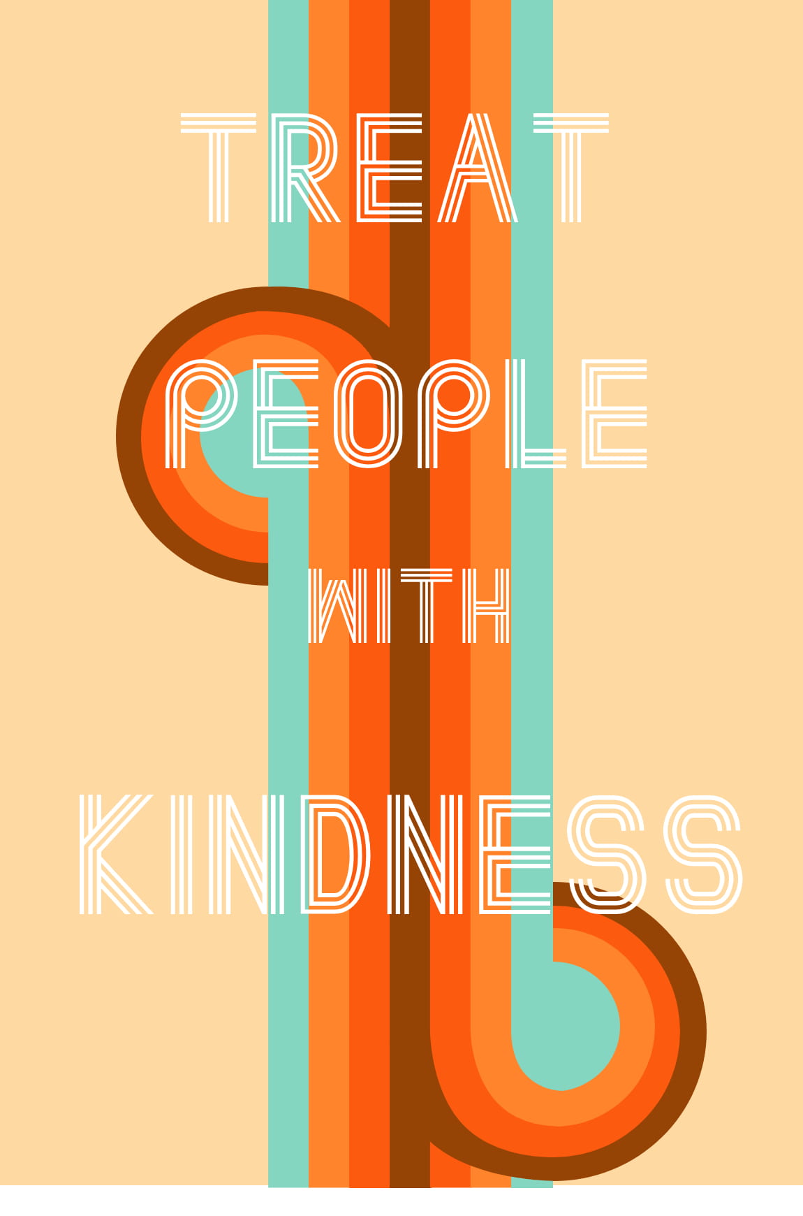
Further progression

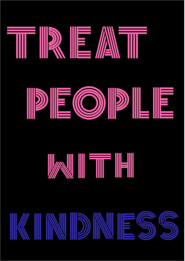
My opinion on this style-
The style I chose for this particular design does portray ‘line’ in a more obvious way, more so than my previous attempts. I kept it simple with the layout as I felt that the focus was on the font. I played around with different colour palettes here, using different combinations. I like how the letters are made up of small lines, it is giving me serious 70’s vibes. However I am still not 100% on this project and feel there is something missing, I want to incorporate more ‘line’ into this poster so I need to take what I like from this and add the finishing touches.
Final design progression
Option 1

Option 2

Option 3

Option 4 –
Final Review
The digital aspect of this project has certainly been a. journey! I have experimented with a lot of different styles and ideas and maybe this shows off my rather indecisive side. I enjoyed turning my sketches into digital forms and seeing the different outcomes I created and I am happy with my outcomes. Moving forward I need to decide on a final outcome to display on my portfolio website.