CHOOSING COLOURS:
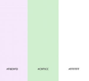
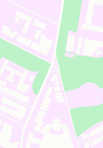
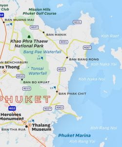
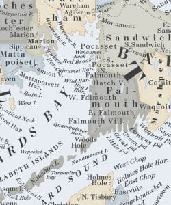
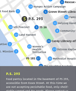
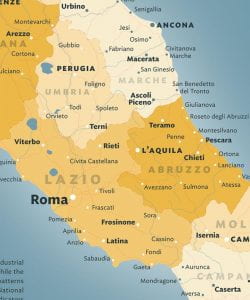
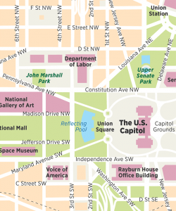
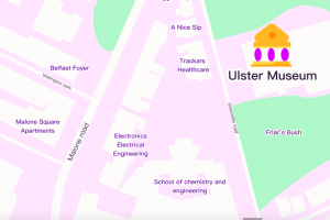
After looking at other travel app maps i found that the colours were always muted and pastel. This is so that its not overwhelming to the viewer and so that the text/ road/business/landmark names can be easily legible and stand out.
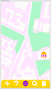
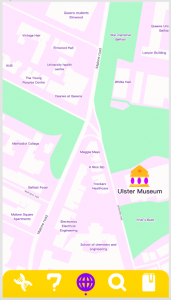
I chose green for the parks/ grass areas and lilac for the buildings/concrete areas.
ADDING ICONOGRAPHY TO MY MAP SCREEN:
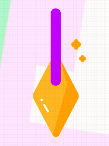
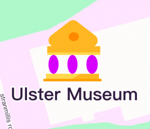
I decided to take away a lot of the shading and details for my dig and museum icons in this case, this was because i felt they needed to be more understated but also stand out for people to easily immediately see the land marks:
CHOOSING MY TYPOGRAPHY:
Reference: https://blog.typography.com/fonts/styles/cartography
According to Hoefler&Co, when choosing typefaces for cartography, they:
– must be legible in cramped circumstances
– with clear gestures
– a large lowercase
– compact proportions
– enough weights to allow for fine control.
However, different kinds of maps will benefit from different typefaces. For example:
DECIMAL has “wide proportions” that make it very clear at “small sizes”.
SURVEYOR is a large family of typefaces modeled on the unique style of lettering from nineteenth century engraved maps. I feel i could possibly benefit from using this map style with my prehistoric map.
OPERATOR uses different strategies to make easily-confused characters understandable, and has short, compact descenders such as g’s and y’s that make it much easier to stack type. This would work well if i was only positioning my text horizontally.
IDEAL SANS SSM was initially created for screen environments. This is because it is very easily legible at small sizes – meaning it does well in web and mobile environments.
GOTHAM NARROW is a very compact typeface that helps to use the space its given efficiently. This is because it has a tall lowercase that helps create legibility at small sizes. It also has three widths that help to convey different types of info such as street names, buildings, and park names.
HOEFLER&CO TAKEAWAY:
My typeface choice for my map should be:
– large lettering when lowercase
– wide
– have a range of different weights to convey different kinds of information
– have short descenders
MY TYPEFACE CHOICE:
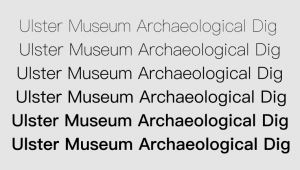
PingFang HK
I chose this typeface as it fits all the requirements above. the size of the lowercase lettering is similar to that of the uppercase, its wide and therefore very legible, it has short descenders (you can see this with the height of the G in dig), and it has a wide range of weights so ill be able to convey different types of information easily .
I then added a white stroke around each piece of writing so it would stand out against coloured backgrounds even more, and added a heiracrhy of text sizes and weights depending on what was being named:
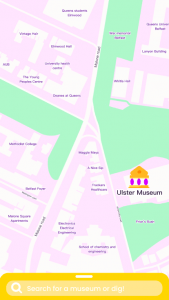
ADDING A SEARCH BAR:
Something I really admired about the interface of Apple Maps was how they decluttered the map screen. They did this by adding a pull up and down menu at the bottom of the screen/ search bar.
PAULS FEEDBACK:
Paul felt that the background colours were too pale and as a result blended into eachother too much. My goal was to have a background which made the locations recognisable but also have the text stand out however I think I overdid the paleness of the colours – thinking that the text is more necessary and forgetting that the building shapes and having roads stand out is also equally important to the users.
As a result i darkened the purple so the buildings and roads would stand out more. Overall i feel like it looks a lot more clear, understandable, and visually pleasing now:
