CREATING THE EXPANDED SECTION OF MY MAP SEARCH BAR:
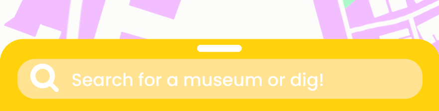
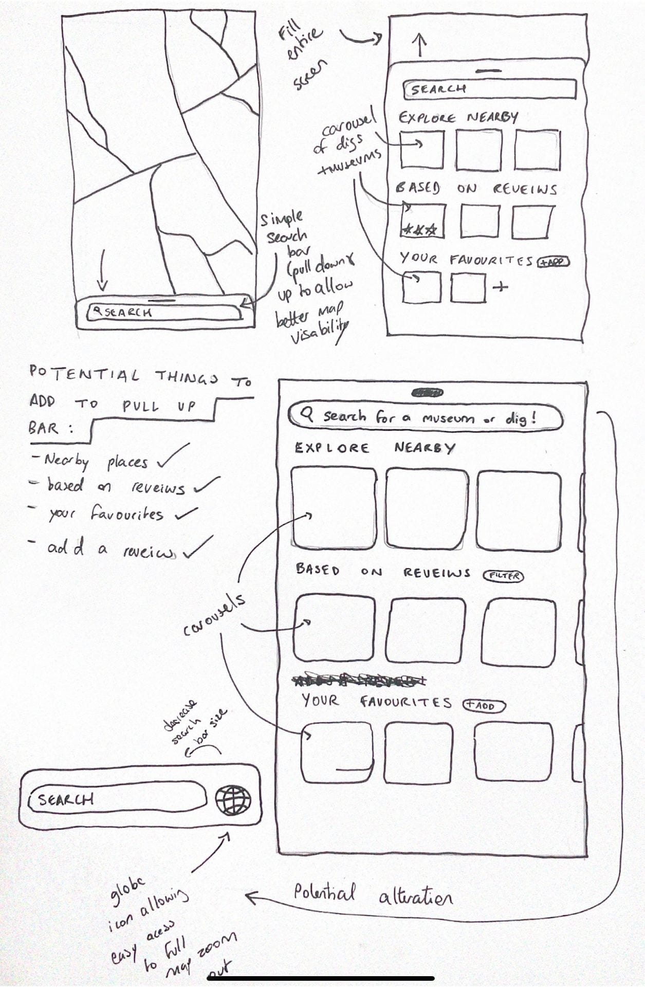
At the moment the search bar for my map currently looks like this, however i intend on adding place suggestions, favourites, and reveiws to this section, taking inspiration from other travel apps i’ve looked at in the past. I chose a pull up/down search bar to allow for better map visibility. Google maps didnt have a feature like this and instead the map screen was very cluttered and hard to see behind all the icons.
ASKING MYSELF WHAT I’D NEED IN A PULL UP BAR:
In order of importance, I listed the things i felt were most important:
- Nearby places to visit
- a list of places based on reveiws
- the option to add a reveiw
- a favourite places section
LAYING OUT MY PULL UP BAR:
I intend on laying out my sections in carosel format with illustrations inside them of various places:
CREATING A FIGMA WIREFRAME:
After creating the wireframe i realised two flaws that made it look boring and too harsh on the eye.
- the background colour was too harsh for a background – as a result i should choose a much lighter/ monochromatic colour. this will allow the colourfil illustrations to stand out.
- the regularity of the boxes made it look very boring and monotonous. as a result i could change the shape.
- after researching carousels many UI experts say that they should only be used for things that are supposed to blend into the background as they have the tendancy to remind the veiwer subconciously of advertising.
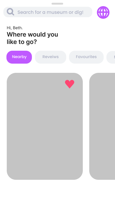
THINKING OF A NEW STRATEGY:
I drew out two potential options, both hopefully eliminating the issues stated above:
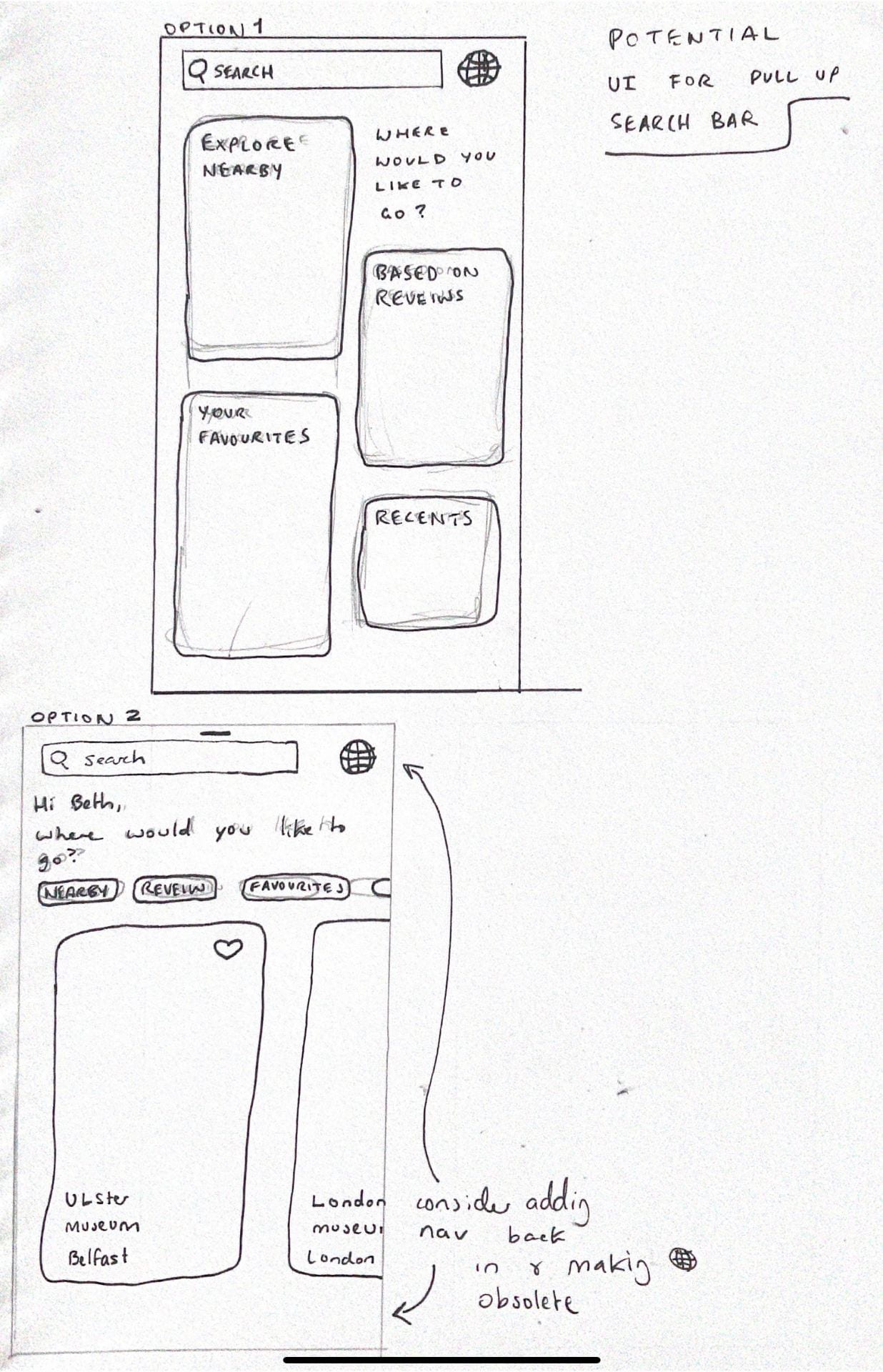
I think the bottom option is a lot cleaner and will save the veiwer time reading too much information. i think a carousel could be potentially very visually pleasing and would help the user to find things quickly and easily by altering the sort by carousel above.
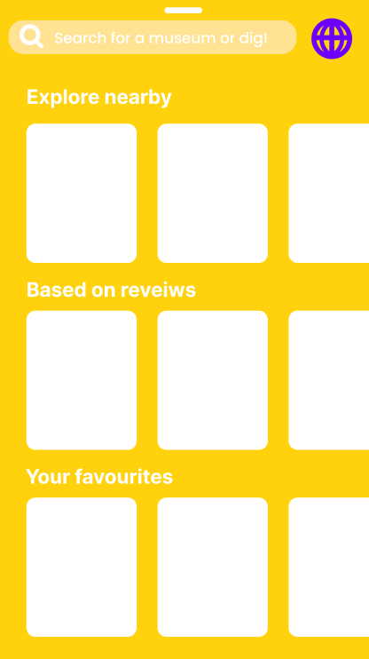
In my next figma wireframe I changed the background colour – therefore creating a much more visually pleasing and minimalist design overall and hopefully pairing well with the illustrations I will create: