NICHOLSONS CIRCULAR GRID APPROACH CREATING THE TYPEFACE:
Aphex Twins monogram and typeface is something that’s always stood out to me as being really original and visually pleasing. the entire brand identity in fact is consistent as a result of the way the typeface is created.
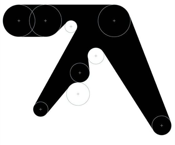

He said that “The original Aphex Twin logo was drawn by hand using circle templates and rulers in late 1991.”
When circles are applied to the letterforms it becomes very clear how they are created. The logo was actually so liked that Nicholson created a typeface to go along with the rest of the brand – called “Xylem”. In my own typeface I’m going to try and make use of this method myself – as I feel it goes against the usual way of using a square grid in type design.
