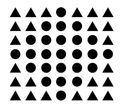
Gestalt principles are a set of principles that tries to explain how humans process complex stimuli around them and interpret the information into their minds. Max Wertheimer, Wolfgang Köhler, and Kurt Koffka are said to be the pioneers of Gestalt psychology. Understanding how users interpret the information on the screen is an important skill for designing aesthetically pleasing user interfaces and at the same time allow users to find what they want quickly.


pictures from https://slideplayer.com/slide/14786206/
Having been just introduced to Gestalt principles in class, I just want to summarise what I have learnt so far in this blog.
Law 1- the principle of proximity
This is when we see objects that are close to each other as more related than objects that are far apart. This is also an essential element of visual hierarchy.

The same 16 dots separated into 8 dots makes look like 2 different groups instead of the same 16 dots as before.
Based on this assumption, it can be assumed that even objects with different shapes and colours can be perceived as being grouped together from other visuals by putting them close to each other.
Law 2 – the principle of Simplicity
People tend to see complex images in their simplest form possible, this can be used creatively as shown below with the guitar. Keeping the bigger image simple as a whole can help the more striking elements stand out.
quoted from a Visme blog (at https://visme.co/blog/gestalt-design-principles/);
“According to psychologists, when we identify an object, we first seek to identify its outline. We then compare it to known shapes and patterns. Without even realizing we’re taking these steps, we finally combine the identified elements to recognize the whole.
Therefore, a simple and well-defined design will more quickly communicate the desired message than detailed illustrations with ambiguous contours.”

Law 3 – Principle of similarity
Objects with similar components, such as shape, sizes etc; we tend to group them together and think that they serve the same function.

Picture Source: Creative Beacon
Law 4 – Principle of figure-ground
we tend to instinctively perceive objects as either being in the foreground or the background.

Picture Source: A Dwarf Named Warren
A lot of what we see either stand out prominently in the front (the figure) or recedes into the back. With the image above, you can instantly see a white apple icon sitting on a black background. Although interesting, although the head of the man is the same colour as the background; the image appears to stand out since it’s now sitting on a white background.
“This determination will occur quickly and subconsciously in most cases. Figure/Ground lets us know what we should be focusing on and what we can safely ignore in a composition.” —Steven Bradley, web designer
Law 5 – Principle of closure
Perhaps one of the more famous principle, the principle of closure states that our human minds tend to perceive forms in their entirety in spite of the absence of one/more parts. It is sort of like that our brains like to fill in the blanks. Some of the most well-known usages of this principle lays within logos designs such as IBM.

and one here is another version of the logo which plays on the idea of rebus.

Law 6 – Principle of focal point
This principle states that within a design, elements that are more distinctive/ different from the rest of the elements in size, shape colour etc will catch the attention of the eyes will hold the viewer’s attention first. In some ways this can be related back to the hierarchy of typography, the bigger/bolder letters will first catch the attention of the viewer and stand out.

Image Source: Iniobong Udoh(Inioge)
Law 7 – Principle of continuity
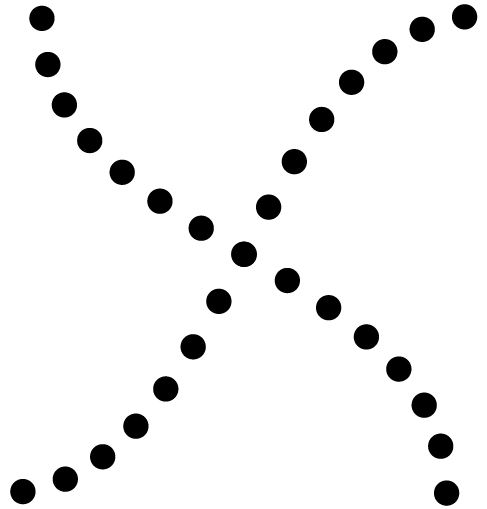
This principle suggests that our brains like to see smooth, continuous lines rather than jagged and broken lines.

Image source from https://courses.lumenlearning.com/waymaker-psychology/chapter/gestalt-principles-of-perception/
As we can see from the image above. Most of us will see 2 smooth lines overlapping each other rather than 4 lines coming together to meet in the middle.
Conclusion
After looking at all the principles. I had another idea for my manifesto poster. I realised that my last few attempts at the design might have been a bit too complicated. Thus I redesigned my poster using the same colour scheme, but this using the principle of closure and the principle of figure-ground.
With the principle of closure, even though parts of the cat are not drawn and the components of the cat are not connected to each other, we can still immediately see the face of a cat upon viewing the poster.
With the principle of figure-ground, the cat appears to stand out from the background.
I like this redesign a lot better, I particularly like how the large eye of the cat really connects to my message of looking into the “eye” of fear. I also like that it’s simpler than my previous design, but is just as effective at conveying the message.
