
Our second week in class with Paul focus on the importance and need for research techniques that we would should be aiming to consider when taking on this module.
What we covered in class:
- Needs-Driven Design
- The Research Landscape
- Analysing Findings
Needs-Driven Design
Paul brought to our attention that its never too early to begin involving our users into our projects as this is more beneficial to our process than anything. He highlighted to us that if we get to know and acknowledge our users from the beginning of our projects then this would leave us the open space and time to fix issues or problems that are arising through the process of our projects as we would be aware of our users needs and these then would drive the design.
When discussing this Paul highlighted to us 3 point we must ask ourselves to consider when creating a product or service, these included:
- Does this need to exist
- What users needs are you trying to solve?
- What users goal are you hoping to satisfy with this product?
“ It’s never too early to involve users and test your assumptions. The later you leave user research the more expensive it is to fix the things you’ve built.”
Grand Reveal VS MVP
Grand Design
When discussing Grand Design Paul used the explanation that this method is like a surprise reveal of a product or service. He used the example of the Segway and how this was supposed to be a revolutionary piece of equipment for transport when it first came about but due to the price demand its expected popularity didn’t meet the standard and typically now its used for tourist attractions round cities.
With that Paul also gave us the example of a piece of technology that came from Grand Design and met the popularity of its users and created a new world of want and need when it came to phones with the welcome of the iPhone with Steve Jobs. This piece of technology came at the right time for users and met users needs and needs users weren’t even aware they needed at the time.
Some lesson that can be learnt from the use of Grand Design with these two example are:
- Sometimes there is no need for a product or service and just cause its an idea doesn’t means people want it
- How you view the world is completely different to how other view the world (Segway)
- Home runs are hit once in a blue moon but it doesn’t mean that one of those won’t be made by you but its important to keep in mind that its not a common as its made out. (iPhone)
Minimal Viable Product (MVP)
MVP is a product that has enough features that attract early promoters or customers and validate the idea being the product in the early development cycle. A MVP can help the product team receive useful feedback quickly allowing time to iterate and improve a product from the gathered data.
A version of a new product which allows a team to collet the maximum amount of validated learning about customers with the least effort.
– Eric Ries
This method has minimal work load at the beginning of the development but once successful and approved you build and work from this.
Lessons we can take from this include:
- Produce and let go to learn
- understand we can do everything and not expected too
Discovery – Task
In this weeks class Paul assigned us a small task of “Researching local health centre”. This task allowed us individually to search and discover the sites available for our local health centre and their online present. We had to look out for:
- Opening Hours
- GPs register with practice
- How to book appointments
- Services
- Order prescription
My Health Centre site – Malvern Family Practice

Prior to this class task I had never been aware of my surgeries website so I was interested to get started on this task. Honestly with the discovery of my site I can say I wasn’t too surprised with the what I found. The site was outdated and crammed with text and outdate buttons and animations. I was able to find the points above with ease after directing myself to the nav bar but that about all I could find. I found that with closure inspection the majority of the content hadn’t even been updated from the before the pandemic with specific dates and times for booking appointments and notification etc. Overall, there was no feeling of effort to the site with lack of colour and imagery so why would I want to visit it? There was also too much content and this could have been broke down and updated at the very least.
Paul created a class Miro board then that allowed us to share our finding with each other in the class and compare our site to others out there and see the difference or similarities in the content and layout. 
MIRO LINK
I enjoyed this task we had this week in class as it really highlighted the importance behind making our services we are going to create for this project easy to use for all users and consistent in design and content. It also made me aware the importance of keeping the whole site in general modern to design exception as this can play a big role in keep the users interested.
Discovery Research points – Maria Rosala,
- Researching the problem space
- Framing the problems
- Gather enough evidence
- Discoveries do not involve testing, hypothesis or solutions
When looking into discovery research we must understand:
- The users
- The problems
- Solving and opportunists
- Why problem are there?
Competitor Analysis –
Paul then went through the importance behind competitor analysis and how we can implement this into our process and discovery.
A competitive analysis is created to analysis the competition that as designers we should be expected to face when trying to ender a particular field. Understanding the importance and relevance of a competitor analysis report will help identify the strengths and weaknesses that other competitors may face compared to you, allowing you to identify opportunities to grow and strive above the areas that your competitors may be failing in.
In terms of website analysis and collecting information to analysis about competitors this helps create a scenario of what key areas are working and are not working and figure out why this may be the case. This then leads to the end goal to create a better understanding of how your idea of a service or product is in comparison to others in a particular industry. Creating a report will show an understanding of how and why a competitor’s social strategy is working and what can be taken from this to help benefit your business.
For example, a competitor analysis report may show the importance of which platforms work best for your competitors and why this is when it come to social media. Is there a reason why some sites post frequently on Facebook over Twitter or a reason behind why they don’t use Instagram as a source of communication?
When taking on a competitor analysis these points are important to keep in mind:
- Whats already out there?
- Services strengths and weakness (SWOT)
- The market
- Industry trends
- Benchmarks
- Content
- Design (UX/UI)
For the class task we has just taken above is a perfect example on how to begin conducting competitor analysis and how we can bring this to our own project by seeing what else is out there and having the Miro board to show this helped.
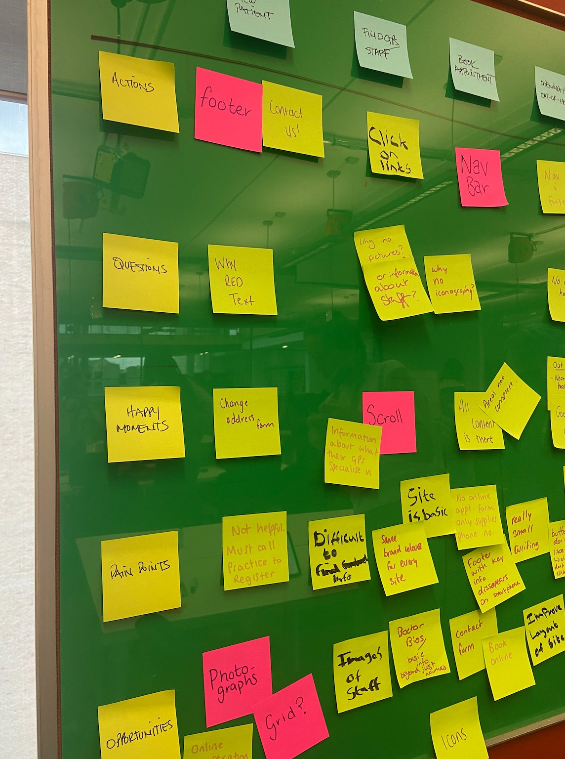
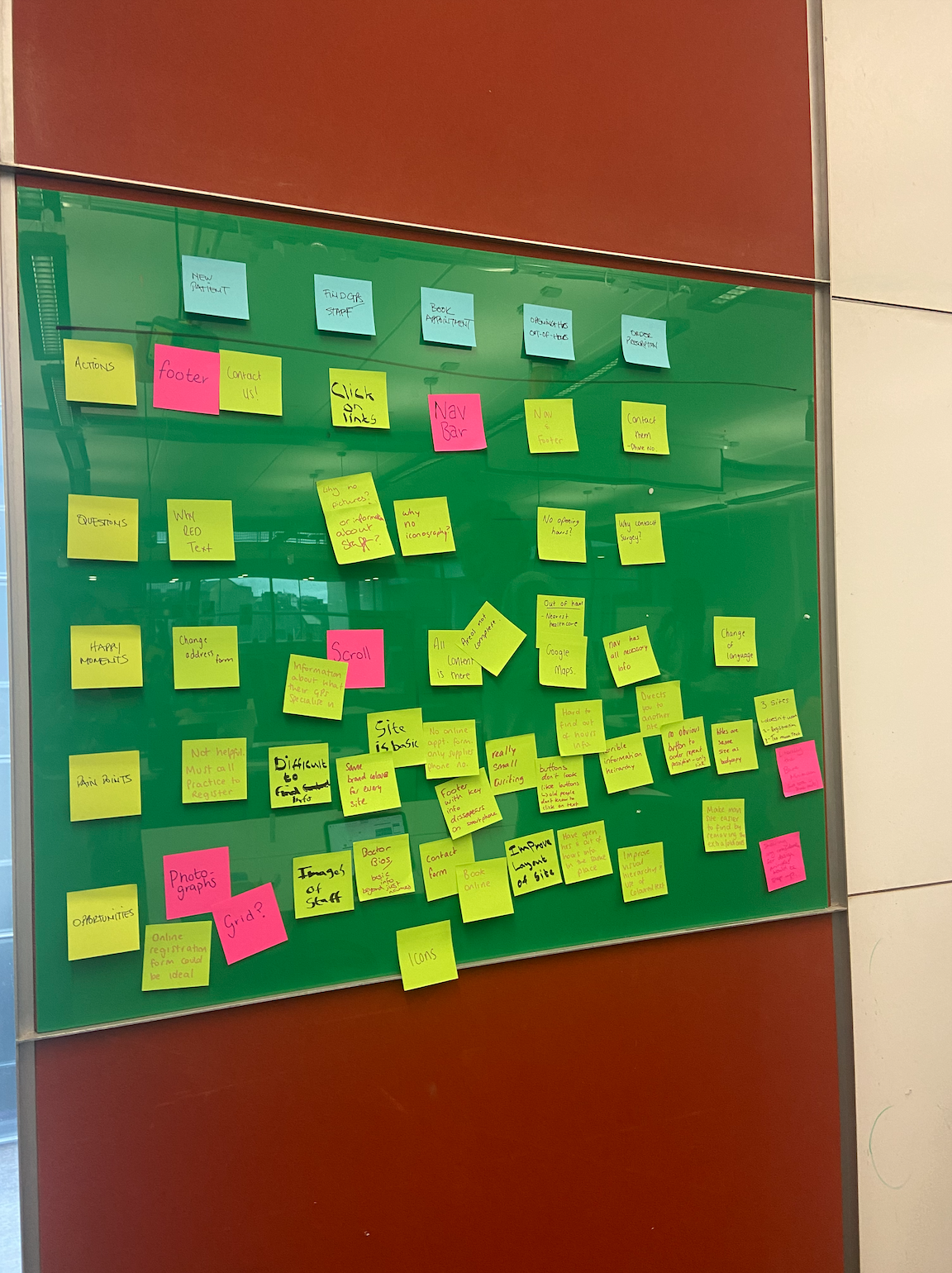
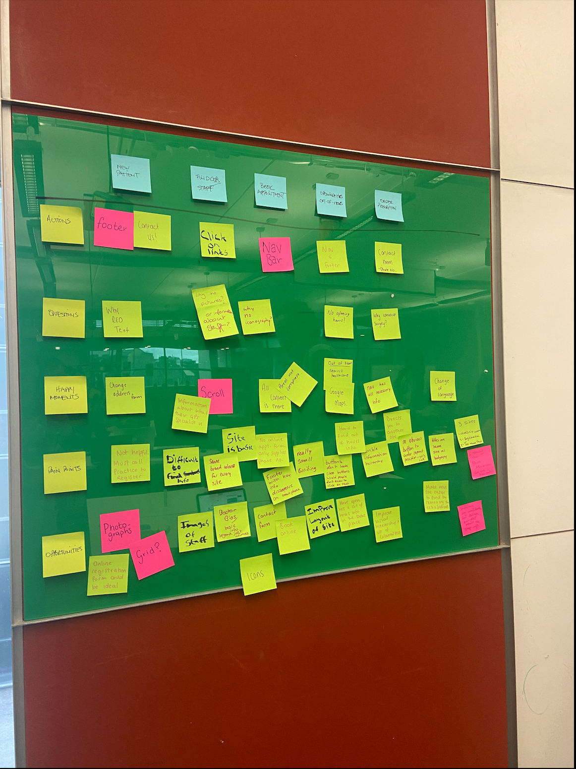
Class Task – Health Centre UX
Paul gave us another class task were we got to go into our teams that were made last week for our research on this project and begin analysing the UX content that was used in our health centre site. We got to choose one site and then from here create a user journey map on the wall in the classroom and began discussing as a team the actions, questions, happy moments, pain points and opportunities we had as the users trying the following points:
- Registration
- GP’s
- Booking appointment
- Opening hours/out of hours
- Prescription
- Contact
My group:
- Beth Buchannan
- Emma McGurren
- Laura Foy
- Sean Downey
My group got stuck right into this task which I loved cause we really got the ideas and opinions down from everyones viewpoint of the site we looked at. It became a really beneficial task getting us to think about the journey we would take as the users of our own services and could take the points from what the others were saying in our group and keep them in mind when it comes to what they enjoyed and didn’t enjoy when taking their journey through the site.
Getting the discover and surf through the site together at a team and get the opinions both negative and positive from each other also help open your eyes to areas you might have missed out on our own individual discovery and given idea to improve the sites could help us in our own designs. We found that as a group the area we would have to focus on would be the navigation and taking into consider the age range that would have to use this as this would both have to be appealing to younger users as well as understandable to the older users with the consideration of is text better for buttons than icons for example.
Creating a User Journey map I find is always beneficial as it gets me thinking more in the opinion and view of my users going through each stage and this was my first time doing this in a group which I really enjoyed as I feel I got more of an insight from 5 users point of view instead of just mine. Overall taking part in this task has made me realised the importance of making sure I have as many “happy moments” for my user and have minimal pain points but with feedback I hope I can eliminate any pain points that arise.
Bias and Research
Cognitive Bias
This is a subconscious error in users thinking that allows them to misinterpret information which affects the accuracy of decision making and judgement. Biases are unconscious and automatic process that are design to speed up decisions making and make this more efficient. Cognitive bias can be cause bu mental shortcuts socials pressures or build up of emotions (attitudes and behaviours).
- Avoiding cognitive bias
- Confirmation Bias
- Anchoring
- Clustering Illusion
- Laws of UX
Confirmation Bias
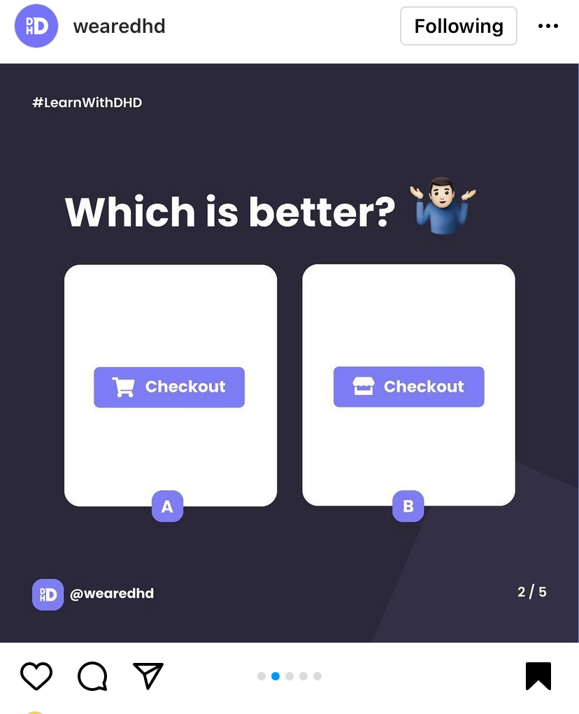
This is the process of information that’s gathered by looking for or interpreting information that is consistent with someone’s beliefs. This is an example of how users might process information in a biased, illogical manner influencing their experience. It has been noted that once humans have development their own opinion on a situation, then there is greater difficulty processing information in a rational, unbiased manner.
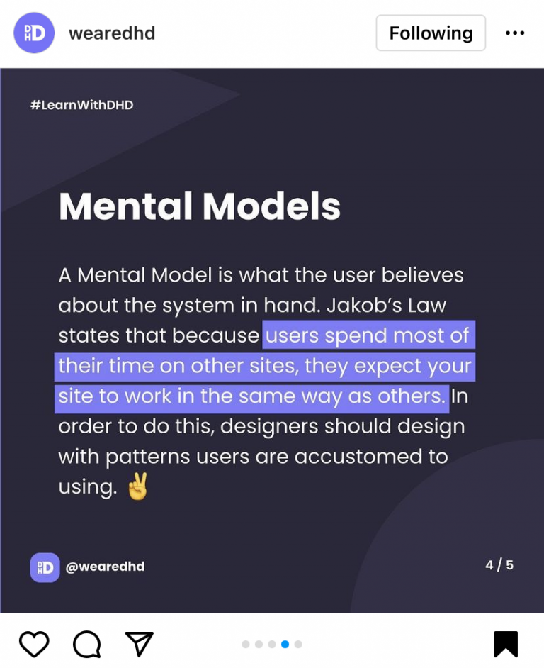
I have mentioned this in last weeks blog post however it fits into this point well when finding an example for confirmation Bias. In the post I showcased some screenshots that I had found on We are DHDs instagram where they demonstrated the importance of keeping button design familiar for the user as this can effect the experience the users is having with your button with something as small as a change of icon. This fits into Confirmation Bias as users would already have an understanding to what the checkout button should look like and the actions behind this.
Blog post week 1

Jon Postel – Chunking
Jon Postel, executive director and founder of Internet Assigned Authority Numbers (IANA) and is know for his use of “chunking”, making information or data easier to register and take in when divided into chunks. Commonly this is done with phone numbers or card numbers as it makes the content easier to read.
Chunking (UX Definition)
In the field of user-experience design, ‘chunking’ usually refers to breaking up content into small, distinct units of information (or ‘chunks’), as opposed to presenting an undifferentiated mess of atomic information items.
Class Task – Patient Registration
Paul set us our final class task this week where we got to design our own registration form in groups using sketches and Figma and then showcase these on the Miro board to the class.
- Design an online patient registration form
- The form should include all of the information provided
- Consider how the information can be presented to make the process as easy and intuitive as possible.
- What can you remove/add to make the form more user friendly?
- Consider your layout, how can you make the form easier to complete?
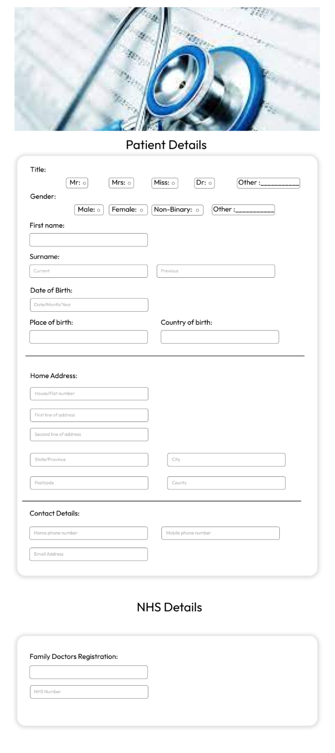 I was paired in a group with Katie and we design up the following form.
We got to upload these into the Miro board and share our opionion and reasonings behind our design to the class. Me and Katie’s aim with this form as to create a form with consistent but as little content as possible to ensure we were getting the most out of the users of the form. This was a fun task as it got us to compare each others content and how each of us image a registration form would look like.

To conclude for this weeks class I found it really informative and beneficial going over the difference forms of research techniques and the ways we can implement these into our creation with this project with Paul. I hadn’t ever went into so much detail into the consideration for research and feel a lot more ready to begin searching and discovery the range of content need for this project. This class was jammed with information but with the break up with class task this week it kept it fun and kept me interested in the lecture content. I also enjoyed getting to meet my group face to face as I haven’t got to know a lot of the people in my class and it was fun to get to speak to some new people and see there ideas and opinions on the design aspect of the tasks.