Our second week with Kyle and we are looking Typography and the importance this plays in all elements of design. I love the topic of Typography and always find it so informative as I find the lecture content is always different through my past courses as I like to think everyone has their own opinion on Typography and I was excited to hear Kyles point of view and his example pieces.
Covering in class:
- marContent
- Typography
- Details
- Inspo
Typographic Practices
Typography is the art and technique of arranging type when it comes to how text is styled allowing it to become readable, legible, clear and appealing to the target audience either on paper, a screen, on packaging or on signage etc.
Typography is all around us from our phones, books, websites to styling a brand. It is more than just choosing pretty fonts, it is choosing typefaces that best suits the product or service that you are providing for your client. Typography is the power to great design and a vital component to any user’s interface design. With web design specifically typography sets the overall feel and tone of the service provided, allows a strong visual hierarchy to take place and provides a professional graphic design to the website.
How readers read the web:
Its statistically proven that users of the web tend to scan pages picking out individuals words or sentences in comparison to reading a piece of text word for word like they would in a book.
People read paper – Jakob Nielsen
Below shows the title of one of usability expert Jakob Nielsesn earliest articles on writing for the web.
How Users Read on the Web
The first paragraph:
They don’t.
This example shows how as a user you tend to scan for over the text that is more obvious on the page before you navigate to the less bold smaller text.
From an article I found by eye-tracking studies by Dejan Marketing, they stated that people read word by word online just 16% (1 in 5) of the time which is the same percentage Nielsen had stated in his findings.
Because the number of users that scan webpages is significantly high compared to the number of users that read word for word its important to employ “scannable text” when creating context for web. We can do this by using:
- Highlight keywords (hypertext link – typeface variations, colours
- Meaningful sub headings
- Bulleted short lists
- One idea per paragraph
- Inverted pyramid style (start with the conclusion
- half the word out than conventional writing
This article below features some content that I found to be relatable to this weeks lecture. It explained the reasonings why some context may be overlooked compared to other pieces and ways you can approve on this.
Typography @ page level:
Kyle demonstrated to us the importance behind making reading your context enjoyable for the reader by easing the them into your piece of text and ensuring that what you have presented is easy to read in terms of typeface considerations of size, colour and font style as well as the amount of context and that way you have written and constructed pieces of text. We want to make reading for our users as appealing as possible to ensure that they enjoy the subject you are showcasing to them.
Rules
Kyle went over some rules that we can follow and keep in mind when it comes to creating and pursuing to create pieces on context.
- Comfortable/reasonable size 15-25px
- Leading consideration (120-145% point size)
- Legible typeface (important for an enjoyable read)
- Focus on body copy
- Maintain measure (45-76 characters)
- Clear noticeable headings and subheadings
- placing info up front
- plain language
Typographic Terms
As well as rules we also went through some tips in this weeks lecture to ensure we give our users a consistent comfortable reading experience.
- Body text – not to bold, dark grey is a consistent professional colour as it creates a softer contrast when presented on a background
- Measure – this is the result of the length of a piece of text. Kyle discussed with us how setting a max width for our sites would ensure that the text stay on screen.
- Leading (line height) – This is the distance between your lettering to allow your eye to follow between the lines. This can be objective in design and can be difficult to correct as it depends on the typeface and as designers it is our job to adjust and perfect the typecast using these terms.
- Weight and Italics – This includes the consideration of bold, light, regular, italic when choosing typefaces. It is a good idea to try to find a typeface that has a lot of weights as this would allow you to have more options for experimentaion when using certain typefaces throughout your site.
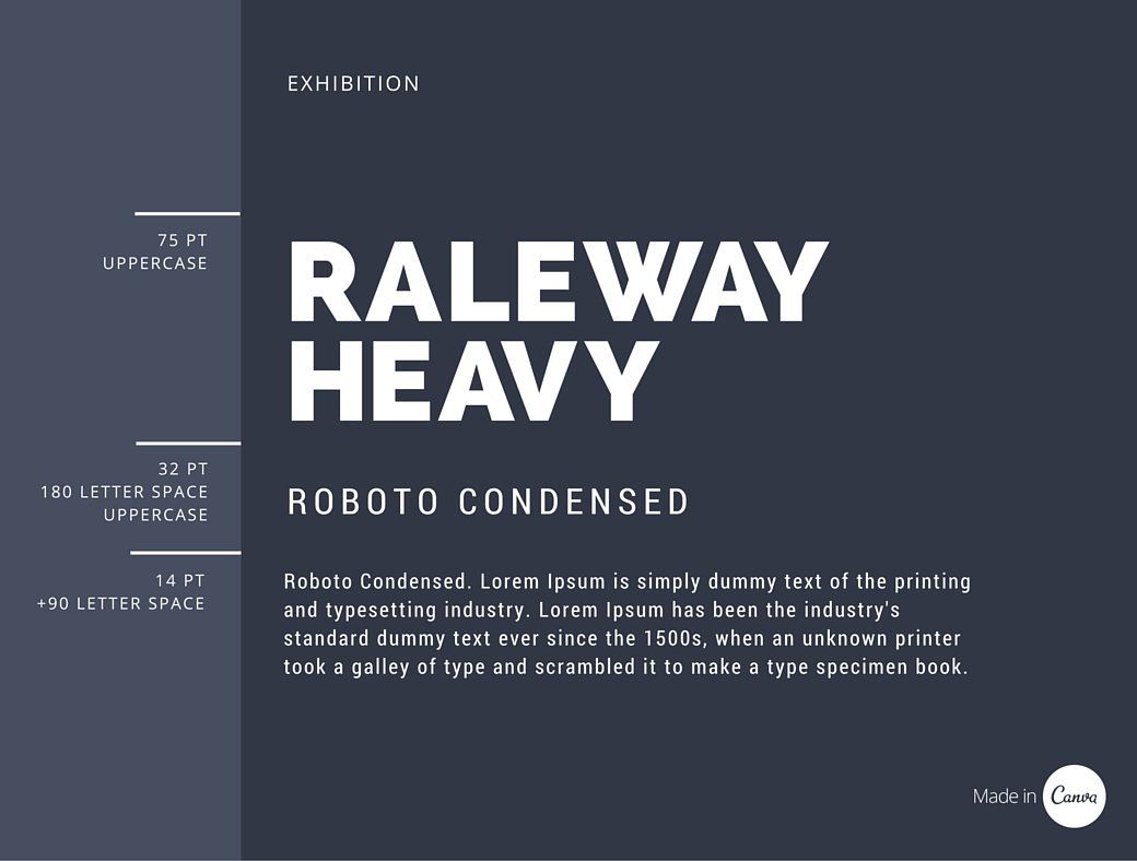
Choosing and Pairing Typefaces
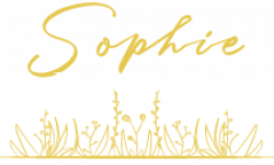
This part of the lecture is something I wanted to keep focus on and tried to take in as much as I could on what Kyle was presenting to us. I wanted to get as much of an understanding of this as possible as this was an area that Kyle mentioned in my feedback that I received in my most recent module mentioning that this was an area that I needed to work on when it came to my choice and demonstration of typeface pairing.
No more than 2 typefaces is the standard to all design is what I have heard from I have began this design journey and try to keep to this to keep my collection of text as consistent and neat as I can to ensure a comfortable reading experience is being delivered to my users.
Kyle showed us the tool for a google plug in call WHAT FONT which is used to allow you to discover similar fonts that you might find online that you don’t know the name for the typeface. I have used this tool before and find it useful for the times where I have discovered fonts on other websites or apps, out in town on billboards or signage or searching for inspiration on Pinterest. This tool allows you to take a photo of the typeface and upload it to the website then this detect that specific style of font and directs you to similar fonts and where to find them.
Perfect partners
Kyle went over some tips for parting. He explained that titles and subtitles should have character and be strong to attract the users to that point of the webpage. As well as this the body copy should be subdued and connect with the title.
- Body and main text mix well
- Mix of sans serif and serif fonts
- Contrast fonts
- Experimentation


Kyle gave us some sites to help with us with type pairings that I will be keeping in mind to use with this module if I find it a struggle to choose my typefaces. I do find however that I enjoy pairing fonts and enjoy this part of discovery and experimentation to help me learn and use my skillset of design but with the feedback given from the previous module from Kyle I’m aware that these might be tools I may come to consider to make sure I’m choosing the best typefaces.
- Just my type
- Adobe fonts
Hypen and Dashes
1) Hypens – These are the smallest dash available and used when we need to connect words to form an adjective (idea) or divide a word that breaks from the end of a line to the next. For example Mother-in-law.
HTML CODES FOR HYPHEN = Press the hyphen key.
2) En-dashes – An en-dash is longer than a hyper but shorter than an em-dash and is used to show a range of spanning time or quantities. For example 2010–2022 (keypad option –). Note that an en-dash is not to be used when a piece of text includes from or between.
HTML CODES FOR EN-DASH = – or –
3) Em-dashes – These are used to break a thought and is the longest of the three dashes. These are also be used as an opening and ending dash to add a thought in the middle of a sentence and want to bring attention to that point in the thought. “Em-dash is a mark of separation that is stronger than a comma, less formal than a colon and more relaxed than a parentheses.
HTML CODES FOR EM-DASH = — or —
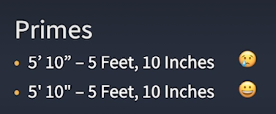
4) Primes, Apostrophes and Quotations –
- Primes – Commonly referred to a inch and foot marks and are slightly angled, tapered marks and are not available in all fonts are used for numbers such as speaking about someone height.
- Quotations- These can be referred to as smart quote or typographer’s quotes and new used to set off a word, passage or group of sentences. These are designed differently with each typeface as they are intended to match or blend in with a design.

Kyle made us aware that this area and focus on detail is something that he will be keeping a close eye on when marking our projects as this shows serious understanding and of micro and macro level of detail and its importance to be aware of it.
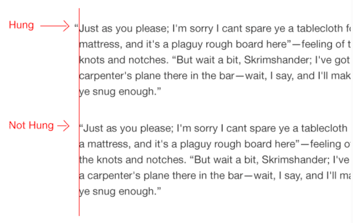
5) Hanging Punctuation –
This is a typographic tool that is used to create a optically aligned body of text. It is the method of setting punctuation marks outside the margins of body of text creating the look of a uniformed edge in the text creating a better optical flow.
Links
Kyle gave some links to find some inspirations and advice. These included
https://www.typewolf.com
https://blog.8faces.com
https://practicaltypography.com
https://www.fontshop.com
Discovered Typography Site –
I discovered this site while searching for inspiration on ID passes that were used by the Nasa Astronauts. This site I discovered basically covered how the Apollo 11 mission brought the typeface Futura to the moon. It is a fun site that I came across and thought it would be a nice fit into this weeks blog just to showcase the influence that typography and typefaces has on the years past as well as the years to come.
To simplify the site, when Armstrong and Buzz were set to leave the moon before their departure they left a plaque that was attached on one of Eagle’s legs which read “Here men from the planet Earth first set foot upon the moon. July 1969 A.D. We came in peace for all mankind”. And was written the the typeface ‘Futura’ which this site I discovered goes through how this typeface made its journey to the moon with the Astronauts.
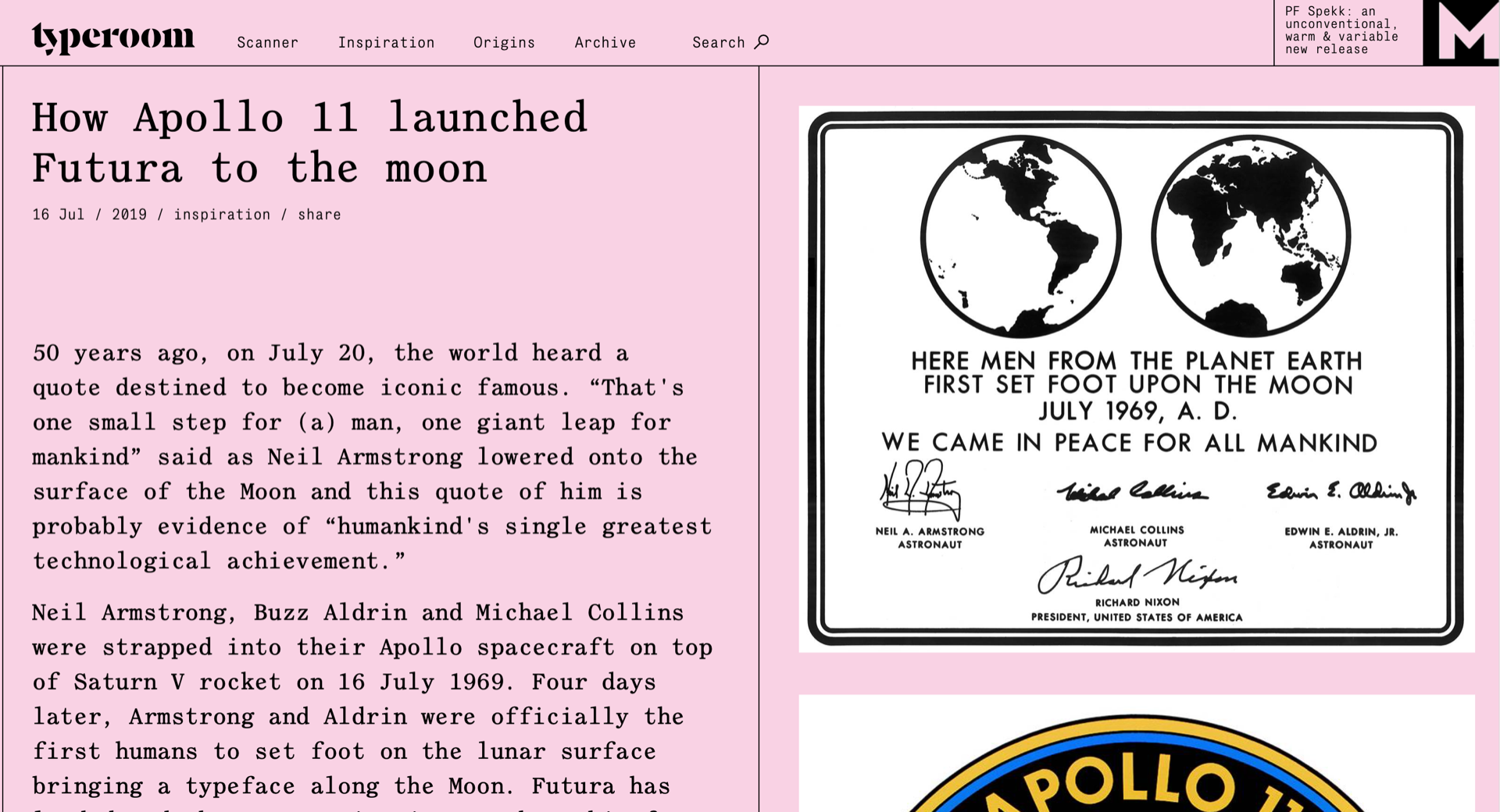
https://www.typeroom.eu/article/how-apollo-11-launched-futura-moon
Tasks for next week
- Mark up content
- Consider navigation
- Choose Typefaces
- Start setting content
- Continue inspo and research