Animation for the Creative Industries – Assignment 2 – Week 1
Animation for the Creative Industries – Assignment 2 – Week 2
Animation for the Creative Industries – Assignment 2 – Week 3
Animation for the Creative Industries – Assignment 2 – Week 1
Animation for the Creative Industries – Assignment 2 – Week 2
Animation for the Creative Industries – Assignment 2 – Week 3
this week I worked hard to try and get it finished but i decided that after lining it that i didn’t like it and i decided to redo it all
i added the body then to the guide
then I began lining and this is the part where I realised I wanted to redo the animation but with a litter bit better quality
I drew up my own head turns and references for the new animation


and i restarted the animation with the new heads and bodies
I had received some feedback from Alec to make bonk point a little harder than he was as it felt kind of limp, so I made him hold the pose a little longer than before
I had also added a background like they were in school as it fits in with the characters stories on how and when they met when they were younger.

strangley enough the animation appears as 7 seconds on here but in the upload and on all of the devices i have the animation is 8 seconds long, i’m not sure why this is happening as it even said 8 seconds when i uploaded it
Overall I’m glad that I reanimated the project as I feel its a little better than it was before, if I wasn’t as pressed for time as i was due to the other projects I feel I could’ve achieved more movement and better acting, though I am glad for the learning experience and as stressful as it was to redo it I’m glad that i gave it a go as it taught me more about the importance of line ups and turn arounds to give a better understanding to the character, and also a better understanding to movement
Through this experience I found it very rewarding to try and develop my animation skills through acting and lip syncing. Though i struggled a little with the original animation it was ultimately rewarding to go through and redo it as it taught me more about turn arounds and how important it is to have something to keep me on track with the size and the shape of the characters in my animation. I feel like i kept my time wisely and I was able to do what I needed to do during that time however i wish we had a little longer on the assignment as i feel i could have added more weight and depth to my animation had I the extra time. I am happy with the results of this assignment though like I said I wish I would have done more if I had extra time to add more to the assignment, I might’ve also picked a different audio that I could’ve added more movement to, but i am happy in the end that I was able to get everything done that i wanted to, I feel I managed my time well alongside my other assignments and I believe that I have improved in my animation abilities from the previous 2d assignment.
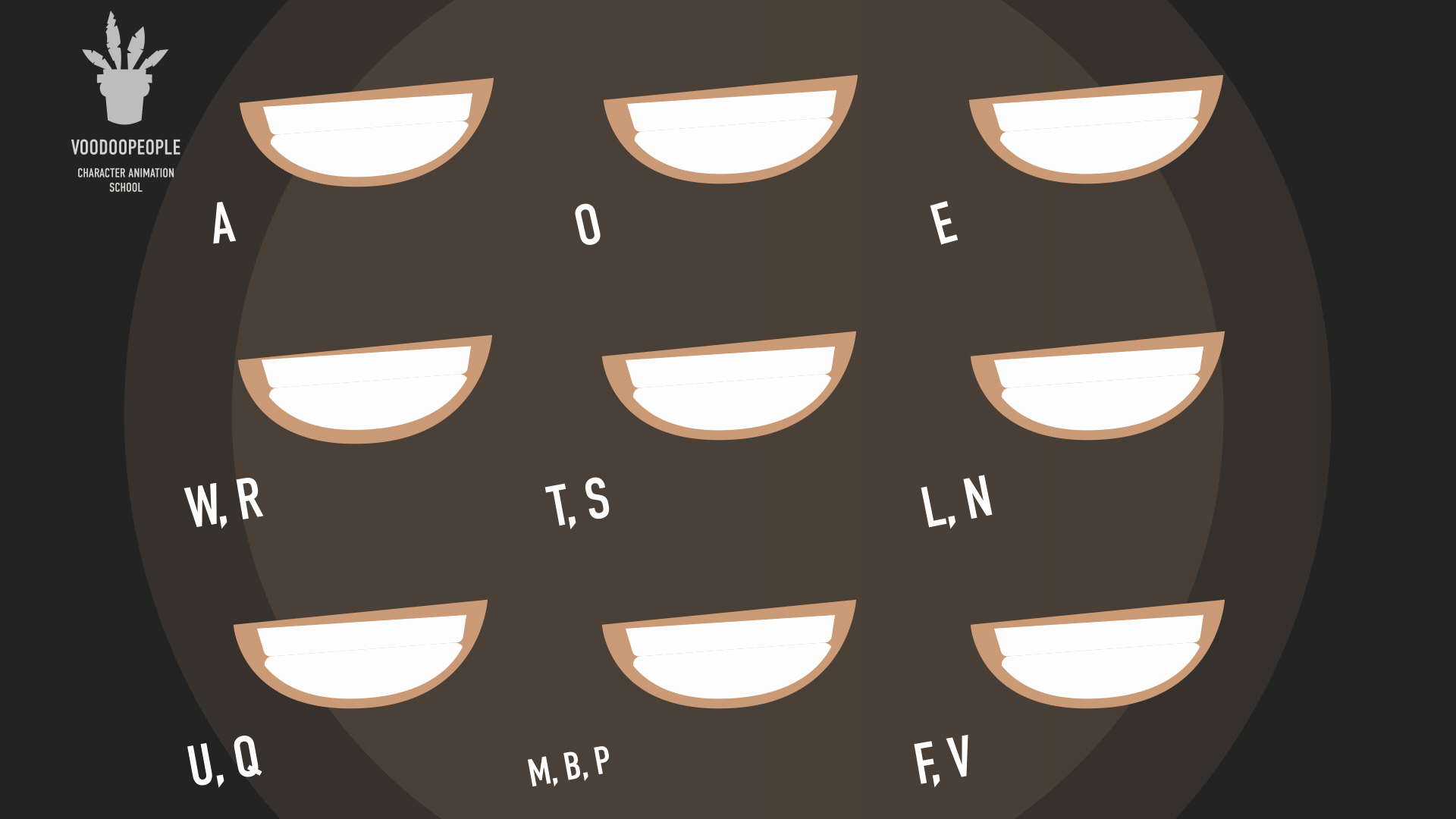
I started by going through the lip sync and writing each word with a red line under the sounds being made in that particular frame as i found it helped me better to understand the animation if i could see what sound is meant to be made.
I then went on to do the block out, which there are many mistakes in such as them getting bigger and moving around, which i will go on to correct later
i added the extras first like horns and ears just so it could help me with the head turning
then i moved onto hair
i then added the mouth animation which i was very happy with
for this assignment I decided to do a lip sync based on a “vine” this audio has been reused a few times and the way I found it was through a pokemon edit. i have another audio lined up if I finish this one in time and if i feel like doing two, for the first animation that I’m focusing on it will feature my character ‘Levi’ and a character belonging to Manny Maguire called ‘Bonk’. it features them when they’re younger so Manny had drawn up a reference for me which was very helpful when keeping his shape.
I did some initial research about how to animate mouths on characters with snoots speaking as i have minimal experience with this in the past, i found a few helpful guides on google images (the origins of which being DeviantArt and other like Deviantart sites) and I had found a few YouTube videos about different types of lip syncs, different styles like classical or mouth chart. for most of my animation i used the mouth chart approach as it kept me in line with what i was meant to do and what the mouths were supposed to look like.
Below i will post my references and then i will post progress updates in later posts!
unfortunately this is the only reference i have as the original vine is lost to time and only reposts are easily found now

(ART BY MANNY MAGUIRE)


( Lip-Sync – Mouth reference by DarkmaneTheWerewolf on Deviantart – https://www.deviantart.com/darkmanethewerewolf/art/Lip-Sync-Mouth-reference-330070453)

( Cat and dragon lip sync chart by Kaieaf on Deviantart – https://www.deviantart.com/kaieaf/art/Cat-and-Dragon-Lip-Sync-Chart-905397225)
movement references
After receiving some feedback we decided to change a few of the models and some of the textures, i went ahead and made a texture pack for the group so that the models would all look the same and as we were told quite frequently that our models were different and didn’t feel like they had a flow to them, alongside this ive made a few new models just for the area!
Here is ther feedback we recived from the industry people
First Crit
Text up for longer
have a prompt Disconnect from cinematic and game play change camera
Let loose have indication on where to go next – light text prompt something at least
Aimless
Add output log and have all of the previous text come up
Auto play option along side click option
Indication of what person is talking or what text is coming up but if clarity
Make font bigger
Half transparent background for the text
Disconnect between 2d 3D and ui Likes bold white text, evident as a hover state, some text dark when not the focus, boarder semi transparent somethin give that clarity
Collab between ui and 2d 2d shader implimemt the 2d more more characterised
Wanna go more realistic or more toony together a bit more, doesn’t feel connected
Clean the textures
Too much of a disconnect pull them together
Game feel main points
Add the sounds in
Make it a 2d 3D hybrid If u want to get thru the narrative fast cut content
Fix the bathroom walls
Make things look dirty
Really high up and also manually click off
Have a full ref board for ui
Tiny bit of music put in in dawg
Fix the font the spreading across the screen
Permanently have a ui Add more of the models
from this i enforced the use of the texture pack and the style guide i had made weeks ago as it was evident people were not using it which was upsetting as it lead to a disconnect.
i also made a few more models during this time, i had asked about the pivots on the desk as well so that the desks would work
. 


Reference images


this week a few more minor props got added onto the list so i took on a few and tried to get them done !!


i also did some animations that i was allocated this week!! i animated these on the wrong rig so i will change that and get them added to the right rig!
here are the animations with the right model!!
this week im focusing on UI design
Ethan had asked me to make an icon and title for the gsmr, here i am discussing with him and working with him on the designs


these are the game title for the title screen and the icon for the game!!!


i was also asked to make a few little like candid photos for each character just for an intro scene to get to know the characters better, these didnt take too long and i had a lot of fun making them , though i did feel myself start to run out of ideas about half way through as i wasnt too sure what to have each character do


these images will appear in the opening cutscene just to have an idea of each character and to add to the detective nature of the game