I was pretty excited to start this module, as I really like games and exploring the work that goes into them. I was also pretty nervous as I hadn’t had good experiences with group work so far and while I know some elements that goes into making games, I have never seen how they come together.
Initial Game Development and Understanding Style Guides
On the first day I was sick with the Flu, and I ended up missing the ideation of the game itself. This made me a little nervous as I didn’t really understand the game itself despite Nicolle relaying some information to me.
Then we learnt about what Style Guides/Style Bibles were. Essentially they work as a sort of rule book/reference guide for the whole team to pull from so that the game all remains consistent despite everyone on the art team having different styles. They will have a combination of: List of key observable features; Examples of concept art made for the project or external references to visually communicate (this could also show what NOT to do); and the technical guide on how artist should approach elements/ the rules so that the team follows the same approach and get the same/similar results. It should make it so that when passed around, without further explanation, people should be able to follow our exact style on how to create and texture our characters and environments.
I then went and did some research on what a full guide might look like, as well as looked at some of the examples provided to us from Mike to see what was expected of our guide:
Liberated Pixel Cup Style Guide
https://ericreimer.com/art-direction-enviromental-style-guide
Before our team could start to put together our style guide we needed to better understand our game, and start putting together some inspirations and references. We hopped onto a Discord call with our Game Dev team to work out what our game would entail and start to think of some similar games that had the same mood/themes, and think of how our art could supplement these.

The only rule we had when thinking about style was that we had to pick from one of the broad ‘genres’, and looking at some references we were leaning toward the Soft Fantasy style to contrast the gameplay in a sort of comedic way, subverting the players expectations and having light graphic imagery of death and blood but an overall cheery design.
At this stage we also discussed splitting into roles, and I ended up being one of the character artists with Ellen. This was something that made me really nervous as I wasn’t confident in my rigging, or 3D animation skills, I’m more confident in my 2D skills, but I wanted to challenge myself as one of my future careers I could see myself going into would be creating characters for games. I also hadn’t worked in the style that my group had chosen for this, in 3D and 2D I had only practiced in higher poly fantasy styles so this would be quite a challenge, but my group said that they could help me where I needed it.
My group told me to collect some references and start on some concept art for when we meet up next week, so I gathered a collection of references that I thought fit with our games narrative, wanted to play with proportion and shape language, as I didn’t want every character to be this rounded, cutesy design that I thought would make our game look really boring. For sharing our ideas and capturing our progress we were using a MIRO board which Ellen set up, which is fine if everyone adds things and uses it but I have seen that this doesn’t always happen.

I produced some really rough design explorations, I tried to cover a lot of different options and then my group could tell me which one was most fitting to our games style (as largely when asked they just said ‘cutesy’ and this was confusing to me…), I also had a quick think about how we could use colour to contrast A) characters’ from the background, B) character’s from each other.

Then we did a class exercise on how to pull style from references and understand how art can better communicate the narrative or actions of the game. We had to pick 3 separate games/animations that had distinct style and then answer questions about where the style influence may be, what make it unique to similar stylistic projects and what could some rules for the show/game be. I actually found this process pretty hard- and it gave me a lot of insight to how much research and thought goes in to exploring and tailoring an art style to a project. We were largely supposed to do this as a team but I found my group wasn’t staying on task so I assigned myself one of the three and worked ahead, it also gave me some clarity on how to pick out exactly WHAT we want from our references and WHY we want those thing, so we can combine those and make something unique!


This then inspired me to go back over my groups previous selected art style references and look into some of their inspirations and potential rules so that when we next talked the group could pick out the rules that we wanted to follow inspired by these. I had invited my group to help me work on these on our shared Miro board, but they were too busy working on their own things/work, so I went ahead and worked on these.
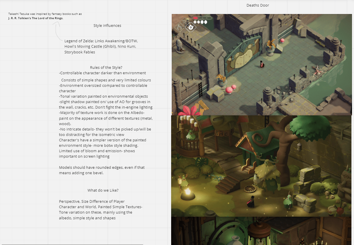
After doing some research on these inspirations I realised that they had some similar themes, which is why we probably liked them in relation to our game, I did some research online of each of these games inspirations and found that they largely came back to Ghibli for their texture style/vision [Death’s Door and Aka (not listed below)]. So it makes sense that we ended up adopting that when thinking about our environment and texture work, capturing the watercolour designs that Miyazaki loved. Due to the turnaround of our project, we would be leaning closer into the simplified version of these. We also really liked the low poly, softer looking assets of the games, so I noted to research into some low poly character models. I also noted the use of coherent colour schemes for areas in these games, this is something that we ended up discussing on call and decided to have the environment use desaturated warm colours, which would be tied together with a warm light in Unreal itself, like Nicolle and I noticed in the screenshots from Death’s Door.
When thinking of how art style reflects the audience and tone of the game Untitled Goose Game reflects an all age range look, it is pretty accessible which works with the simple controls, bright colours and rounded simple shapes tailor more to younger audiences. The human meshes feel like Playmobile toys.
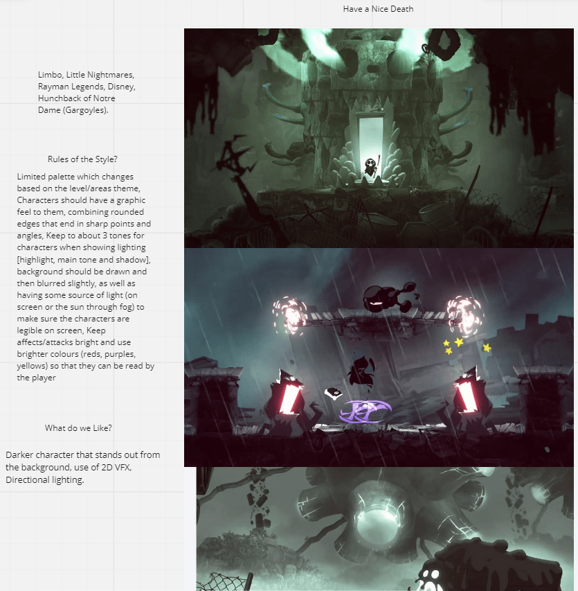
Have a Nice Death uses a lot of blacks, foggy atmosphere and sharper linework and points which tailors to the more mature audience of Teens, even though a main inspiration is Disney which is kid friendly, the darker colour palette and sharp unnatural lighting combined with weapon imagery to create a dystopic feel, which tailors to older, more experienced players.
Finally there’s Death’s Door which falls between these two. The background takes from the water colour designs of Ghibli, using dithering colours and some coloured shadows painted on the Albedo to create a soft painted background, this is a more mature version to the flat colours in Untitled Goose game, the shapes are a bit more complex in structure/design and we see elements of weaponry/ danger and use of really dark contrasting colours, creates this idea of this small protagonist vs the world like in the fantasy settings this is based on. Largely this is what we are aiming for, to have a soft environment and simple shapes to adhere to childish designs and then having our darker player character that inflicts death to contrast things for comedy, the plan is to have mild graphic deaths (slipping into a cement mixer, falling onto a saw, electrocuted, etc).

I also went and found the artists who worked on one of our main inspiration Death’s Door, which let me have a deeper insight into their concept work and see how they constructed elements. I used this to help me think of how I would approach creating my characters in 2D and 3D (start to think about production and how I could most efficiently approach this since we are about 1/4 of the way through our time). I was also able to find Sketchfab uploads of a low poly game character, and I took a fair amount of time looking at the wireframe to see 1) how they approached clothes/layer 2)how they approached hair and 3)What loops did they use.
Frits Olsen Concept Artist For Deaths Door
Juan Abad- 3D Modeller of Death’s Door
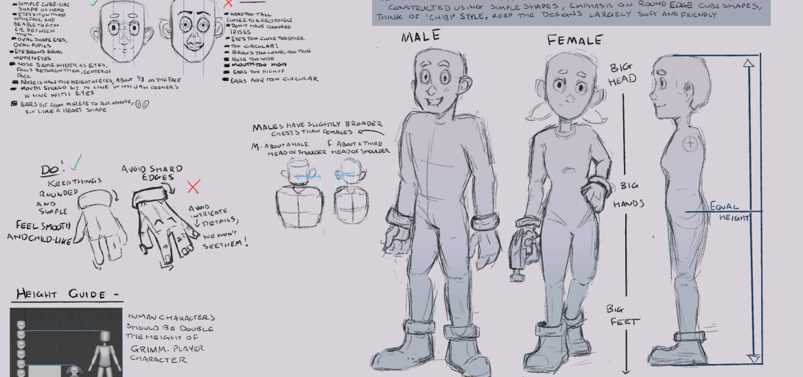
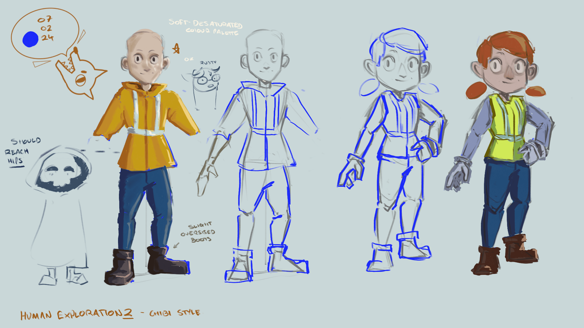
I also went ahead and working on creating some quick proportional references for the group to use, and seeing how they looked in our chosen perspective. After making some adjustments from the groups feedback, everyone agreed that the below proportions were what we would follow, hopefully making it easier to piece together our style guide and keep consistency.


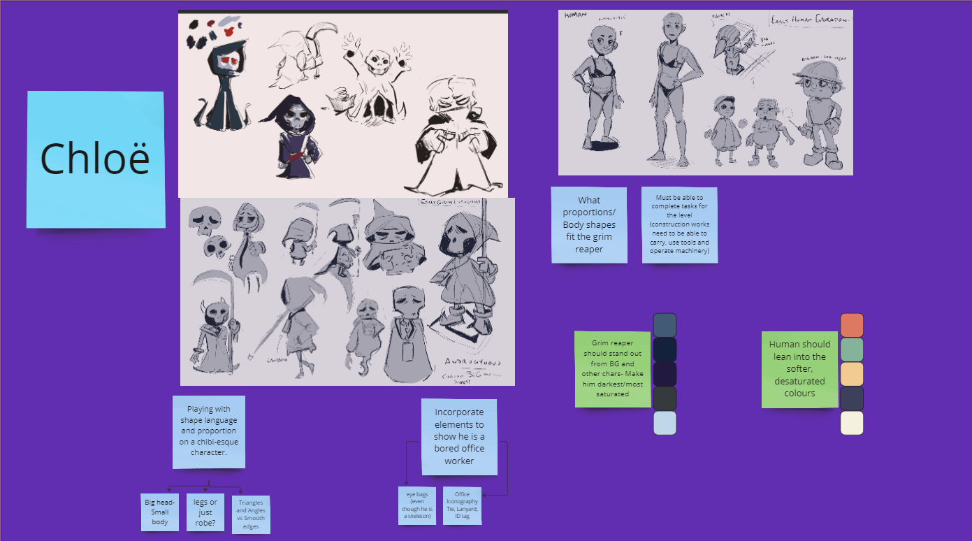
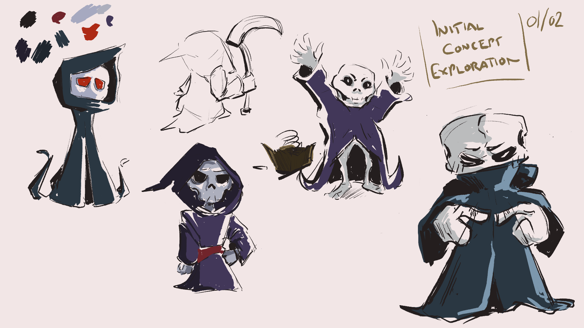
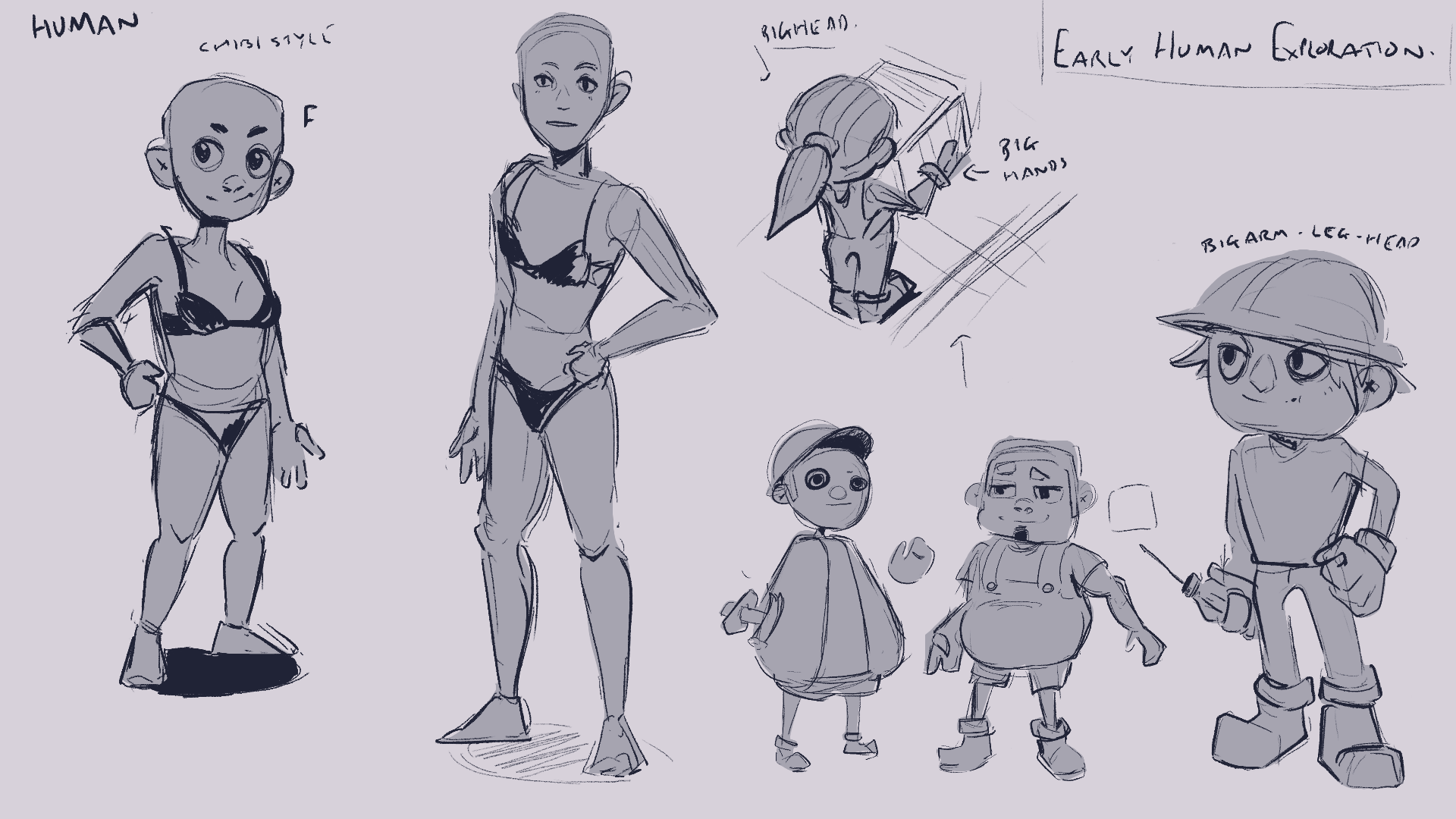
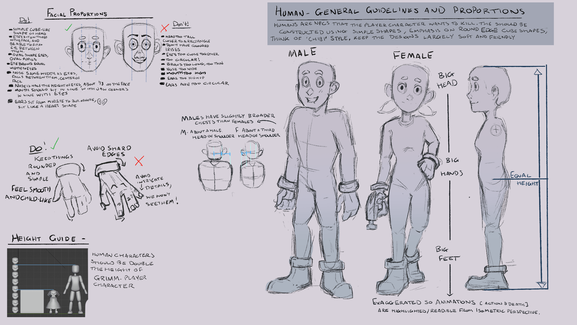
In a group meeting we decided what roles we would take, and I ended up with the NPC Human characters. I then went ahead and did some research on how I should construct the human characters based on previous designs my group said they liked.
For this I started looking at BOTW and Ghibli characters, before branching out to Yoh Yoshinaris work, since he plays with ‘chibi’ proportions for both young and mature audiences. I also looked at some Western children’s shows to see what they did to appeal to kids, largely simple shapes and rounded edges, big eyes and big heads- it makes them charming and friendly. Then I really liked the exaggerated proportions I was seeing, so I decided that since we would have an isometric perspective it might be hard to see the NPCs actions so by making the head, hands and feet larger than the rest, the animations would be clearer (highlighting deaths, interactions, etc).

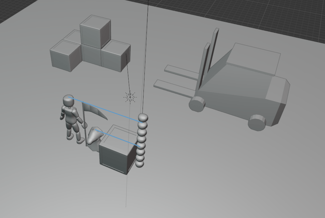
We decided to have our player character differentiate from the NPCS, I would use largely cube shapes, and Ellen would use more spherical ones as well as decided that I would use bright saturated colours to reflect their joyful personality and Ellen would use a limited purple colour palette in order to stand out from the background and to reflect the tonality of the job for Grimm. I then sent these off for Ellen to colour pick from.

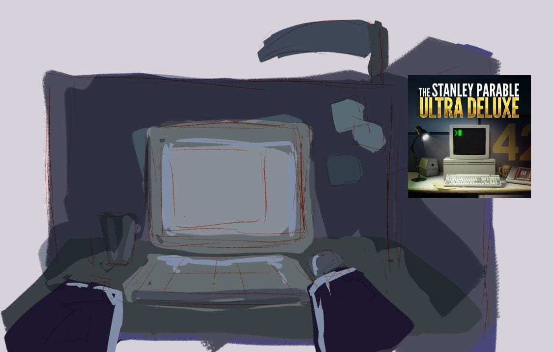
We also discussed briefly on how some of our environments would be structured and I ended up doing a quick sketch of my vision for the Menu/Level select environment of the Office space. For this I was largely inspired by Stanley parable and we all agreed that using desaturated colours would work for the idea of corporate monotony, and using blues and purples like Grimm’s limited palette would tie him and the office ‘hell’. I sketched out what I was thinking while on call and people liked this perspective so I think that’s what we were going for.
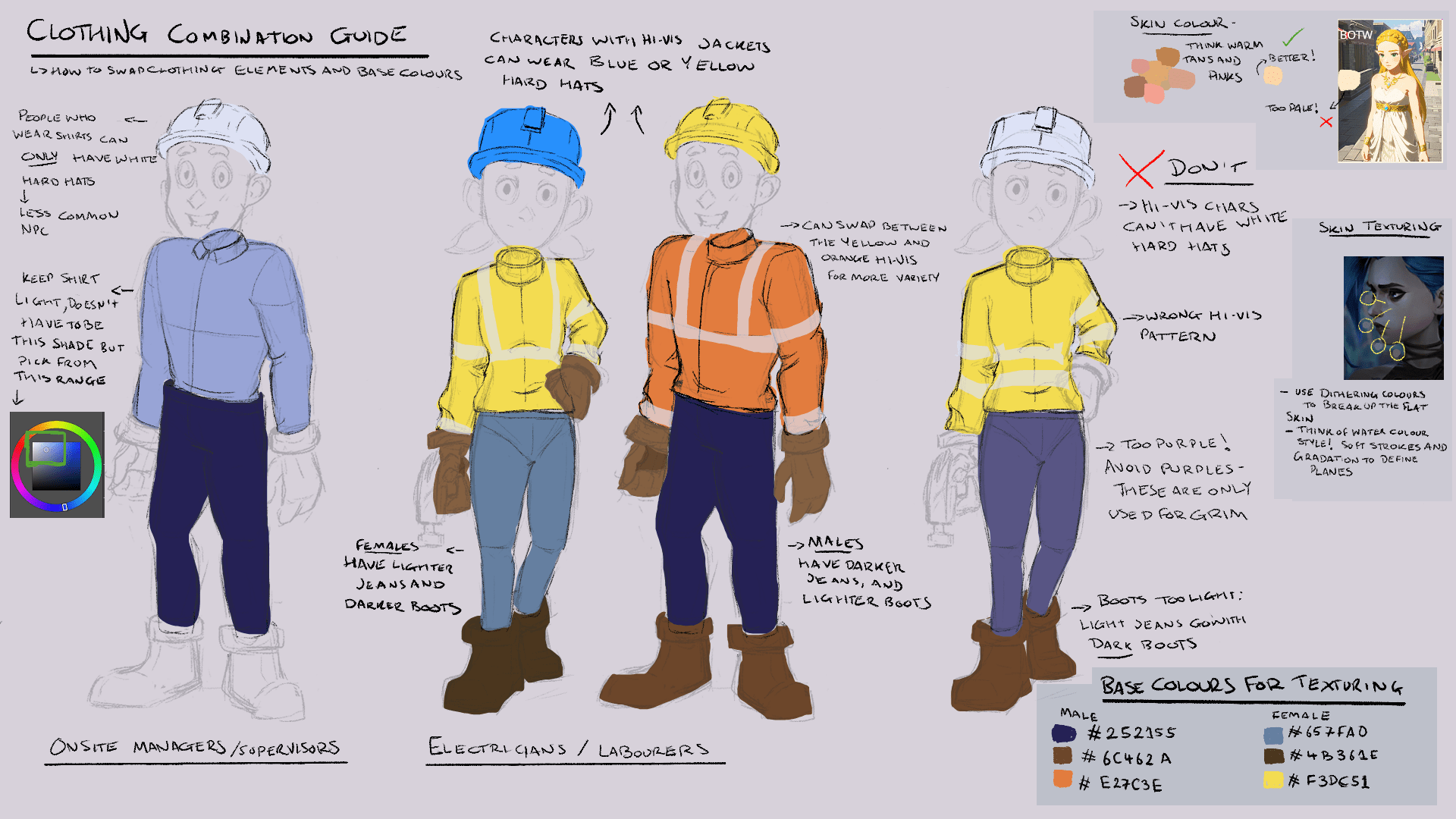
I then did some research and decided that I could make two base meshes (male and female), and for these create clothing and create different clothing/colour variations to fit into 3 different roles on the construction site, to give the appearance that there is a wider character list when really it just stems from two characters. Will this be achievable in the time given? I am hoping that by creating just two different top types and a male and female version that this isn’t a massive load, especially since we won’t be using normal maps/detailed sculpts. I then went and looked into what different roles existed on a construction site, and for our vertical slice chose two main roles, the workers and the production manager. Shane helped me find some different hard hat meanings, and this let me have a further variety on our NPCs.

Creating Our Style Guides
When it came to constructing our guide, initially I still wasn’t sure how detailed we were expected to go, so I followed some of my earlier research and threw together what I had and sent that off to Henry. Then I realised how I should have been approaching the style guide, which is largely to be able to hand this to any artist and have them be able create our vision without us being there to explain it. This is where I wished my group talked a lot more, as we left discussing the final elements of the style guide quite late and I had a lot of work to do in not too long a time. I was also not seeing a lot of work so I didn’t know what was being done and what still needed to be done, which made me quite stressed. Having specific measurements and comparisons, Dos and Don’ts, workflows and examples took a lot of time to try compile my research into finalised decisions (these final decisions is something I find myself struggling a lot with as I tend to second guess myself a lot), but I know that once this document is finished I can go straight into production because everything I need is right there.
There was still some development of our style guide as I was making it, mainly in refining our broad colours choices to more specifics and ironing out how we were approaching sculpting and texturing. For all of these clarifications, I posted in the discord for some feedback and we discussed what best fit the child friendly style. Largely we ended up using simpler colour palettes, using similar shades and hues like in my references from Children’s TV (Fireman Sam, Bob the Builder, etc) to make them more recognisable and simple.

Then I also wanted to see if I could replicate this art style with an already existing character, so I went and used Jinx from League of Legends and translated her from wiry to more sturdy simple shapes. I think this worked out quite well, and it was pretty cool to see how I could recreate the style following the rules, especially since this was something I wasn’t comfortable with. Pretty cool to see!

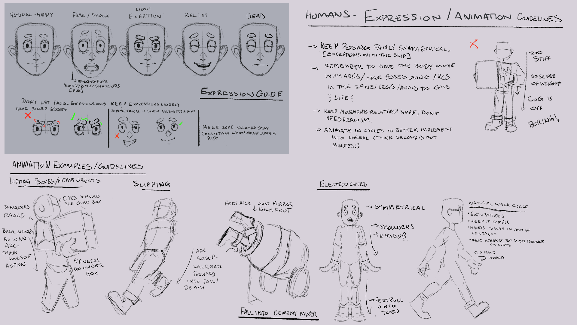
Character Guide
These ended up being my finished sections of the Style Guide. They are definitely not the prettiest, they don’t have a great layout/organisation of thoughts but there is a lot of visual and written content that hopefully outlines the exact rules on how to construct the characters, from design and shape languages to sculpting and retopology. Then exactly how to approach constructing clothing, hair, texture work, etc. This is definitely the most I have thought about developing a character, and having all this planning done now will greatly help when we move into production. I also made sure to grab references for things like retopology and skin texturing since I didn’t have time to create a demo for these.


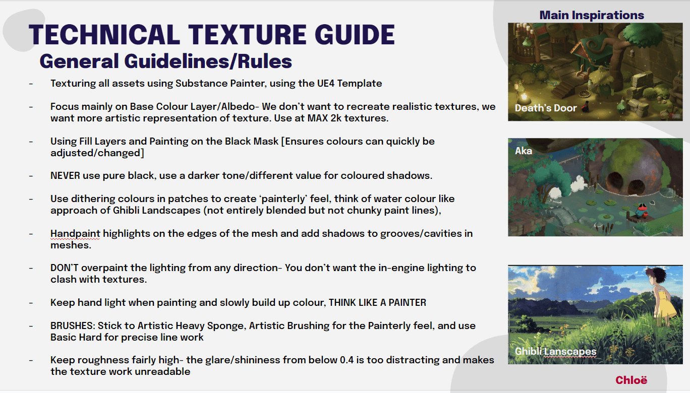
Texture Technical Guide
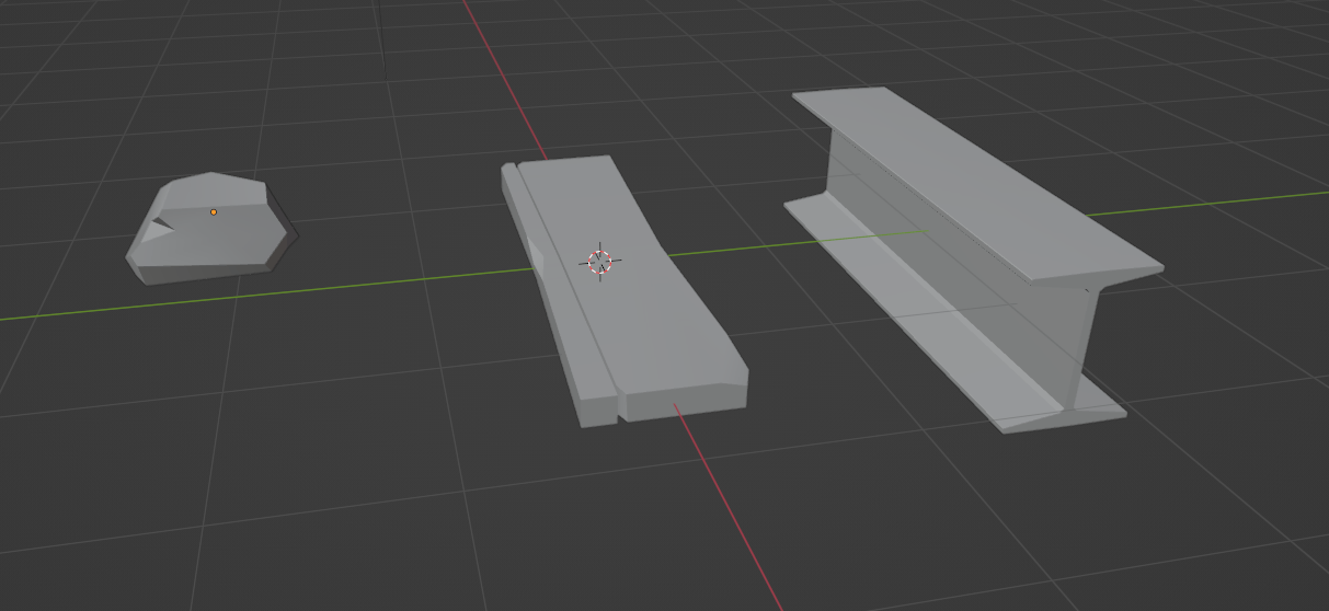
Henry also said it would be good if I could SHOW the textures on example assets, as well as set up a smart material. So I went and quickly poly modelled a stone, a plank of wood and a metal beam, to show case the different textures needed in the environment. I then went ahead and brought them into substance and started working on the materials, I made sure to send these into the groups discord for feedback, and Nicolle who was doing texture research really helped me hone down the combination of inspirations we were using to create our own. She also helped in taking one of the props to texture off of my hands, as I was feeling really overwhelmed and stressed with the amount of work so far.
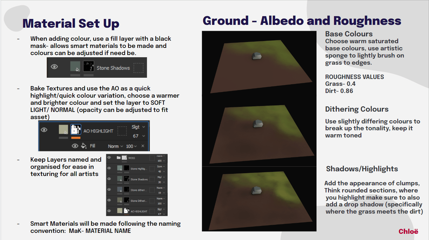
I went ahead and typed up our guidelines follow the research that Nicolle and I did for how we all should approach texturing. I then went and showed off step by step processes of texturing the each of the materials. We decided to keep the roughness fairly high so that the in- engine lighting wouldn’t create glares and obscure our nice hand painted style. I find texturing a really fun topic to look into and research, from these tests I went and created smart materials for each of these to share with the group.
To supplement these I founf two tutorials largely to help with how to approach texturing/painting wood and metal, the wood is included as apart of my slides and I sent the metal tutorial over to Nicolle to develop the technical guide for us. I also noted this guys channel down in future as he makes loads of hand painted texture tutorials!


Overall this was a pretty stressful assignment, working with people I hadn’t worked with before was pretty scary. I also was a bit worried about some of my members outputs, one particular member didn’t really produce a lot of content and another left them quite late so I wasn’t really sure about how much each person had done, or what was missing- communication is something we will have to work on as we move onto production as having everyone be really lax stresses me out. I think I will have a talk with my group to set specific goals so that we can stay on task. That being said despite these, I think my group was able to produce a lot of quality work, despite the timings of it and we were able to communicate once the stress hit people to create some consistent work that reflects everyone’s idea for our games style. I am quite excited to move onto production.
You can access PDFs for the style guide and our presentation here:
As well as the presentation Slides here: Making a Killing Style Guide Development