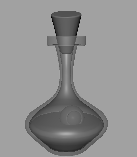
Today, as our class exercises, we were given run cycle exercises in both 2D and 3D, in which we had to identify the missing pose in the run cycle, add it and then try our best to time the movement better:

The missing frame was the down pose — the timing on this isn’t great, there’s a pretty big jitter at the end where the GIF is looping round to the beginning which is a bit off putting. We were also asked to play around and give the base run more personality than a standard walk cycle, but I don’t think I really did that. I just gave it a visual effect rather than giving it personality. I like it OK, but I just don’t think it’s anything special.

This is the Maya vanilla walk cycle — the missing pose was the first up pose which I had an annoying amount of difficulty adding to the run. I also reduced the frame rate from 24FPS to 12FPS. I actually think it looks quite good, if – again – quite jittery where the GIF loops back to the beginning. I dislike animating in maya.
For my run cycle, I refined and used the run cycle that I made during summer, in which I referenced the run cycle of the main character in Pokemon Arceus. I really love the little bouncy run of the main character in this game, it’s a very light and carefree movement and I wanted to try my best to capture that:


I worked on characters that I would use for all three assignments, walk, run and body mechanics; I wanted to ensure that all of them matched so that I could have some cohesiveness when compiling my show reel at the end of the year:


I am being a little ambitious doing two characters, however I wanted to ensure some secondary animation in my walk cycles and therefore I committed to my character Ali and her robot companion!
I did some little maya block outs just to try and get an idea for the form of gigabyte:


First pass: I used the following reference to get the movement of the bag on her back, which I used as the base for the movement of Robo later:
I added a couple more in between poses as the initial run cycle felt quite abrupt on the contact pose, which Mike pointed out and I wanted to fix:

then added the head, body, arms and legs as basic blocks to try and lock down that movement:

Moving on, I concentrated on the movement of the base body only:

The bottom of the robot body needs to swing back and forth a little more, almost with the aim of matching the monitor head but in the opposite direction, so both components meet in the middle. However, I’m happy with the run cycle of my main humanoid character, Ali! It’s not necessary that I submit more than one character, but I really want to push myself to improve upon my secondary movement. I decided that I would make a couple of characters for all three animation assignments so that there was a feeling of a little bit of a narrative with them, making them more cohesive for my show reel when it’s ready to be compiled” – with this thought, I refined the movement of the bottom of Robo a litle more, as well as refining the movements with the arms and legs drawn more clearly:

This is the final drawing of the run cycle, pending feedback and I will colour this later:

It’s not perfect, I’m not sure that the angle of the robot makes a lot of sense considering it’s at a 3 1/4 angle and the character is on a strict side view, but I think it communicates the point ok! I’m happy with the movement of the robot’s arms and head, too. I think it was worth the effort, I’ve learned a lot from the process of doing this run cycle — there’s still much to be improved but for a real first attempt, I can feel a lot of improvement with it.
After feedback from Alec, I was advised to remove one frame whilst landing as it made the character feel like she held her pose in the air too long, making it floaty. I was also advised by Alec to stretch her right leg forward when it was the leading leg:

I added some more animation to Gigabyte’s eyes, to give the illusion of more squash and stretch:
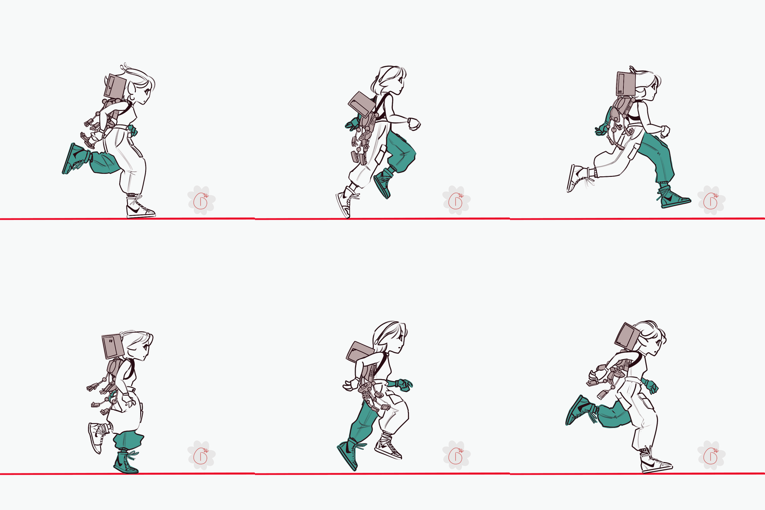
This feels Incredibly smooth to me now, and going forward the other pieces of feedback that I needed to act on were to ensure that Ali’s head size stays consistent throughout the animation, and to try and offset Gig’s arms and legs a little more in his movement, as per the feedback I received from Mike Cauchi!

I’m really pleased with my run cycle over all. I think perhaps Gigabyte’s movements on Ali’s back could have been done better, by offsetting his arms more. But honestly, I really do think I did everything I could have possibly done with this animation.


