
I wanted to do some research into CV templates and how different kinds of artists went about organising their CV information. The graphic design artists have a very methodical way of presenting their information, making their CV’s look a lot like newspaper articles or advert spreads. This was a bit too OTT for me, I think that they are a little too text heavy, and I find them quite difficult to follow. However, I did like the use of font and format with these; It made me think a lot about how I am going to layout my CV.
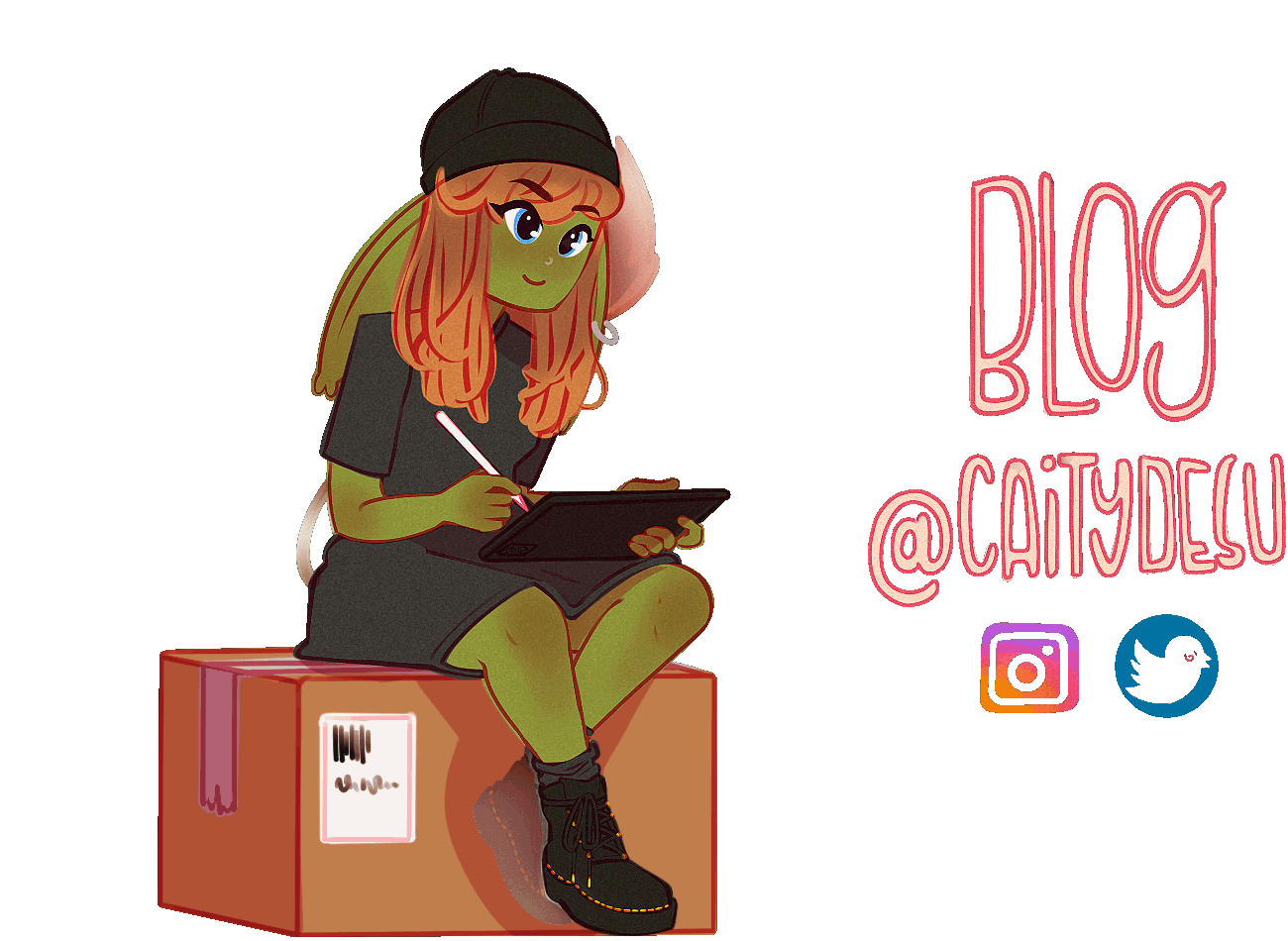
I much prefer illustration approaches to CV’s, in which most include some sort of little drawing with their information. I think that including a little bit of your own art adds a lot of personality and gives an indicator of art style very easily. This is something that I plan on including in my own CV.

I then looked at some potential colour palettes. CV’s that included the colour yellow would often catch my attention, and therefore the colour palettes with bright yellows included are the ones I am aiming for. The look I am going for with my personal work and social media includes a lot of green, and when I initially made up my CV I stuck to this. However, I am looking for ways that I can bring in accents of yellow, which I have colour picked from my own avatar on the top left hand side – I believe the best way for me to achieve this is through the symbols I have created and possibly through the lines that centre my title texts.
I need to ensure that the text is better aligned under my education section and I need to add a symbol above ‘experience’ to balance out my CV, which at the minute wastes a lot of space at the top.
After receiving some feedback from Alec last week, I edited and experimented with other colour combinations:
I felt that the coloured icons weren’t represented in terms of colour enough throughout the document, and therefore didn’t look right. I tried making the entire CV yellow, however this still didn’t feel right either. I listed further things I wanted to make changes to in the above PNG.
After some experimentation with colours, and some analysis of content, this is my finalised CV:

