The final groups have been settled and I am now part of the ‘Split World’ group. The people in this group are lovely and fun so I think I’ll enjoy this group. However there is quite a number of people in this group so I’m not entirely sure what I will get up to.
With that thought I decided to do some practice for this world, to get a feel for it’s aesthetics and design. I began with character designs, as its my favourite thing to do, so I took my Peach character that I did for the ‘Flora World’ and revamped her to suit the different areas of the Split World. In this world there are 3 areas; Cyber, Crystal, and Forest. Therefore I focused on the Cyber and Crystal designs as her look that she has already would suit the Forest part.
However before going straight into designing, I needed some practice with body shapes, so I spent some time practicing those. I am quite glad I did that, as I am not sure whether the results I got would have been the same if I didn’t practice beforehand.
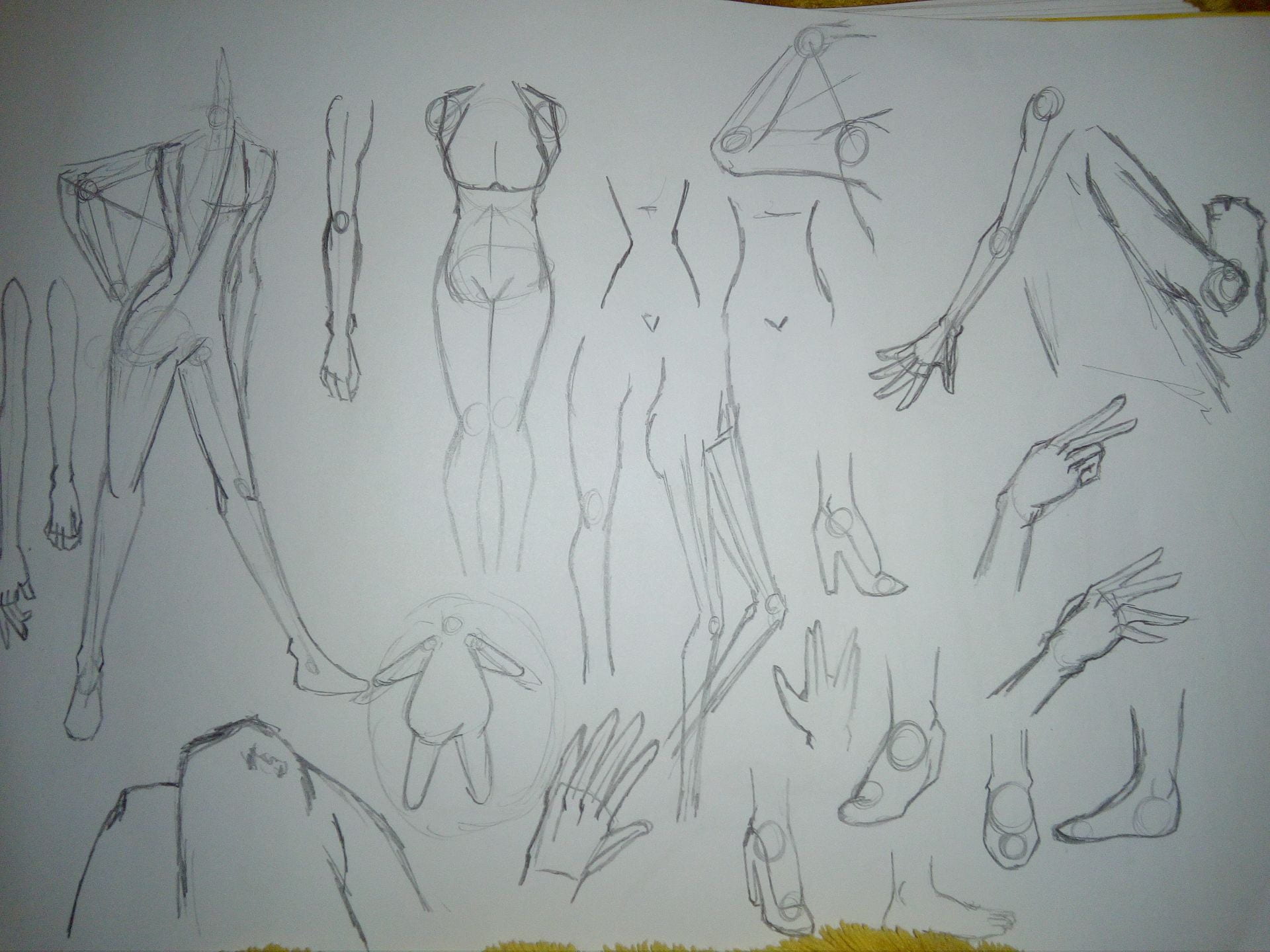
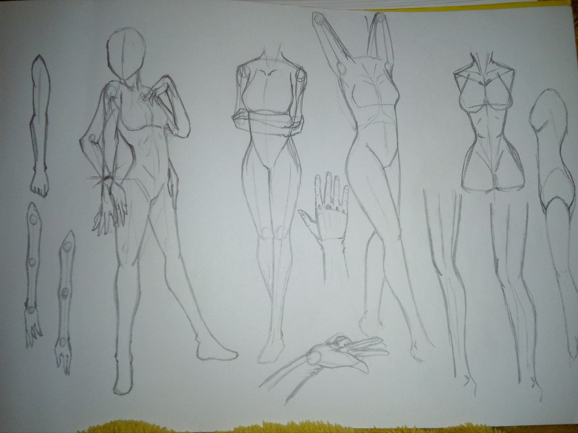
I practiced the female body as my Peach character is a female, plus I find them more pleasing to draw than males.

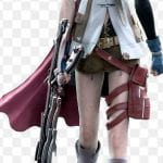
With the body practice I went on to draw some designs, also trying out different eye shapes, mouths and noses. I’m not a fan of faces but I do want to get better at them. These designs are for the Cyber version of Peach. Below are some images that I took some inspiration from for the designs.


With the frontal designs done, I then tried to do a design with a back view, along with trying out flower shapes. Angles with flowers are difficult I will admit, but I tried to keep it basic as possible.

Next it’s time for digital work. I wanted to add in some colour and I always want to do it digitally as well as it is good practice for me on working on my monitor that I am using.
I remember from previous weeks being told that silhouettes are important when doing character designs as it should allow you to get a sense of the character without seeing any details. I am not used to silhouettes so I’m not sure how I am meant to analyse them, but you can see that the character is female and has long hair.
Here are the full colour versions of these designs. Overall I am very pleased with them and I have to say the design on the right it my absolute favourite. I am actually really happy with it. It took a few tries to get the design right as I reminded about primary colours and to be careful not to colours too saturated that they block out the other colours.


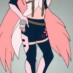
Out of these tries, I ended up going with a slick black look, not complete black, but dark enough to know that the colour is black. I feel that it ended up being a much nicer contrast to the bright colours. I did try hope for a dark navy blue colour but I feel that the black is much better.
The pictures below show the version of the cyber part of the Left Peach design. I initially went with a plan colour but then thought that a gradient would look colour and more cyber-like. So I tried a couple of gradients using different tones of the colours that are used in the design, and I found that I really liked the right version of the cyber look so I used it for the design.


Next are the Crystal Peach designs.


I know I probably should have changed more features of this Character, but I adore the hair style and the basic colours, it wouldn’t be the same Peach if I changed it. As these are crystal designs, I tried going for a more elegant look because in my mind, crystal related to high class societies and formal functions. Therefore the images I looked up where shapes of crystals and diamonds to create the shapes I need to make the design look like there are crystals in it.


Here are the silhouettes of the designs for the crystal versions of Peach.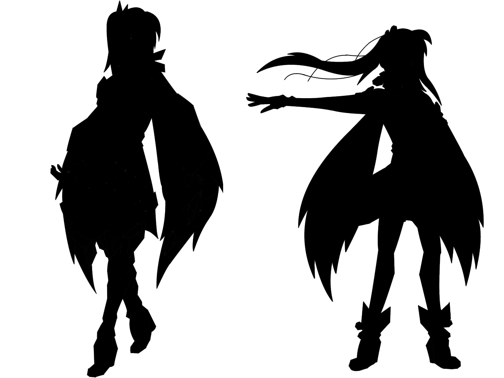
And these are the colour versions of the designs. The right design is based mostly off the original design for Peach, substituting flower petals for crystalized versions of the flower. I also tried making the shoes a bit more crystalized as well. Another added feature are the crystals in the hair. As an inhabitant of the crystal part of the world, I thought that this would be something that would be a natural part of the inhabitants.
The left design I decided to go off a bit with the colour scheme and add in some blue to the mix. This is because I naturally think of the colour blue when thinking of crystals, and so I wanted to incorporate that into the design. I did initially colour them pink to see what it would look like but the blue is much better in my opinion. I really wanted to go with a pure theme so I stuck with pale light colours. The adding of white does seem to make the design colder I feel, but you never really think of crystals being warm either.

I am really happy with how my designs came out. If this character was incorporated into this ‘Split World’ world, I would probably want it to be one of the cyber designs, mostly the right cyber design. I just think she looks so cool and adventurous, plus I honestly think it is my best design out of them all.
