IXD103 – Week 02 Wordmarks
For this week’s class we were introduced to wordmarks and how they work within the world of branding, and how we should approach typography for this module and specifically our logos.
Wordmarks are defined as being a type of logo exclusively contains only the company/brand name no symbols, mascots, or images. Wordmark logos are alternatively called “logotypes,” and can include monogram variations for smaller spaces like social media profiles and favicons. Because of the simplicity of these logos, typography and spacing are given more of an emphasis. Up until this point, I had never really been introduced to a wordmark before or knew what it was, so it was nice to have a word to refer to logos that were just exclusively made up of fonts and typefaces.
Some examples of wordmark logos include Google, Coca- cola, and Calvin Klein, the words themselves for these brands have essentially the words have become the entire visual aesthetic of the brand. We seemed to be introduced to wordmarks to give us more options when deciding on a logo for our bank brands.

Like the last PowerPoint we were gain given a quote to refer back to for this topic “Typefaces are to the written word, what different dialects are to different languages” – Steven Heller, this clearly emphasises the importance of typefaces and how they can seriously affect the vibe and message you are trying to coney to your readership.
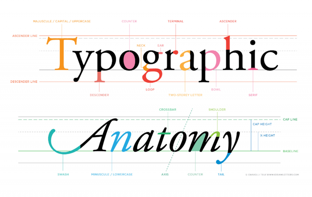
We were then given a brief history on the use of letters and how they came about and how this lead to typefaces. We were shown the term letterforms, Letterforms developed as an alternative to the spoken word – from pictographs. It communicates a message where the originator is not able to be present. A letterform, based on the words, refers to the graphic and visual form of a letter of the alphabet, whither its written or in a particular type of font. It basically refers to all the design choices that goes into creating a typeface, and it effects the tone and mood of the subject it’s paired with. There are various terms that refer to each aspect of a letterform:
- Baseline: This is the line that sits at the bottom of capital letters or at the base of the main body of lowercase letters.
- Median: This is the line at the top of the main body of lowercase letters.
- X-height: This is the distance between the baseline and the median.
- Cap height: This line is at the top of capital letters.
- Ascender: Some lowercase letters extend above the median and are called ‘ascenders.’ The ascender line is the top of their ascent.
- Descender: Like an ascender, some lowercase letters reach below the baseline and are called ‘descenders.’ The descender line refers to how far down a descender reaches.
- Stem: This is the primary, vertical line in a letter. If there are no vertical lines, this will be the first diagonal line.
- Stroke: This is a diagonal line extending from the stem. Often, this term also gets used for the stem and can refer to any vertical or diagonal line.
- Serif: This is a small, horizontal stroke at the bottom of a letter’s stem and stroke.
- Terminal: When a letter does not have a serif at the end of the stem and stroke, it is said to have a terminal. Sometimes, the line just ends. Other times, it is rounded off or has a circular end
After this we were then given another quote which states “Typographical design should perform optically what the speaker creates through voice and gesture of his thoughts” – Eli Lizzitsky . Tone of voice was also further emphasised to us and how important it is that we take it seriously as it’s the way we will communicate to are target audience. It’s crucial that the typeface we end up choosing evokes the same feelings as our tone of voice. For my brand that would be feeling of: Consultive, Simple, Compassionate, down-to-earth, and Straightforward.
We were shown a few examples on sources we could use on the internet to try af find a typeface that meets our brand values, The first was “Meet Your Type” on blackboard which can help develop a good typeface for our brand book.
Here are some of the pages I’ve read through:

![]()

There is also “Thinking with Type” by Ellen Lupton, Thinking with Type is described as being the definitive guide to using typography in visual communication. Lupton apparently provides clear and concise guidance on how letters, words, and paragraphs should be aligned, spaced, ordered, and shaped.
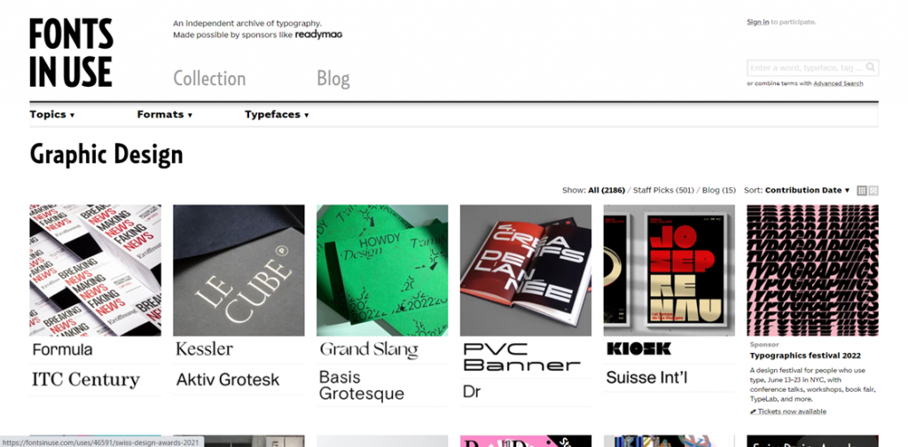
Were then given actual websites to check out, Fontsinuse.com is a great source for seeking out typefaces. It seems to operate somewhat like a typical shopping site, where you can filter in the typefaces that more accurately align with the message you’re trying to get across. It gives you three categorise to choose from Topic, Format and Typeface.
Another website we were shown, that seems like would be more helpful would be, Typewolf.com, as it shows you what trends are emerging. They also offer learning resources to users, to better understand typography. They provide look books, checklists, and guides. However, they are behind an expensive pay wall, which for someone like me who’s a student, I don’t exactly think these resources are going to be that helpful. Despite this they still have many features to the website which could prove to be very helpful. Like, ranking ranked recommendations list.

On the last of the recommendations, Daniel gave to us there was. Myfonts.com/Whatthefont, which can show you what typefaces previous brands have utilised in their own branding. The use pictures to seek out fonts that are the exact same or are similar to the font depicted in the image. WhatTheFont uses deep learning to search their collection of over 133,000 font styles and find the best match for the fonts in a photo. It even works with connected scripts and when there’s more than one font in an image. Just upload an image, click the font you want to identify, then check out the results. Daniel was trying to highlight to us that there is more options for finding fonts than Google or Adobe.

Kerning
Kerning in typography, refers to the spacing between individual letters or characters and how to arrange them into a visually pleasing format. It’s predominantly used for one singular word, and you want to adjust the spacing of the characters contained in that word. Kerning is normally utilised when adjusting logos, headlines, and other typographic compositions. We were told Type.Method.ac as a good site for both practicing and testing our kerning skills. Kerning makes certain combinations of letters, for example, WA, MW, TA, and VA fit together better

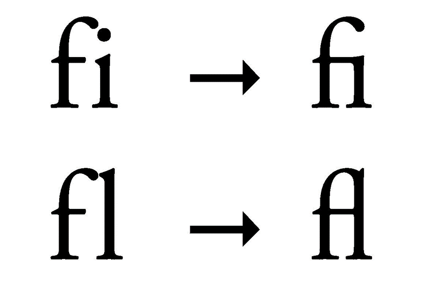
Ligature
We were then introduced to ligatures, which comes from Latin ligari which means “connection”. In typography ligature means when two or more letters combined into one character make what would be called a ligature. The reason people use ligatures is simply to help with kerning and decorative purposes. If we talk about the appearance of type, a ligature is made from two or more letters, which appear connected.
Custom type
When designing a wordmark there are other considerations after choosing the font. In lieu of any accompanying symbol, it is important to create distinction in the wordmark logo with the appropriate design decisions.
A Twist
Another way to create distinctive wordmarks is using a small simple tweak to customize the mark. It can be a ligature, a notch, a color difference, playing with positive/negative space, kerning or letterspacing or basically any twist that makes it unique and different from the standard typeface.
We were lastly given another quote to finish off the slide show. “Words having meaning, Type has spirit. The combination spectacular” – Paula Scher
Self-Reflection
I will be honest and say that typography and wordmarks, don’t really interest me all that much in terms of branding. Though I do think that this class today did make me have a better appreciation for typography and how it really does affect the messaging a designer would be trying to present to their potential customers. I still haven’t fully settled on a name, so the task for next week, where we are supposed to experiment with wordmark designs for our bank brand. So, trying to find a typeface will be quite difficult when I haven’t even settled on a name for the bank. I am aware that the typography used in logo design is just as important as any symbol that could be used in logo design. I think perhaps why I don’t find typography and searching for the right typeface as interesting as other aspects of graphic design, Is the fact that I just associate letters with writing and essays that it doesn’t really seem like a space that would inspire a lot of creativity. However, I am excited to find the right typeface for Haven, I think it will definitely help with generating the other aspects of the bank brand like colour scheme and logomark.
Bibliography
https://fontsinuse.com/in/1/topics/27/graphic-design
https://looka.com/blog/wordmark-logo-design/