This week we had a class critique for our Apollo Space Program immersive prototypes. These critiques are useful for getting valuable feedback and constructive criticism for my work so far. At this state I have completed a functional Figma prototype. Instead of scrolling, the user has to click through the site to see how each section animates in. This emulates the parallax scroll which will be possible to do in a website. This prototype also has multiple pages for each section, however I may change this into a single page website later.
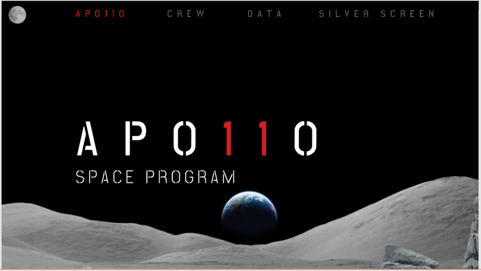
This is the homepage. I may have an introduction or loading screen before this loads. The user can hover over the title so the text glitches. The navigation menu at the top has links to each section. The imagery is separated into different layers to allow for a parallax animation when the user scrolls down the page.
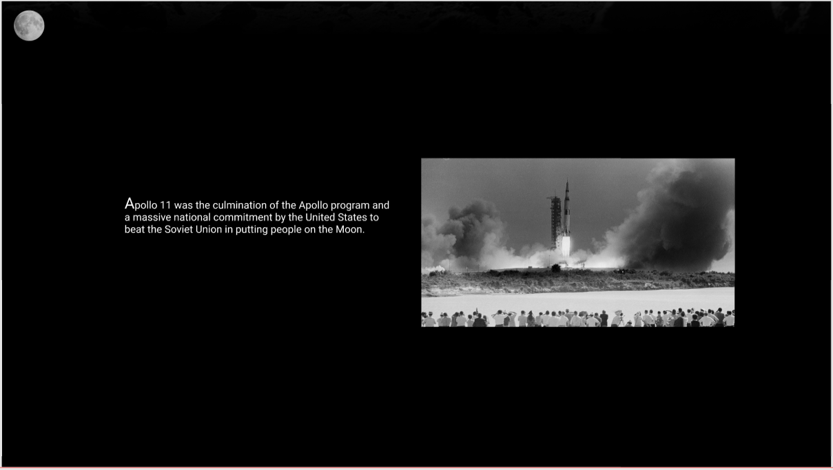
These are some pages with content below the homepage. These are very simple in design so I might make it more complex with imagery. The homepage icon is an image of a moon in the top left corner which brings the user back to the homepage. This icon is included across all the pages in the site.

The ‘Crew’ section is a simple screen. The heading is large and bold with an image of the Apollo 11 statue from the Kennedy Space Center Visitor Complex in the bottom right. When the user scrolls down the page, these layers overlap eachother in a parallax effect. Again, this is a little simple, so I might make it more complex through imagery or text.
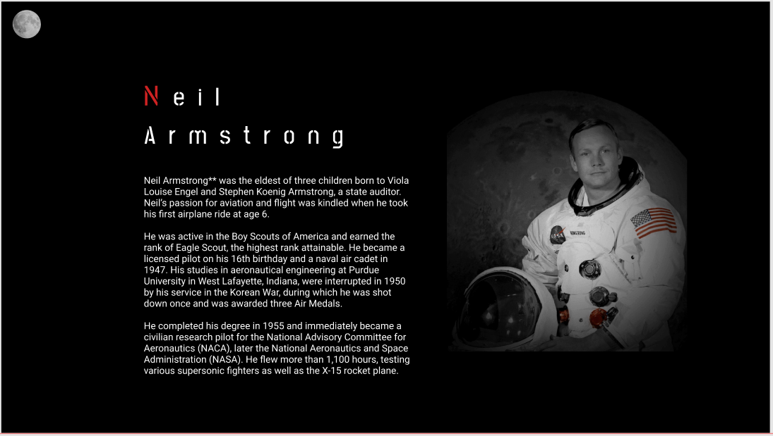
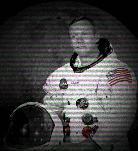
This individual crew pages have the paragraphs of information on the left with the image of the astronaut on the right. When the user hovers over this image, it should play an animated gif of the astronaut ‘coming to life’. This animation was created with AI software.
I received some useful feedback that the text on these pages should be formatted better, so the pages are more visually interesting.

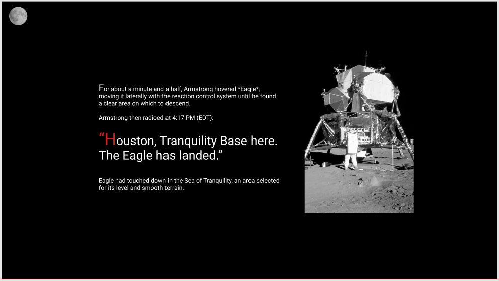
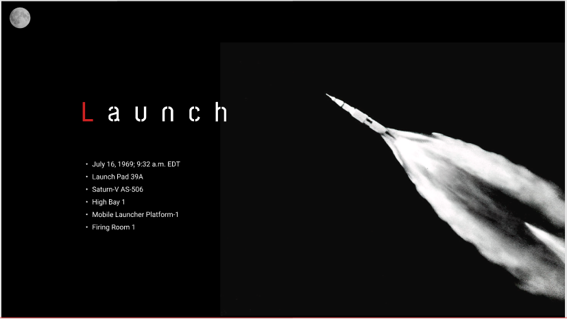
This is the data page section. When the user scrolls down the page, the Apollo spacecraft flies out from Earth and towards the Moon in a parallax animation. I don’t know if this will be possible to do in the final website, so I may have make some changes to this.
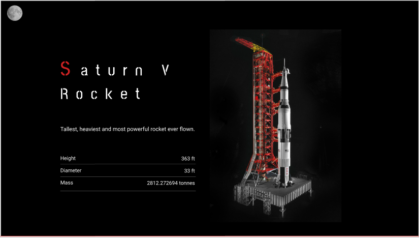
These are individual data pages. I may refine these pages with more information and better formatting. I may also include more interactivity through animation, such as images following the user’s cursor.
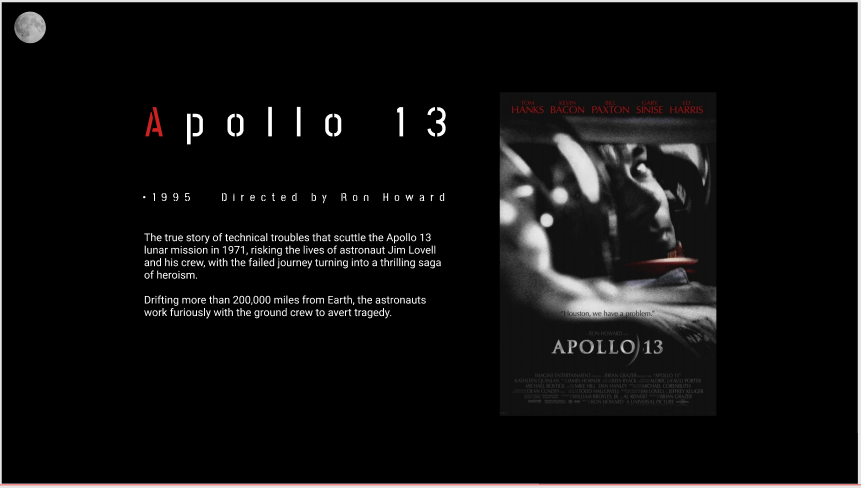
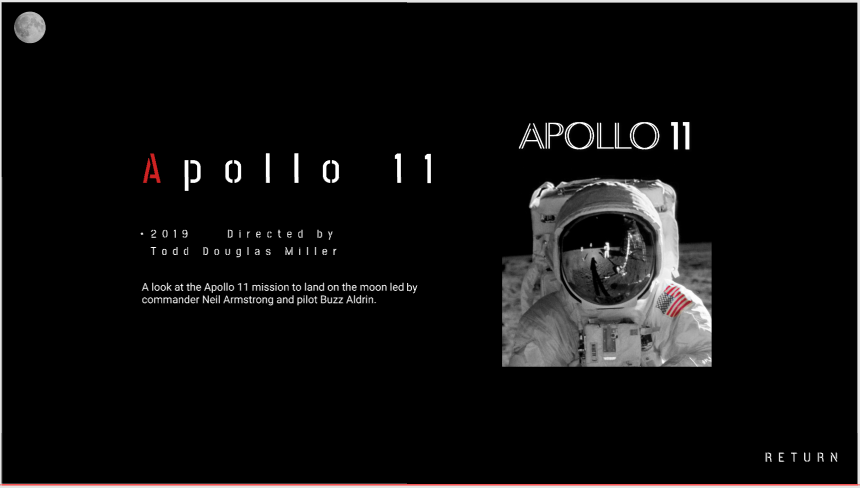
These are individual ‘Silver Screen’ pages. Again, I will possibly include more information across these pages and format them to be more visually interesting. The last screen includes a return button for the user to return to the homepage.
I think my prototype for this Apollo Space Program website was successful. I edited all the imagery here in Photoshop with a black and white filter, highlighting red elements to keep with the overall black, white and red colour scheme. But I will need to include more formatted text to keep the text heavy pages more visually interesting, and also some animation and interactivity.