Starting on paper is crucial in the design process. It enables us as designers, to come up with multiple concepts and ideas quickly on the page. Mistakes are welcomed here, as you have to put the bad ideas down before you find the good ideas that are worth exploring further. I always start my design process on paper first, and this was the case for this module’s app prototype which I will be designing.
I started out by sketching different concepts for the brand logo. I came up with the name – Hydro Homie for my water tracking app. I tried involving illustration in the logo, starting with imagery of waterdrops, glasses of water, clocks (for the reminder feature in the app). I eventually settled on the logo on the top left, featuring a playful waterdroplet as a mascot, with a water drop replacing the dot over the ‘i’.

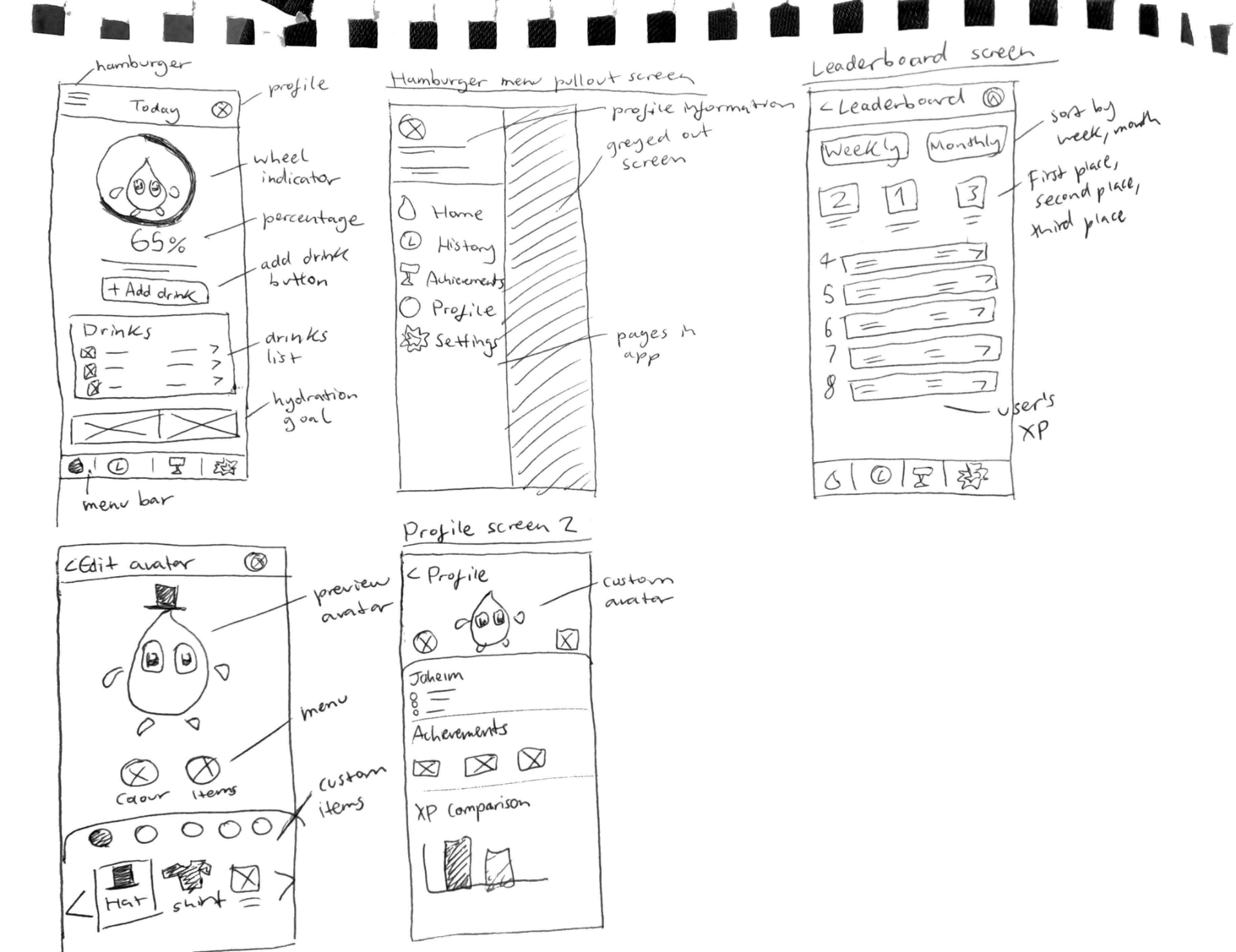
I then sketched out some initial screens for the app design. Including the homepage, a hamburger pullout menu with different pages for navigation. I also sketched out a leaderboard concept, where users could compete against other users and compare and measure their stats with eachother. The entire concept behind my app’s idea is the theme of gamification, and so screens like this that are mostly seen in a lot of game apps would be something that I would like to emulate and include in Hydro Homie.
Something else I sketched was a “customise avatar” screen. The concept is that users could customise their unique Hydro Homie mascot shown on the homepage with different fun accessories and items from a virtual store in the app. I’m not sure about this screen, as it might take too long to make all the different vector images for accessories and various items myself.
I made sure to sketch a quick layout of what the onboarding process for this app might look like. Onboarding screens like this are a common feature of many apps and are useful for introducing the rules or guidelines of the app itself and welcoming the user to the interface, before directing them to a signup screen.
These onboarding screens feature the waterdrop mascot I designed, explaining how the mascot changes its appearance depending on the user’s water intake for the day. For example, the waterdrop grows in size and gets darker in colour when the user’s water intake increases. On the other hand, if the user’s water intake is low, the waterdroplet shrinks in size, and is washed out.
This visual indicator will be showcased on the homepage of the app along with a percentage ticker of the user’s water intake.

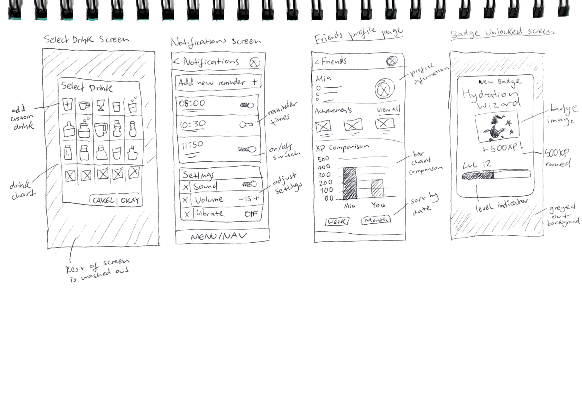
These are some other screens I sketched out for Hydro Homie. Including a select drink screen – featuring several icons for various beverages or volumes of water. A simple notifications screen. A friends profile page – this screen will show statistics and achievements of a user’s friend within the app so that users can compete against eachother. There will also be a XP comparison chart which can be sorted by the date, in which users can see a visual indicator of difference in XP between them and their friend.
A popup achievement screen is something I would like to include in this app design. For example, it would display to the user that they achieved a new badge, gained a level and gained XP points when they reach their hydration goal. This is another gamification element that I hope to emulate.
I wanted to introduce some colour in some wireframe sketches. So for these three screens, I used a blue marker to highlight areas in the app that would be in colour. Since my app will most likely use a lot of whitespace, and as the colour scheme will mostly be blue/white I thought this would be a good exercise. I sketched a different design for the homepage, to see what it make look like from my previous design. However it looks inferior to the original concept I came up with. So I will probably stick with the old one.
As well as that, I sketched a quick reminder screen, as well as an achievement badge screen that shows the user’s achieved badges, their current level etc. It’s a rough sketch, but it’s a good idea for a screen in my app’s design.


Some post-it note brainstorming for things I could include on each page/screen.
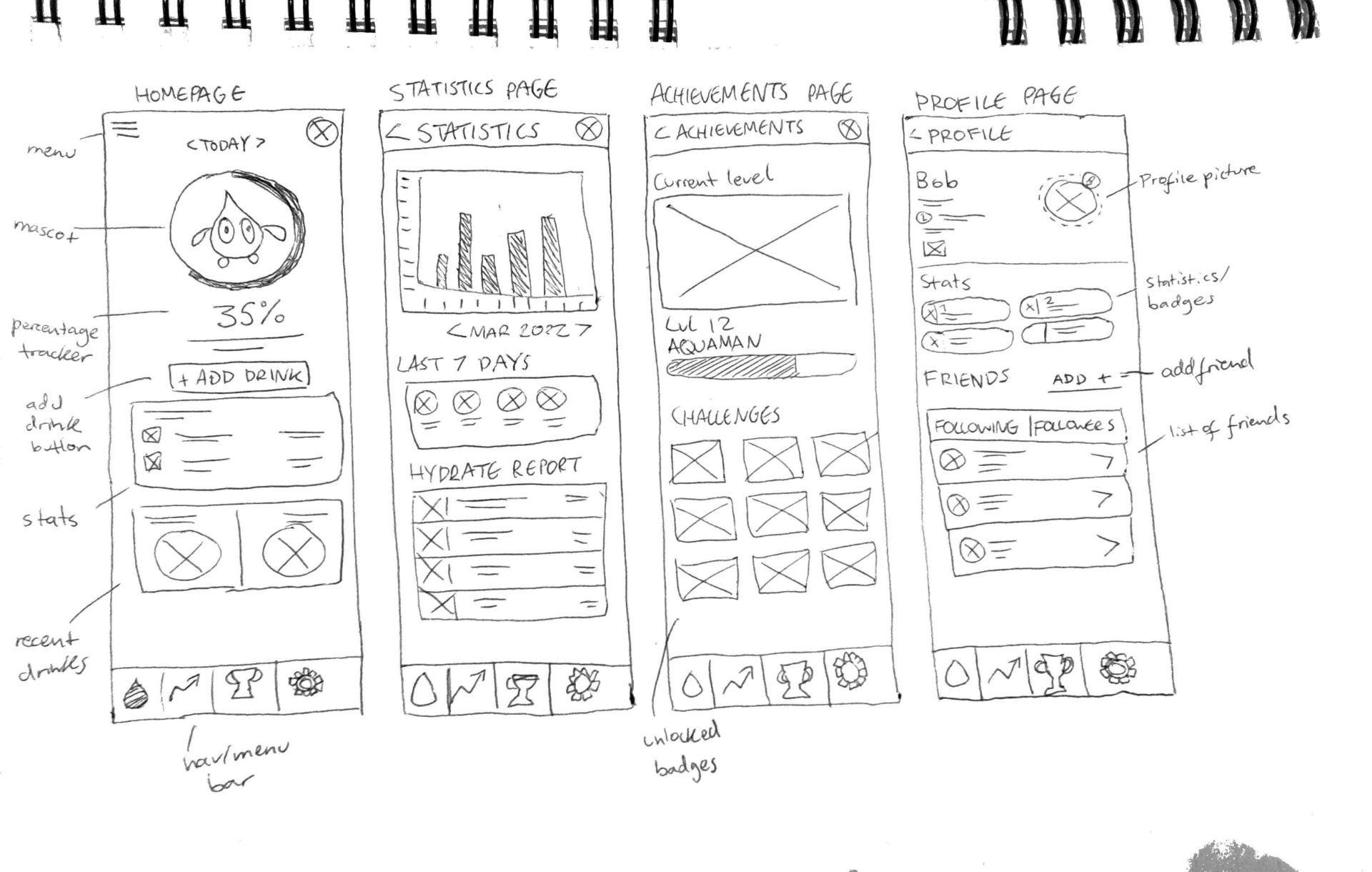
The above sketch was a refined version of the previous sketches I had completed. The new screen I sketched here was the statistics page. This page would include things like the user’s hydration levels displayed in a bar chart, which could be sorted by week/month or year. The user can also see things like their progress over the last 7 days of using the app, as well as some other stats included in a hydration report for that week. I will have to narrow down exactly what will be included for this page, since it’s very technical, but I’ve got the basic gist of what this screen is about within the app.

Knowing the various pages and screens within my app is also an important part of the design process. Creating a basic site map such as this clearly outlines the individual screens that I need to create and helps keep me on track. As my app develops and grows, this site map may change with more elements added but the basic layout here will remain the same.