Graphic Language:
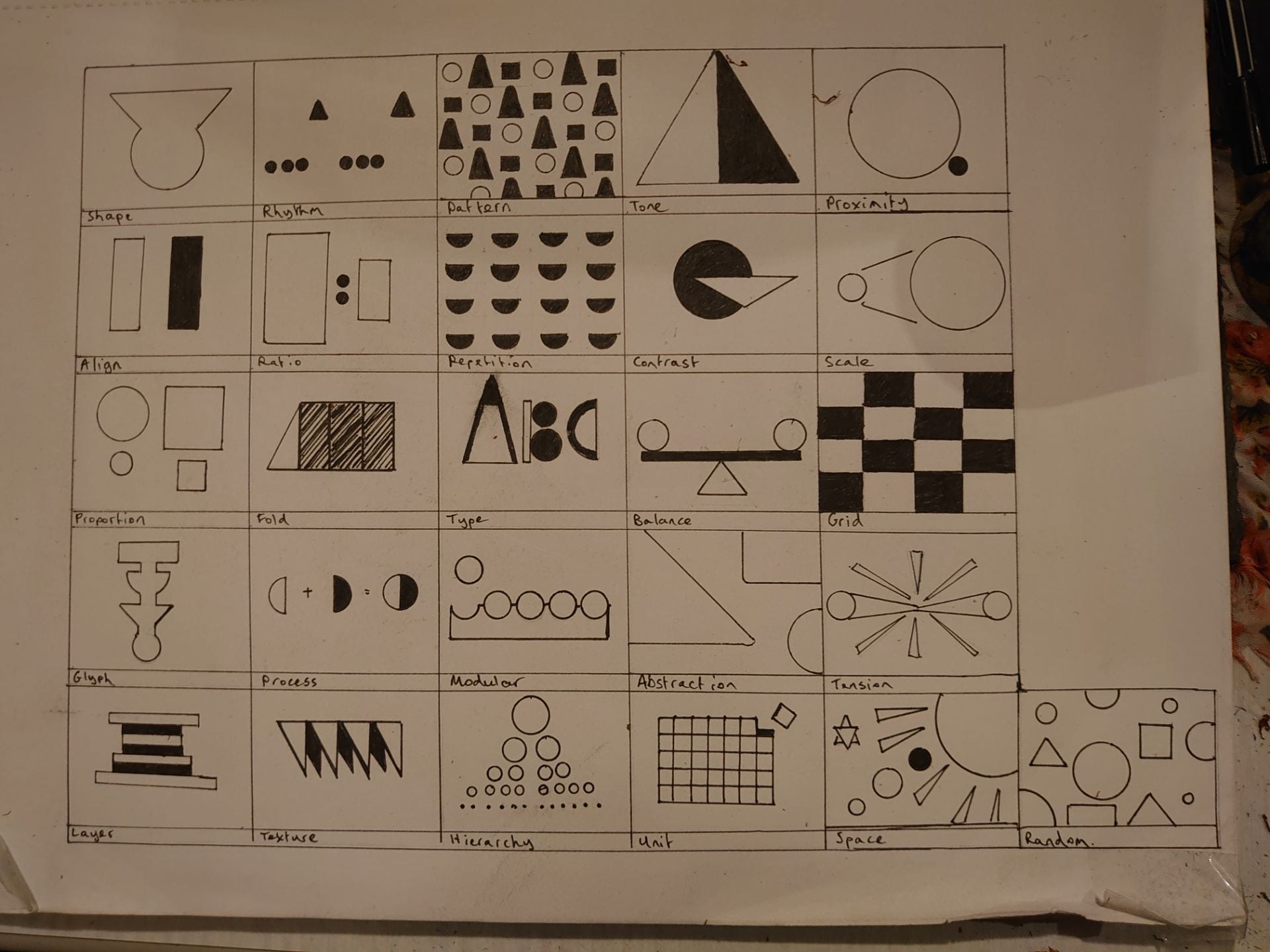
I began this task with a very basic approach to interpreting these words, trying only to use the three shapes set out in the task; square, triangle and circle.

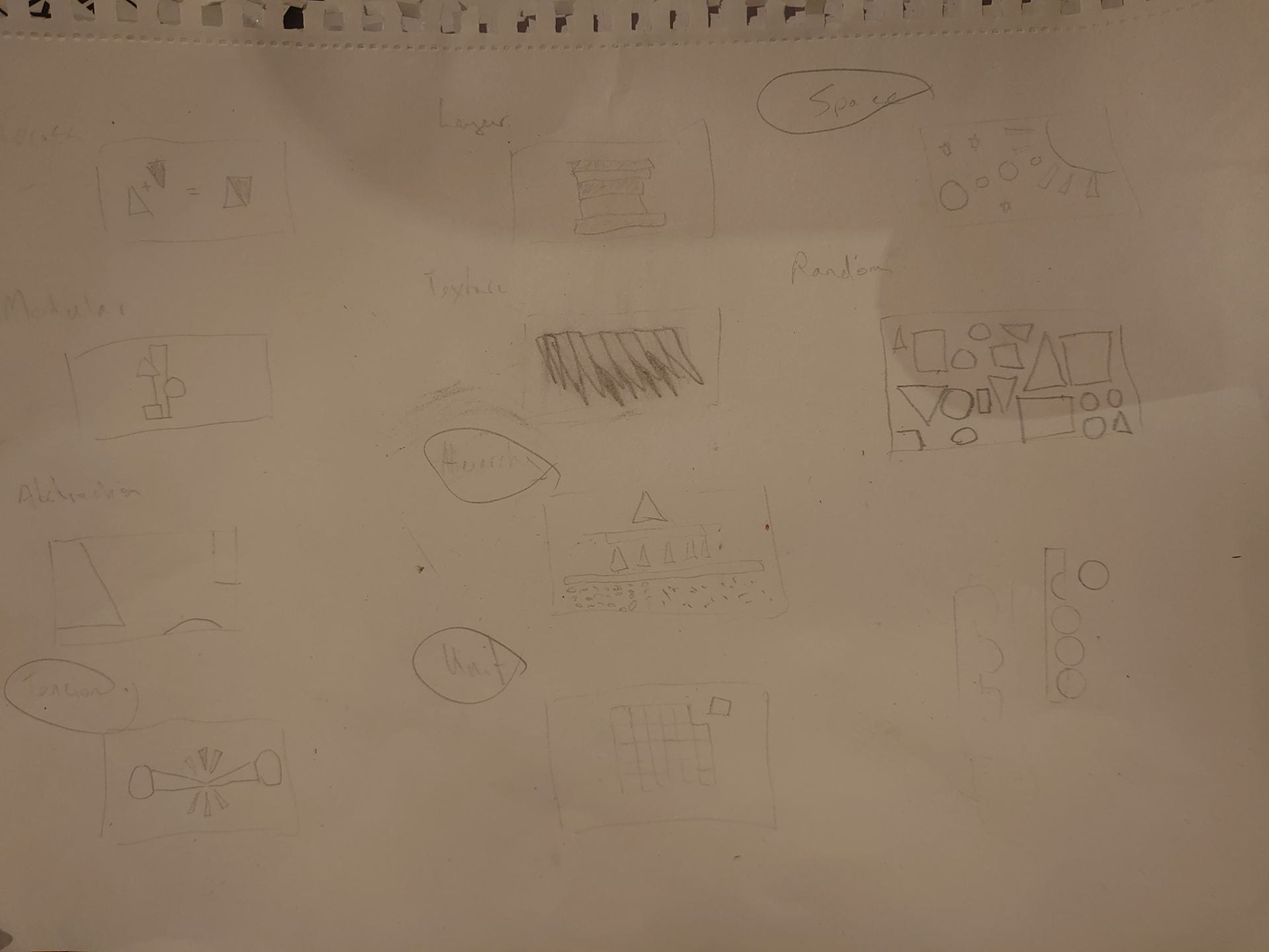
After I was happy with the ideas I had, I developed them with fine liner in order to better make my selection for the final 12 digital images.
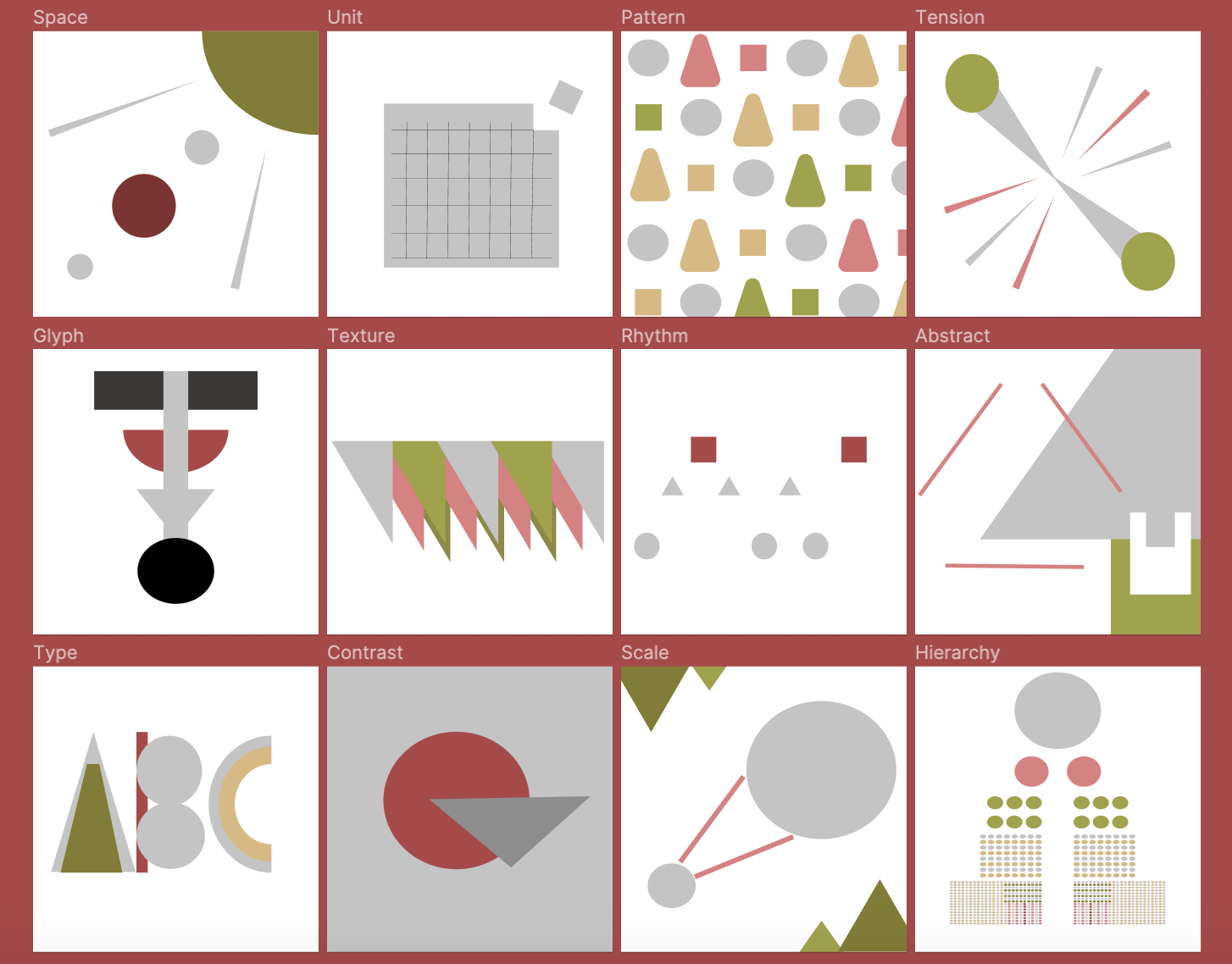
Below are the 12 images set out in a grid formation. I rather like this image of them grouped in this way as the red background adds to the contrasting colour scheme I chose. The images are displayed in full at the bottom of this page.
Here are the 12 images compiled as a GIF.

And finally here are the images individually, in no particular order:

Type

Texture

Tension

Scale

Rhythm

Pattern

Hierarchy

Glyph

Contrast

Abstract


Contextual research:
Opening title by John Kennedy and Arice (Windmill Lane):
This eery yet fantastical video begins with a scarecrow image in what appear to be children’s clothing before taking you on a rollercoaster of imagery and sound. A well produced piece of electronic music plays in the background while a clever combination of computer generated graphics, video effects and stop motion result in this epic musical video. The artists have chosen to focus on the human form however through abstraction, these forms are stretched and dance wildly across the screen which dehumanizes the figures entirely whilst not taking away from their virility. The video has very bright and vibrant colours as well as black and white imagery. Although the video begins with very organic figures and natural subjects, the overall feel of the video quickly shifts and is very futuristic and digital.
This video I assume is meant to give an idea of what lies ahead and can be found in the rest of the archive and therefore I imagine it to be full of videos of a similar standard and subject matter. I really enjoyed this clip and it has inspired me to want to go further and explore the rest. I particularly liked the music and how the artists were able to smoothly transition between styles and emotions. Although I enjoyed it, the video does have a slightly jarring/creepy quality to it and may make some people feel uncomfortable. This video would work well as a music video for a popular band or artist and I wouldn’t be surprised if this studio is involved with the music industry.
Emiliano Ponzi:
Emiliano Ponzi is 43 years old, born on 30th December 1978 and is regarded as one of the finest illustrators of his generation. He has earned himself numerous honours such as the Young Guns award, the Gold Cube and a number of Medals of Honour from the Society of Illustrators. His first monograph ‘10X10’ was published in 2011 by Corraini and his first picturebook was published by Penguin for their 80th anniversary in 2015. This was ‘The journey of a penguin’ and this book took the famed penguin from the publishers logo on a fantastic voyage across the globe. Emiliano uses strong graphics to communicate concepts to audiences for a number of reasons and is known for his exciting use of colour and skilful use of line or lack thereof, in a minimalistic but beautiful style. Emiliano himself refers to his style as more of a language as the term ‘style’ is too rigid. He believes that more akin to a language, he is constantly adapting and learning as he grows.
As well as publishing books of his artwork, Emiliano is commissioned by a variety of different companies to create custom visual products that can be understood and appreciated by its intended audience. He manages to communicate ideas directly and concisely using conceptual metaphors and simple yet elegant artwork. Notably his ‘SELECT Aperitivo’ campaign attached its image to the identity of the people of Venice through the ages. Each piece is marked by a partially hidden number denoting the decade and uses his painterly style alongside vibrant colour to translate the vitality of the city and its favourite alcohol through his signature simplistic yet magnificent imagery. Emiliano also has a number of political pieces, showing images of soldiers and those affected by war, again in this typical ‘language’.
Kris Sowersby:
Kris Sowersby was born in 1981 making him 40 years old and he is based in Wellington, New Zealand. Growing up as an avid reader, he was drawn to the power of language and typefaces themselves. He is best known for creating popular fonts that we use on popular word processing applications such as Calibre and Domaine but he also creates custom fonts. He has been commissioned by the likes of the Financial times and National Geographic to create custom typefaces for them and has also published collections such as ‘The Art of Letters’ which is a celebration of his type art. The book contains 750 large character illustrations from his studio ‘the Klim Type Foundry’. His style is very functional yet charming and he has been named an Art Laureate by the Arts Foundation.
Kris says that he was drawn to the type art world by its ability to express so much more than language through what we typically take as a predetermined language. He does this through subtle stylised changes to this ‘preset language’ we are accustomed to and he himself would say there is ‘no definitive form of alphabet’. Kris explores language by writing and reading a lot and experimenting with shapes and different ways of connecting each letter together. At the beginning of his career he set out to simply survive as an artist in what was then a very small field. Over the last few decades he has mastered his ability to create more and more works of art where others may think there is nothing left to create.