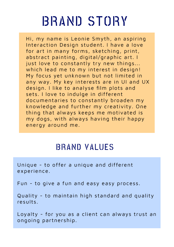
Brand Guidelines
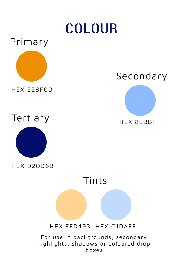
I have reconsidered my colour palette again and simplified it to three colours, and mentioned two tints. I have spaced out the monogram and visual marque onto their own pages. I have added so small ‘Aa’ to the typography page and changed the header text to the navy blue which will be continued on into my business card.


Business Card
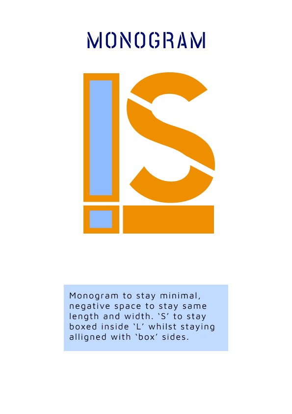
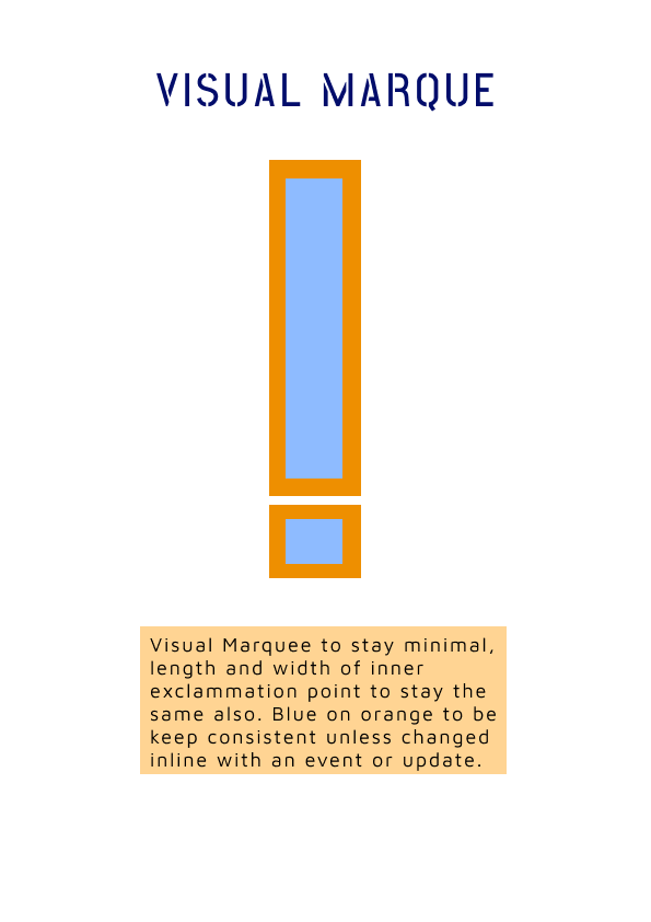
There were too many exclamation points in the original, where it become overcomplicated. So I make the monogram to the one without the visual marque, and only included the visual marque on the back and used a thin line to separate the content on the back. I think it looks a lot better from before as it doesn’t look as cluttered.


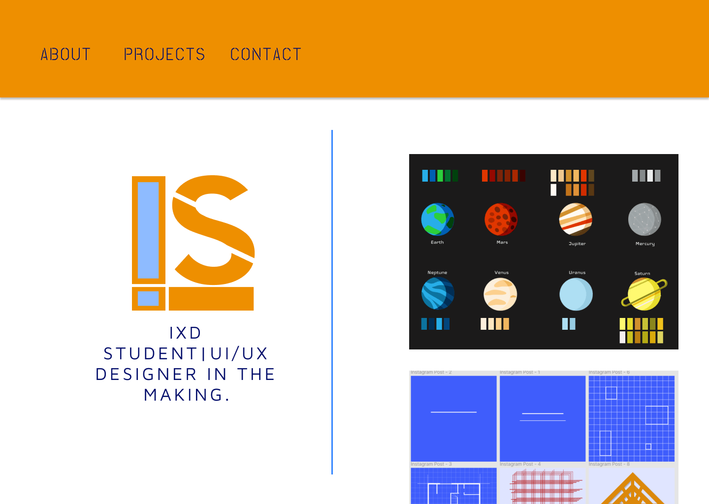
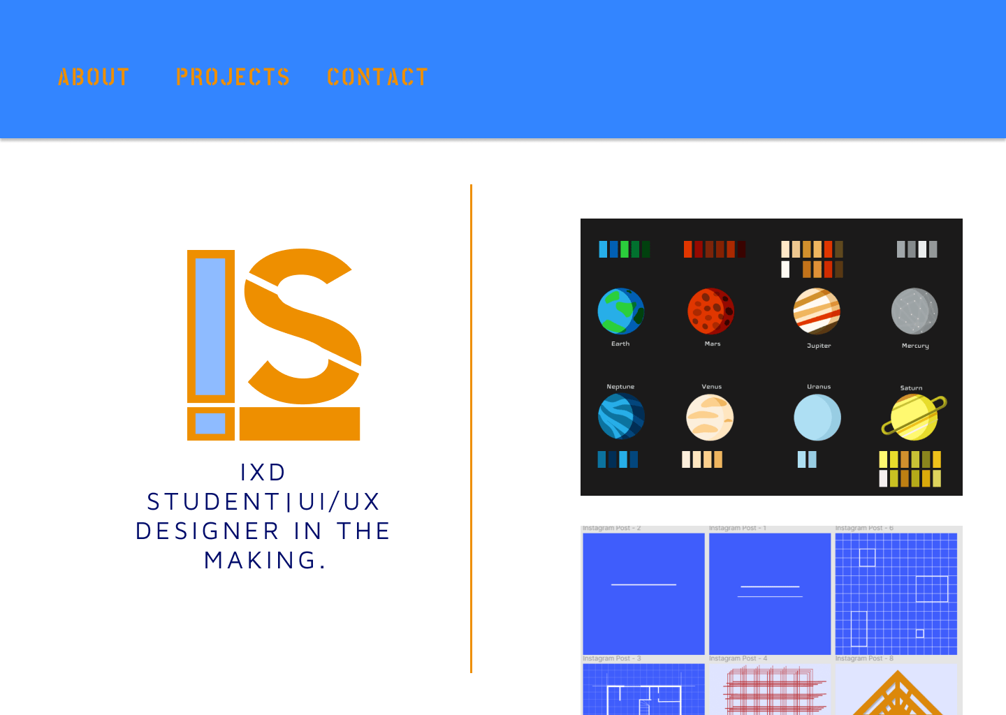
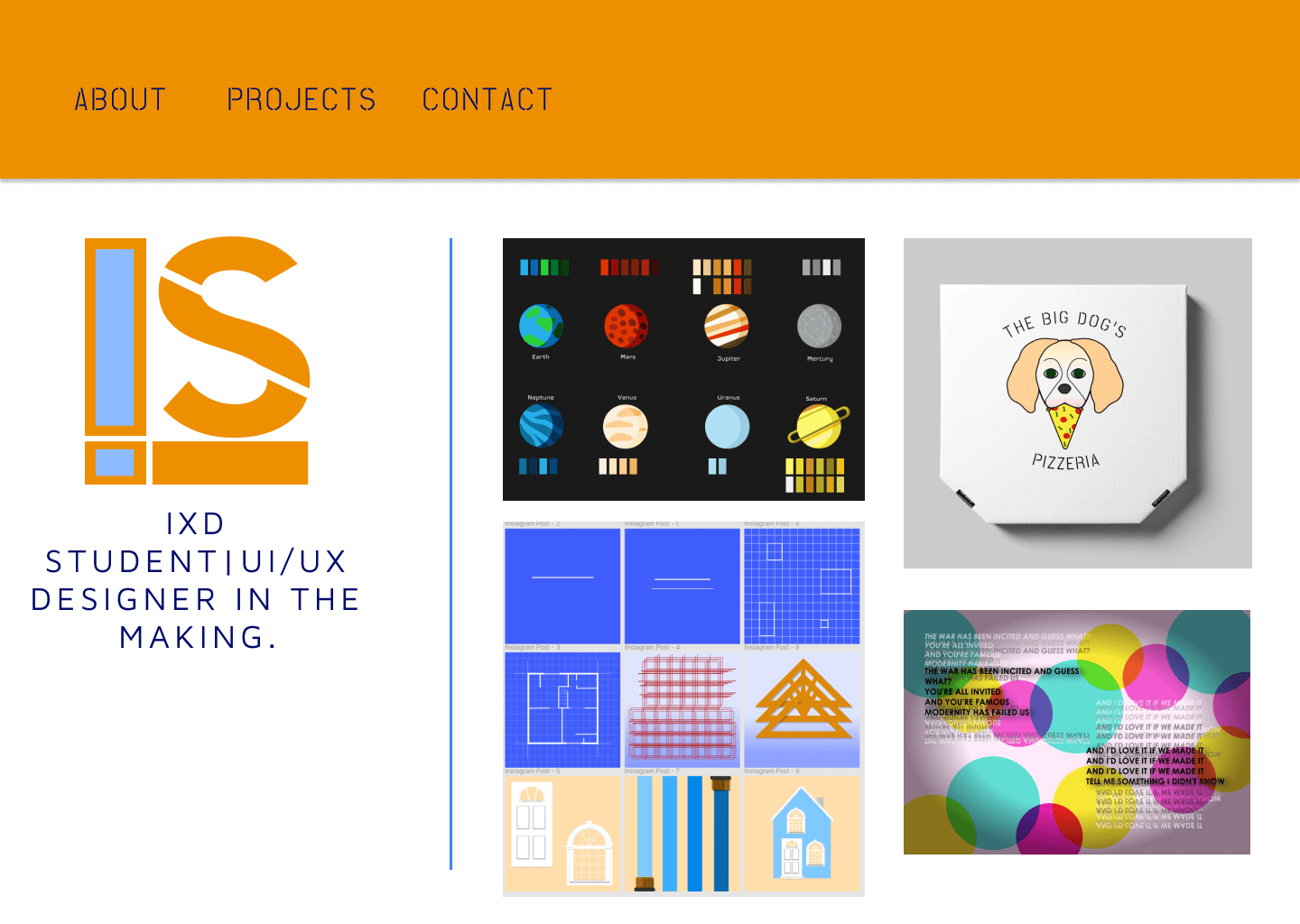
Portfolio Site Prototypes
I made my site more simple as suggested. I think it works better and gives my work more space without it being cluttered or boxed in. I think I will go with the third design as m final as I like the layout better. I like having more work showcased rather than have my monogram bigger.