
Work I uploaded for the group critique on Miro.
Included in the board;
- monogram
- wordmark
- primary type and secondary type
- visual marque
- colour consideration
- business card
- physical and digital touchpoint
- portfolio site mock up
- link to brand guidelines
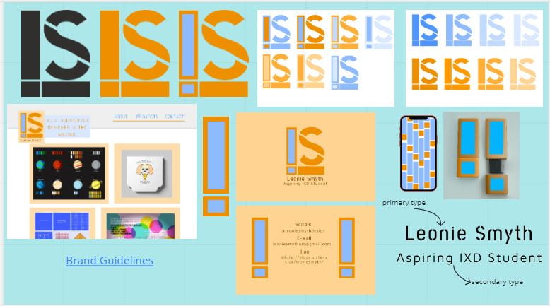


Tutor Feedback
- consider navy colour for text instead of dark orange (business card)
- first – orange second – light blue third – navy
- rule for brand guideline colours – 3
- business card – three exclamation points is too much
- revisit brand guidelines
- spread content out more (guidelines)
- revisit site design and wireframes
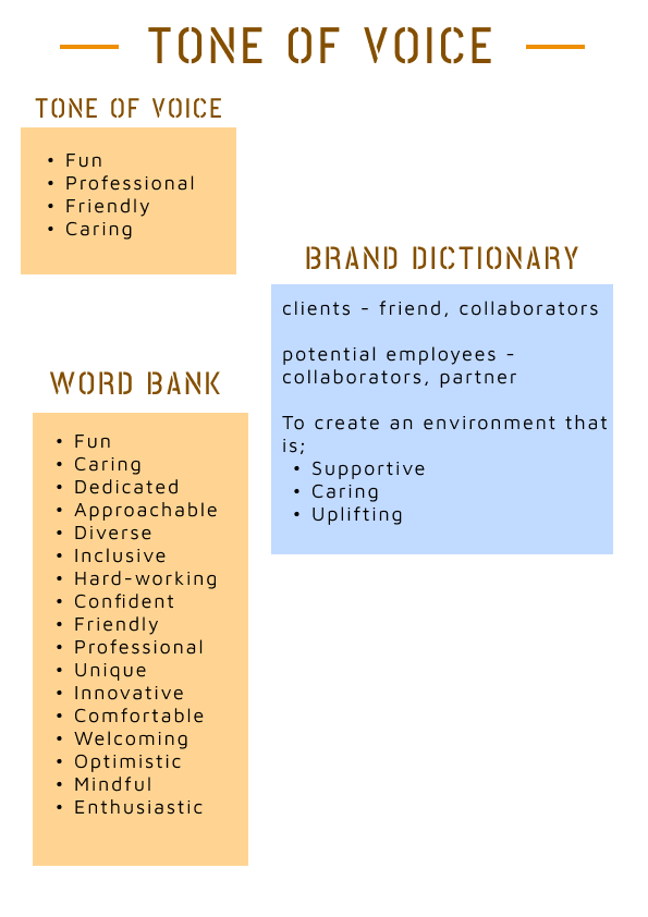
Peer Feedback

Self-Reflection
The critique went okay, I mostly agree with what was suggested. Moving forward I am going to look over my colour palette for text again and simplify the whole thing. This critique has really helped me see where I was going well and where I was going wrong. Mostly need to look over my business and brand guidelines, so this will be my most focused bits of work this week.