Week 06 Group Critique
Below is some notes left on my work from my peers during week 06’s critique.
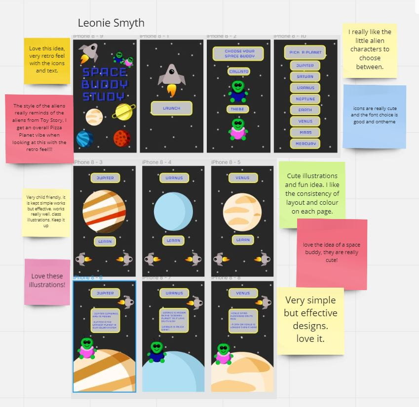
Tutor Critique
- Retro feel
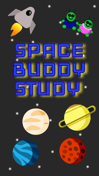
- Maybe make the logo a bit brighter as it gets lost against the black background
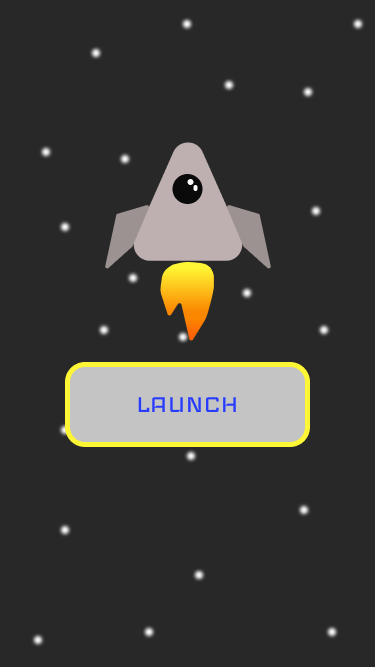
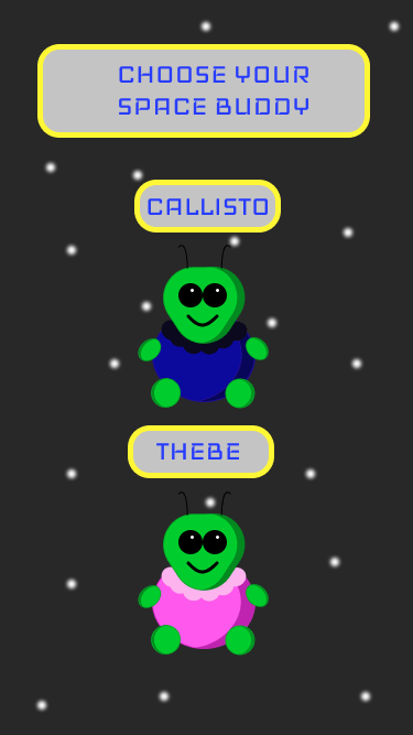
- launch and pick buddy look great
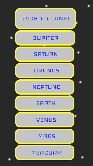
- ‘pick a planet’ maybe keep them the same width
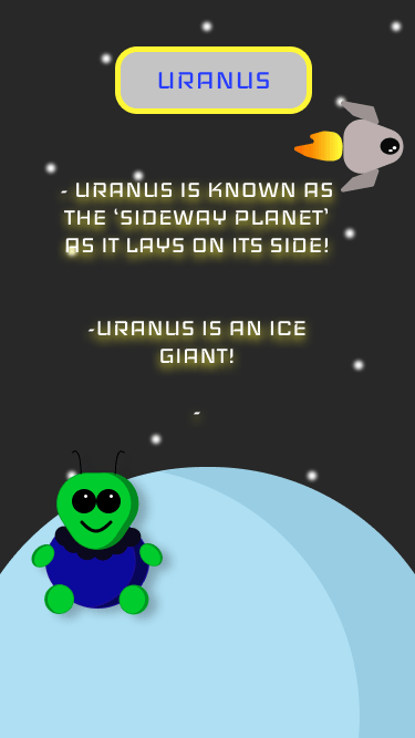
- Maybe add a tiny version of the characters next to each of the planet
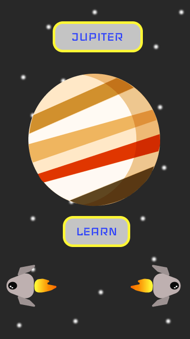
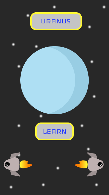
- With the planets, I love that you’ve done them all – lighter blue on the planet, and the red storm would be an important visual feature.
- The ‘back’ and ‘forward’ navigation is effective
- You could bring the character down on the planet to give more space for the text descriptors of the planet. Don’t go too much with boxing everything in, a little more detail and you’re pretty much there.
Design Revisits/Reflection
Below are my screens revisited after my critique. I agree with a lot said in my critique and I’m glad I made the changes suggested. Taking the text out of the boxes was a good change as it makes the text more legible and was probably the change that helped my app the most. Overall I am very happy with my critique as I found it helpful and constructive towards my final screens. I’m happy with how the final screens below work, I think the overall aesthetic and concept is consistent and well thought out.