Research
In week 9 we looked at portfolio sites and I learned a lot about why they are great to have as well as the approach I should take and things to consider when designing my own. You can see my reflection on that lecture here. This lecture gave me a good grounding but I would still have to do some further research.
I first decided to consult the big book I bought a the start of this semester; ‘Designing Brand Identity’ by Alina Wheeler, since it has a couple pages on Websites in its touchpoint section. Although I did learn a good bit about the development process of a brand’s website by a team, I feel that it’s not really all that applicable to developing a personal portfolio site.

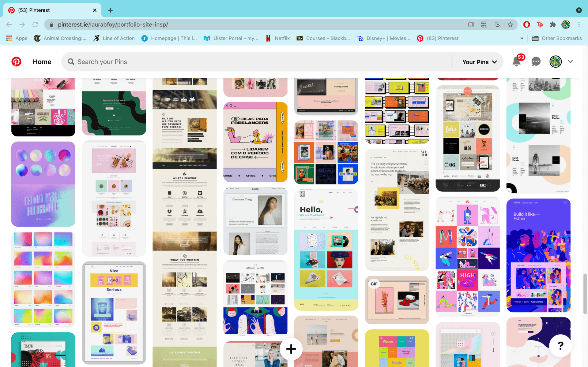
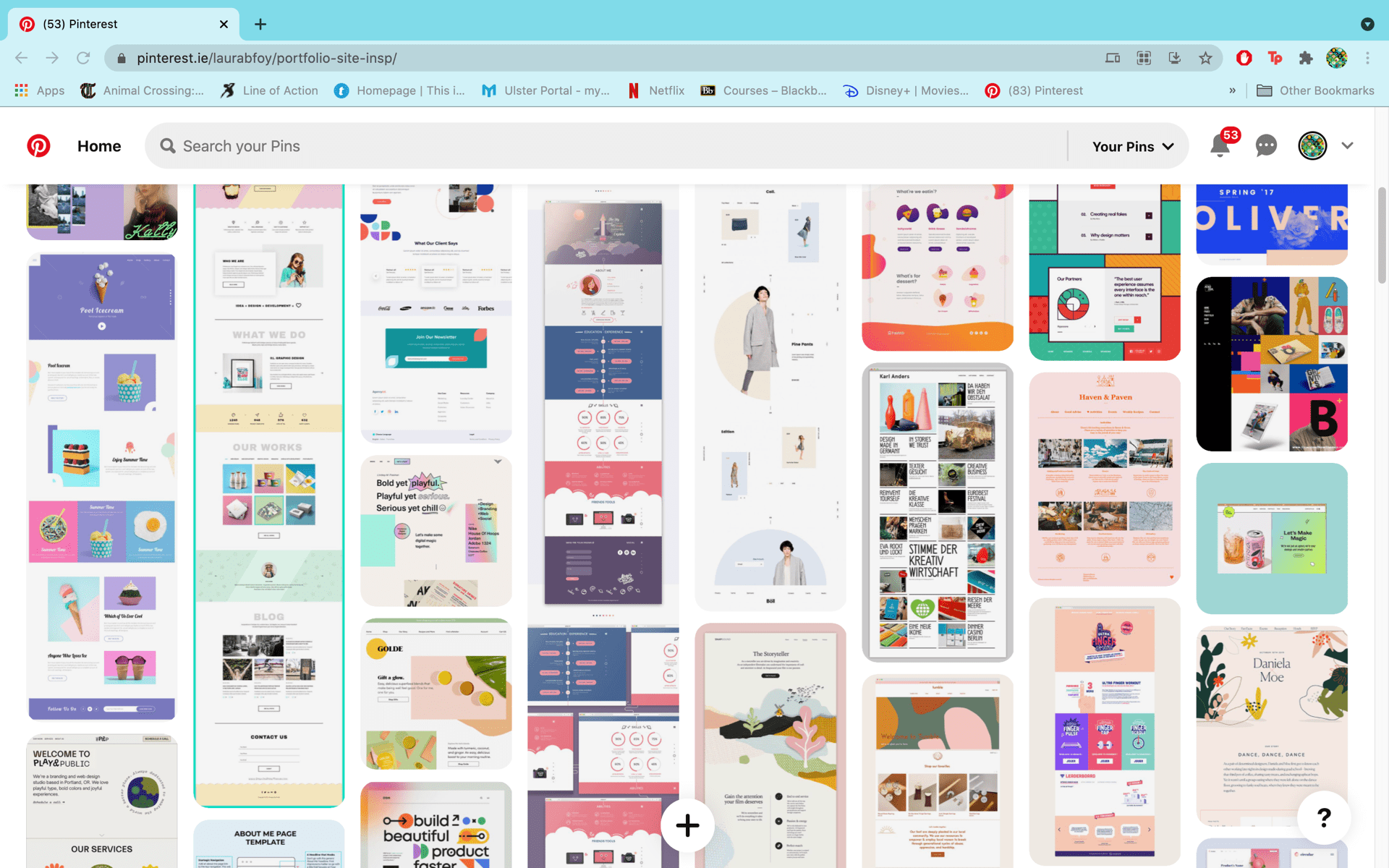
I then went on Pinterest to look for some inspiration. You can go here to see the board I made.
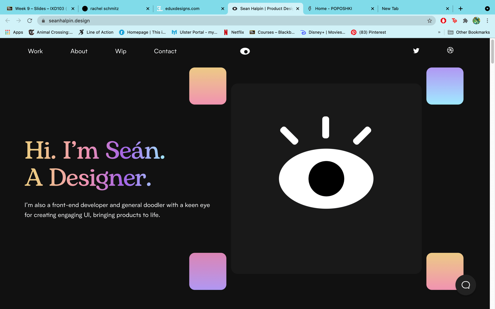
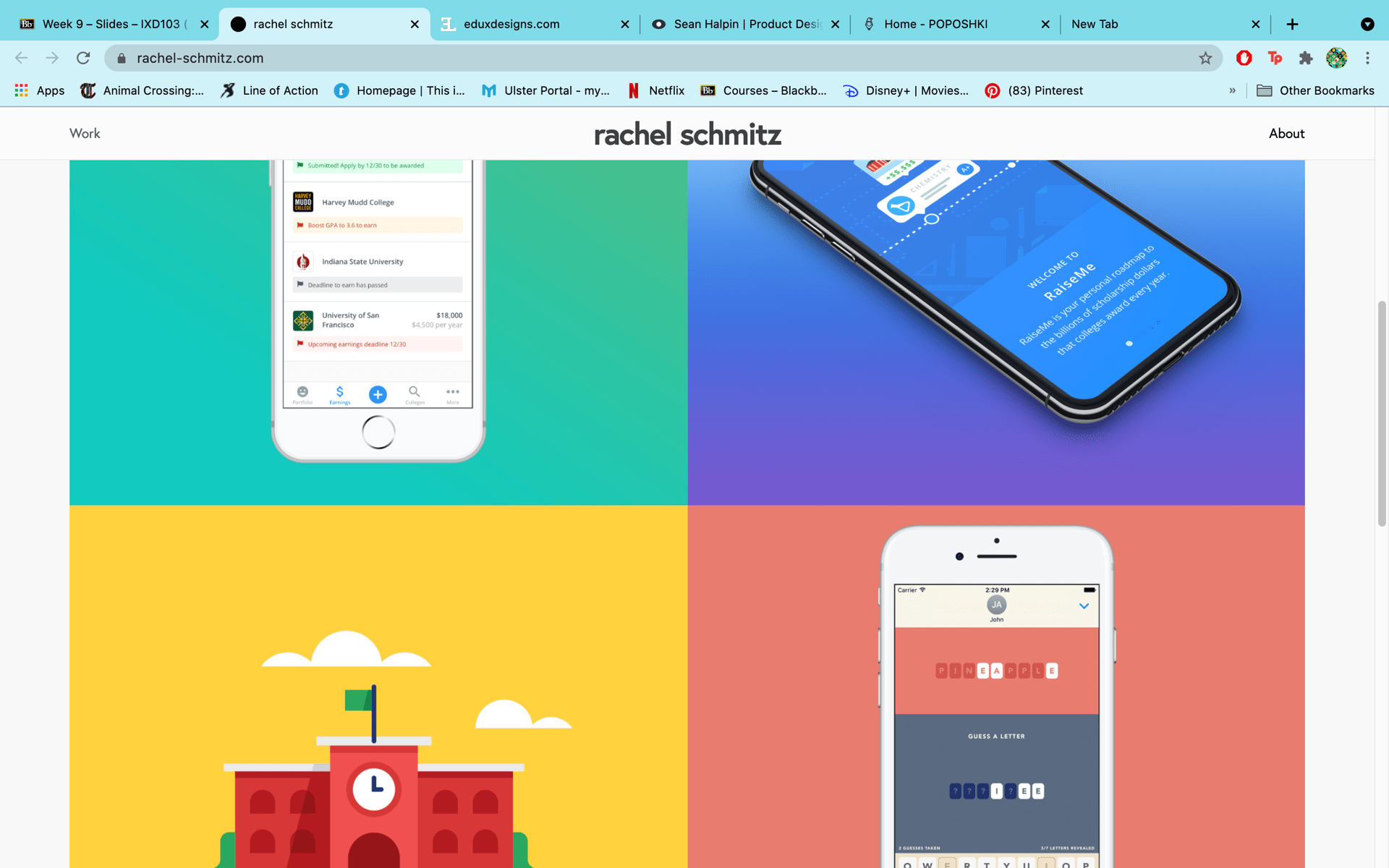
After that I looked at some real life examples like the portfolio sites of Sean Halpin, Poposhki, Edward Lim and Rachel Schmitz. The site that stood out to me the most was Sean Halpin’s as it leaves a really impactful first impression. Theres there’s animated eye that’s looking around and then it sort of zooms in on you which I found very striking. He also uses a really pretty iridescent looking gradient for the header type and these little curved cubes around the eye. I’m not sure if it’s just because my browser is in dark mode that the back ground is dark but having that iridescent gradient is very cool and striking. I also liked the footer and image layout of Poposhki’s and the colourful block of links in Rachel Schmitz’s.

Wire-framing and Prototyping
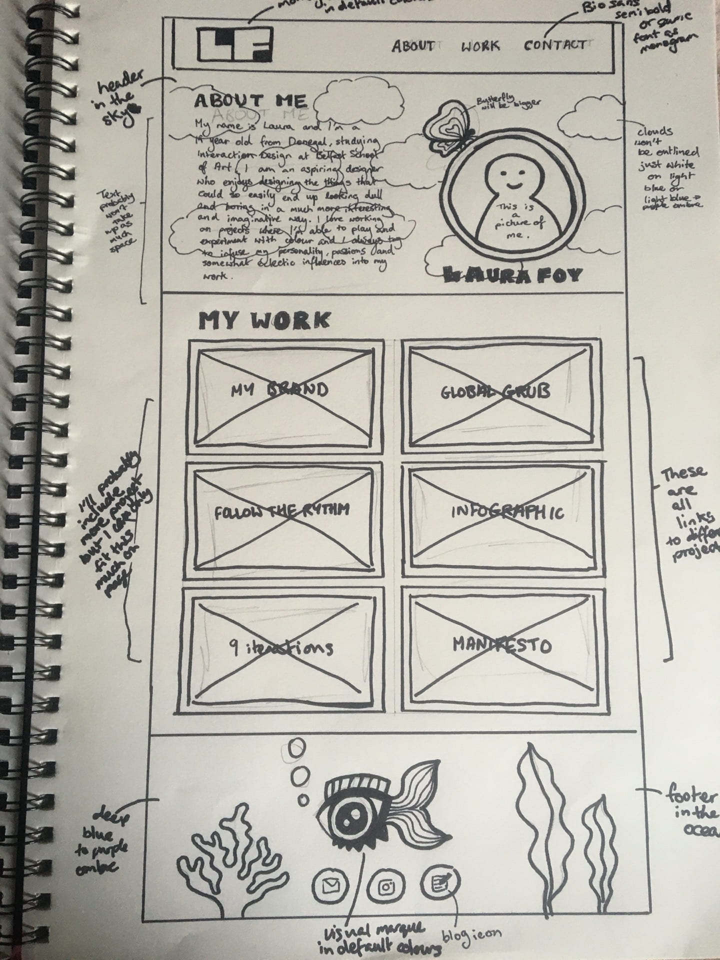
After I felt I had done enough research, I went and started wireframing. My initial idea was to give my portfolio site a fun and playful feel by having my about me section in the cloud with a butterfly and my footer under the sea with my eye-fish. I think I initially wanted to have a one page site where you could click on links to take you to specific projects or you could just keep scrolling through all of them.


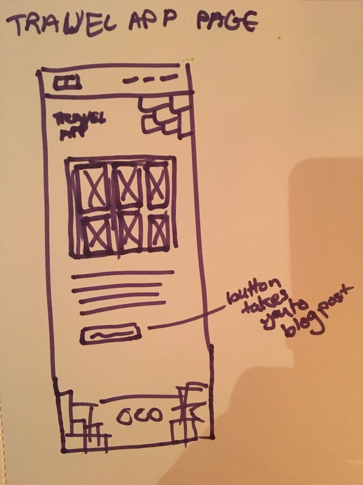
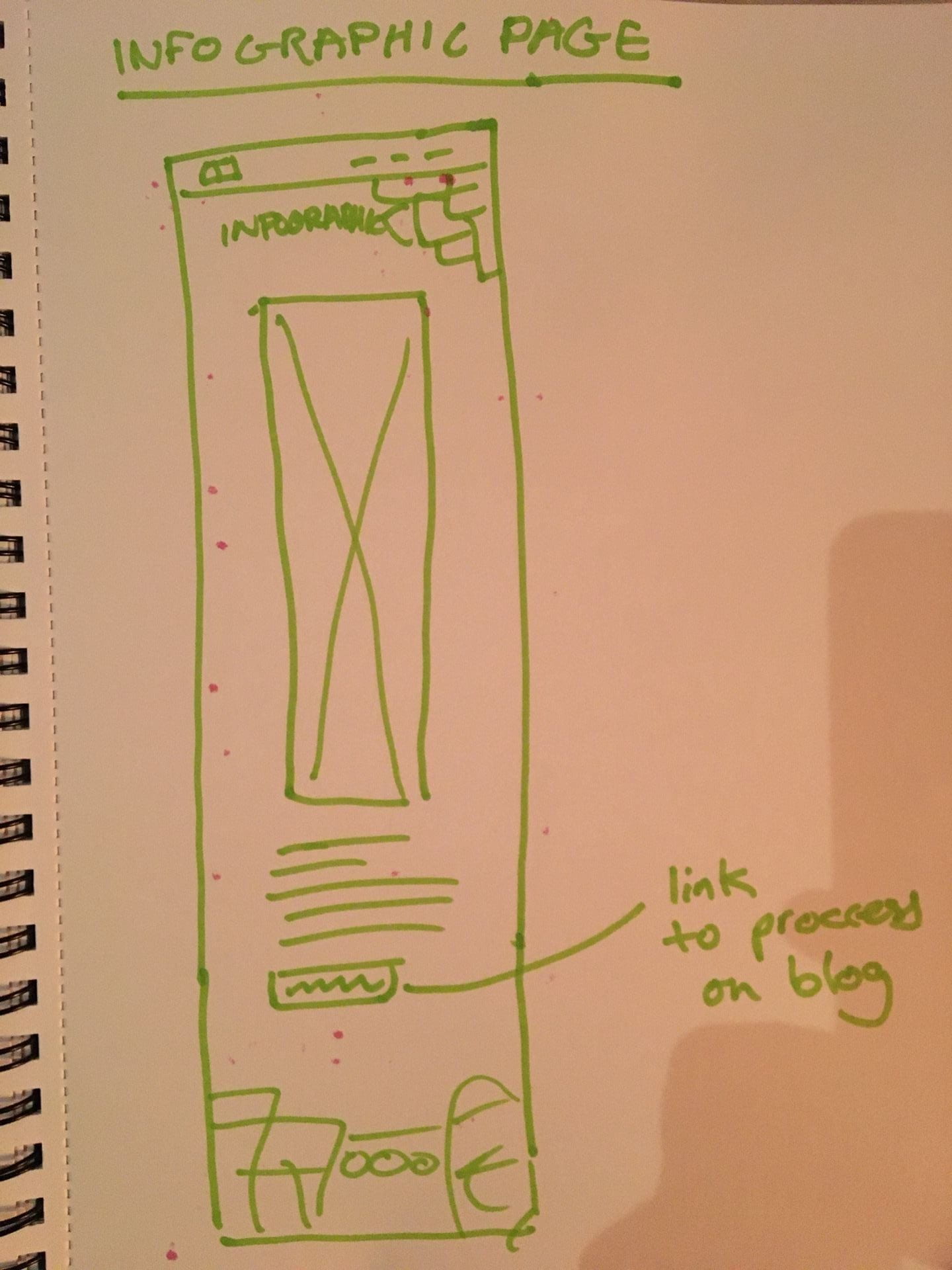
When it came to sketching a much larger and more detailed paper prototype, I decided to do away with that idea and go for a multi-page site instead with a quick overview of linked images on my homepage.
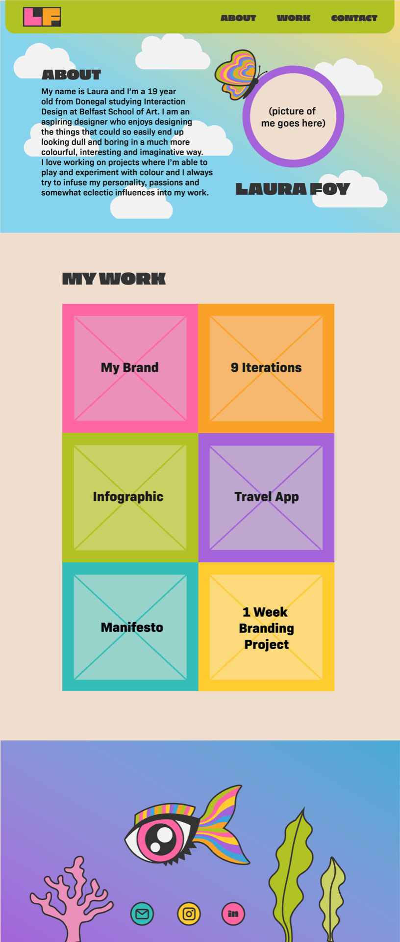
From this paper prototype I went and made a digital prototype in illustrator. I’d already established my brand colours so for this I spent some time changing those colours in, out and around to see where they’d work best and I landed on what you see below.
In week 11 we had group critiques of all our work to date and it was then that I received the general consensus that my site design had too much going on for a portfolio site. It’s meant to showcase my work after all, not be a piece of art work in its self. I kinda had a felt that it was a bit much but I took a chance, sometimes it pays off … this time it did not. It was almost like I was back to square.
Here are the critiques I got on Miro:

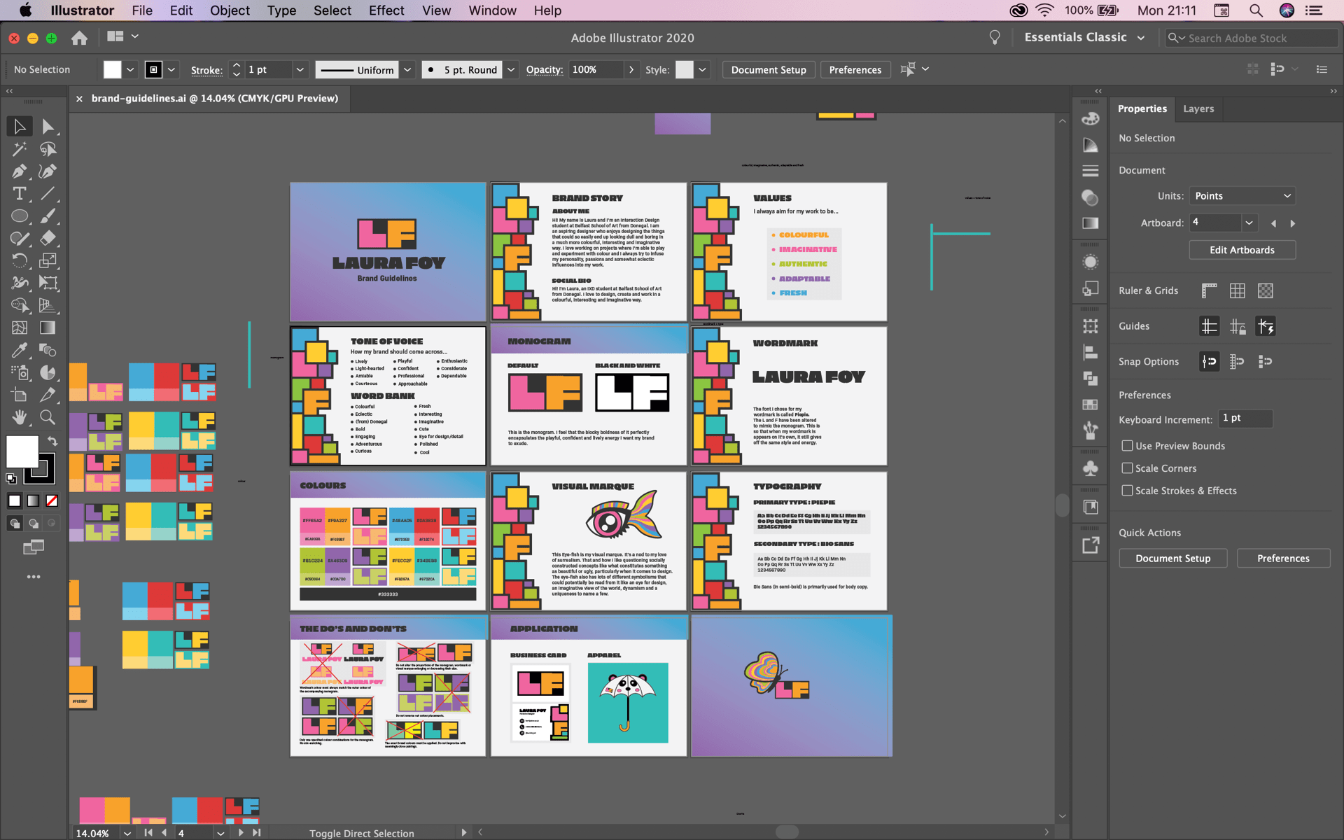
I was given the suggestion of redesigning it in similar style as my business card and brand guidelines. In retrospect, it’s insane to me that I didn’t consider doing that in the first place. I had a look at my brand guidelines and then did some quick wireframes.
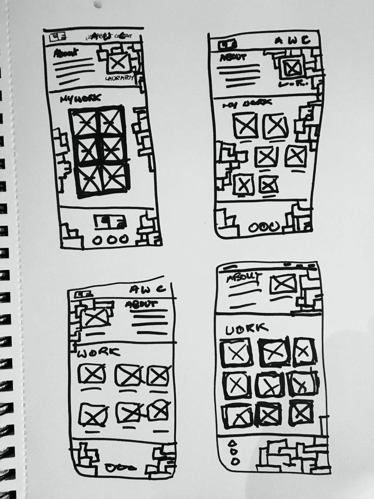
I then made a digital prototype.

Then after receiving some feed back I altered the layout. I also put in my imagery. I wanted each block that takes you to one of my projects to look like a sticker had been plastered on it and I think I achieved that. The picture I used is the same as my linkedin. I’m definitely going to change it as it doesn’t really go with my colours and just generally the overall vibe I’m going for, but it’s the only decently taken photo I have that’s been taken fairly recently. It’s a place holder till I take something better essentially.
Now that I had a home page it was time to plan out my content pages. I wanted my brand page to incorporate a little bit of that first concept so I put the fish in the footer and a butterfly struggling to hold my monogram upright.

I then went and digitised them too.

Coding
After doing all that prototyping, it was time to get to grips with coding. I used my portfolio sight from IXD101 as base so that the bulk of the work would be done and all I’d have to do then is skin it. Except I ended up changing and cutting out so much of the original that I wondered if it would have been easier just to start from scratch and copy and paste the bits I needed from the old one. Anyway, it wasn’t insanely difficult for the most part but it did take me way longer than it should have to figure out how to make my make my icons SVGs. I also found it quite frustrating just generally making things go exactly where I want them to. I ended up having to make some a compromise with the footer since I had no idea for the life of me how to get the footer to look the way it. does in my prototype. I enlisted help from my dad who’s good at this html/css stuff but he couldn’t figure it out either. I left it as it is now but I’m definitely gonna revisit it over the summer to see if I can figure it out.
Here is the link to my GitHub repo: https://github.com/LauraFoy/ixd103
My Portfolio Website
Here’s my website homepage link: https://laurafoy.github.io/ixd103/portfolio_home.html
And here’s my full prototype pdf: portfolio-full-prototype
Theres still much to do in terms of making it complete. I’m definitely going to continue working on coding the other pages and perfecting that home page over the summer. Overall though, I’m really pleased with what I’ve accomplished here. I think my portfolio site design reflects my brand really well, just like my brand guidelines, which would make sense because they’re in the same style.