Since I want my app to have a fun and playful feel to it, I thought I would try to incorporate cute faces into my icon designs.
Based on my initial sketches for my travel app I decided that I would include icons spread across the bottom of the screen for the five main sections of the app. These being a home icon, a location icon, a food related icon, a Wishlist icon and some sort of icon for planning.
Research
I had learned a lot about icon design from week 2’s lecture on the subject and felt more confident about developing my own after doing the master/apprentice tasks which I posted about here. I would still need to do a bit of research though before sketching out ideas.
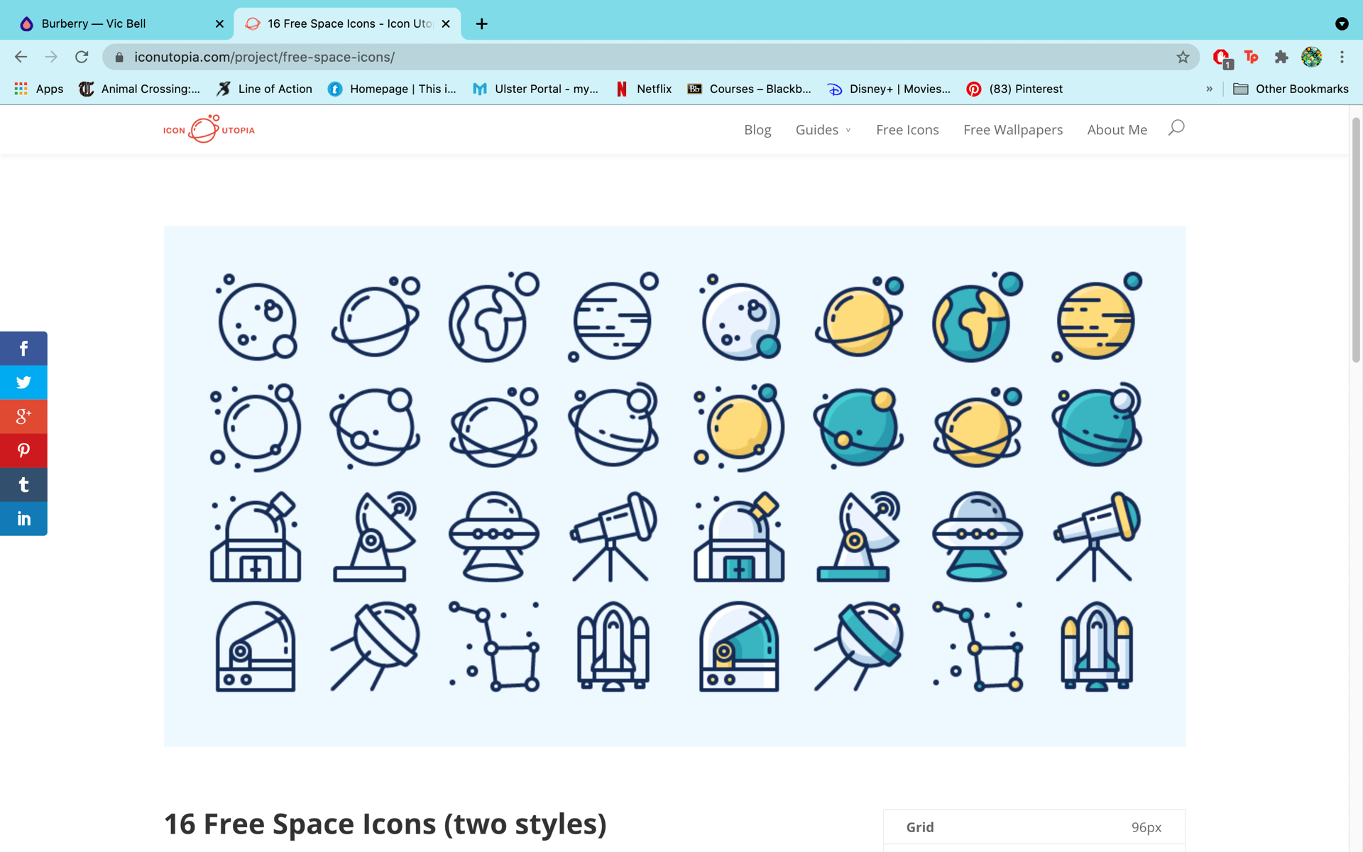
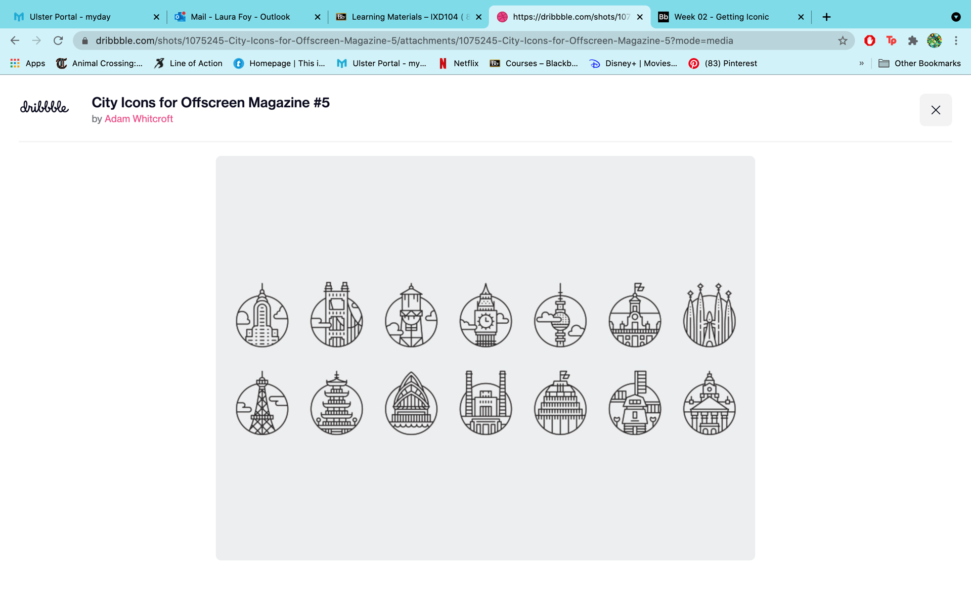
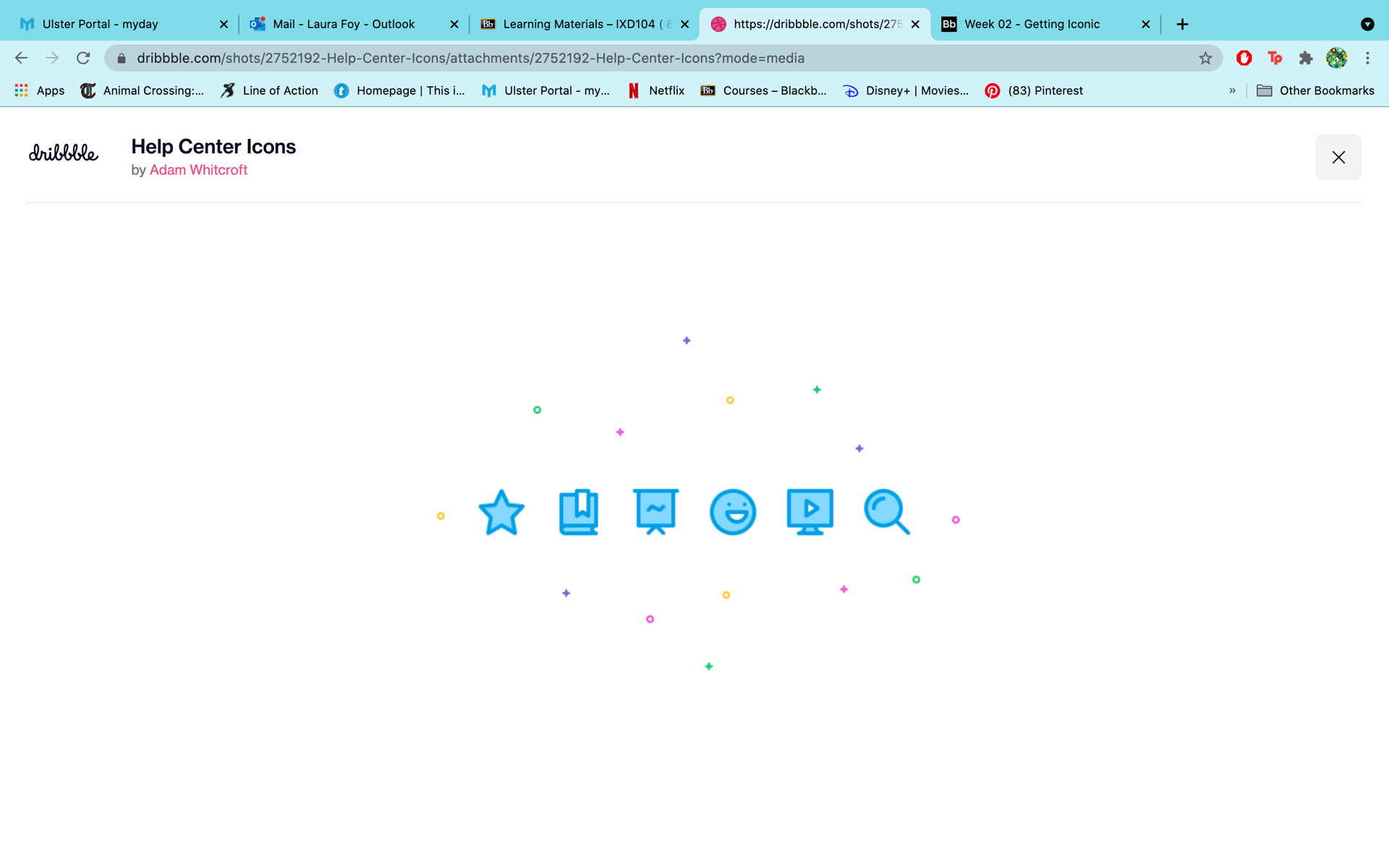
In that lecture we were given suggestions for designers’ iconography work to look at for inspiration so I went and looked at those. The icons designed by Vic Bell, Justas Galaburda and Adam Whitcrott stood out to me the most and I got a lot of inspiration from them. I found it really benificially looking at the guidelines Vic Bell put with here icons as it gave me a good insight into what I should consider when designing my icons.

I then started to make a Pinterest board of different icon sets and cute, cartoony faces which you can find here. I got a great deal of inspiration from this board.

Sketching Out My Ideas
After I felt I had found enough inspiration, I began to sketch out ideas.

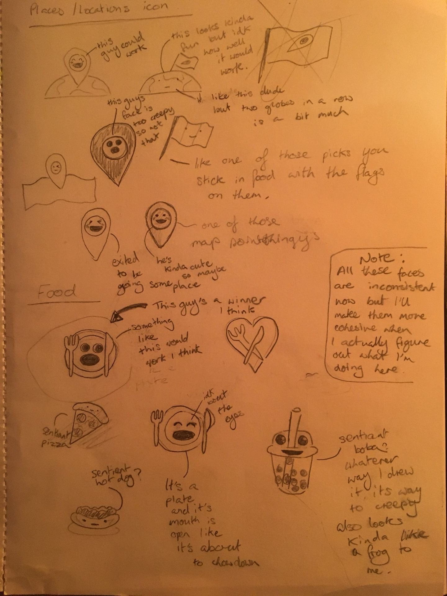

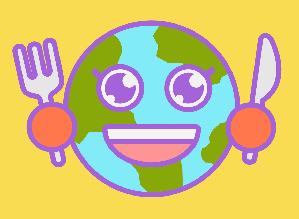
It was surprisingly difficult trying to get their faces to not look creepy but anyway, now I had figured out what my icons were for and what they would look like. I initially thought of using the earth as the home icon but then later realised that having a house shaped icon would be more identifiable and just makes more sense for that screen. I’m planning on keeping the globe guy as a sort of mascot on the load/start screen of the app though.
After week 4’s lecture I decided to try Paul’s suggestion of using a sharpie for sketching since I had one on hand. This was supposed get me to draw bigger and more confidently which I’m pretty sure it did successfully. Since I’m not at a place for finalising my wireframes just yet I decided to try sketching out my icon designs this way. Here’s the results of that…
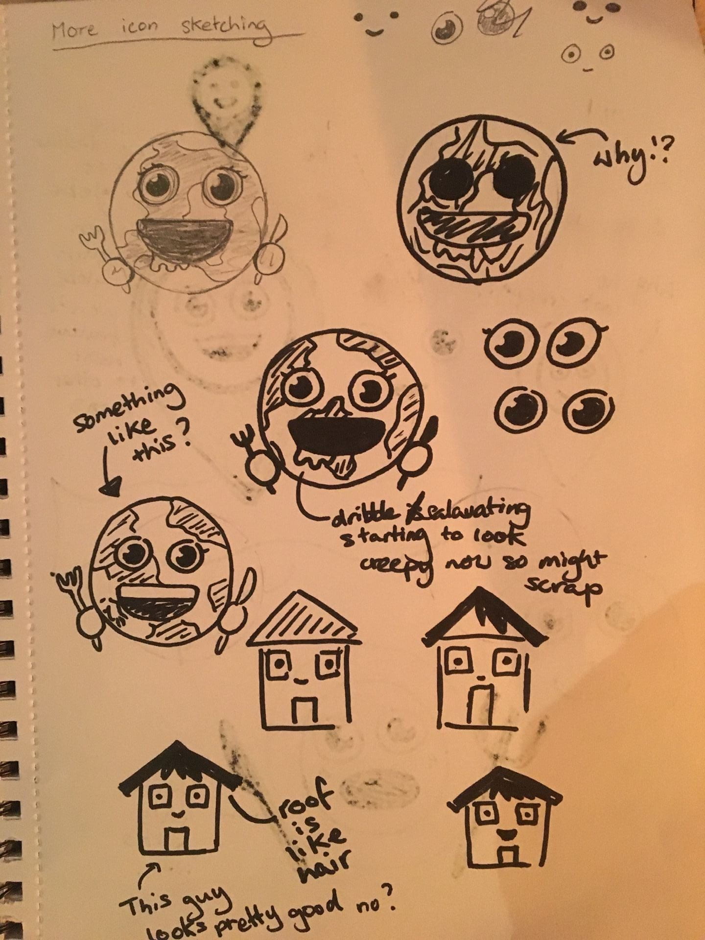
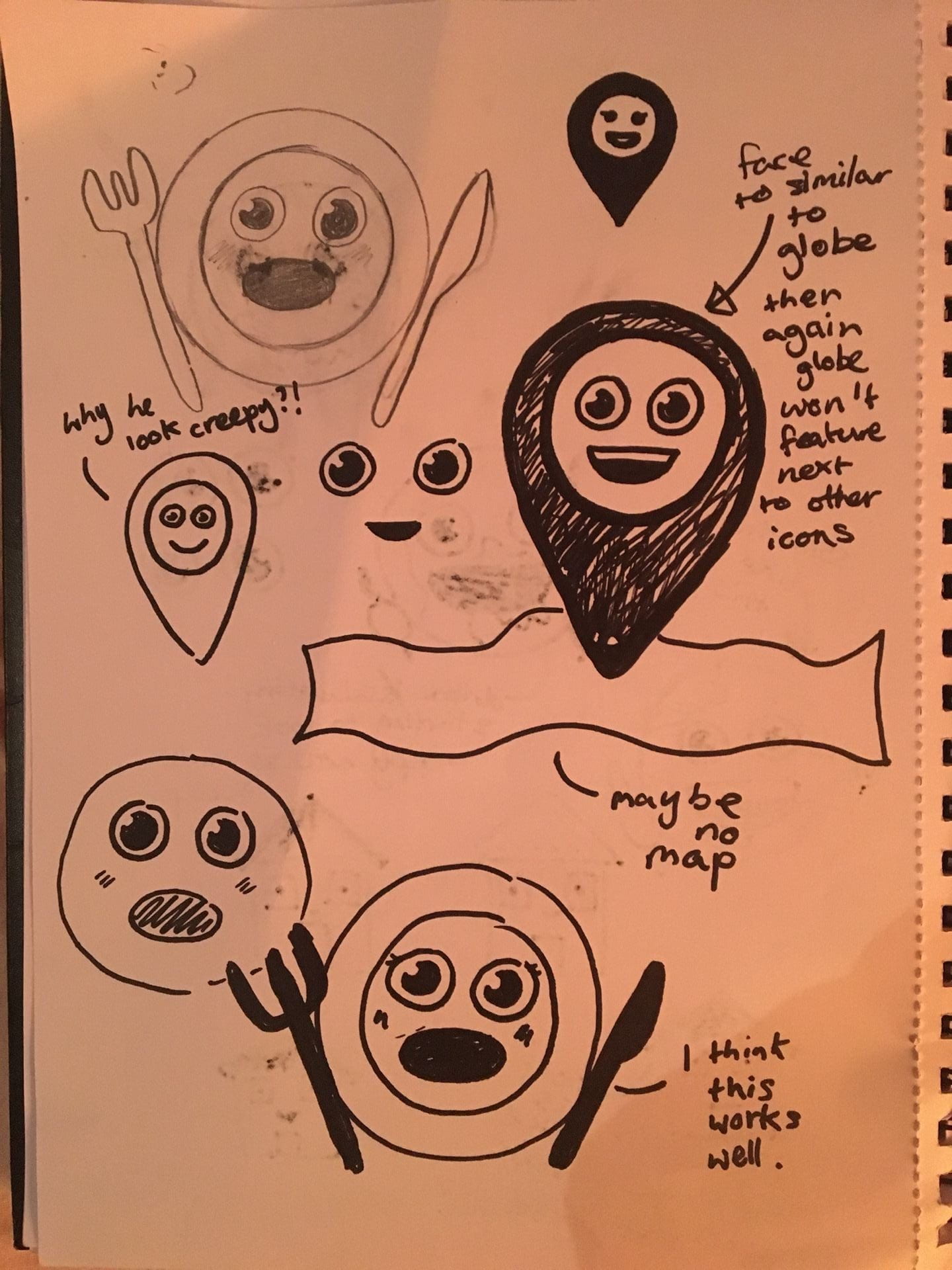
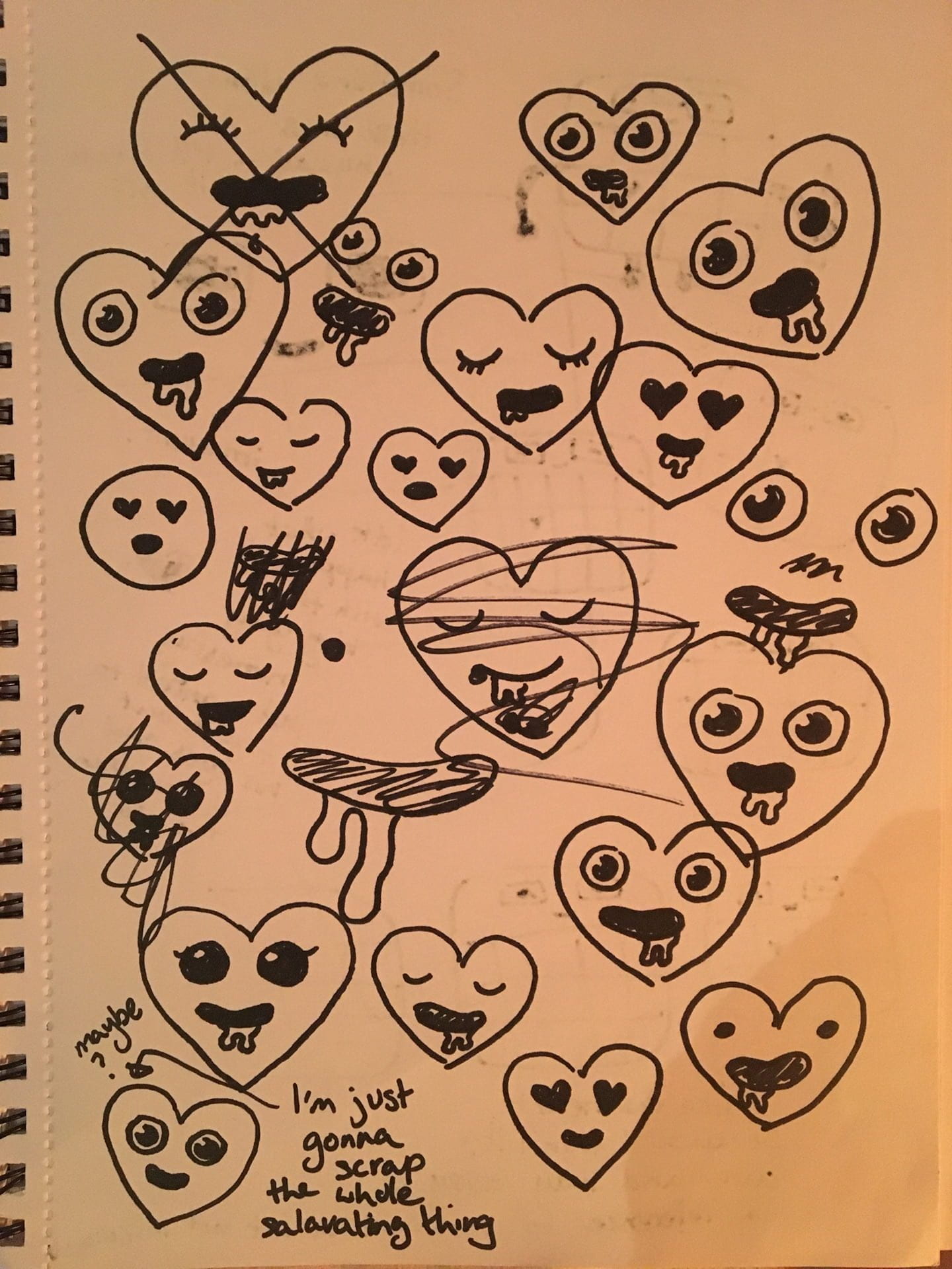

These sketches are admittedly quite messy but from this I figured out a home icon design and also very importantly, to scrap the salivating as I can’t get the heart icon not to not look creepy with it. I’m hoping to digitise these soon but before I can do that I’ll need to finalise my wireframes and the apps overall colour scheme.
Digitising My Icons
While developing my first 3 screens (Which I’ll have a separate post about), I digitised my icons. In this process there were things I realised I would have to take out, tweak or simplify like how the eyes aren’t googly and the heart is no longer drooling because no.1: it was really hard to shape right and no.2 : it was a bit too creepy as I mentioned that earlier. Instead I opted for a cute lil’ smiley face.

I also digitised the hungry globe, which I’ve given the name “Earthling”, for the launch screen and I think it turned out really fun, playful and cute looking; exactly how I wanted it to.