One of our tasks for this week was to begin our research for our portfolio sites. This will help me to better understand what works well in a successful portfolio, and how to come about making something that employers will like. On the other hand, it will also help me to better understand what I don’t want for my own portfolio, and what things to take into consideration when planning out my design.
During this task, I will look into the portfolios of existing designers, and explain what I like and what I don’t like about their sites.
Stephen Calvillo Design


What I like about their portfolio:
I really like their use of the black and white theme, as this is something I want to incorporate into my own portfolio. The thick, white text goes really well against the plain black background, and then the opposite way when they are talking about their work. There is an overall theme of contrast throughout this site that I’m really drawn to. It all feels very bold and striking, and their use of negative space is something I admire.
What I don’t like about their portfolio:
There are a few things I would change about this portfolio, such as the font choices, particularly in the parts where they are discussing their work. To me, it feels more like they are showing us a piece of typewritten paper, which may be what they were going for but personally I’m not a fan of it. Another thing that I would change about this portfolio is that, when you scroll down the page, sometimes the body text can overlap the text in the sticky navigation bar, which makes it impossible to read. This distracted me from the text, which I feel would be a disadvantage to employers.
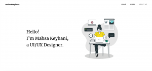
Mahsa Keyhani
What I liked about their portfolio:
I really loved looking through this portfolio – the sleek, minimal designs are always something I have loved in UX design. There is an effortlessness that comes with minimalism, while although it is not easy to create, it looks like the creator has done it with such ease. I really like this designer’s use of fonts to portray the difference between headers and paragraphs.

There was also a really nice detail I liked on their home page – when you hovered over their name in the main header, it changed to blue. I really liked that little detail, as it isn’t something you would notice unless you ran your curser over that area. It wasn’t linked to anything, it was just a small design choice which works so well.
What I didn’t like about their portfolio:
There wasn’t much I could see about this portfolio that I disliked, as the more I explored the more I felt inspired. The one thing I would say is that there wasn’t a lot of information on the home page, whether it was about the designer or the work they were showcasing. Most of the stuff on the home page was just links and titles, and I feel a bit more information may have been better.
To expand my research further, I also began building a pinterest board around portfolio designs, and little attributes I wanted to include in my own portfolio. I have found pinterest to be very helpful for me in the past in terms of gathering a large amount of ideas to look back on.

Link to my pinterest board: https://www.pinterest.co.uk/jessicadonnan/portfolio/
What makes a good portfolio?
After researching a variety of existing portfolio examples, I came up with a brief list of different qualities that all my favourite portfolios seemed to possess, and what employers will be looking for when they see mine:
- conveys your branding identity and personality
- easy to navigate and follow
- should showcase your ability of work well
- should also showcase your process > design
User Consideration
I need to also think about who will be looking at my portfolio.
- Potential employers will be wanting to see what work I am capable of, and get a feel for who I am as a person and designer.
- Professional designers and competitors will want to see my work.
- Students will also want to view my work in order to gain inspiration or to see how they are competing against.