During Monday’s lecture, we explored the use of typography and colour, and how both can be used effectively in projects. We also carried out a few typography exercises, which I have posted in my next blog post.
Typography
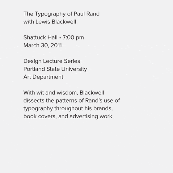
Typography is the most important aspect of web design, as it is said to make up 95% of it. Therefor, it is extremely important to be able to understand it and its elements. We looked at the key elements of typography,
“Today we are inundated with such an immense flood of printed matter that the value of the individual work has depreciated, for our harassed contemporaries simply cannot take everything that is printed today. It is the typographer’s task to divide up and organise and interpret this mass of printed matter in such a way that the reader will have a good chance of finding what is of interest to him.” – Emil Ruder, 1969
This quote is a great example of how web design is used today. It is the job of a web designer to divide up information and organise it in such a way that it can be easily read by the user.
Typography Hierarchy
We were asked to take a look at a post on typography, this one being titled Typography Hierarchy by Frank Chimero, where the use of typography in web design using markup is investigated.
“On the web, a large chunk of our content is text. This means it’s important to understand how to reinforce this hierarchy typographically. A clear understanding of hierarchy results in more beautiful, meaningful, and communicative designs that better serve their audience.”
On the post, he slowly begins to add more and more typographic elements to a piece of text, in order to achieve a hierarchy of text, and you can view the process behind his thoughts and design ideas.
This is what the piece of text begins as:

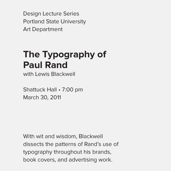
He then divides it into logical groups, to add some clarity to the text.
He then highlights the most important part of the text, and adds a new type size to show the reader where to begin reading.
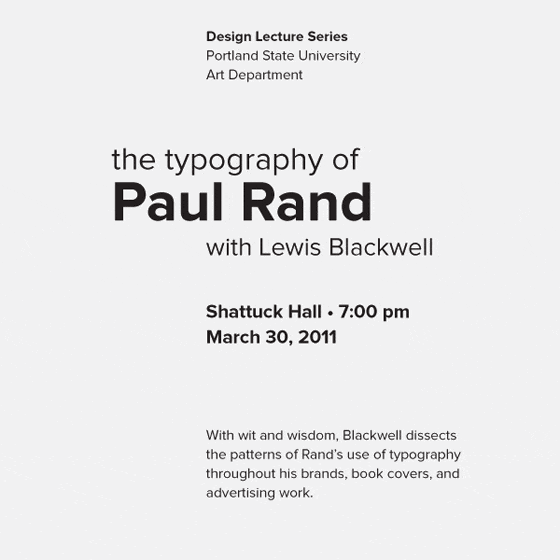
He then adds some variety by changing the alignment and spacing of certain words. Weight and size are used to emphasise the most important content, and put less emphasis on the less important content.
I think this post was a very helpful resource for learning about typography, as I feel I know much more about the simplicity that size and weight has on emphasising words in a body of text. I will be able to use what I have learned from this post in all my future projects.
Colour
We also looked into the use of colour in web design, and how it can be used to highlight information that otherwise might be overshadowed or lost. Colour can be used to alert us to things we might otherwise be unaware of, such as the theme or message behind a certain piece of text. We looked into the work of designers such as Josef Müller Brockmann, Josef Albers and Muir McNeil, who use colour as a main means of communication in their work. It was insightful to see what they could do with their use of colour, and how it completely changed the message of the piece.
Reflection
Having always slightly struggled with colour in my pieces, I have found this lesson extremely helpful in finding resources and ideas that will help me in the future. I can use these resources in the development of my current projects, as well as any impending ones that will come up soon. I can also refer to the research on typography hierarchy to help me when I am making use of text in my piece, which will make my work easier to read and understand.