Non-Specific Task
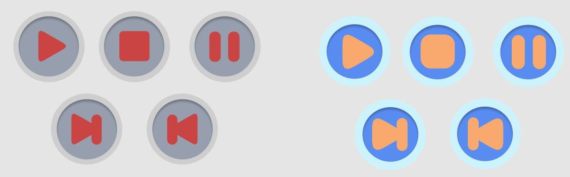
For this task we were asked by Paul to create a play, pause, stop, forward and backwards button on Figma through the select use of shapes. For the outer circle I decreased the opacity, the inner circle I added a gradient and used basic shapes such as squares, triangles, etc. for the icons. I smoothened the edges of the shapes to create a more inviting environment. Paul then asked us to create the icons with kids in mind (left). I softened and enlarged the shapes to give it a more playful look. I also changed the colour to a more vibrant tone.
Week 1
The point, line and plane system is the elemental foundation of design. Digital and native artists use these elements to create various images, icons, textures, patterns, diagrams, animations and typographic systems.
These elements can be used in its most basic form to create sophisticated designs through the work of scale, shade, colour, frequency and transparency.
The use of points is found everywhere in the online age, including branding, art, data, etc. Its simple yet sophisticated design allows people to easily understand and interpret the visual representation.These elements can be used in its most basic form to create sophisticated designs through the work of scale, shade, colour, frequency and transparency.
The foundation of a point is in itself is very simplistic and many people come to terms that a single point may not relate to anything visually/artistically pleasurable. However, they can be used for very modern graphical designs.
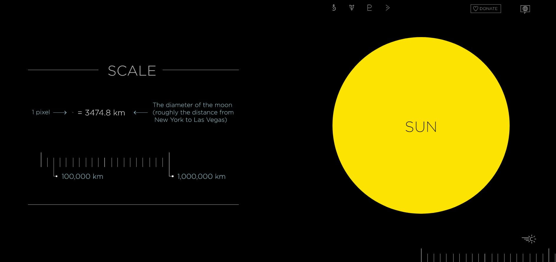
Looking at Josh Worth’s “If The Moon were Only 1 Pixel”, it showcases the design of using a point to indicate planets/sun of our solar system. Josh uses scale (3480 km = 1 pixel) and colour to differentiate each point.
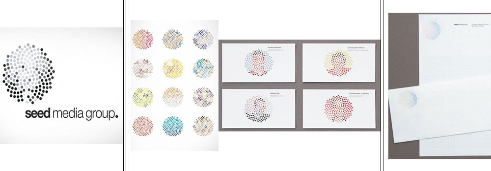
Something as simple as a collective group of points can instigate an identity and meaning seen in the logos below:

Task – Points
For my first task, I was asked to create a 3×3 grid. I was then told to experiment and make something from each column. However, as the columns went down the points got more numerous allowing me to add a more detailed illustration.
Row 1: 2 points
Row 2: 3 points
Row 3: 5 Points
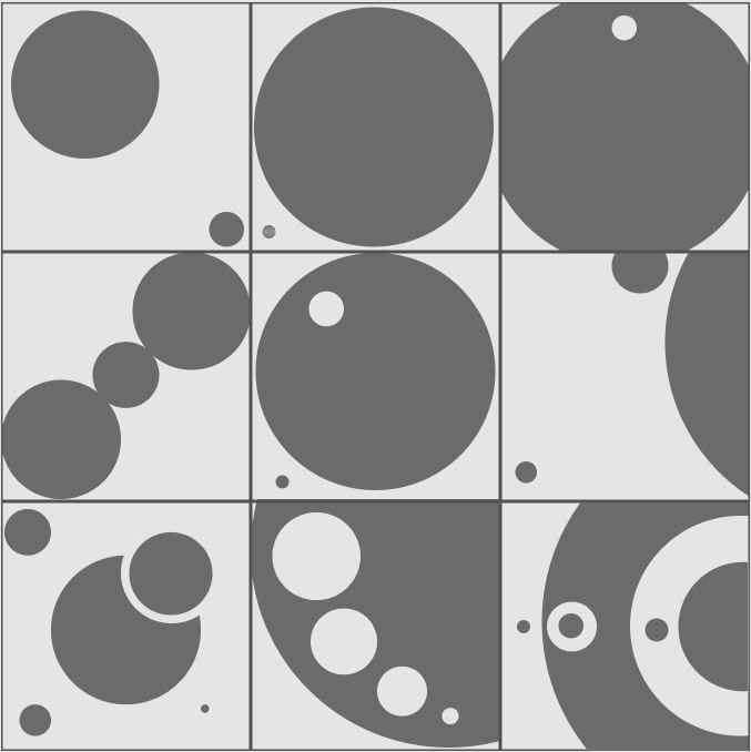
On this task I decided to play with scale. I opposed the sizing of each point to give depth to the points creating a unique and unlawful comparison. On half of the grid I experimented on asymmetrical placement, often interjecting and inverting into each point as the points became more frequent.
My theme for this task was to mimic the universe. For example, on the last grid it can create a perceived look of our solar system, the middle point being the sun and the point in the ‘outer shell’ being earth inside the habitual zone.
Line

HP was a company that shifted its logo to a more ‘futuristic’ design to show changing times. This made the logo 4 slashes at a 13 degree tilt. While HP’s logo was already barebones it comes to the common notion that “less is more”. The story behind the tilt represents HP’s international spirit as a company, with its belief in human progress. Showing that a good design must b

Task – Lines
Row 1: 2 lines
Row 2: 3 lines
Row 3: 5 lines
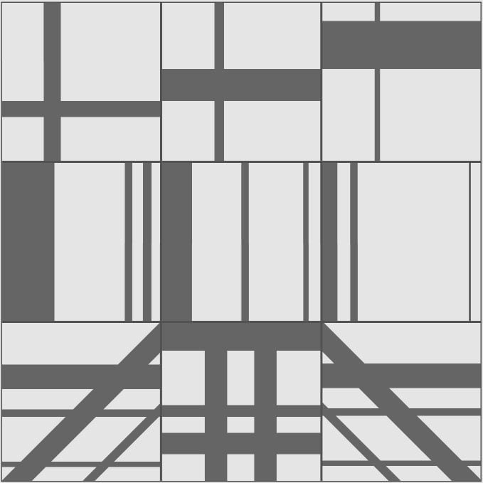
For the line task I started off simple in the first row playing with the width of each line. From left to right I increased the horizontal line while decreasing the vertical line. For the second row I played with positioning and width of the lines. Finally, the third I created continuity and symmetry among each box allowing lines from each to connect to each other.
Plane
Josef Müller-Brockmann


Wim Crouwel
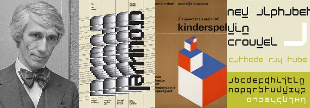
Blanka Posters
Task – Planes
Row 1: 9 Planes
Row 2: 9 Planes
Row 3: 9 Planes
 For the Plane task, I was quickly becoming familiar on how to use Figma. Like the other two the gridded tasks this was a 3×3 only this time each box contained 9 planes. This task allowed me to play with tones, scale and shapes. For the top I created an symmetric pattern across the entire row with the middle box being the centre and outers opposed to each other, I managed to do this by using a simple 3×3 boxed grid and mutable tones variation. The second row I created a systematic pattern with top half of each box getting broader and the bottom becoming smaller. Finally, on the bottom row I did the same as the top only making the patterns more sophisticated and using multiple shade variants.