Definition – What is a typeface Specimen?
A typeface specimen refers to a presentation of a typeface (writing style) which displays random characters from that typeface on a canvas in an artistic flair to showcase its design and/or use in an unique and modern way. It is usually used in media such as magazines, newspapers, websites or even movies.
A Brief Contextual History of Typeface
Typeface has been around for hundreds of years starting with the invention of movable typefaces by Johannes Gutenberg during the mid-15th century. This gave the world a more portable and cheaper way to obtain written word. Until this point, all written material were painstakingly handcrafted which decreased output and made written material more valuable and scarce. He also made the first typeface named ‘blackletter’. It was bold, medieval and intense.
Timeline of Typefaces & Writing Styles:
- 1470 – Roman type – Nicolas Jenson
Inspired by the written text on ancient roman buildings, it replaced the original blackletter typeface and presented an easier to read typeface.
- 1501 – Italics – Aldus Manutius
Created to fit more words onto a page thus saving money in printing. Today italics is used for a design detail or for emphasis when writing.
- 1734 – ‘Old Style’ – William Caslon
Created a new typeface which contains straighter serifs with more depth in the thin and bold strokes.
- 1816 – Sans Serifs – William Caslon IV
At this time William created the first typeface without any serifs. This was the beginning of the Sans Serif typefaces, advertisers were starting to pick this font up for its balanced proportions making it easy to read.
- 1957 – Helvetica – Max Miedinger
One of the most liked typefaces of present. It gave a minimalistic and simple typeface promoting similar typefaces such as Futura which arrived around this time period.
Project – Typeface Specimen
The project which I have been given involves creating a typeface specimen for an iPad from the following 6 fonts:
Times New Roman
Gill Sans
Helvetica
Baskerville
Palatino
Futura
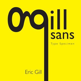
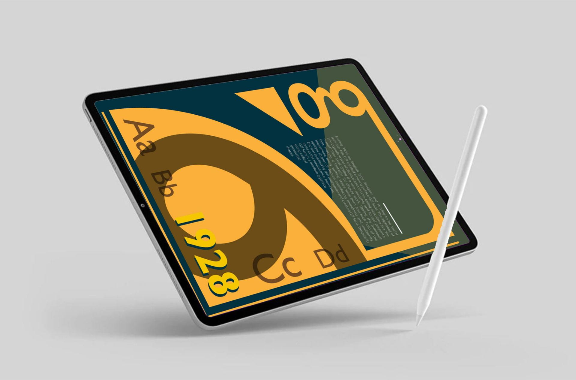
My chosen typeface is Gill Sans as the the radical proportions and the simplicity appeal to me. I also love the double story lowercase ‘g’.
Unique Characteristics of Gill Sans
- Strokes are a consistent thickness, e.g. the letter ‘O’ is a perfect circle
- Simple, eye catching and easy to read.
- It’s famous double story lowercase ‘g’
- Eric’s unique flair on letters ‘r’, ‘a’, ‘t’, ‘Q’ & ‘J’
- Small X height compared to other san serif typefaces.
History
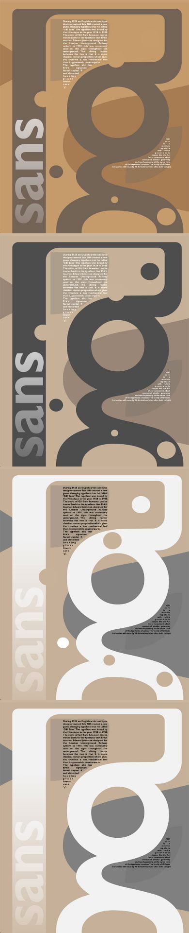
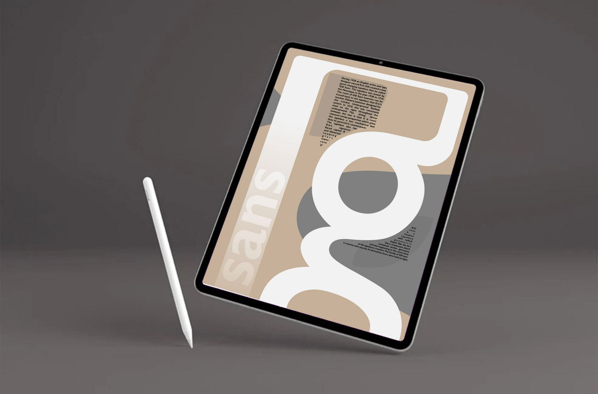
During 1928 an English artist and type designer named Eric Gill created a new typeface that he called Gill Sans, it was issued by Monotype from 1928 – ’30.

The roots of Gill Sans however, can be traced back to the typeface that Eric’s teacher, Edward Johnston designed for the London Underground Railway system in 1918, this was commonly used on the signs throughout the underground. The diving factor between the two is that it is more classical roman proportion which gives the typeface a less mechanical feel than its geometric counterparts. The typeface also contains Eric’s signature flared capital R and distorted

looking glass lowercase ‘g’.
Uses
Gill Sans is a common typeface seen ubiquitously in todays world, initially it was always recognized for its advertising and headline use, but as time went on it slowly became normalized into full body text.
Many of the top brands/companies have used Eric’s typeface for a diverse range of work. The BBC used this typeface on their widely recognized logo:
![]()
Other companies which have used one of the many Gill sans fonts:
![]()


![]()
Task
Inspiration:
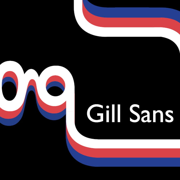
I am really inspired by the use of these designs below which can be found on Pinterest and various other websites. The use of the lowercase ‘g’ and a unique terminal stroke design. The inverted and contrasting colours against the ‘g’ is interesting.

Areas of References:

Lower case ‘g’
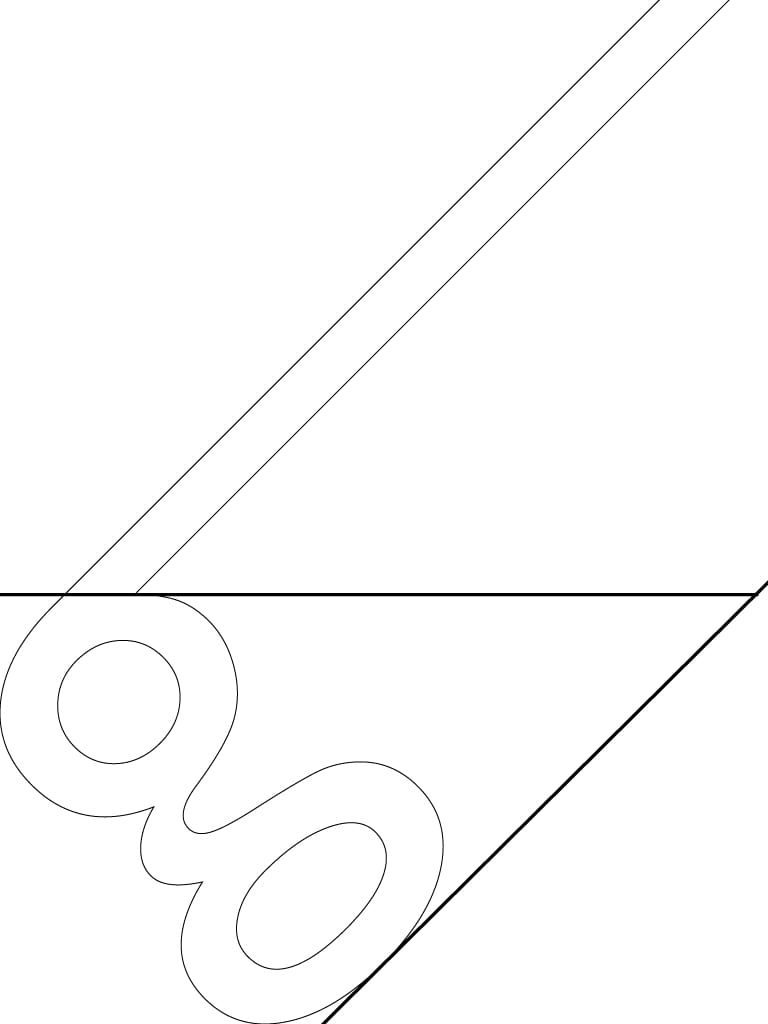
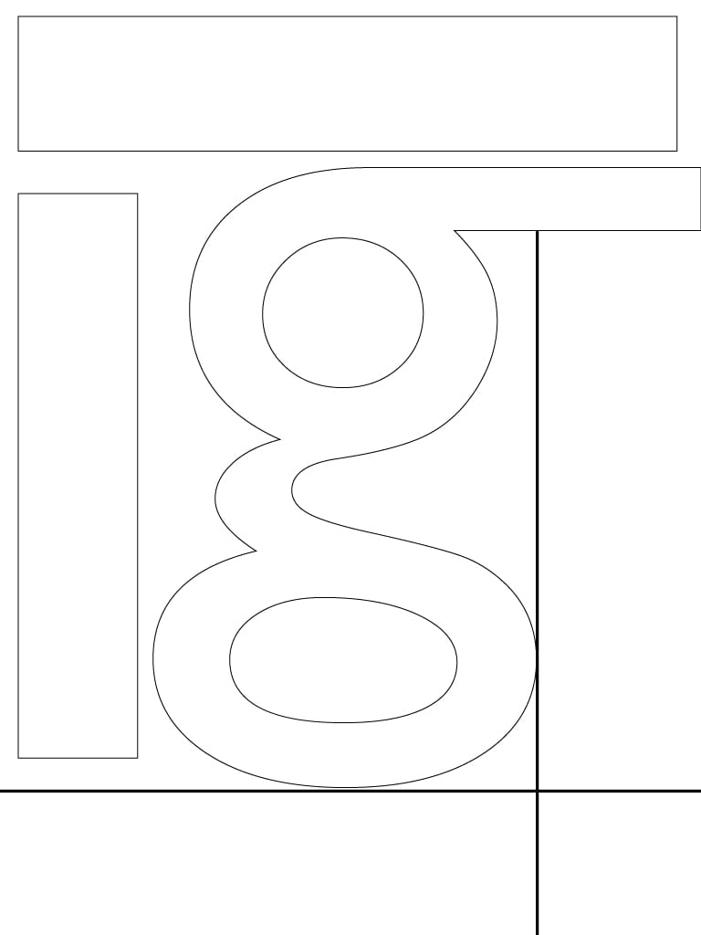
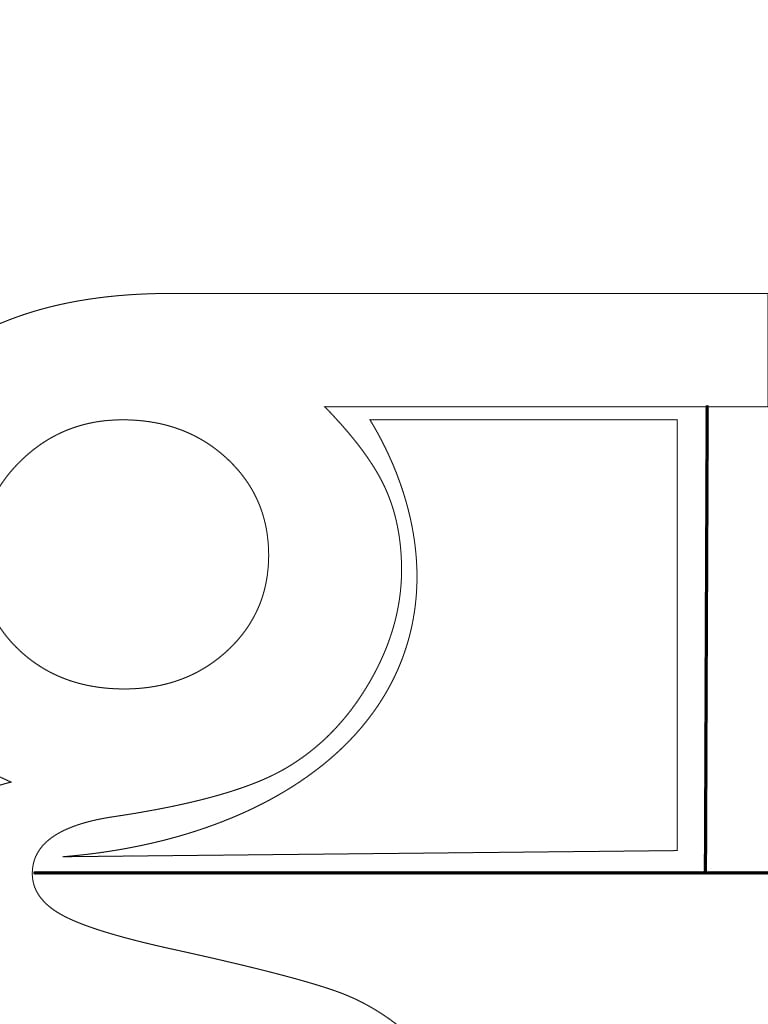
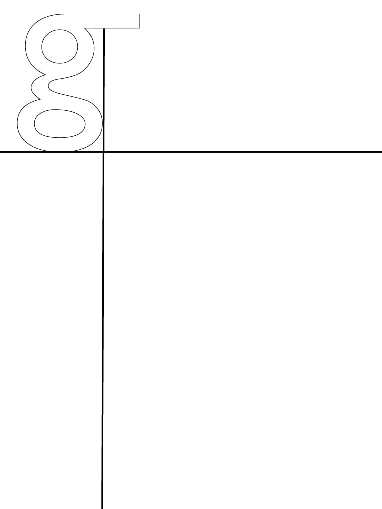
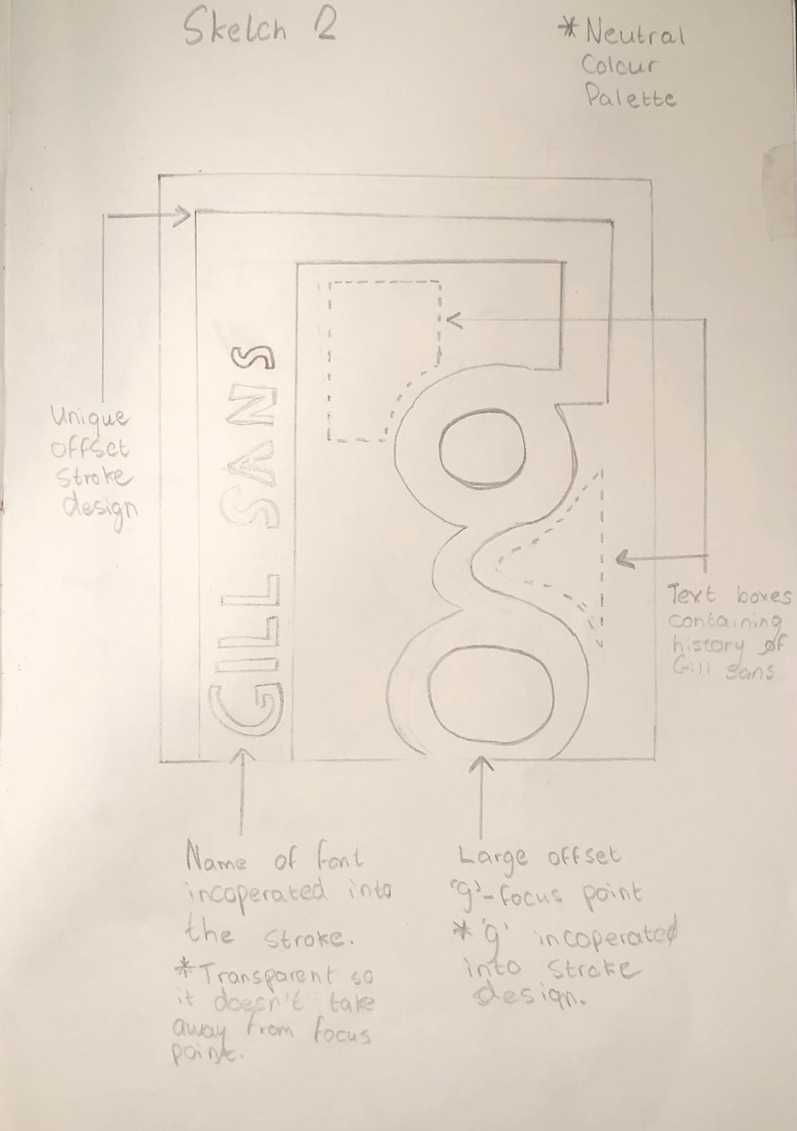
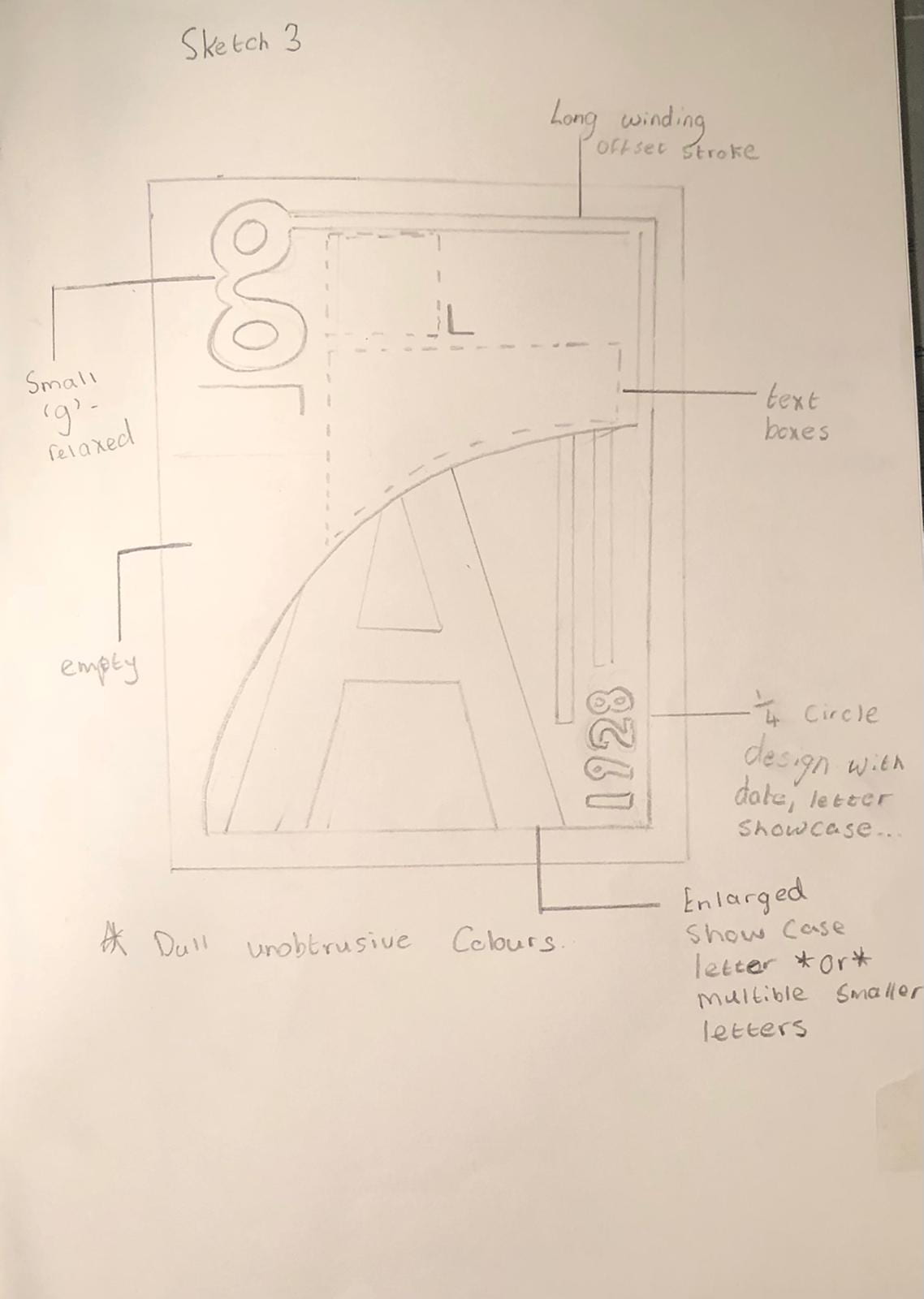
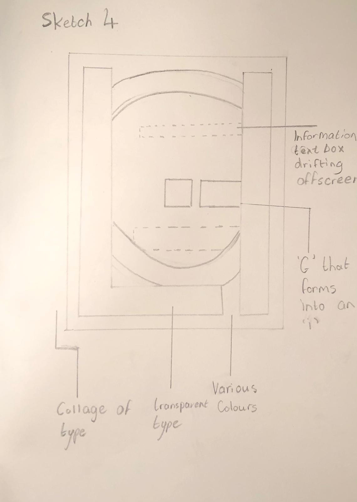
For my designs I want to play with the lowercase ‘g’ with a stroke going out of frame as seen in the previous typeface specimens. I want to experiment with colour so I will make a monochromatic, neutral and vibrant typeface specimen. I will create a fitting environment for each of these specimens. Anatomy of Gill San’s ‘g’ – Deconstruction

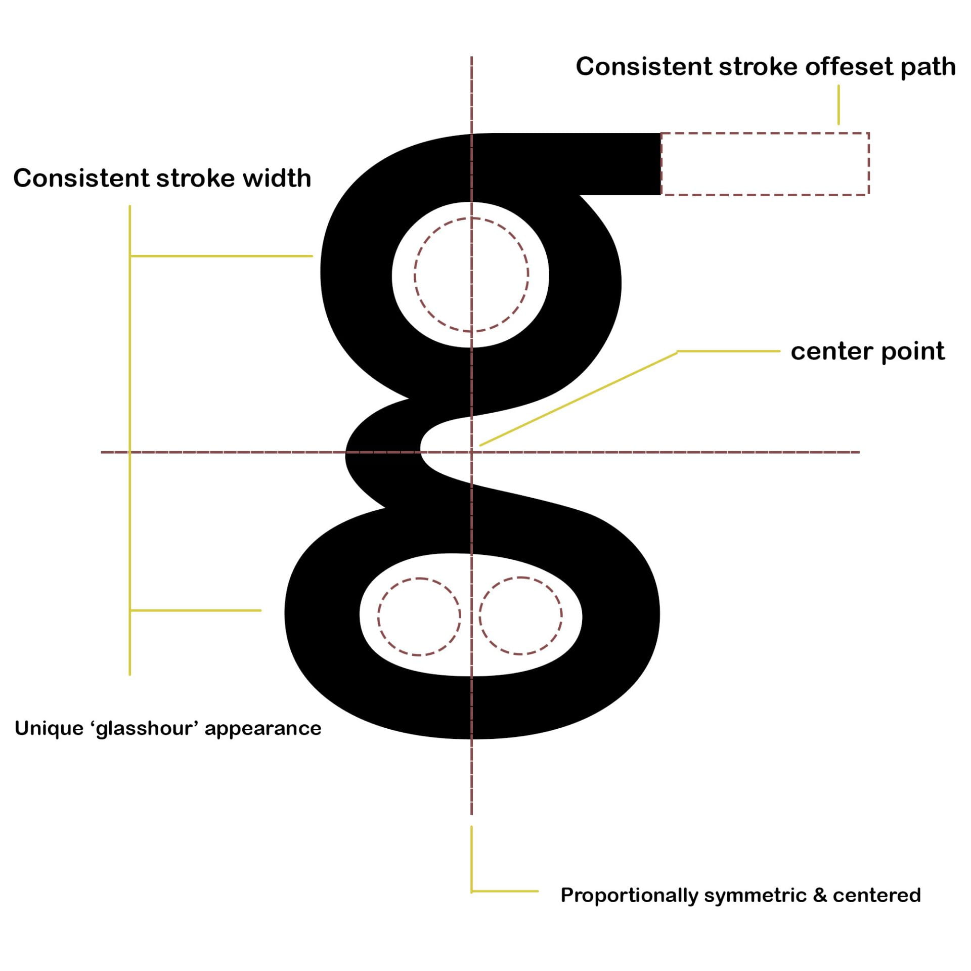 I chose to study this letter more than others as it’s one of Gill sans most unique and appealing letters to showcase, personally speaking. Its unique double cased structure and hourglass appearance holds detail while retaining similar consistency throughout the strokes to create a visually stunning and unprecedented letter.
Another big factor in choosing this particular letter for my research is its only terminal at the top right, unlike many other ‘g’s this remains the same stroke thickness as the letter itself allowing me to get creative and play with the design such as expanding it offscreen etc. Basically allowing me to merge type with design.
While I can’t accurately match colour on paper to the colour spectrum onscreen. I will make four different sketches, each with their own representing colour scheme.
Sketch 1 – Monochromatic
Sketch 2 – Neutral
Sketch 3 – Vibrant
Sketch 4 – Creative choice
Sketches:

Revision
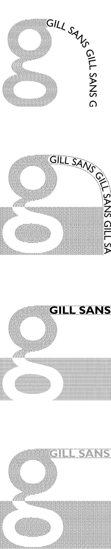

Finalized Designs:
Design 1

Design 2
Design 3
Design 4

Final Decision
I decided to pick Design 2 as I feel like it had the most character and visual rhythm to it. The curves and swirls of the background matched the flow of the geometrics on the ‘g’ creating a mutually pleasant and satisfactory looking piece.
Analyzation and problems with other designs:
Design 1:
For this design, while structurally unique from others I found the overall colour scheme and design bland and lacking of any character.
Design 3:
For this design I enjoyed the mixture of colours and design. However, the main ‘g’ focal point is smaller than ordinary show case type. It just makes the piece very unassuming and against what a typeface specimen is.
Design 4:
On this creative piece I created a sense of the type ‘drifting’ through, I really liked how the text drifts in from each side. I also liked the sporadic contrasting colour pallete. However, like the Design 3, while it looks aesthetically pleasing, the center piece is blocked by two large L’s which are the same size as the ‘G’ itself, taking away from the center piece.