Dark mode Competitor analysis
Since my element project is all about space I have decided to go for a dark mode theme. This is completely new to me and I am eager to learn how to do this well. Therefore I decided to do some research into this subject- see blog post here, as well as that I wanted to take a look at popular dark mode themes that run across different major brands and popular companies which I have written about below.
Apple air pods-
Apple decided to go for dark mode theme for the new Air Pods pro on their website. The design is crisp and moody but the dark mode gives it an elegant and expensive feel. Apple always delivers when it comes to dark mode making it look so professional and it always ties in well with the products and the vibe they try to give off- and always succeed in doing so.
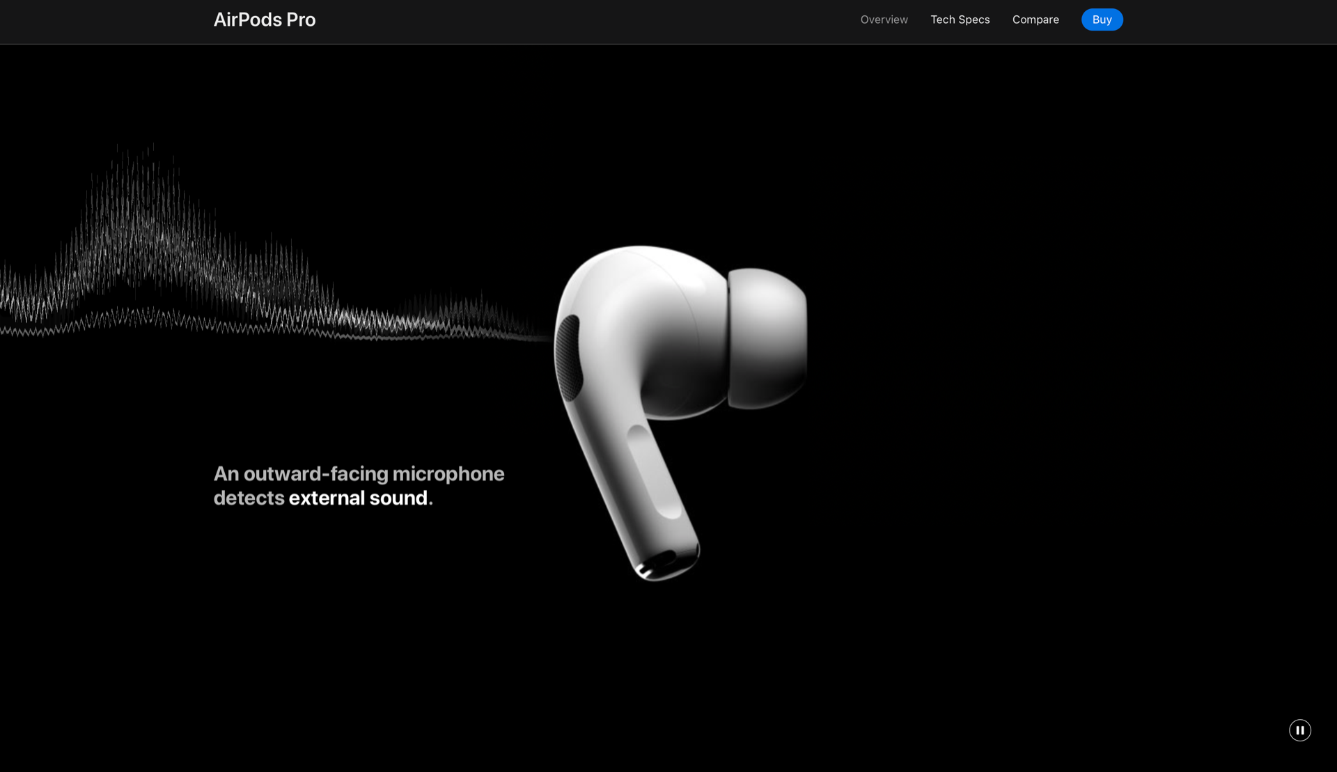
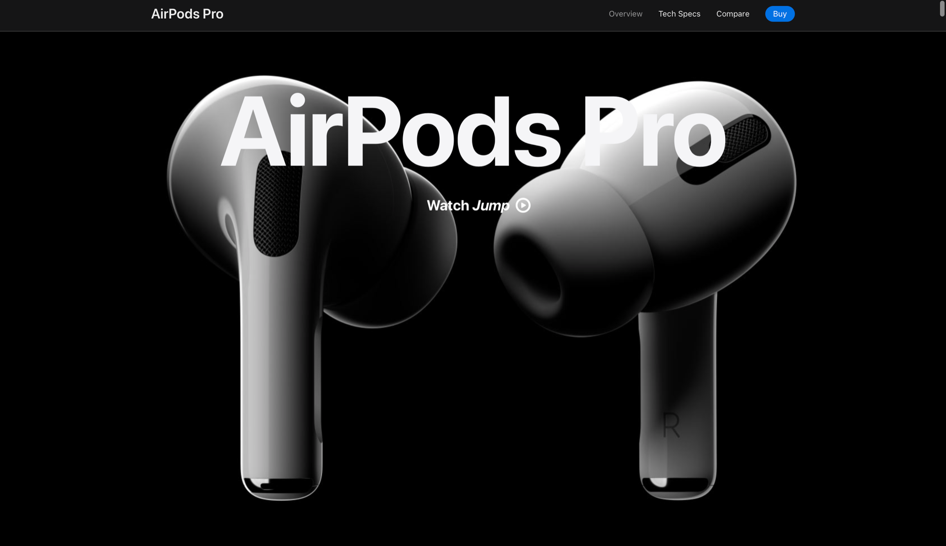
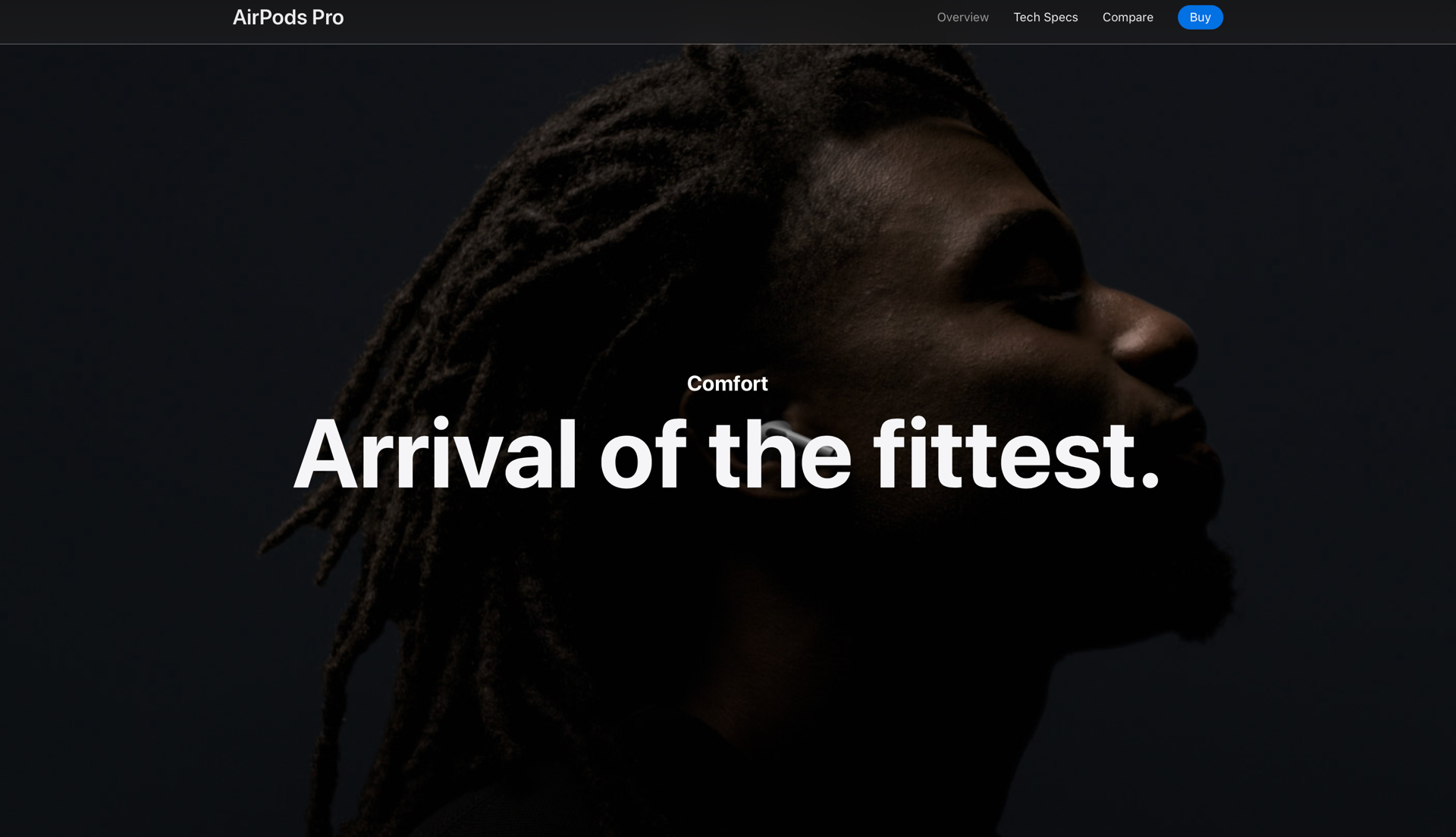
Alongside the dark mode theme they include high quality imagery and the highest standard of photography which ties the whole product brand and vision together. From looking at Apple’s high standard of design here and their use of dark mode I have learned that dark colours are also associated with luxury and elegance. Western formal wear is typically black or dark-coloured Luxury cars, clothing, and other high-end goods are often dark-coloured as well. This therefore helps to make the user feel like they are getting a high end and high quality product.
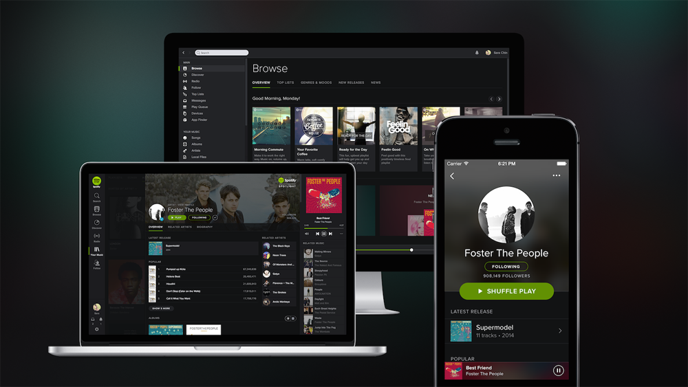
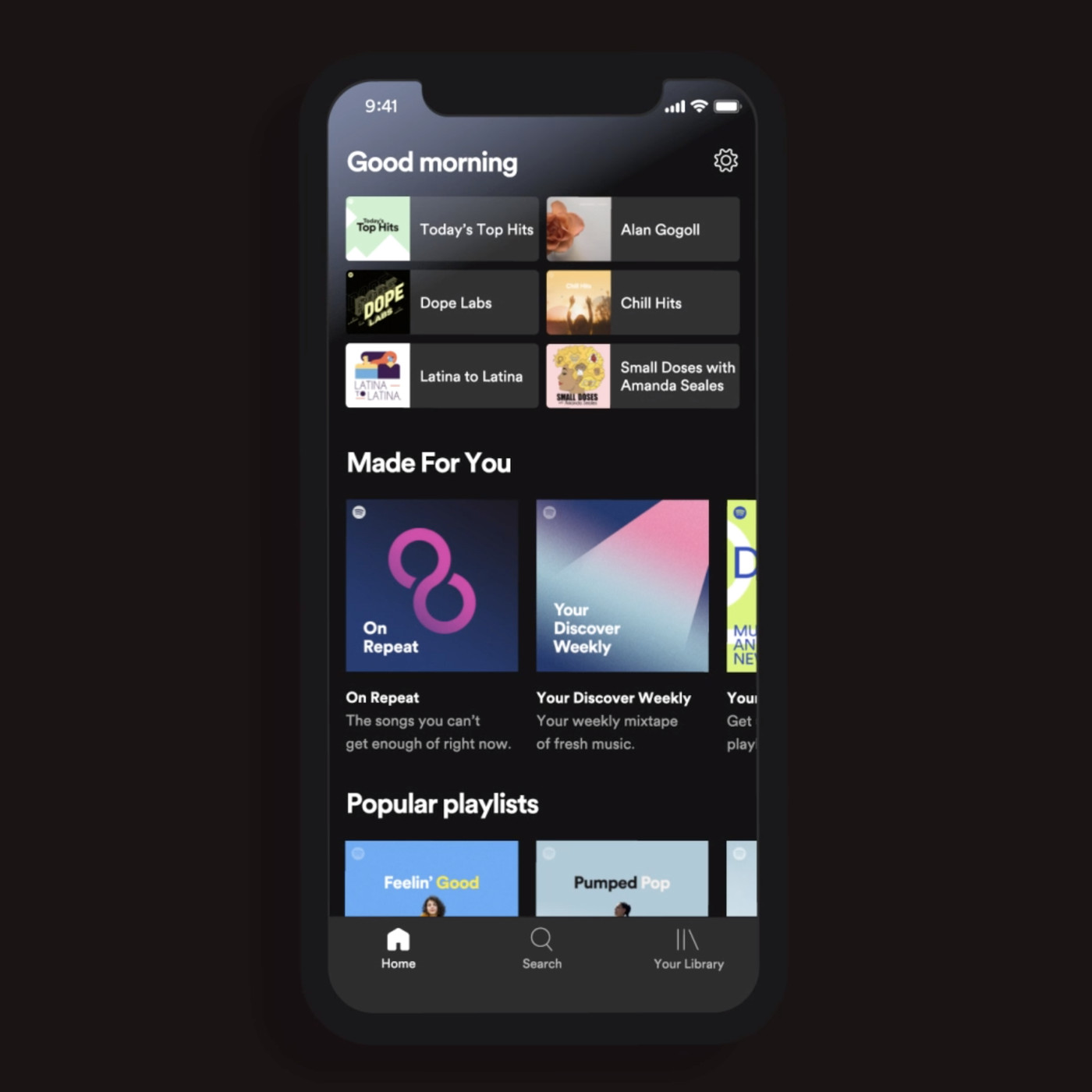
Spotify
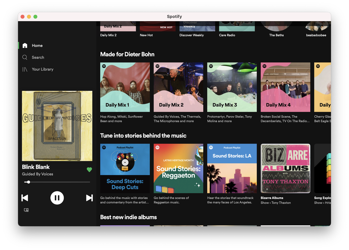
Spotify is another company that use this theme as well. They are known for their sophisticated dark colours and tones as well as their use of colour gradients for the music and their artist images. I like the way Spotify use bright colours to contrast the dark theme it makes the music and the artists really stand out and it is very cleary visible and doesn’t strain the eyes. I also this this application wouldn’t be the same if it was light mode- I think that the dark mode sets the tone for listening to music I find it actually quite calming and personally I always enjoy opening this app. They have used good text colour on top of the dark mode as well as good overlay use, this suitable contrast standard increases readability as well as accessibiltiy which is always important to consider. I have included a lot of screen shots of the spotty app on different interfaces including tablets and phones below.

What did I learn from this research?
Moving on from this I can take away that dark mode definitely creates a certain mood and theme when it comes to apps and brands. For Apple and Spotify it has created a different feel and atmosphere for each brand despite being about different things and different designs- it is still dark mode that is being used; but it does create a different vibe for each product. I need to make sure that the visibility and readability of my dark mode designs is done well and taking tips from the above competitors and the research I have previously done I am confident in my ability.