This week’s focal point was building our visual vocabulary. These include the terms Point, Line and Plane which we will continuously refer back to over our career.
Point
‘When we jump straight onto the computer and begin pushing pixels around in Photoshop (or our weapon of choice), we’re jumping several stages ahead in the process, without any of the foundational stages that go before it. As a result, we’ll likely find that problems arrive that would’ve been foreseen if we’d only gone through a bit of research and discovery first — some sketching, some loose ideas. The best designs come at the end of a process, and that process begins with rough experimentation with lo-fi tools.’ —Elliot Jay Stocks, Typekit
This quote was one of the first things shown to us this week to help remind us that all of our design research should start on paper. this can be very easy to forget as since it is all app and web design, you would think we should do all the designing on the computer from start to finish, which isn’t true.
we then looked at Josh Worth’s ‘If the Moon Were Only 1 Pixel” which is an accurate scale map of the solar system that illustrates the mind-glowingly large amount of space between planets. We were showed this because it made us realise the scale of things and realise that everything comes from the same thing; one atom. this atom resembles a pixel in digital life. Just like on earth, everything can be created using pixels, however to understand this we have to go back to the beginning of just one pixel.
“Point, line, and plane are the building blocks of design. From these elements, designers create images, icons, textures, patterns, diagrams, animations, and typographic systems.” Ellen Lupton
Line
After this, we then looked at line, more specifically, Moving brands vision for HP. They have designed a new identity scheme for HP in which the new logo sees the well established lower case ‘hp’ logo reduced to four forward slashes.
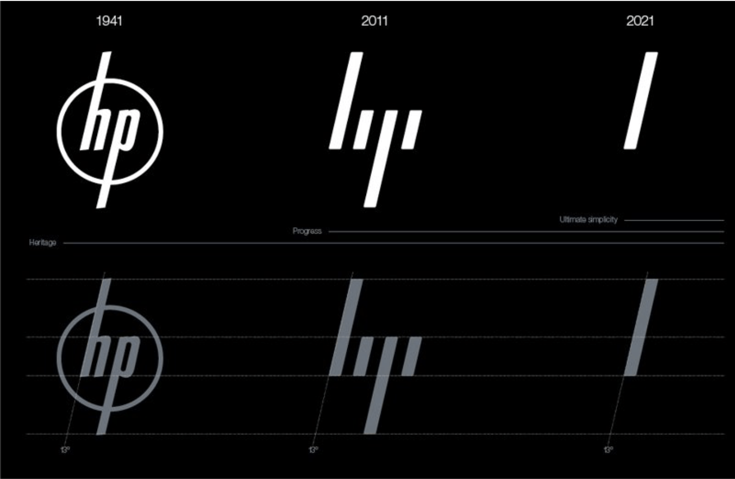
A the technology around us is constantly improving, Moving brands partnered with HP and wanted to transform the world’s biggest technology company into the world’s most powerful brand by updating it.
However HP were not happy with this new design and decided not to change it after much discussion. I personally agree as I think their original fits in well with the brand.
Plane
Lastly we looked at Plane. we looked at artists who practised this such as Josef Müller-Brockmann. He was a twentieth century Swiss graphic designer and teacher. Müller-Brockmann studied design, architect and history of arts, as well as studying as a European design consultant. His works had been exhibited in Zurich, Hamburg and Bern.
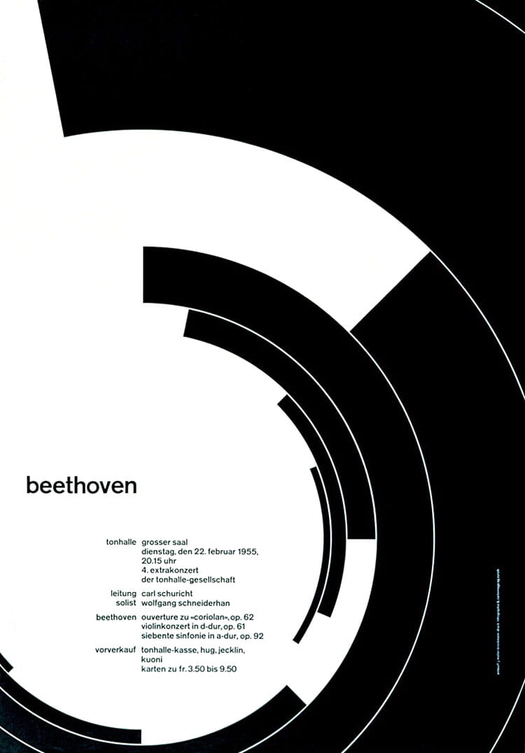
As with most graphic designers that can be classified as part of the Swiss International Style, Joseph Müller-Brockmann was influenced by the ideas of several different design and art movements including Constructivism, De Stijl and the Bauhaus. He is considered the most well-known Swiss designer and his name is the most easily recognised when talking about the period.
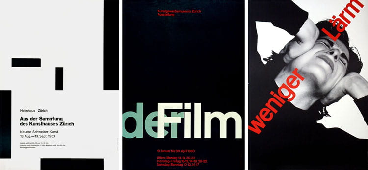
I personally really like his work and feel its very unique. Although it is quite dark, it doesn’t feel to heavy to look at and each piece moves at a different angle. For example, the “deFilm” poster looks like the words are ,moving in different directions across the poster and crossing over each other. this is fitting as just like films, the poster has come to life. However, the “Weniger Larm” poster is moving at a 45 degree angle. we know this because the model on the poster is also angled in this direction, with the text layered on top of her in the same direction. the text is also situated slightly off both sides of the poster, making the viewer also feeling it is slightly moving, bringing it to life yet again.