Today’s class was aimed at ensuring that we are on the right track for week 10 and are preparing to start prototyping our screens on Figma. This brings our product to life and allows everyone to get a better idea of how your product works.
Paul also offered tips on how to ensure that your product is as strong and organised as possible EG by creating a component library. This is a library that contains all of your nav and icon buttons to ensure that you haven’t forgotten everything. It also saves time as it means you don’t have to spend ages looking for a button as they are all in the same place. It also ensures that your screens are kept consistent in size and colour.
Another tip was using Adobe Colourwheel which has a feature where you can check the contrast ratio between your background colour and text colour. This is such a helpful tool as it confirms whether your app colour palette is easy to see and read by people of all ages and sights.
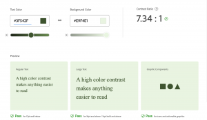
This was really helpful as when I added in my background and text colour I could see that all components passed the check and the colour scheme was seen as fit to use as people of all ages could easily read the text against the background.
Class Task- Text Hierarchy
Our task for this morning was to use the text hierarchy tool on Material.io to transform a piece of text using their text sizes.
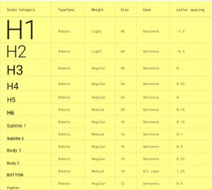
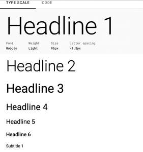
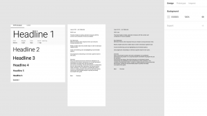
We were given a piece of text from the “Laws of Ux” Book by Jon Yablonski. We then had to transform this. I found this task very interesting as, although it sounds very easy, its actually harder than it looks. We used an iPhone 13 template so we could get a better idea of what the transformed text would look like on a home screen.
This exercise was very helpful as it allowed us tp see what our headlines and body copy sizes and contrasts should be in our own app and lets us experiment what works and what doesn’t. I initially thought the text sizes were far too big however when you added it all together it went well and looked proportionately sized.

I added some colour to differentiate the titles from the body text which I felt worked well and added bullet points to better display the information. I also included the sizes of text I used at the side of the frame to remember for when I am doing my own product so I know what worked for me. The difference between the first text given and the transformed text is unbelievable and makes you remember how important text hierarchy is to create a more comfortable experience for your user. The contrast of sizes and colours make the text much more appealing and easier to read compared to the initial text which people find boring and difficult to read. I will definitely use this technique on my own product that I am creating.
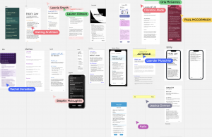
It was also extremely interesting to see how differently everyone in the class approached this task. Some made their simpler than others and others used bold colours and section dividers to separate the text. Comparing our screens on the class Miro board is always super interesting as we can all inspire each other and helps to see other ideas of how we could have designed the piece of text.