COMPACTA
In class we were advised to broaden our knowledge on different typefaces. I decided to carry out some research on Fonts In Use. Through browsing all the typefaces, I was consistently clicking on big, bold fonts, Compacta in particular.
Compacta is a condensed sans-serif typeface designed by Fred Lambert for Letraset in 1963. It is visually similar to the typefaces Impact and Haettenschweiler, though Compacta has a distinctively square shape in comparison
The first original Letraset typeface design. [Loxley] 5 styles (Light, Regular, Italic, Bold, Bold Italic) were released in 1963. Two Outline weights were added in 1965. The family was completed with a Black in 1976.
I like this font in particular due to its ability to be dynamic and striking. The letters alone, scaled up to fill an entire page are prominent enough to need no other visuals. A great way to ensure its visually appealing without the complications of cluttering up the page.
Especially in all caps the typeface is extremely powerful and would easily get a point across.
I am interested to experiment with this typeface. As much as I like the uniformity and consistency it would be interesting to see how it would look if I manipulated the shapes of each character, keeping its iconic bold look but giving it a bit more of an unpredictable personality. Something a bit more fun.
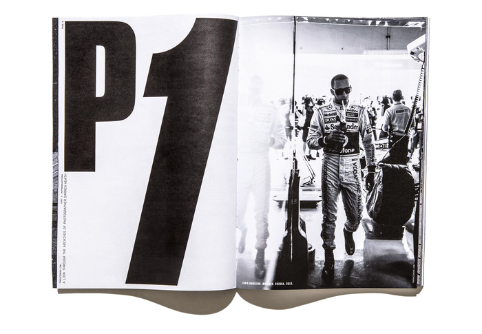
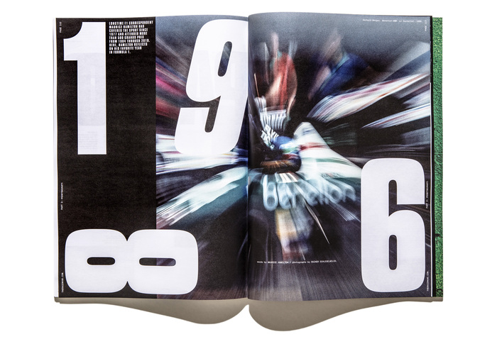
Below I have included an example of Compacta being used, this Magazine in particular really caught my eye.
RaceWknd, issue no. 1
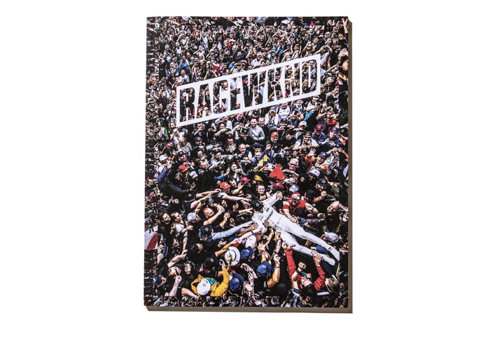
RaceWknd is a new magazine for Formula 1 fans, created during lockdown and crowdfunded through a Kickstarter campaign. The magazine was founded by publisher Magnus Greaves and creative director Tom Brown, and realized together with editor Emily Chavous, Formula 1 correspondent Paul Weaver, and photographers Darren Heath and Fredrik Brodén.
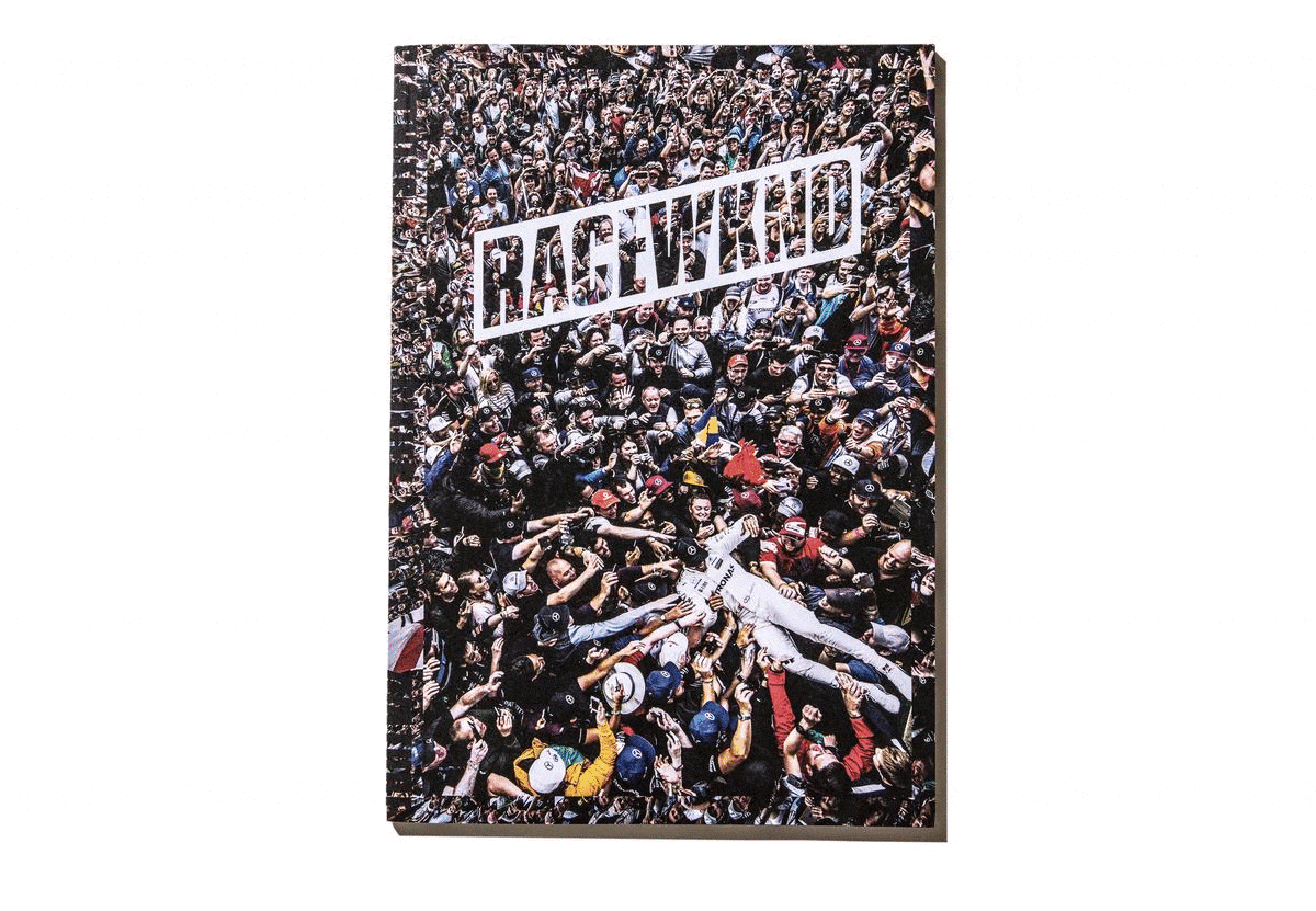
“The typography doesn’t take a back seat. Tom Brown dusted off Compacta and demonstrates that Letraset’s display sans from 1963 still is a banger. Compacta is used in big and bigger sizes, with some glyphs scaled to fill an entire page, or even two. The chosen version is one of the digitizations of Compacta Bold with pronounced ink traps, probably ITC’s or Monotype’s. Originally introduced to keep spots clear and uncluttered where diagonals meet, these notches take on a new role in sizes this large. Now they help to establish a techy and trendy feeling. The occasional italicized letters within words add to the contemporary look, and perhaps symbolize racers revving it up, accelerating to pass (or crash into?) their neighboring glyphs.” (taken from https://fontsinuse.com/uses/38498/racewknd-issue-no-andnbsp-1)
What really attracted me to this zine in particular was how the designer laid out each individual character. Although simple in composition, allowed for a very distinctive look. The contrast in headings and body text is also very apparent. Totally unapologetic and true to itself.
He managed to keep it engaging and aesthetically pleasing all while keeping it minimal. Proving that less is sometimes more.