Prologue
Typography was the topic of discussion this week, and it is going to play a massive role in our project.
What is Typography?
This should be something all of us know at this point, being a major of design. It is something we designers have come to be very familiar with. As a refresher;
Typography is the art and technique of arranging type to make written language legible, readable and appealing when displayed. The arrangement of type involves selecting typefaces, point sizes, line lengths, line-spacing, and letter-spacing, as well as adjusting the space between pairs of letters.
Typography in itself is a really powerful tool at our disposal. Something as simple as a font change can ulitmately change the entire tone or aesthetic of our website, app or infographic for example.
Why is Typography Important?
Typography is so much more than just choosing beautiful fonts: it’s a vital component of user interface design. Good typography will establish a strong visual hierarchy, provide a graphic balance to the website, and set the product’s overall tone. Typography should guide and inform your users, optimize readability and accessibility, and ensure an excellent user experience. Good typography could be the difference between someone staying on your website for one minute or half an hour. It’s important that your website is visually stimulating and memorable, and typography plays a huge role in this process.
How can we keep our readers engaged without them losing interest? This is something Typography cannot do alone, but will and can play a massive role in doing so. Think of it like this, if you are for example make an infographic about Space, and you choose to use New Time’s Roman as the sole and only font for the entire experience. It will become monotonous and the reader will quickly lose interest. To remedy this, we can look at a few things;
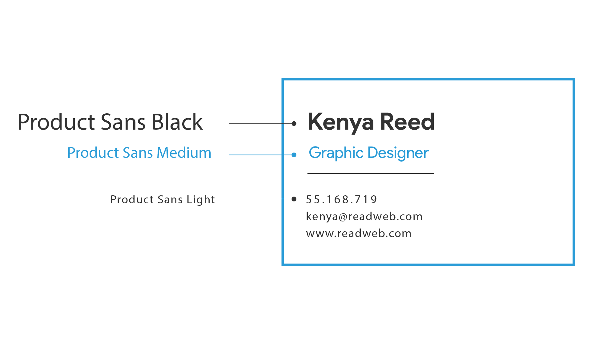
Type Hierarchy
A typographic hierarchy is a system that uses typography – the size, font and layout of different pieces of text – to create a hierarchical division that can show users where to look for specific kinds of information. It is an organizing system for establishing order in a set of data.
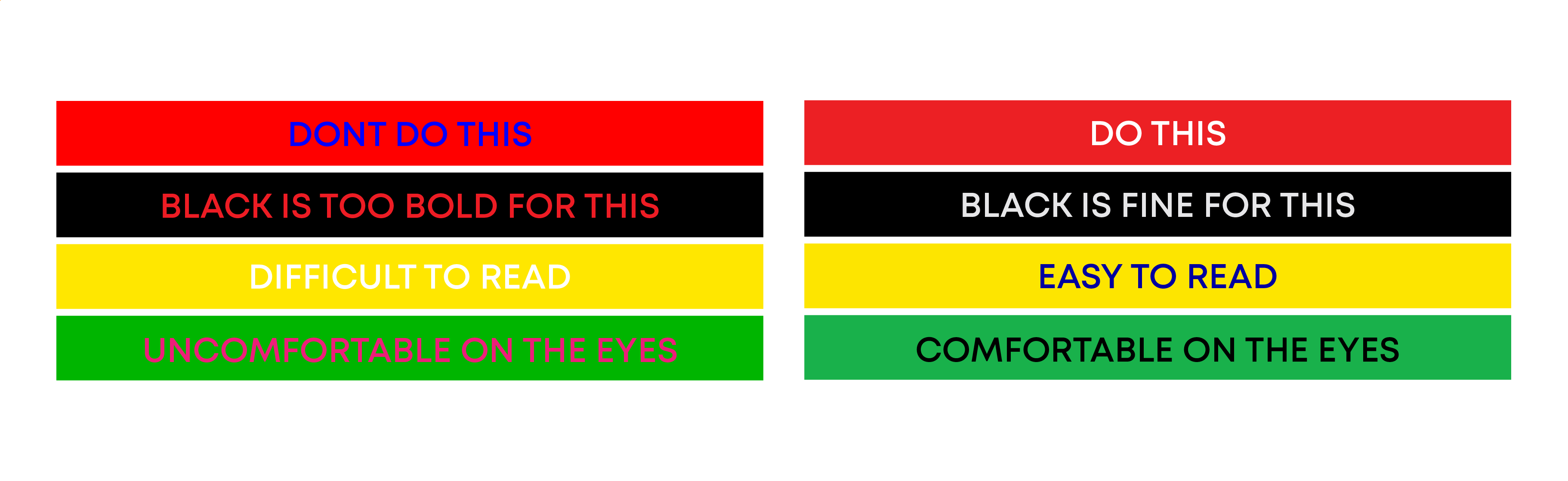
Colour
Type color, or colour, is an element of typography that describes how dense or heavy the text appears on the page. Finding the correct balance of type color and white space can make text more easily readable.
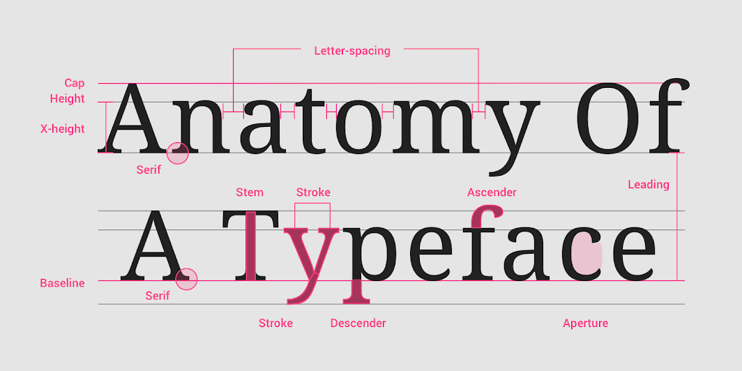
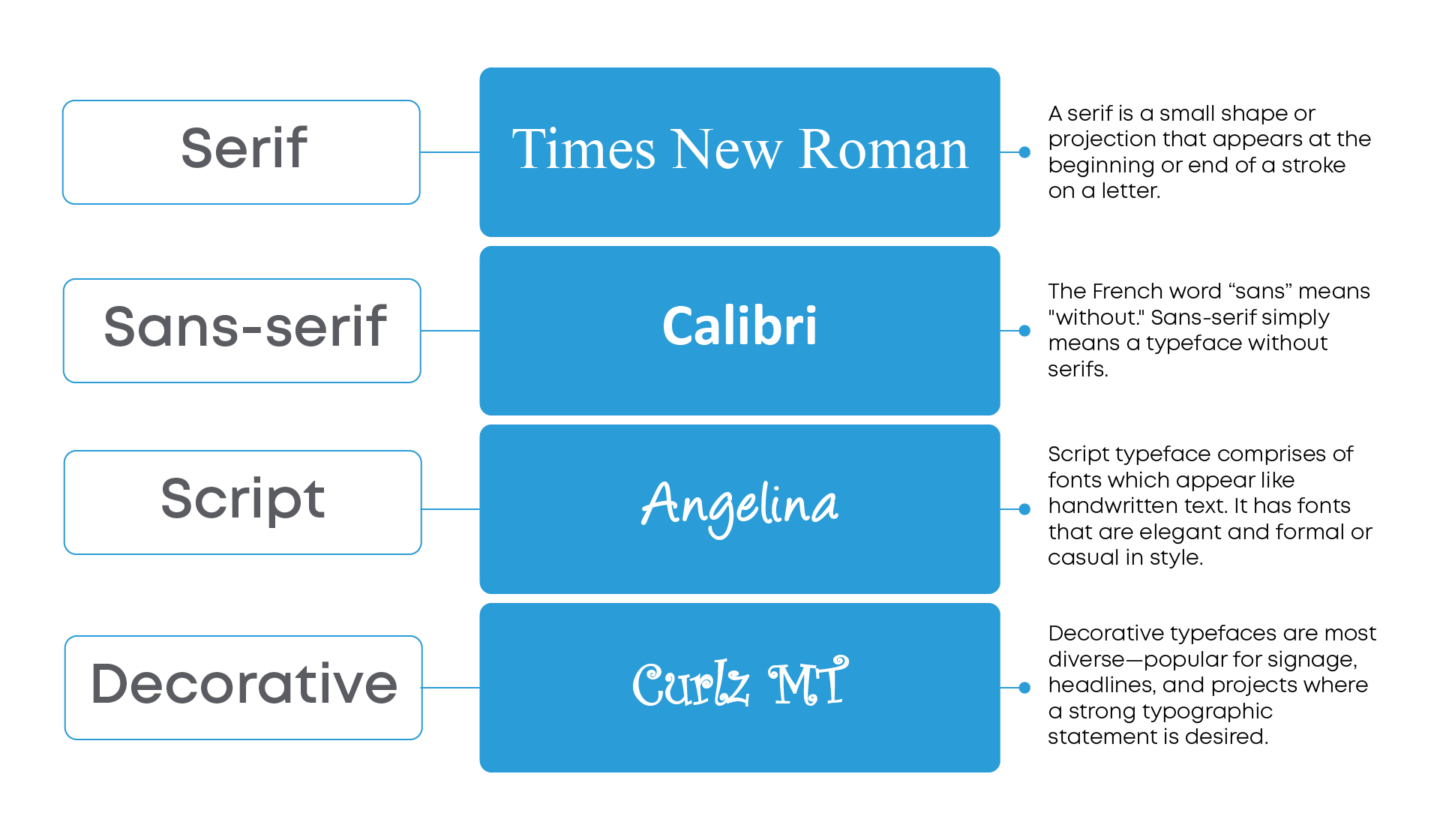
Kinds of typeface.
Serif, sans-serif, script, and decorative
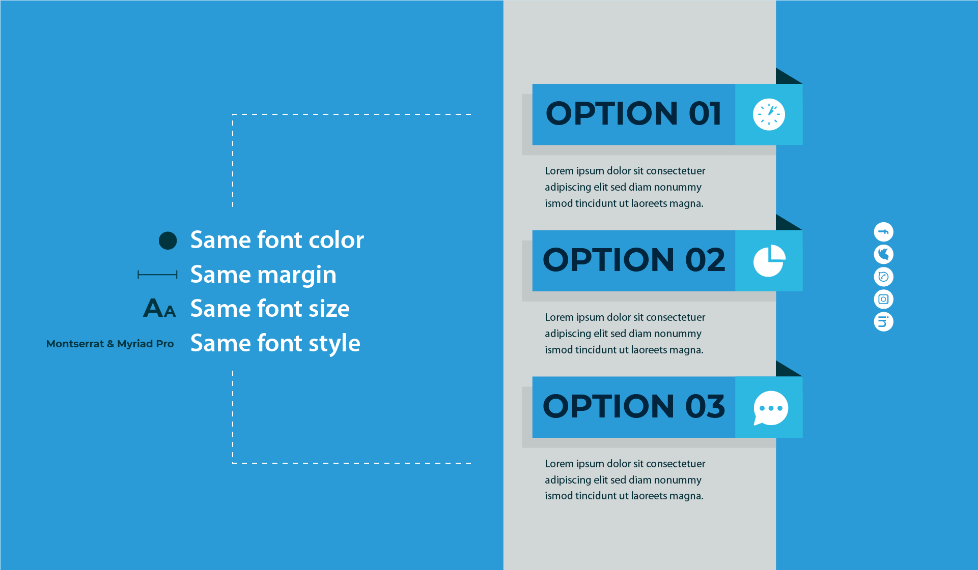
Consistency
It’s important to keep the design of your document consistent from one page to another or one slide to another. Using consistent background and text colors helps readers connect the different sections, while a document or presentation that has different fonts, colors, and designs on each page will look messy and be difficult to read and understand.
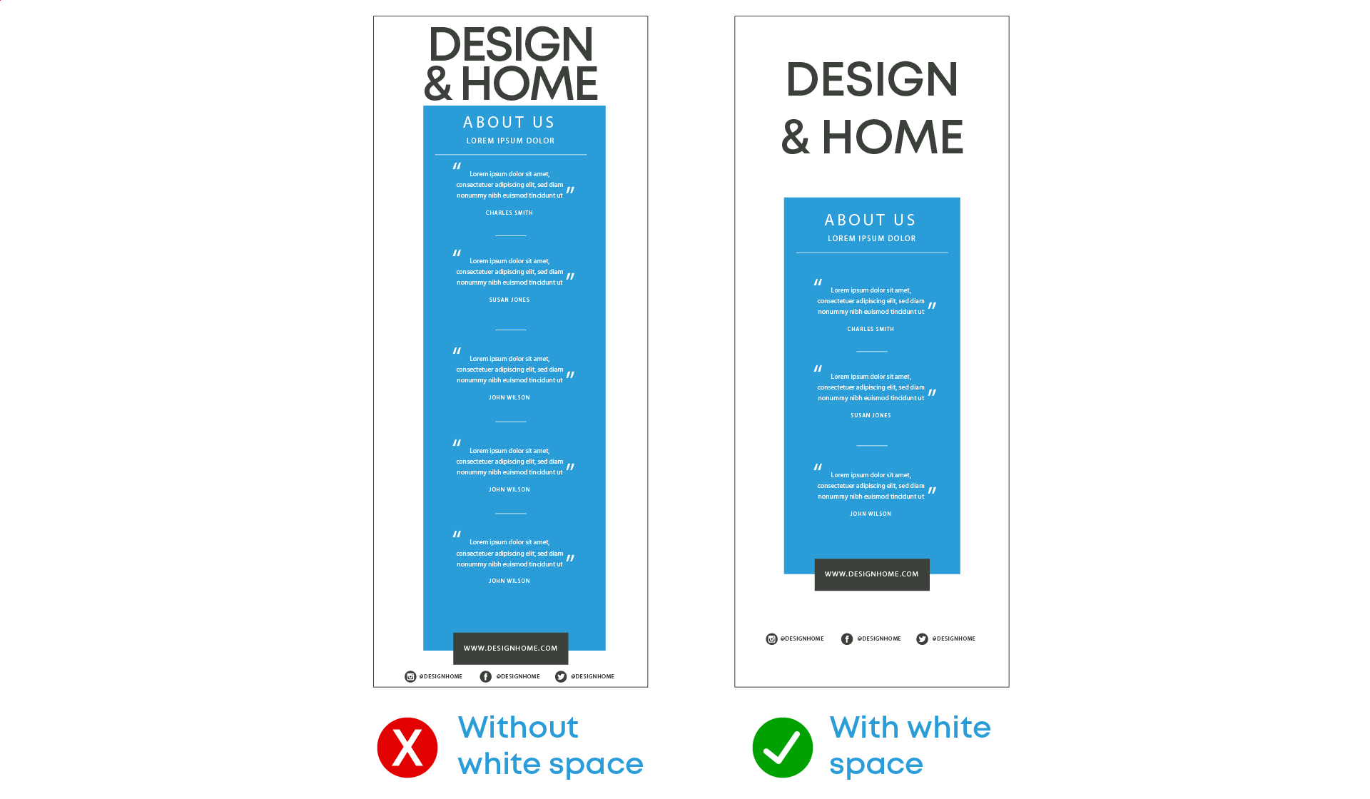
White space
While other elements of typography focus on the letters themselves, white space (or negative space) is the space around the text and images. Readers may not notice white space specifically, until there is too much or too little. Using the appropriate amount of white space makes it easier to read the text and helps readers understand the connections between different parts of the text.