
Visualising Data
Looking at raw data and trying to pull out a sense of order within that to find cures, solutions etc. In the UX seeing how data can work in new and different ways.
Diagrams: The trick is finding the right type of data and presenting it in the right type of way.
Visualisations: Teasing out the underlying meaning of content in different ways
We can be creative with data and stats and amplify and hide information. How data is presented can confuse people. We can reveal or hide through data.
Project 02
Create an infographic or data visualisation looking specifically at global population in certain parameters.
Research and Supporting Material – Do lots of this before putting pen to paper.
Look at ways to present things like population, religion etc.
Illustrator will let you create stats tools. If you have the data Illustrator will generate the graphs for you: pie charts, line charts, scatter diagrams.
Possible approaches:
- Births and deaths in world – past and/or present
- Population figures specific to country.
- Population in last 50, 100 years (future?)
- By religion
- By environment
- Climate change
- Disease/illness
Master apprentice – 2 charts to complete this week.
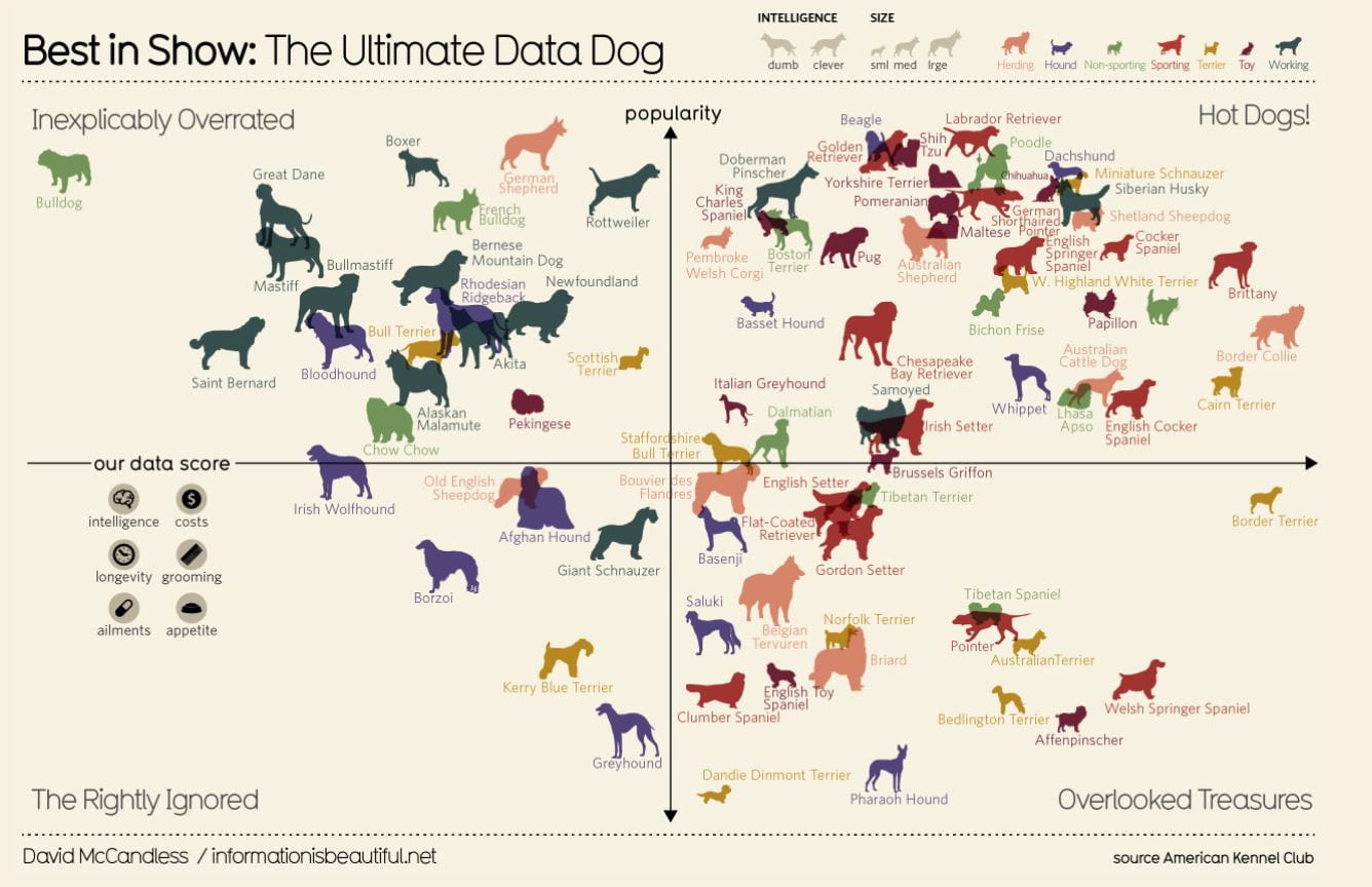
David McCandless
Writer, designer, and creative director.
Researching McCandless work, I realised how much goes into creating a data visualisation piece. The one piece I liked the most is his ‘best in show’ visualisation on dog breeds, I like it because its different from some of the more detailed circle data visualisation I have seen of his. Also, I feel like I would be more drawn to create work like the ‘best in show’ piece. I think I will keep McCandless work in mind when creating my visualisations for my infographic.
Infographic Topic Ideas
- Black Plague
- Spanish Flu
- Covid-19
- Death by natural disasters
- Haiti Disaster
- Fukushima Disaster
Self-Reflection
This week’s content has helped me understand what data visualisation and different ways to display data. I have a few ideas on what I want to research for my infographic. Moving forward I plan to do in depth research into my chosen topic and start considering what data I will be needing to incorporate into the infographic. I’m a little behind on my master apprentice exercises but I plan to prioritise these a little more this week so I can stay on top of them.