Figma Typography Tasks

Typography- Terms
Below are some general terms in relation to Typography that I think are usual to keep noted.
Font and Typeface
What is the difference?
The typeface is the specific design of the letters like baskerville and gill sans and the font is referring to the size or style of that typeface like 24point or italic. #
Character
An individual symbol of the full character set that makes up a typeface; may take the form of a letter, number, punctuation mark, etc.
A non-standard (sometimes decorative) variation of a character that comes as an extra option with a font file.
Serif
A short line or stroke attached to or extending from the open ends of a letterform; also refers to the general category of typefaces that have been designed with this feature.
Sans-Serif/Sans
“without line”; the general category of typefaces (or an individual typeface) designed without serifs.
Italic
A slanted version of a typeface (slants from left to right); a true italic is uniquely designed, more than a tilted version of the upright (a.k.a. “roman”) typeface.
A single linear element that forms part of a character; may be straight or curved.
A curved stroke that is continuous with a stem.
Foot
The part of the stem that rests on the baseline.
A piece of a letter that extends below the baseline.
A part of a lowercase letter that rises above the main body of the letter (above the x-height).
Swash
A decorative extension or stroke on a letterform; may be part of a letter by design or available either as an additional glyph or as an add-on to the standard character.
Colour Theory
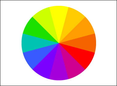
Colour Wheel – Basic Colour Theory
Primary Colours – Red, Blue and Yellow
Secondary Colours – green, orange and purple
Tertiary Colours – blue-green , red-violet etc
complementary – 2 colours opposite
analogous – 3 colours side by side
triadic– 3 colours equally spaced around the wheel
Tints, shades and tones are variants of hues , a hue is a pure colour.
Tint– This is a hue to which white has been added. example, red + white = pink.
Shade – This is a hue to which black has been added. For example, red + black = burgundy.
Tone – This is a colour to which black and white have been added. This darkens the original hue while making the colour appear more subtle and less intense.
Definitions – https://99designs.co.uk/blog/tips/the-7-step-guide-to-understanding-color-theory/#:~:text=Color%20theory%20is%20both%20the,or%20contrast%20with%20each%20other.&text=In%20color%20theory%2C%20colors%20are,secondary%20colors%20and%20tertiary%20colors.
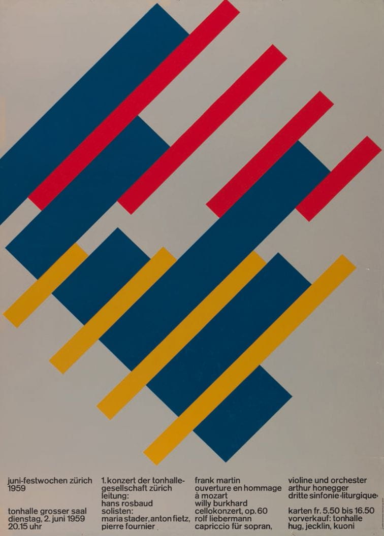
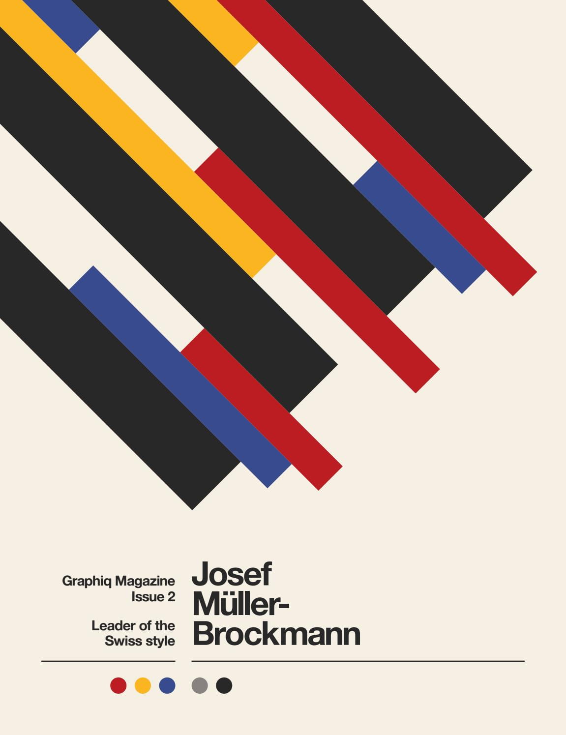
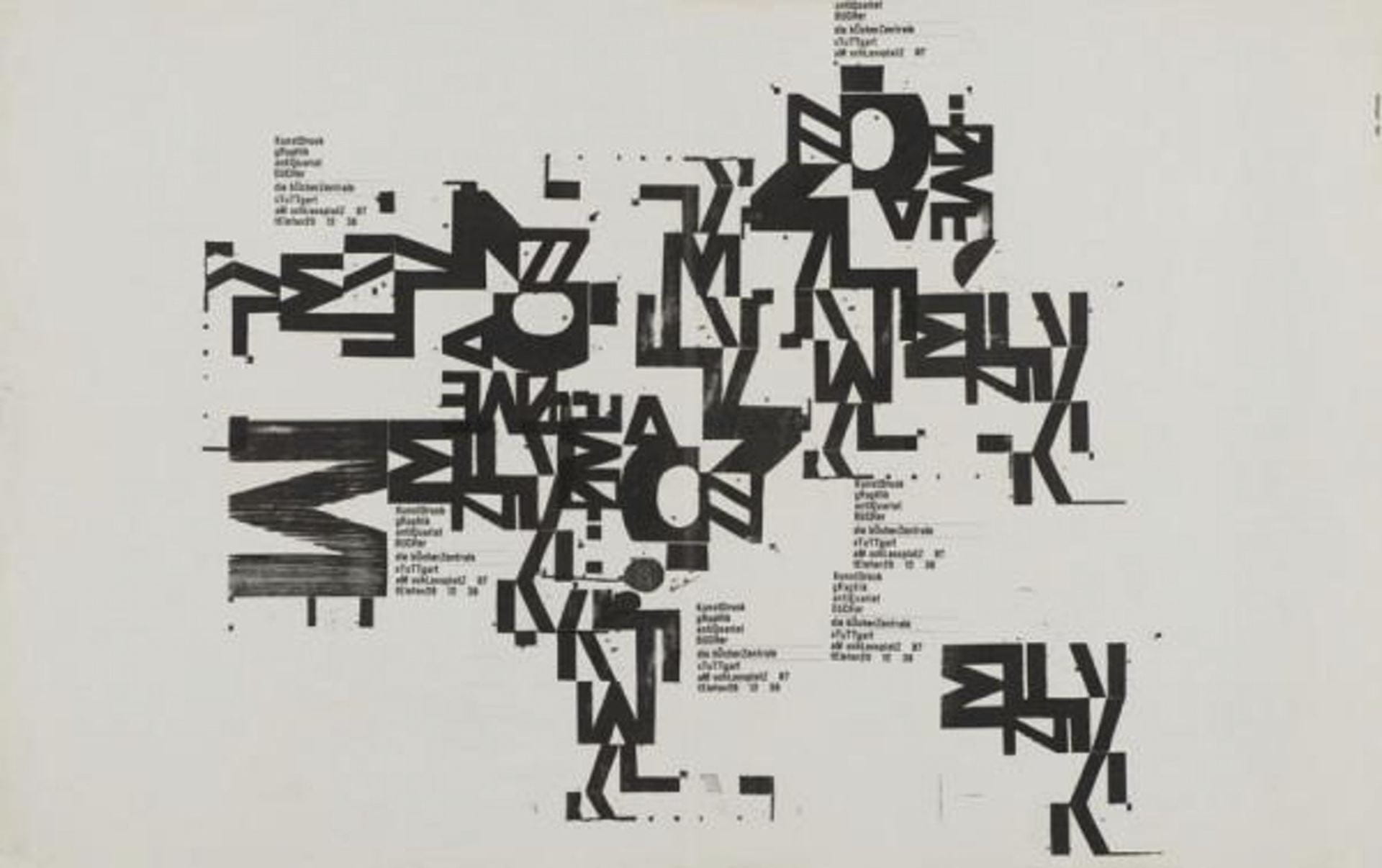
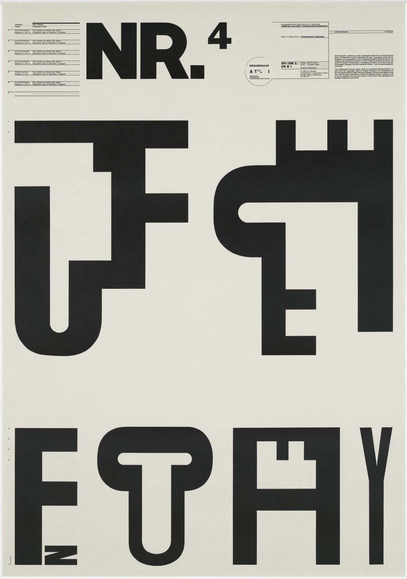
Josef Muller Brockmann
Taking a look at influential pieces in colour. I really like the work of Josef Muller Brockmann when looking at colour theory , this is because of Brockmann’s bold take on using the primary colours throughout his designs. I think his work really showcases colour as a design itself instead of colour being an element of a design piece.