Since my last post, I have made many updates and improvements to my prototype. These are based on research and feedback I received.
Button improvement


This button allows the user to fill the rocket illustration with colour. Previously, the button was just the switch and provided no explanation of what its use was. This could be confusing for users, and they may just skip past it.
Therefore, I turned it into a “control panel”. This fits the narrative more as it ties in with the tone of voice and the theme of rockets. I also included text saying, “press to build”. This gives an indication to users of what it may do. The yellow button against the black background also makes it stand out, making users more likely to click on it. The control panel lines up with the text on this page which creates consistency and makes everything look cleaner.
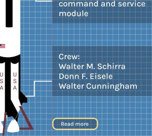
Another smaller improvement I made was to the “read more” button. I made sure to align it with the text. Again, this makes it look cleaner and more organised and it improves readability.
Style consistency
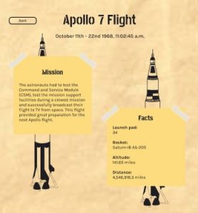
At one of the feedback sessions, I was told that the style on the “read more” pages wasn’t consistent with the rest of the website. I agreed with this as it didn’t have any of the blueprint effect or illustrations.
To improve this, I decided to take the illustrations from the previous page and place them behind the post-it notes. I changed their colour to black as it stands out against the background well. This makes it different than other pages but at the same time, carries the same style over for consistency.
Styling typography
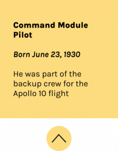
In a previous design, each piece of text in this post it notes was the same. This made it all blend into one and nothing stood out. It needed information hierarchy. Therefore, I made their role, in this case “command module pilot”, in extra bold. This is because it is the most important information and probably the most useful for the user. I then put their date of birth in bold italic. This is so it stands out from the paragraph below. The paragraph is just an interesting fact about the astronaut and this text is regular.
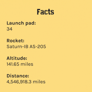
Another style choice I made was within the facts section. Previously, the information/statistics were placed next to the subheadings. This looked quite tight and can make it harder to follow. Therefore, I decided to place them below as it improves readability.
Adding animations
The focus of this project is storytelling and making our site immersive. One of the ways I am doing this is through animations and transitions.

I particularly did this on the “read more” page. First, the title fades in then the post-it notes, the illustrations, and finally the tape. I did this by duplicating the screens and adding the content as I wanted it to appear. I then linked them together and set the pages to navigate to the next after a short delay. I used the smart animate feature to create the fade effect which makes the animations smooth. I think these are beneficial as it seamlessly brings users from one page to another.
I think this method works much better than my previous designs. Beforehand, I had the tape on the post-it notes fly in when the user hovers over them. As much as I liked this, it caused some usability issues. It meant that when the user was hovering over the post-it notes, they were unable to scroll down. This would be frustrating and may cause users to think they can’t scroll down any further which is why I changed it.
Data visualisation
A few weeks ago, we had a lecture on the importance of data visualisation. After learning more about it, I wanted to find a way to incorporate it into my design as it wasn’t something I had done.
I decided to take the flight duration from the “facts” post-it note and turn it into a bar chart. This is the sketch I did for this idea:
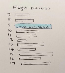
At first, I was going to just have a blank bar chart that showed the users the difference in the duration of each flight:
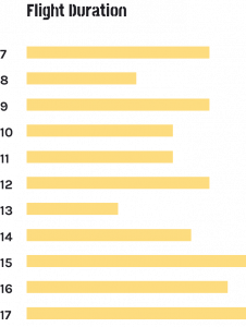
However, I thought it would be of the user’s interest to be able to know the exact duration of the flight:

Since the user is on the page about flight 7, this one is filled in. It also shows all the other flights so users can compare the duration at a glance.

As you can see, the user can also hover over each flight and see the duration. This offers easy comparison, and it means they don’t have to go to each flight page to know the duration.
Overall, I am happy with how my prototype is coming together. I think these improvements have strengthened it and provides an easier, more enjoyable user experience. I am enjoying telling the story of the Apollo flights.