The next step in this project was to take our prototype and bring it into webflow to make it a fully functioning website. I found this to be quite daunting as I have only used webflow once before and I was unaware of all its tools and how to use them. However, I was up for the challenge.
Link to my website:
https://lauren-gilmore-apollo-flights.webflow.io/
Building the home page
I was able to recreate the heading and introductory paragraph accurately in webflow. Something I learned from my previous experience with it was how to properly use sections and containers. This allowed me to center my text easily and makes it more responsive.
One thing that I found challenging about this page was getting the tabs working correctly. Once I figured it out, it works well. I discovered the benefits of creating classes as this meant I could make the style of each tab consistent quickly by giving them the same class. I then changed the background colour and changed the text to bold of the selected tab. This way, users know what tab is selected.
![]()
The biggest issue with this page is that the whole blueprint I used was an image. This included text which would cause accessibility issues. This meant that if a person was using a screen reader, it wouldn’t pick up on the text. I needed to fix this issue right away.
Another issue I had with this page was the placement of the read more button. It was off the blueprint and not in clear view of users. There was a chance that they wouldn’t scroll down this far and miss it completely.

Firstly, to fix the accessibility issue. I decided to make the blueprint a background image. This included the folder, blueprint, and rocket illustration but not the text. I then placed 3 columns with this layout:

This allowed me to place the text where I wanted in the center column. The left-hand column was used for a dashed line pointing from the rocket to the text, like my prototype.
I moved the read more button onto the blueprint, so it is in a more visible place. Lastly, I added a title to the blueprint “Flight 7”. This will make what they are reading clearer to users. This title and the read more button line up together in the centre of the screen.

Building the read more page
Again, on this page, I had used an image that had text on it, making it inaccessible to those using screen readers. This had to be changed.

Like the updated home page, I made the rockets a background image and added the text on top of it. I was able to achieve the post-it note effect by adding a background colour to the text and increasing the padding around it to create the square.
I added animations to the text on this page to make it immersive like my prototype has. However, instead of the text fading in, it flies in. The heading flies in from the left and the text below flies in from the right. I feel that this fits the tone more as they fly in like rockets.

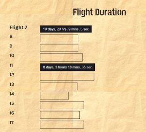
Next, it was time to build the bar chart showing the flight duration. A challenge I faced with this was that I couldn’t get the bars to be the size I wanted them to be depending on how long the flight is. Instead, it just goes to the length that the text is.
Therefore, I decided that instead of an accurate bar chart, it would just be a cool interactive visual for users. The way that I made this interactive was by making each bar into a non-clickable button. This meant that I could add a hover effect that makes the duration of the flight appear when you hover over it. I think this will engage users and it allows them to compare flight durations easily without having to go to each flight page.
Lastly, I built the crew section of the website. I wanted to have a button that you can press which drops down into a post-it note with information on it. To do this I added an element trigger to the arrow. I set it so that it would show the post-it note on the first click and hide it on the second.

When I first did this, I had some issues with the typography. The spacing wasn’t right and the text came too close to the edge.

Therefore, I added more padding to either side which improved the look of it. This makes it feel less busy and cleaner.

Although building this website has had its challenges, I have enjoyed doing it and improving my skills. Next, I want to receive feedback on these pages so far so I can make improvements. Then, I want to do the same thing with the other pages but with different content of course.