Mind Map
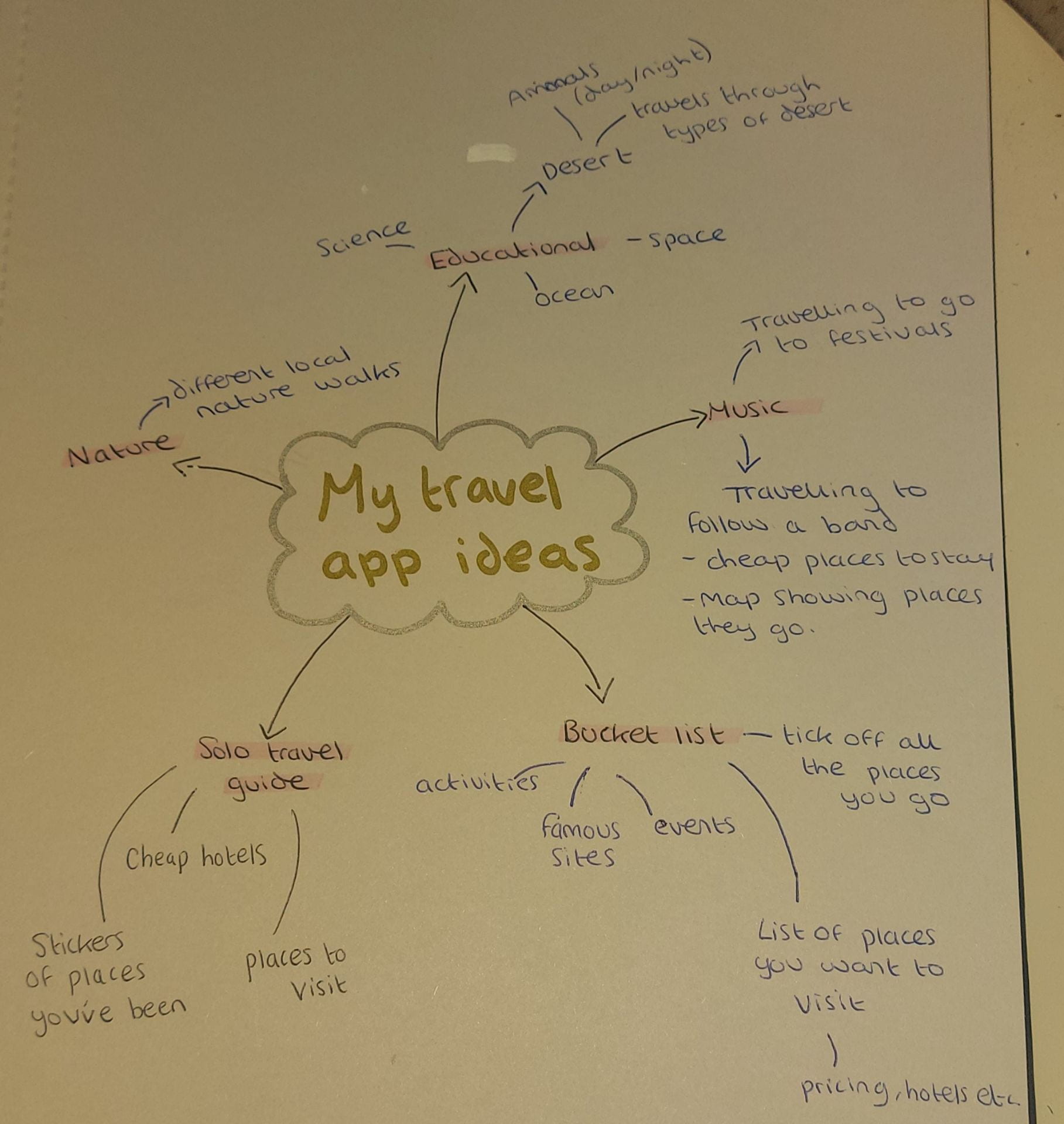
My idea
Of these ideas, the one that interests me the most is the educational one about the desert. The general idea for this is that you travel through the desert through the app, learning about animals, types of deserts etc. I chose this because I have an interest in wildlife and I think the illustrations for a desert could be cool.
Research
Before I began sketching out my own ideas, I thought it would be beneficial to research some similar concepts.
First, I wanted to look at a general travel app to see what approach was taken.
Trip.com
This app allows people to plan trips with ease. They can book flights, hotels, cars etc. and receive exclusive deals. I really like the layout of this app as it is visually appealing and simple. I think this is important, especially because travel can be stressful, therefore, a simple, easy to use interface is essential. I like their use of icons as it provides easy navigation through the app and they are consistent throughout.
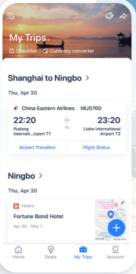

Something I liked about this app was that you could collect “trip coins” every time you make a booking. I think this would encourage users to be frequent users of the app, rather than just use it for one trip. This would increase the apps engagement and keep regular customers. It’s also something that’s enjoyable for users as they get the satisfaction of collecting the coins.

On the app store where they showed what the app was like, I really appreciated the illustrations. I think it shows the tone of the app. I like the colours and the simplicity of them, this is something I want to put across in my app’s illustrations.


Since my app would be educational, I wanted to look at apps more specific to this with differing target audiences so I could decide which path I wanted to go down.
Star Walk Kids

This app teaches kids about astronomy in a fun, interesting way. Since it is directed at children, there are many things they have taken into consideration. It’s easy to use as it uses child-friendly design. For example, the language is simple and easy to understand. This Is important for an educational app as the children need to be able to comprehend what they are reading so they can learn easily. The app itself is easy to navigate through with easy to read typography.
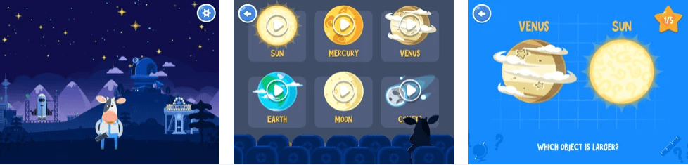
I like the illustrations they use as they would grab the attention of children. They also use fun characters which would engage the user and make it more entertaining. These are all things I would need to consider if I targeted my app at children.
Chemistry Pro

This is an app which provides topics, definitions etc. on chemistry. Its target audience is students at all levels up to university. Since it isn’t purely targeted at children, it has a more sophisticated style. I think the interface is very clean and appears easy to use and navigate.
![]()
I think the icons are simple and easy to recognise. They also stand out against the rest of the content as they use bright, eye-catching colours. With the educational content, I found that they have it in condensed short paragraphs. I think this is important to consider with my app as this will prevent users getting bored of reading large pieces of text. This way, they will be more engaged and interested.
After doing some research, I think I want to direct my app at older students as this will better fit my style of illustration I want to do. When researching, most educational apps that I came across were quite bland and didn’t have many illustrations. This is something I want to avoid in my app, instead, I want to include bright, aesthetically pleasing illustrations and icons as this is more engaging.
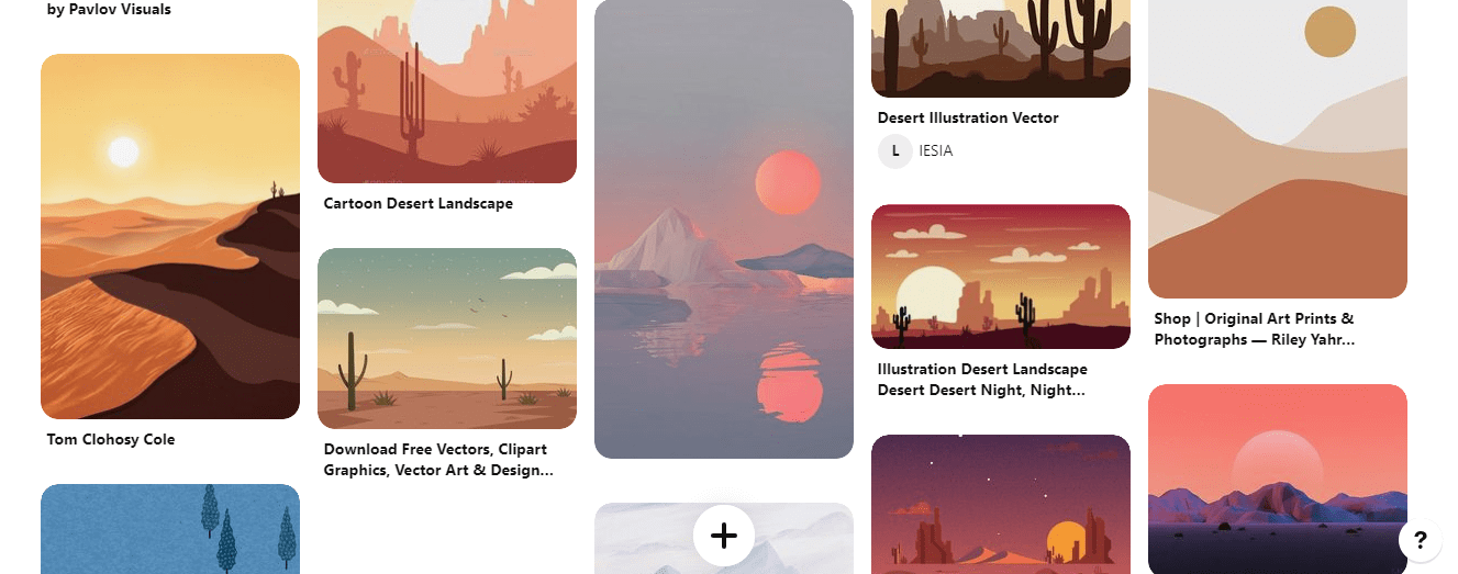
Illustration Mood Board
https://www.pinterest.co.uk/lgilmore401/illustration/
My next step is to begin sketching some wire frames, so I have an idea of what I want the screens of my app to look like. I will also start researching more about deserts so I have a better understanding of the topic.