What is a typeface?
It is a set of characters and symbols with the same design. Whereas, the ‘font’ refers to the weight and style of a typeface e.g. Bold, italics etc.
What is a type specimen?
Type specimen is a presentation of a certain typeface to show its design and use.
The typeface I have chosen for this project is ‘Helvetica’. This is one of the most popular typefaces in the world. I like it because it is simple, relaxed and easy to read. This means it can be used for a variety of things. It can look quite modern but it also fits in with more traditional design too.
Features: It was purposefully created to not give an impression or have a meaning; this provides an opportunity for it to be very adaptable. It has tight spacing between the letters which gives it a more solid appearance. It uses primarily vertical or horizontal strokes. It also has a tall X-height which can be seen below:
![]() – Despite these four X’s (The last being Helvetica) being all lower case and the same size, you can see that the X written using Helvetica stands the tallest.
– Despite these four X’s (The last being Helvetica) being all lower case and the same size, you can see that the X written using Helvetica stands the tallest.
Where is it used?
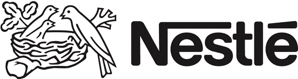
Helvetica is a very popular font. It is widely used by companies for logos and websites. Even NASA have been known to use Helvetica from space shuttles to signs. Many of these companies use it as it is consistent, simple and clear. Here are some examples:

![]()
![]()
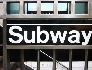
However, company logos aren’t the only place Helvetica can be found. It is also seen in New York subway systems, signs, shops, clothing and packaging. It was even the chosen typeface for the first iPhone. This is because it is a very versatile typeface.

The history of Helvetica
Helvetica was developed in 1957 by Swiss typeface designer Max Miedinger. It is based on a typeface from 1896 called Akzidenz-Grotesk. It was originally named Neue Haas Grotesk and it made its first appearance at a graphic 57 trade show and the swiss designers instantly took a liking to it.
In 1960 it was given the name Helvetica to make it easier to sell abroad as it is a catchier name. However, it kept to its origins as it means ‘swiss’ In Latin. With Swiss design becoming more and more popular in the early 1960’s, advertisers were very eager to use this new exciting typeface. Since then it has become one of the most used typefaces and it has been a favourite for many companies.
However, in more recent years some people have fallen out of love with Helvetica. Many designers argue that it is too dull. The neutrality of this typeface means it can often go unnoticed. More companies are going for custom fonts to set them aside from their competition.
Although this typeface isn’t for everyone, there is no doubt that it does its job in being simple and effective. It has consistently worked for thousands of companies over many years and is still top choice for many people.
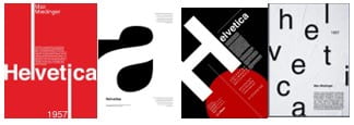
My Type Specimen Inspiration