In order to refine my initial sketches and ideas, I want to look into some visual research and inspiration. I’ve decided to create a Pinterest board focused on infographic designs that appeal to what I want my own to be styled similarly to, that I can take influence from.

What makes a good infographic?
Here is an example of an infographic from my board that I really like:

I want to break down it’s elements and figure out exactly what makes it such a good portrayal of information.
- Consistent colour scheme and illustrative style
- Elements are spaced out, allowing a lot of room between everything
- Blocks of text are not too long – easily read
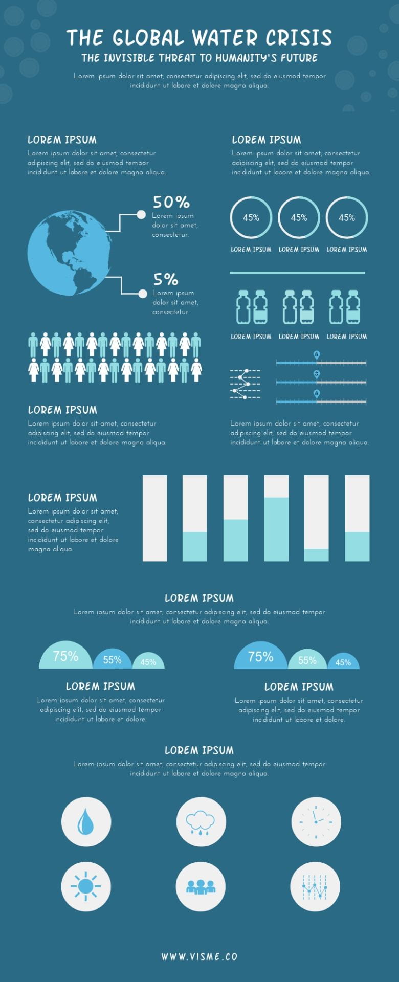
Here is another example of an infographic.
- Charts and graphs are very simplistic, easy to read and minimal
- Illustrations are not overly detailed
- Everything is evenly spaced out, with lots of empty space which doesn’t allow it to feel cluttered
- Consistent blue and white colour scheme throughout
- Handwritten-style font appeals to a wide range of audience, from children to adults