Colour Systems
Pantone
Started in New Jersey in 1950 for a commercial printing company, Pantone is now a global colour matching system which allows designers to colour match specific predetermined colours and achieve the exact tone regardless if the method of production. This is great for company brands as it will ensure that their chosen colour will match perfect on all applications.
The Pantone colour system uses a letter/number ID system which gives each colour a unique ID code E.g. PMS 485 – McDonalds striking red they use on their chip boxes and PMS 123. These Pantone colours are used extensively throughout all of their branding and are trademarked.
The purpose of Pantone is for companies to remain consistent in their colours in a variety of their branding applications across the board. Upwards of 10 million designers around the world rely on Pantone services and products to help maintain, define and communicate their product.
CMYK
CMYK stands for “Cyan Magenta Yellow Black” which are the four elemental colours that create this subtractive colour model. It’s a subtractive colour model which means the more you blend the colours together the darker it gets. This model is usually used on both screen and printing (Used in ink cartridges thus the importance).
When do I need to use CMYK?
When I want to reproduce something physically (printing) for my brand such as:
- Flyers
- Brochures
- Stickers
- Posters
- Business cards
- Signs
- Physical Merchandise
- Packaging
RGB
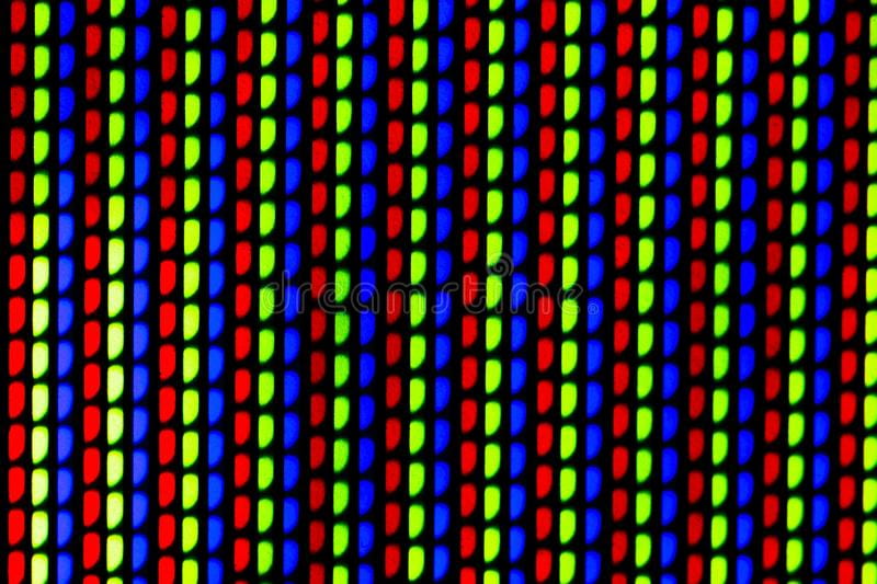
RGB stands for “Red, Green, Blue” and unlike CMYK which is a subtractive colour model, RGB is an additive model which combined make the colour lighter instead of darker. It is widely used in many digital and visual components such as TV/monitor screens, camera sensors, light fixtures and image scanners.
RAL
Introduced in 1993 yet developed in 1927 Ral is a German/European colour matching system which involves 4 colour ranges under the headings classic, design, metallic and luminous. For example the Classic category contains upwards of 200 colours all with a unique code to identify them. This was created for designers to use on plastic, paint and powered coverings allowing to sub categories elements and give them unique codes.
Hexadecimal
Abbreviated to HEX code for short, this is a unique six-digit number combination that defines an absolute and specific number. Same to RGB, HEX code can be used as a short code for RGB which contains a mixture of red, green and blue.
This code system is good for graphic designers identifying their unique colours and for HTML/CSS websites.
Colour Schemes
What is a colour scheme?
A colour scheme is an assignment of colours that are used to create style, aesthetic and visual appeal.
Monochromatic:
Colour scheme that uses tints, tones and shades of one single hue.
Triadic:
Colour scheme that uses evenly spaced colours around each corner of the colour wheel.
Split-complementary:
Colour scheme that uses two colours directly across from each other on the colour wheel.
Analogous:
Colour scheme that uses two colours close to each other on the colour wheel.
Tetradic:
Colour scheme that uses 4 colours arranged into two complementary pairs.
Phycology of colours
Implementing colour on my brand:
To look at implementing colour in my brand I have to go back to my brand values and customs. My brand values consist of being creativity, uniqueness, passionate and having a premium which all colours physiologically connote with the colour purple so I will be looking at implementing purple to my brand.
Although, I have to acknowledge the cultural and historic physiologically representation of the colour purple around the world as the western world symbolize the colour purple with wealth, status, imagination and power other places see it as colour that evokes mourning such as Latin America, Middle East, African continent and East Asia.
Purple in Brands & Reactive colours
Hallmark is a successful American gift card company which uses both Gold to illuminate the wordmark and logo along with a dark rich purple background, display complete and absolute royalty from both combined company.
Cadbury is a famous chocolate company renewed for its great tasting chocolate, the company uses its own unique shade of purple connotating a sense of luxuriousness.
Yahoo is a long running and successful email provider and service. The brand is very easily recognized for its vibrant striking purple which evoke a sense of power, loyalty and mystery.
FedEx is an American courier service which uses purple to convey a sense of luxury service and importance in their packages.
While looking at primary purple brands, I noticed that most of them use white as a secondary colour usually on their wordmark or logo which reacts with the purple and creates a sense of premium, cleanness and luxury. I want to achieve similar emotions with mines.
What have I learned?
This class has really helped me to identify and disguise from a variety of different colour systems/models and what their practices and purpose is. I have also further knowledge on how colours can be combined in different systematic style and how they can evoke different emotion in most cultures. This has ultimately allowed me to develop my own brand further and now I will begin on the implementation of the colour purple in my brand.


