In todays class we had a look at icons, their functions and style.
“Trying to capture the essence of an object or idea with only a few lines and at the same time maintaining its elegance is pretty much design in a nutshell. That’s what’s so great about icons, they’re tiny poems.” —Kyle Tezak
This quote describes how icons are formulas to information in which they present visual knowledge seen as ‘mini poems’ and navigation through the art of simplistic recognizable designs. This is because icons aren’t just instantly recognizable designs, instead they have history through culture and history, from ancient cave paintings to the badges of a tribesman. Symbolism has became part and parcel of the evolutionary being and beyond.
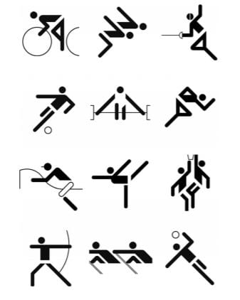
Icons represent a hidden language that can connect to the reader better than the written word. I really liked collection of Olympic icons Paul showed us using negative space and closure to create a perceived image of different sports with minimal visual presentation.
Icons are not just a language through repeat exposure of culture and human habits, but instead evolutionary that can act like a universal language that anyone can recognize without the need for exposure.
Instead of creating countless books in different languages Ikea decided to create a visual manual to appeal universally through visual illustrations allowing them to save costs on printing.
Icons play a role in user interfaces, they navigate people through the site with universal visual information such as a picture of an airplane meaning flights, bed meaning hotel/accommodation, etc.
“A pictogram is a visual translation of a concept. It is a sign: a combination of shapes associated to carry meaning.” —Symbol and signs: Exploration, A. Frutiger, 1999
Icons play one of the fundamental roles that create an interface, without them people would be lost and without the universal recognition it could damage the user comfortability and appeal to the app.
“Today icons are an integral part of visual identities, programming interfaces, information systems, websites or mobile applications. Just as before, icons are kind of mental shortcut. Their goal is to improve fast identification of things / functions.”
Different styles of icons:

What other elements must be considered during icon design?
- Detail – Often more simple is seen as better but this can depend on what you are using it for.
- Scale – Can it withhold consistency while scaled down?
- Harmony – Is it consistent in design with the rest of the icons?
- Unique – How does it differ from other icons?
- Readability – How will my icon be read/what does it convey?
What have I learned?
I really enjoyed this class today from Paul as it has provided me with the contextual knowledge and the fundamental understanding of icons. As well as the methodology behind icon creation. He also showed us different iconographers and designers to gain inspiration from which I will do more research on. From this class I have gained a better understand of what I want my travel app to consistent of and the stylistic approach I want to take.