For my travel app, I don’t necessarily need to represent a chosen country, although this is what I would like to do. However, I need to know what locations I am going to display and showcase.
I have looked at and researched three different geolocations where I might base my app on:
- Ireland
- Caucasus area
- Global – Anywhere
First of all, before I implement colour into these apps I must study how other travel app companies tie and implement colour into their app.
Looking at colour significant to countries there is many factors that combine colours to countries. For example it can tied due to cultural, political, flags and environments.
An example of implementing colours from culture:
In India it is renowned for its festive day ‘Holi’ which celebrates the divine love of Radha and Krishna. This can be significantly tied to Indian travel apps through the use of vibrant and bright multicoloured palette.
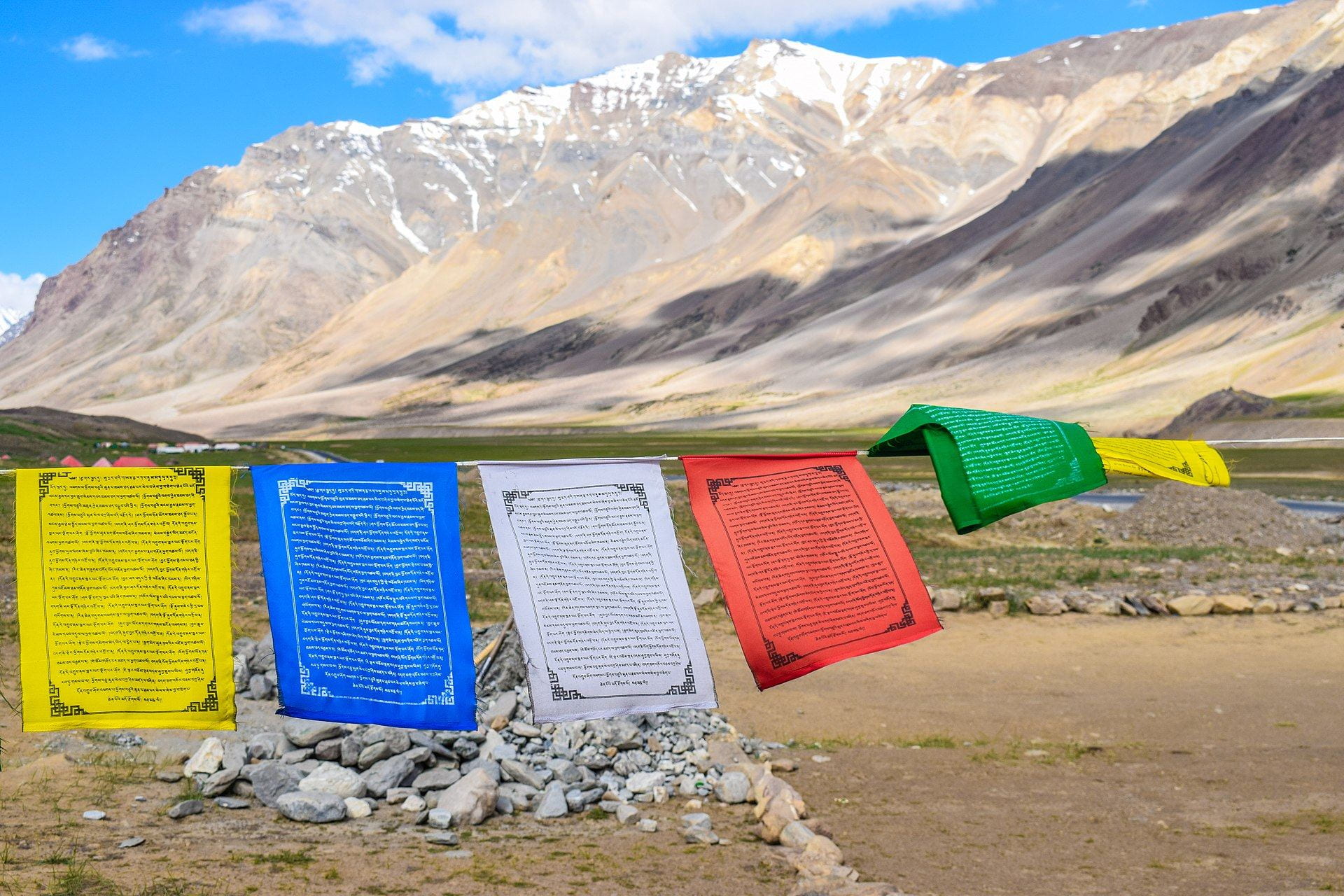
Another similar example of this would be its neighbouring country Nepal which uses unique multicoloured prayer flags throughout the mountainous landscape and is symbolic to the countries identity.
Ryanair also uses a blue & gold colour palette which combined with their logo contains significant ties to the Celtic harp.
An example of implementing colours from environments:
Egypt & surrounding countries has significant ties to a barren sandy desert due to its location in the Sahara desert. For this reason many people would tie Egypt with an yellow/orange colour.
A similar example would be Ireland due to its lush green hills and glens many people would tie the countries colour to a vibrant green.
An example of implementing colours from politics/flags:
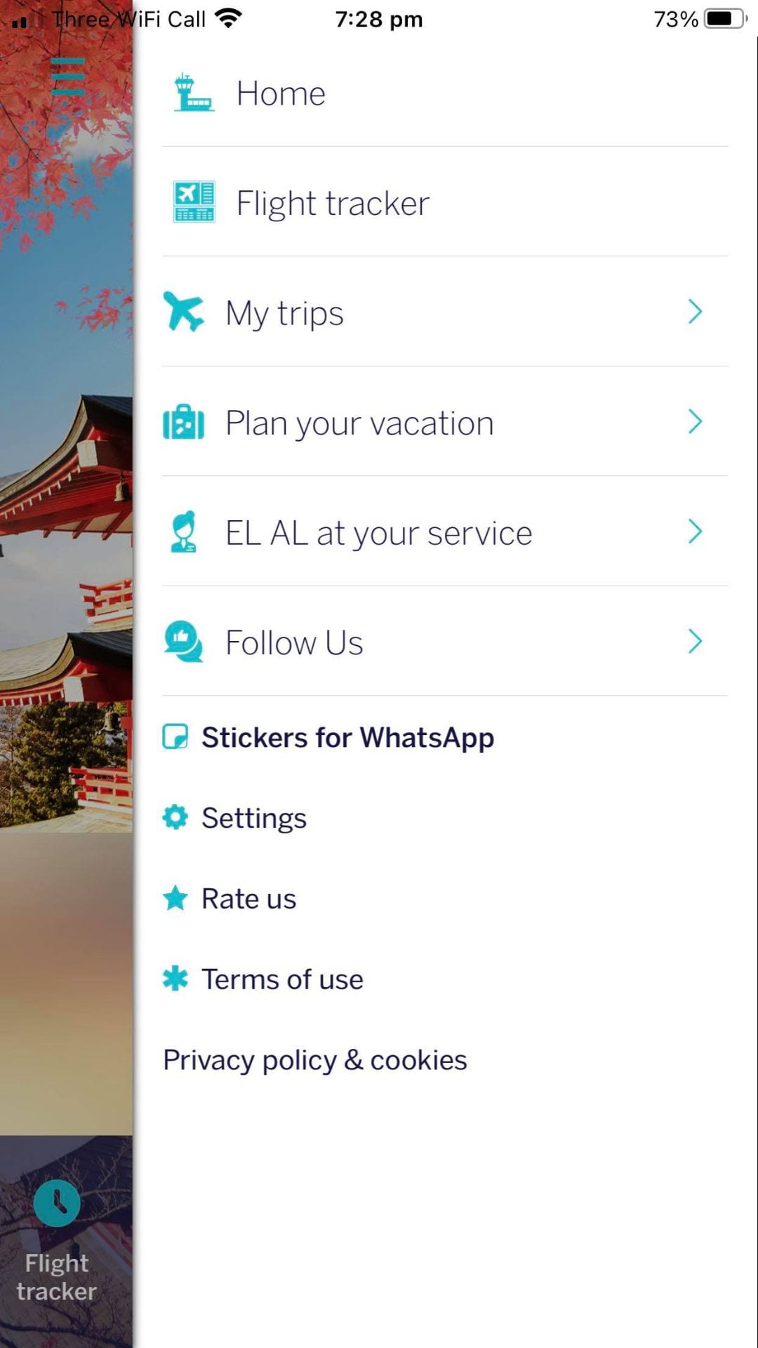
EL AL flights uses blue and white on their flight app and planes to represent the colours of Israel for both national identity and historic representation.
British Airways uses the blue, red and white colour scheme which represents national pride and identity.
Common colours used in Travel apps
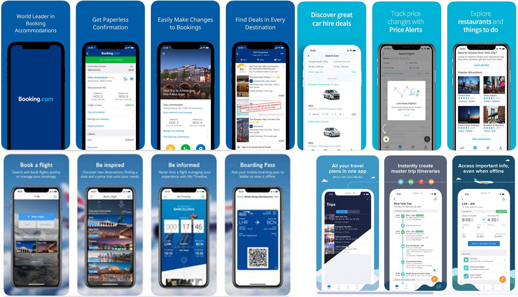
When exploring travel apps I noticed a common colour scheme; blue and white. I compiled a collage showcasing the amount of travel apps that contain both blue and white.
Why is this?
Companies use this colour scheme as the colour blue conveys a sense of safety and trust, which is what many people want when booking flights and going abroad. White creates a sense of purity and innocence. It also makes the app look simple and clean.
Selecting colour for my chosen app
As I will be picking Ireland for my destination I want to use Green and white as my colour scheme with green being primary and white being secondary I think it will be a good pick.
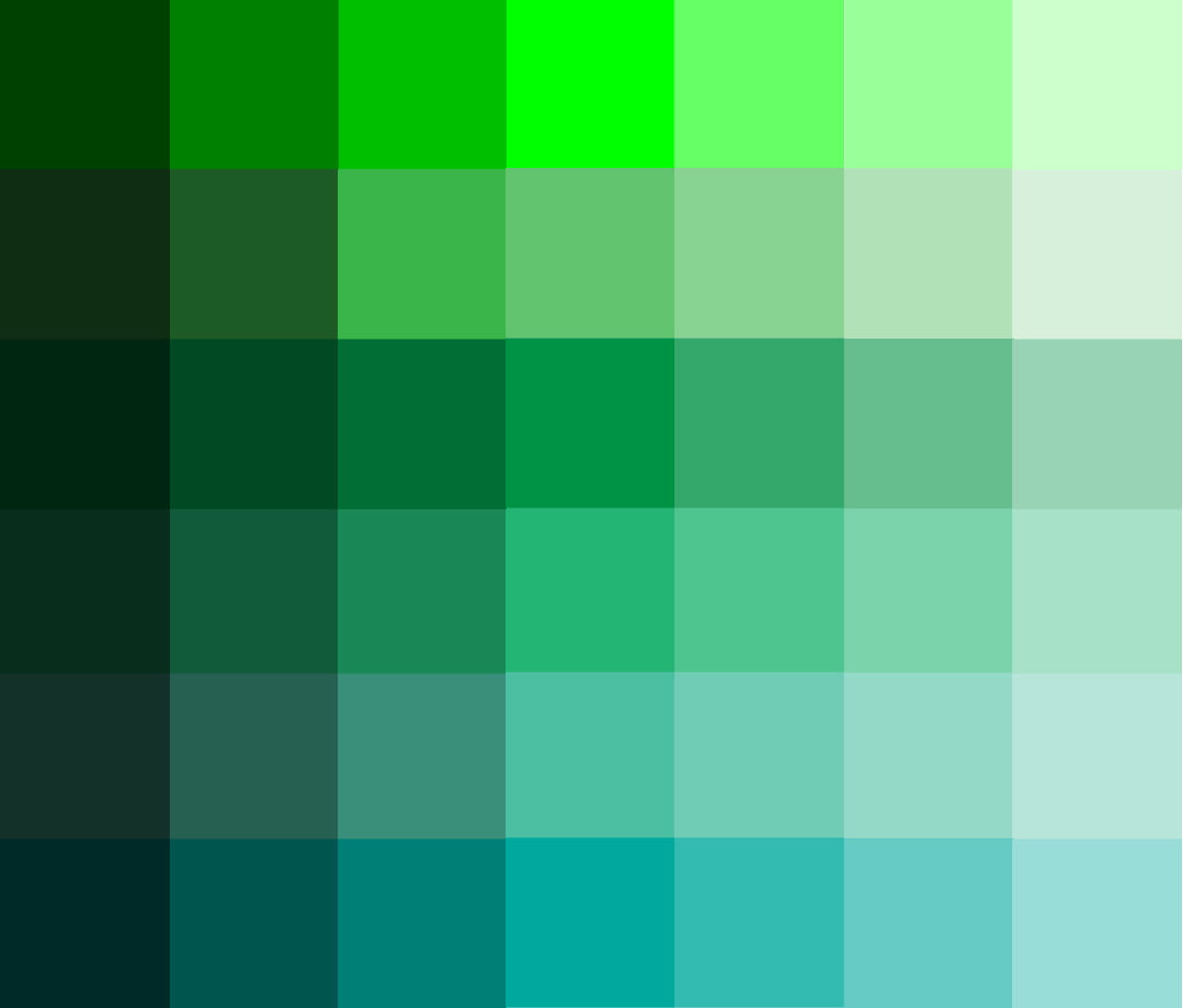
To look at my colour options I decided to get multiple colours and display them in different hues.
I then made a fake mock-up consisting of a navigation bar, header and a information box to see what it looks like in practicality and against the white backdrop.
I played with it for a while looking at a variety of colours but there was one that stood out the most. It was a more of a turquoise colour which looked fantastic and simple next to the white background. It also meant that it had that ‘travel app’ blue that others contain while also containing a tint of green which holds national identity and environmental connotations.
Primary colour – #4CBFA2
Secondary colour – #FFFFFF
What can I include in my travel app?
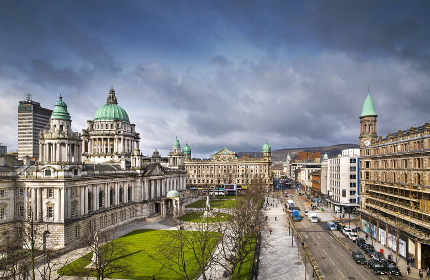
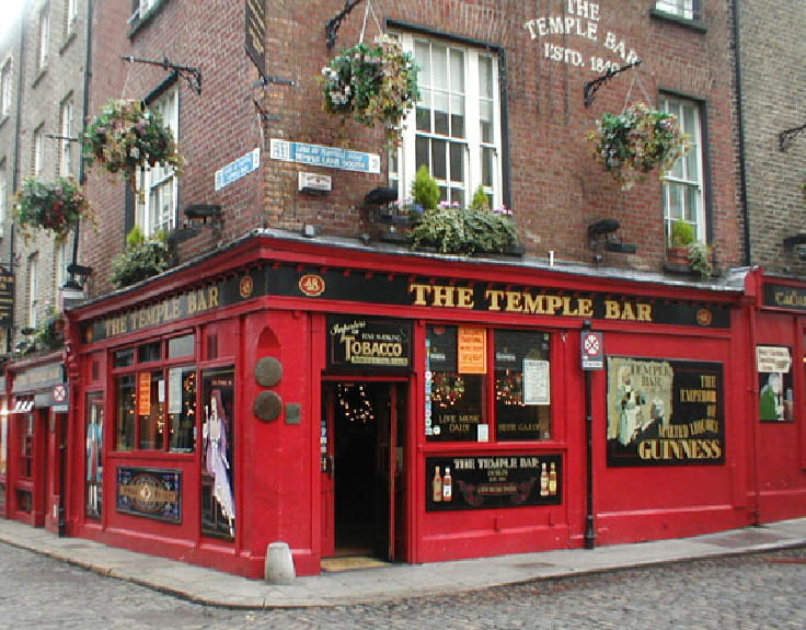
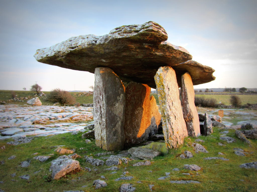
Ireland features a diverse range of different iconic landmarks to include into my app. I have made a list of some of them.
Cities
- Belfast
- Dublin
- Cork
Natural Landmarks
Historic/Cultural Sites
Typography
While doing my research on travel apps I also noticed another common pattern, the majority of travel apps use a sans serif font. This was interesting to see as it made the apps feel more simplistic, easy to navigate and less formal, giving an inviting and fun experience. Looking at some of the typefaces such as Skyscanner’s bespoke ‘Relative’ typeface shows their clear and straightforward custom values, matching the simple artistic style of their app.
Picking a Typeface
As I wanted a typeface that matched the artistic personality of my app – simple, clear yet playful. I set out to try and find the perfect typeface. I decided to create a list of the best typefaces I can find on Adobe fonts. I will pick the one that has the best match to my style.
After picking six, it was clear the winner; “All Round Gothic Demin”. This typeface appealed to me from the start. It just has the essence to be used on a travel app with no flicks or no unnecessary letterform characteristics, it’s simple, clean and round whilst retaining a sense of playfulness. Exactly what I want.
What have I learned?
I enjoyed researching colours, location and typography for my chosen travel app and how the identity of travel apps can be used through these various factors and characteristics. I am really happy of the choice of colour and type that I have picked as I think it fits perfect for what I’m trying to convey in my app. I will now begin to sketch out wireframes for my app.

