Daniel advised that we read a particular chapter in the book ‘A Project Guide to UX Design’ by Ross Unger, this was to get us aware of what a proposal is, he didn’t mention much about what the chapter was about or what we would fin out, he left that up to us. I am always glad to hear book recommendations because reading is something I love to do. The chapter Daniel wanted us to focus on was chapter 3 – so that is were I looked first.
Chapter 3 – Proposals for consultants and freelancers.

‘A guide for those in the business who also mange their own business.’
The first part of the chapter was about the importance of proposals and why they are needed. I read that they are essential to protect your business and yourself from financial and legal troubles. I was surprised at how much the word protection was used throughout this chapter but it was encouraging to hear because it is nice to know that such a document can exist. Then I read that how you should make sure you spend time composing an agreement because sometimes a well written proposal and a poorly written one is the difference between getting the job or not.
The book also said that the biggest challenge in wiring the proposal is writing your very first one because there are core elements that are common in every proposal. But the first one can be daunting to write and normally people have no clue where to start.
Then I noted down that you should always write a proposal. ALWAYS.
Unger said that sometimes you could be tempted to skip this part but you should always write one. Before one starts to work they should take time to define their professional relationship and rules of engagement with every client. No matter how good the connection was at the beginning. I was shocked to read that when a proposal is written up that there is less likely of fights between parties because promises can always be broken on both sides. There could be with held content needed from the client or funding could be stopped, the possibilities are endless.
The last thing I noted down that caught my attention was that well written proposals provide clients with a sense of stability and protection. This was a n ice way to end the first part of this chapter and then the next part of the chapter was all about the core components, the authors listed out every core component that should be included in every proposal and then went into more detail on each one.
Core Components
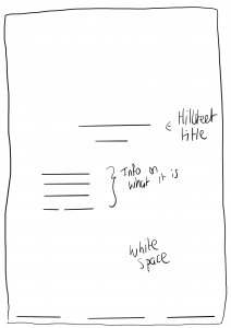
- Title Page
- Scope of Work
- Revision History
- Assumptions
- Project Overview
- Deliverables
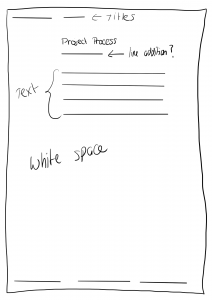
- Project Approach
- Ownership and Rights
- Additional costs and fees
- Payment Schedule
- Project Pricing
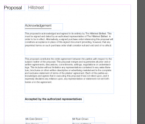
- Acknowledgement and Sign-Off
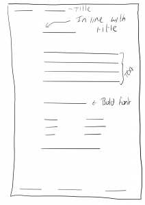
It was really helpful to see all of the components listed within the book and is a great help to someone like me who has never seen a proposal before. I understand most of them but I thought I would write about a few that I wasn’t aware of and had no idea what they meant. The authors did a deep dive into each one and it was very interesting reading every one, this made me really comprehend the importance of a proposal, through finding out what each section entailed.
Assumptions
In reading this section I was weary because I did not know what they meant by assumptions. But an assumption in this context is used to spell out what is needed from a client to ensure success. It really means ‘exceptions’ but assumptions is just a more polite phrasing. This then made sense to me when I read this. In general the assumptions are an exception of resources and assets as well as timely (prompt and immediate) access to both of these.
There was then an example of an assumptions section of a proposal, this was extremely helpful because it helped me visual it in real life. I then understood completely why this is needed.
Ownership and Rights
This was another section I wasn’t quite sure on because I have never needed to know about copyrighting etc. But this was explained well also. I noted that the majority of work will fall into two categories-
- Work for hire
- Licensed work.
When I read this I was still pretty lost because I was unsure of these definitions. Work for hire is the when the work is under copyright to the party who pays for the work. It is owned by the client whereas Licensed work enables you to retain the copyright of the work but grant other parties the right to copy or distribute it. I read that time and having experience will help determine which one you choose.
This was helpful and enlightening, I have never had to think about any of this before and it was a bit scary to read about because copyrights and fees sound so serious, but that is the reality of freelancing and proposals.
Pricing
This is another area that I wanted to write about because it is where I learned the most. I have no experience in selling my skills when it comes to UX design so I would have no idea how to price and this part of the book really helped me understand the steps to take. They included lots of tips on how to start, it was said that you should firstly, estimate how long you think it will take you to do the job, time for revisions and estimate a time for project management. Then determine an hourly billing rate and calculate it all out.
I was not aware of how to do this but then I read on and they gave me some tips, for example research what others are charging because it is important to know for comparisons. I also noted down a list of organisations and websites that preform salary and contractor rate surveys. I also noted down an important note ‘Remember: You can always lower your rate, it is always harder to ask clients for more once they have seen the numbers on the page’. I thought this was great advice and a note I will be following.
This section also included an example of a project estimate. This helped me visualise what mine could possibly look like. It was also helpful to see the language used, as I would not be familiar with business lingo.
Reflection
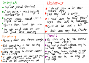
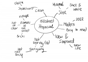
Overall I really liked reading this chapter and found it extremely helpful. Going into this I had no real knowledge on this topic oc proposals but now for reading about all of the components and really taking in the examples given, I feel much more prepared to make a start on the project Daniel set on writing out own proposal soon. I will be sure to go back an dread the rest of this book as it was very well written and easy to digest as a young designer starting out.