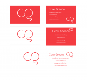
Daniel got us to design our business cards during a lecture and this was when I hadn’t changed the colour of my brand, so I have re done my business cards to a higher standard and more suitable colour choice.
What message did I want my business cards to send out?
Similar to my ‘beyond the brand’ outcome for example the mug and pens, I wanted clients or the public to hold my work at a high standard, so therefore, this means my gestures/gifts I give out must be of a high standard as well. Daniel informed us that sometimes business cards are the first time a person will experience your brand, so I want everyones experience to be a fun and memorable one.
How do I make this a reality?
I first had to analyse what is it that I think make my brand fun, exciting, memorable and interesting. I thought and came up with the idea that my colour and imagery plays a big roll in it. The colour red is exciting and passion and my multicolour imagery of fun items like sweets stirs up feelings of youth and fun. Considering these elements I knew that I had to design a business card that reflects these parts of my brand and use both aspects – colour and imagery.
The first business card drafts
I started to experiment with colour and positioning, here is what I came up with and played around with,
Why don’t these work?
- Too boring – not fun enough
- Positioning is off and the space between in formation needs altered
- My logo is repeated too many times
- The front of the card is slightly bland
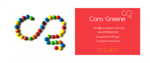
I then replaced my logo on the front of the business card with my brand imagery of m&m’s because I knew something was missing.
Does this work?
In my opinion this works much better, it is a different approach and one that makes my brand appear very fun, exciting and full of possibilities. I think adding this bright image to the front of the business card makes my brand unique. I also think the colour goes well with the white and red on the back, it really brightens up the business card. My logo is easily read and understood on the front thanks to the sweets but I also put it on the back so everyone knows that’s what it is – my logo.
Getting another opinion
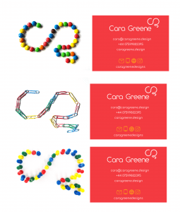
During the group critque I showed Daniel this new business card and he liked the idea of using the m&m image because he thought it was my best imagery but he showed my how to rearrange my information at the back more successfully. He felt that I did not need my logo on the back as well as the front. Even though we have discussed removing the yellow from my brand he said that I could leave the icons yellow if I wanted because it brings out the yellow in the m&m’s. He also suggested that I should try using the other images I had taken too because I should make lots with different items to give out. This will make each customers experience different.
Adding other imagery images
The image above is an assortment of the multicoloured imagery Daniel told me he liked the best. I agree, I think that the imagery has to be somewhat multicoloured because otherwise it may contrast with the colour red on the back and appear too blocky. I think these work well but I think still need to work on a few images.
Final Business card
What changes did I make?
- I positioned the information the way Daniel told me
- I took away my logo from the back of the card
- I change the colour of the icons back to white so it keeps in theme with my brand
- I made my monogram a little bit smaller to it wasn’t as over powering
My thoughts
I think that the end result is really nice, I think it ties in all aspects and values of my brand. I would be quite happy for this to be the first thing people experience when it comes to my brand because I think it gives out a positive, fun and creative message about my and my work. I can’t wait to hopefully get these printed because I think the colours would really pop and look very bright and fun. I also like how I got to include the icons I made – I think this is a nice touch because the public get a small sneak peak of my work. Overall I enjoyed this task and the journey my brand has been on through colour changes and adding imagery, I think it all paid off in the end because I got these fun business cards out of it.


